# Action tray
A fixed bottom tray for a screen's essential figures and its confirming action. Compose it from ActionTrayNotice, ActionTrayRow and ActionTrayDetails.
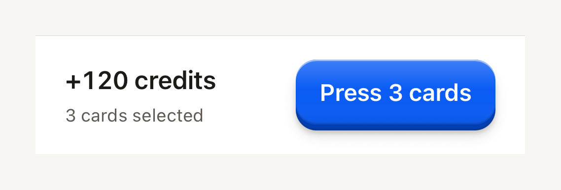
```tsx
import { ActionTray, ActionTrayDetails, ActionTrayRow, Button, ButtonText, Text } from "@terratcg/ui";
export default function ActionTraySummary() {
return (
+120 credits3 cards selected
);
}
```
## Import
```tsx
import { ActionTray, ActionTrayDetails, ActionTrayNotice, ActionTrayRow } from "@terratcg/ui";
```
## Usage
```tsx
+120 credits
```
The tray draws its surface, its hairline and its padding, and nothing else: you position it at the bottom of the screen, pass the bottom safe-area inset, and own the operation its action starts. `ActionTrayRow` lays the details out on the left and the action on the right, and wraps the action below them when the text grows or the screen is narrow.
## Examples
### With a notice
A one-line notice above the row: a danger notice is announced as an alert, a default one is a quiet hint.
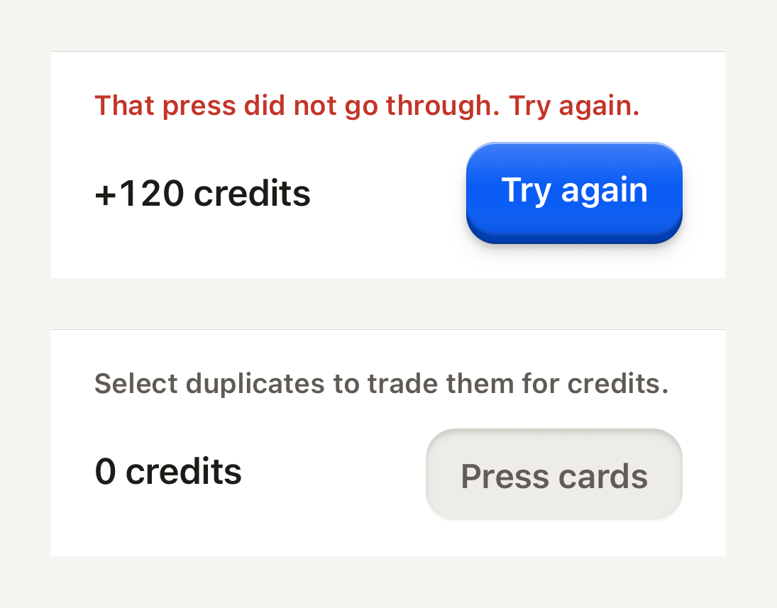
```tsx
import { ActionTray, ActionTrayDetails, ActionTrayNotice, ActionTrayRow, Button, ButtonText, Text } from "@terratcg/ui";
import { View } from "react-native";
export default function ActionTrayWithNotice() {
return (
That press did not go through. Try again.+120 creditsSelect duplicates to trade them for credits.0 credits
);
}
```
## Props
### ActionTray
### ActionTrayProps
| Prop | Type | Description |
| -------------- | -------- | ------------------------------------------------------------------------------------------------- |
| `bottomInset?` | `number` | Bottom safe-area inset supplied by the host; the tray pads at least its own spacing. Default: `0` |
ActionTray also accepts React Native's `View` props, such as `style` and `testID`. Its bottom padding is the larger of `bottomInset` and its own spacing.
### ActionTrayNotice
### ActionTrayNoticeProps
| Prop | Type | Description |
| ---------- | ----------------------------------------------- | --------------------------------------------------------------------------------------------------------------- |
| `tone?` | `"danger" \| "default"` | "danger" announces as an alert; "default" is a quiet hint. Default: `"danger"` |
| `weight?` | `"bold" \| "medium" \| "regular" \| "semibold"` | Overrides the variant's default weight (`label`, `title` and `headline` are heavier than `body` and `caption`). |
| `tabular?` | `boolean` | Tabular figures for counters and stats. Default: `false` |
ActionTrayNotice also accepts React Native's `Text` props, such as `numberOfLines`. A notice is `danger` unless you pass `tone="default"`.
### ActionTrayRow and ActionTrayDetails
Both take React Native's `View` props and nothing of their own. ActionTrayDetails grows first and keeps at least 140 points, so the action wraps below it before the figures get squeezed.
## Accessibility
- **Reading order:** put the notice first, then the row. Screen readers announce a failure before the figures and the action it concerns.
- **Danger notice:** a polite live region with the `alert` role, so a new failure is announced without stealing focus.
- **Default notice:** a polite live region with no role, read as a quiet hint.
- **Larger text:** the row wraps, putting the action under the details instead of clipping either.
## Platform differences
- **iOS and Android:** the same tray, hairline and spacing. The bottom inset comes from you, so read it from your safe-area provider on each platform.
- **Web:** ActionTray renders through react-native-web for these docs, but the web is not a supported target.
## Rules
- Keep one confirming action in the tray, the screen's primary Button, and nothing that scrolls.
- Show only the figures needed to confirm: a total, a count, a chip. Everything else stays on the screen above.
- Pass the bottom safe-area inset as `bottomInset`; never pad the tray yourself.
- Use a `danger` notice for a failure the user must act on, `default` for a hint. Keep it to one line.