# Avatar
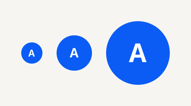
A round portrait on the accent fill that falls back to an initial when there is no photo to show.
```tsx
import { Avatar, AvatarFallback } from "@terratcg/ui";
import { View } from "react-native";
export default function AvatarSizes() {
return (
A
A
A
);
}
```
## Import
```tsx
import { Avatar, AvatarFallback, AvatarImage } from "@terratcg/ui";
```
## Usage
```tsx
{user.name[0]}
```
Compose an AvatarImage and an AvatarFallback inside the Avatar. While the photo loads, the circle shows its accent fill; once it loads, the photo covers it. With no source, an empty uri, or a failed load, the fallback shows instead, so a missing photo never leaves an empty circle.
## Examples
### Beside a name
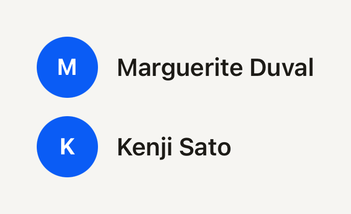
The default size fits a list line: the Avatar is named for screen readers, and the name beside it repeats it for everyone.
```tsx
import { Avatar, AvatarFallback, Text } from "@terratcg/ui";
import { View } from "react-native";
export default function AvatarBesideAName() {
return (
M
Marguerite Duval
K
Kenji Sato
);
}
```
## Props
### Avatar
### AvatarProps
| Prop | Type | Description |
| ----------- | --------------------------- | -------------------------------------------------------------------------------------------------------------------------- |
| `size?` | `"default" \| "lg" \| "sm"` | Diameter: 24 pt (`sm`, beside captions), 40 pt (`default`, in rows) or 72 pt (`lg`, profile headers). Default: `"default"` |
| `children?` | `ReactNode` | Compose AvatarImage and AvatarFallback. |
Avatar also accepts React Native's `View` props, such as `accessibilityLabel` and `testID`.
### AvatarImage
### AvatarImageProps
| Prop | Type | Description |
| --------- | ------------- | ------------------------------------------------------------------ |
| `source?` | `ImageSource` | A React Native image source. A uri-less source counts as no image. |
AvatarImage also accepts React Native's `Image` props, such as `onLoad`, `onError` and `resizeMode`. It fills the circle.
### AvatarFallback
AvatarFallback takes React Native's `Text` props, except `variant` and `tone`: its size follows the Avatar's and its colour is the on-accent ink.
## Accessibility
- **Role:** `image`, on the Avatar itself, which is one accessible element. Its parts are decorative.
- **Label:** pass the person's name as `accessibilityLabel`. The initial alone is not a name.
- **Photo:** the image ignores Smart Invert on iOS (`accessibilityIgnoresInvertColors`), so a face is never shown in negative.
- **No flash:** the fallback decision is made before paint, so a photo that is there never shows the initial for a frame.
## Platform differences
- **iOS and Android:** the same circle, sizes and fallback.
- **Web:** Avatar renders through react-native-web for these docs, but the web is not a supported target.
## Rules
- Always include an AvatarFallback: it is what shows while there is no usable photo.
- Render AvatarImage and AvatarFallback only inside an Avatar; outside one they throw.
- Keep the fallback to one or two characters: the circle is sized for an initial.
- Pick the size by place: `sm` beside a caption, `default` in a Row, `lg` in a profile header.