# Cell
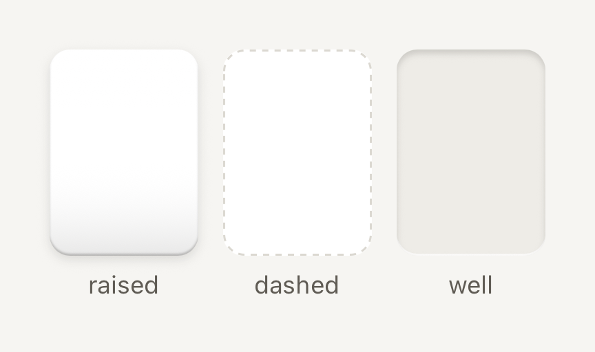
One pocket in a dense grid or shelf. Quiet framing keeps the art inside as the subject.
```tsx
import { Cell, Text } from "@terratcg/ui";
import { View } from "react-native";
export default function CellFrames() {
return (
|
raised
|
dashed
|
well
);
}
```
## Import
```tsx
import { Cell, resolveGridColumns } from "@terratcg/ui";
```
## Usage
```tsx
open(card)} accessibilityLabel={card.name} style={{ width: 72, height: 100 }}>
|
```
Give a Cell its size through `style`; the frame and colours come from the theme, and your content is clipped to the frame. The three `frame` treatments tell a Cell's states apart: a raised shell, a dashed outline and a recessed well. With `onPress` the Cell is a button that dips to 94% and tints when pressed. Without it, it is a static frame.
## Examples
### Pressable and selected
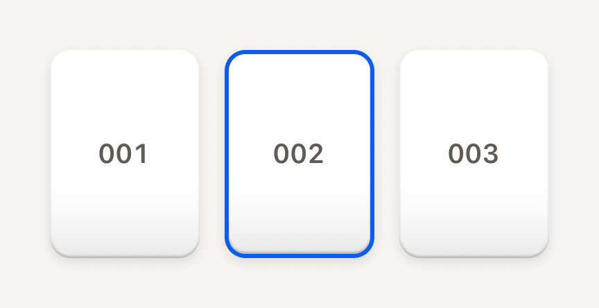
With onPress the pocket is a button that dips and tints when pressed; selected adds a 2 pt accent border.
```tsx
import { Cell, Text } from "@terratcg/ui";
import { useState } from "react";
import { View } from "react-native";
const POCKETS = ["001", "002", "003"];
export default function CellSelected() {
const [selected, setSelected] = useState("002");
return (
{POCKETS.map((number) => (
setSelected(number)}
accessibilityLabel={`Pocket ${number}`}
style={{ width: 72, height: 100 }}
>
{number}
|
))}
);
}
```
### In a grid
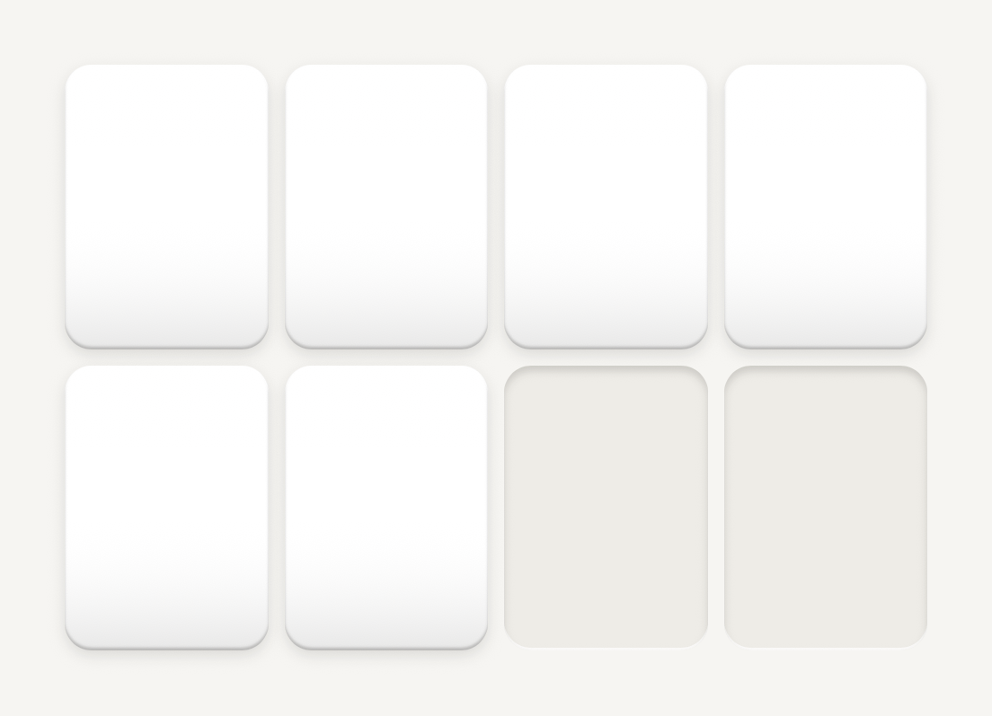
resolveGridColumns picks the column count and cell width for a width: columns drop before cells shrink below minCell.
```tsx
import { Cell, resolveGridColumns } from "@terratcg/ui";
import { View } from "react-native";
const WIDTH = 320;
const GAP = 6;
export default function CellGrid() {
const { columns, cellWidth } = resolveGridColumns({ width: WIDTH, padding: 0, gap: GAP });
return (
{Array.from({ length: columns * 2 }, (_, index) => (
|
))}
);
}
```
## Props
### Cell
### CellProps
| Prop | Type | Description |
| -------------- | -------------------------------- | ------------------------------------------------------------------------------------------------------ |
| `frame?` | `"dashed" \| "raised" \| "well"` | `raised` for a filled pocket, `dashed` for a placeholder, `well` for an empty one. Default: `"raised"` |
| `selected?` | `boolean` | Selection cue: a 2 pt accent border. Default: `false` |
| `children?` | `ReactNode` | Host content, clipped to the frame. |
| `style?` | `StyleProp` | Outer style: width, height, margins. Colors come from the frame and theme. |
| `translucent?` | `boolean` | A see-through floor, for a pocket resting inside a living shell (see Card). Default: `false` |
Cell also accepts React Native's `Pressable` props, such as `onLongPress`, `hitSlop` and `testID`.
### resolveGridColumns
`resolveGridColumns(input)` returns `{ columns, cellWidth }` for a dense grid: on narrow phones columns drop before cells shrink below `minCell`, and wide screens gain columns up to `maxColumns`. `minColumns` wins over `minCell`: at the floor, cells shrink instead (with the defaults, a 200 pt width yields three 52 pt cells).
### GridLayoutInput
| Prop | Type | Description |
| ------------- | -------- | ------------------------------------------------------------------------------------------------------------------------ |
| `width` | `number` | Available container width in points, before padding. |
| `padding?` | `number` | Horizontal padding on each side. Default: `16` |
| `gap?` | `number` | Gap between cells. Default: `6` |
| `minCell?` | `number` | Smallest cell width that keeps art legible. Columns drop before cells shrink below it, down to minColumns. Default: `62` |
| `minColumns?` | `number` | Column floor. Wins over minCell: at the floor, cells shrink instead. Default: `3` |
| `maxColumns?` | `number` | Column ceiling, reached on wide screens. Default: `10` |
## Accessibility
- **Role:** `button` when the Cell has `onPress`, with `accessibilityState` keeping `disabled` and `selected` in sync. A static Cell is one accessible element with no role.
- **Label:** a Cell holds art, not text. Give it an `accessibilityLabel` that names what it holds.
- **Selection:** `selected` is shown by a 2 pt accent border and exposed through `accessibilityState`, not by colour alone.
- **Reduce Motion:** the pressed dip is dropped; the press tint stays.
## Platform differences
- **iOS and Android:** the same frames, dip and tint, with no ripple. A press waits 70 ms before it shows, so a scrolling grid doesn't flash its Cells.
- **Feedback:** a press calls ThemeProvider's `feedback` handler with `"press"`; TerraUI plays no haptic or sound itself.
- **Web:** Cell renders through react-native-web for these docs, but the web is not a supported target.
## Rules
- Size Cells with `resolveGridColumns`, so cards keep their geometry at every width.
- Use `raised` for a filled pocket, `well` for an empty one and `dashed` for a placeholder the user can fill.
- Label every pressable Cell.
- Set `translucent` only inside a Card with a `ground`.