# Field
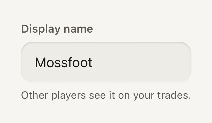
One form field. A Label, an Input and an optional FieldMessage stacked together, sharing the field's invalid and disabled state.
```tsx
import { Field, FieldMessage, Input, Label } from "@terratcg/ui";
import { useState } from "react";
export default function FieldDefault() {
const [name, setName] = useState("Mossfoot");
return (
Other players see it on your trades.
);
}
```
## Import
```tsx
import { Field, FieldMessage, Input, Label } from "@terratcg/ui";
```
## Usage
```tsx
{tooShort ? "Use at least 3 characters." : "Other players see it."}
```
A Field only presents its parts: you own the value, the validation and the submission. Set `invalid` and `disabled` on the Field and its Label, [Input](/docs/input) and FieldMessage follow. An Input's own `invalid` or `disabled` wins over the Field's.
## Examples
### Invalid
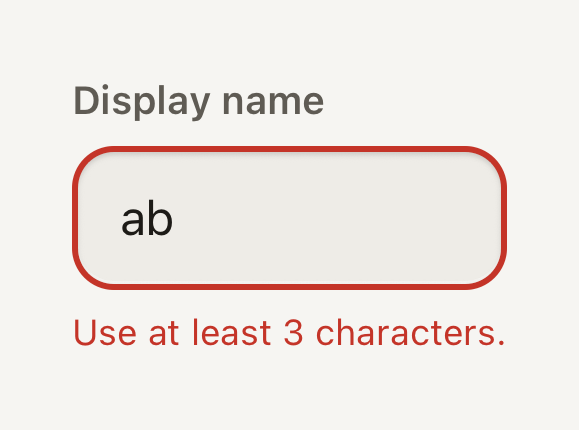
An invalid field draws a danger stroke and turns its message into an announced alert.
```tsx
import { Field, FieldMessage, Input, Label } from "@terratcg/ui";
import { useState } from "react";
export default function FieldInvalid() {
const [name, setName] = useState("ab");
return (
Use at least 3 characters.
);
}
```
### Disabled
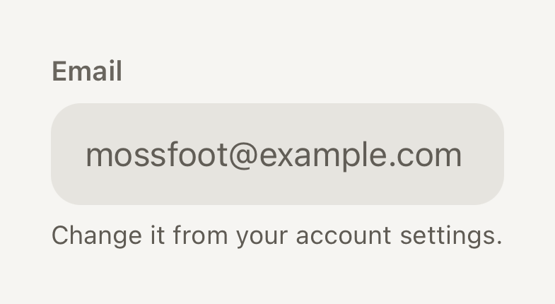
A disabled field keeps its label and value readable on a flat grey well that takes no input.
```tsx
import { Field, FieldMessage, Input, Label } from "@terratcg/ui";
export default function FieldDisabled() {
return (
Change it from your account settings.
);
}
```
## Props
### Field
### FieldProps
| Prop | Type | Description |
| ----------- | ----------- | ----------------------------------------------------------------------------------------------- |
| `invalid?` | `boolean` | Marks the field as failing validation: danger stroke and an announced message. Default: `false` |
| `disabled?` | `boolean` | Inactive: the input is not editable, the label stays readable. Default: `false` |
| `children?` | `ReactNode` | |
Field also accepts React Native's `View` props, such as `style` and `testID`. It stacks its children with a small gap and adds nothing else.
### Label
### LabelProps
| Prop | Type | Description |
| ---------- | ------------------------------------------------------------- | --------------------------------------------------------------------------------------------------------------- |
| `tone?` | `"accent" \| "danger" \| "default" \| "muted" \| "secondary"` | Semantic colour from the theme. Default: `"default"` |
| `weight?` | `"bold" \| "medium" \| "regular" \| "semibold"` | Overrides the variant's default weight (`label`, `title` and `headline` are heavier than `body` and `caption`). |
| `tabular?` | `boolean` | Tabular figures for counters and stats. Default: `false` |
Label also accepts React Native's `Text` props. It is always the `label` text role. Without a `tone`, it is `secondary`, or `muted` while the Field is disabled.
### FieldMessage
### FieldMessageProps
| Prop | Type | Description |
| ---------- | ------------------------------------------------------------- | --------------------------------------------------------------------------------------------------------------- |
| `tone?` | `"accent" \| "danger" \| "default" \| "muted" \| "secondary"` | Semantic colour from the theme. Default: `"default"` |
| `weight?` | `"bold" \| "medium" \| "regular" \| "semibold"` | Overrides the variant's default weight (`label`, `title` and `headline` are heavier than `body` and `caption`). |
| `tabular?` | `boolean` | Tabular figures for counters and stats. Default: `false` |
FieldMessage also accepts React Native's `Text` props. It is always the `caption` text role. Without a `tone`, it is `secondary`, or `danger` while the Field is invalid.
## Accessibility
- **Name:** a Label whose child is a plain string names the Input inside the same Field, from its first frame. With any other child, such as a Text with a link, the Label names nothing: pass `accessibilityLabel` to the Input yourself.
- **Error:** while the Field is invalid, FieldMessage takes the `alert` role so screen readers announce it, and the Input draws a danger stroke. The error never relies on colour alone: say what is wrong in the message.
- **Disabled:** the Input is not editable and exposes `accessibilityState.disabled`; the Label stays readable in a muted tone.
- **Larger text:** the label, the value and the message all scale with the system text size; the well grows taller with its text.
## Platform differences
- **iOS:** the Input is named through its `accessibilityLabel`, filled from the Label.
- **Android:** the Input also points at the Label with `accessibilityLabelledBy`, so TalkBack reads the visible label.
- **Web:** Field renders through react-native-web for these docs, but the web is not a supported target.
## Rules
- One Label, one Input and at most one FieldMessage per Field.
- Write the Label as a plain string so it names the Input. A placeholder is never the label.
- Use the FieldMessage for one hint or one error, not both: while invalid, replace the hint with what to fix.
- Validate on submit or on blur, then set `invalid`; don't flash an error while the user is still typing.