# Header bar
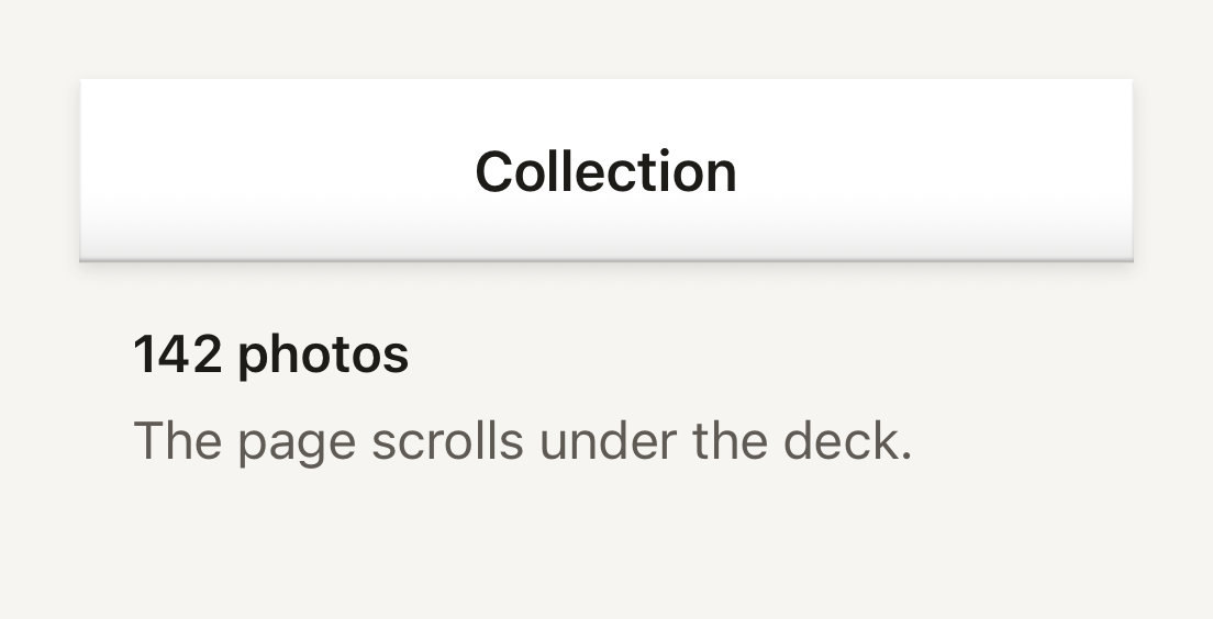
The plastic shell a navigator lays behind its native title and buttons. It is a surface slab over a hairline that casts its lift onto the page.
```tsx
import { HeaderBar, Text, useTheme } from "@terratcg/ui";
import { View } from "react-native";
const HEIGHT = 56;
export default function HeaderBarDeck() {
const theme = useTheme();
return (
Collection
142 photos
The page scrolls under the deck.
);
}
```
## Import
```tsx
import { HeaderBar } from "@terratcg/ui";
```
## Usage
```tsx
,
}}
/>
```
HeaderBar draws only the deck: your navigator keeps its own native title, back button and actions on top. It is absolutely positioned at the top of its parent. Without `height` it fills that parent, which suits a navigator's header background slot; with `height` it hangs from the top at that height, for a header you lay over the page yourself.
The deck fills with the theme's `bar` colour and runs square across the screen, with only its outer corners following the device's rounded glass through `cornerRadius`. Along its page-facing bottom edge it shows a turned-under line, a hairline and the shadow it casts onto the page, the same edge a TabBar shows along its top.
## Examples
### Following the screen corners
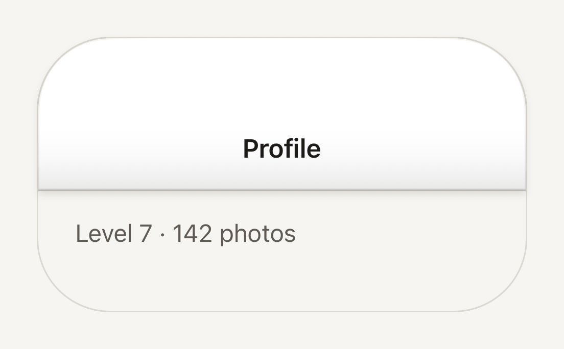
cornerRadius rounds the deck's top corners with the screen's continuous curve, so its edge follows the glass.
```tsx
import { HeaderBar, Text, useTheme } from "@terratcg/ui";
import { View } from "react-native";
const HEIGHT = 100;
const SCREEN_CORNER = 48;
export default function HeaderBarRounded() {
const theme = useTheme();
return (
Profile
Level 7 · 142 photos
);
}
```
## Props
### HeaderBarProps
| Prop | Type | Description |
| --------------- | -------- | ----------------------------------------------------------------------------------------------------------------------------------------------------------------------------------------------------------------- |
| `height?` | `number` | Height of the deck, in points. Without it the deck fills its frame; with it the deck hangs from the top of the frame at that height, for a host that lays the bar over its page and knows how tall its header is. |
| `cornerRadius?` | `number` | Radius of the device's top screen corners, in points. The deck rounds its top corners to it so its edge follows the glass. Default: `0` |
HeaderBar also accepts React Native's `View` props, such as `style` and `testID`.
## Accessibility
- **Not announced:** HeaderBar holds no content and takes no touches (`pointerEvents="none"`). The navigator's title and buttons, drawn over it, carry the header's accessibility.
- **Colour:** the deck is the theme's `bar` colour; check the navigator's title colour against it when you customise the theme.
## Platform differences
- **iOS:** the top corners follow the screen with a continuous curve (`borderCurve: "continuous"`), the shape of the iPhone's glass.
- **Android:** `borderCurve` is ignored and the corners are circular arcs of the same radius.
- **Web:** HeaderBar renders through react-native-web for these docs, but the web is not a supported target.
## Rules
- Lay the HeaderBar over the page, not in a clipped frame, so its lift has room to fall.
- Leave the title and buttons to your navigator; don't draw them into the deck.
- Pass the device's screen corner radius to `cornerRadius` on a full-bleed header, and nothing on one that sits inside a sheet.