# Icon button
A square Button for a single icon, for actions that a glyph names on its own. It always carries an accessibility label.
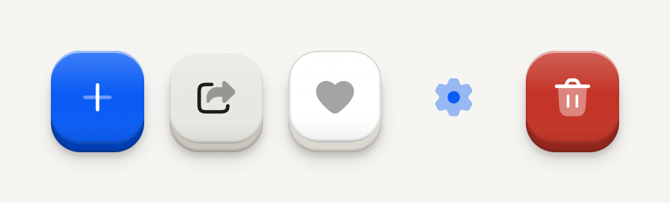
```tsx
import Add01Icon from "@hugeicons-pro/core-bulk-rounded/Add01Icon";
import Delete02Icon from "@hugeicons-pro/core-bulk-rounded/Delete02Icon";
import FavouriteIcon from "@hugeicons-pro/core-bulk-rounded/FavouriteIcon";
import Settings01Icon from "@hugeicons-pro/core-bulk-rounded/Settings01Icon";
import Share01Icon from "@hugeicons-pro/core-bulk-rounded/Share01Icon";
import { HugeiconsIcon } from "@hugeicons/react-native";
import { ButtonIcon, IconButton } from "@terratcg/ui";
import { View } from "react-native";
export default function IconButtonVariants() {
return (
{({ color, size }) => }
{({ color, size }) => }
{({ color, size }) => }
{({ color, size }) => }
{({ color, size }) => }
);
}
```
## Import
```tsx
import { ButtonIcon, IconButton } from "@terratcg/ui";
```
## Usage
```tsx
{({ color, size }) => }
```
IconButton is a [Button](/docs/button) with a square face: it takes the same variants, states and feedback, and only its sizes change. Hand it the icon through `ButtonIcon`, whose render function gives you the face's colour and the icon size. TerraUI ships no icons; bring your own.
## Examples
### Sizes
Small, default and large: 36, 44 and 52 point squares, the icon stepping up with the face.
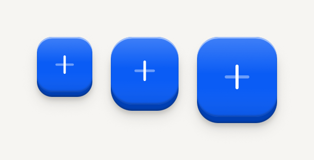
```tsx
import Add01Icon from "@hugeicons-pro/core-bulk-rounded/Add01Icon";
import { HugeiconsIcon } from "@hugeicons/react-native";
import { ButtonIcon, IconButton } from "@terratcg/ui";
import { View } from "react-native";
export default function IconButtonSizes() {
return (
{({ color, size }) => }
{({ color, size }) => }
{({ color, size }) => }
);
}
```
### States
Loading swaps the icon for a spinner at the same size; disabled is molded flat; selected sits pressed in its well.
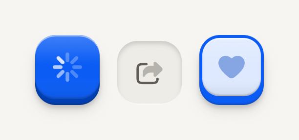
```tsx
import FavouriteIcon from "@hugeicons-pro/core-bulk-rounded/FavouriteIcon";
import Share01Icon from "@hugeicons-pro/core-bulk-rounded/Share01Icon";
import { HugeiconsIcon } from "@hugeicons/react-native";
import { ButtonIcon, IconButton } from "@terratcg/ui";
import { View } from "react-native";
export default function IconButtonStates() {
return (
{({ color, size }) => }
{({ color, size }) => }
{({ color, size }) => }
);
}
```
## Props
### IconButtonProps
| Prop | Type | Description |
| -------------------- | ------------------------------------------------------------------- | -------------------------------------------------------------------------------------------------------------------------------------------------------------------------------------------------------------------------------------------------------------------------------------------------- |
| `size?` | `"default" \| "lg" \| "sm"` | A square face 36 (`sm`), 44 (`default`) or 52 (`lg`) points across. Default: `"default"` |
| `accessibilityLabel` | `string` | Required: an icon-only control has no visible label to announce. |
| `variant?` | `"default" \| "destructive" \| "ghost" \| "outline" \| "secondary"` | The key's look and weight: one `default` key per view, `secondary`, `outline` and `ghost` for the actions around it, `destructive` for what can't be undone. Default: `"default"` |
| `disabled?` | `boolean` | Inactive: readable, flat, no action and no feedback. Default: `false` |
| `loading?` | `boolean` | Busy: keeps its size, shows a spinner over the label, blocks activation and exposes accessibilityState.busy. The host owns the operation. Default: `false` |
| `selected?` | `boolean` | Selection cue (border, marker, weight) plus accessibilityState.selected. Omit for plain actions. |
| `tint?` | `string` | A hue the selection wears instead of the accent, for a choice that owns a colour (a label or a category): selected, the face is washed in it and its border and edge take it, with no leading marker: the hue is the cue. The label stays in ink. Ignored on the default and destructive variants. |
| `block?` | `boolean` | Fill the parent's cross axis (alignSelf "stretch") instead of hugging the label. For stacked full-width actions such as a notice's column. Default: `false` |
| `children?` | `React.ReactNode` | Compose ButtonText, ButtonIcon or host nodes. |
| `style?` | `StyleProp` | Outer style: layout, margins, width. Face colors come from variant and theme. |
IconButton also accepts React Native's `Pressable` props, such as `hitSlop` and `testID`. `size` maps to Button's square sizes: `sm` is `icon-sm`, `default` is `icon` and `lg` is `icon-lg`. `selected` and `tint` work together as on [Button](/docs/button#props).
## Accessibility
- **Role:** `button`, with `accessibilityState` keeping `disabled`, `busy` (while `loading`) and `selected` in sync, as on Button.
- **Label:** `accessibilityLabel` is required: the face shows no text, so the label is the only name a screen reader has. Name the action ("Share card"), not the glyph ("Arrow").
- **Touch target:** at least 44 pt on iOS and 48 dp on Android. The 36 pt `sm` face keeps its size and grows its touch area with `hitSlop`.
- **Reduce Motion:** the face no longer travels when pressed; the press tint stays.
## Platform differences
- **iOS and Android:** the same square key and the same travel, with no ripple. Only the minimum touch target differs: 44 pt on iOS, 48 dp on Android.
- **Feedback:** a press calls ThemeProvider's `feedback` handler with `"press"`, or `"select"` when `selected` is set. TerraUI plays no haptic or sound itself.
- **Web:** IconButton renders through react-native-web for these docs, but the web is not a supported target.
## Rules
- Use an IconButton only when the icon is unmistakable on its own; otherwise use a Button with a ButtonText.
- Always pass `accessibilityLabel`, and keep it in step with what the icon means.
- Put one icon inside `ButtonIcon`, and draw it with the colour and size the render function hands you.
- Use `onPress`, never `onClick`, and style props, never `className`.
- `loading` is yours to clear: the key stays busy until you set it back to `false`.