# Input
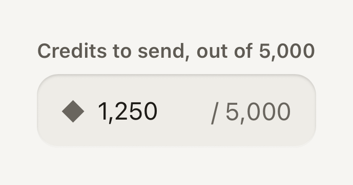
A native text input in a recessed well. It is a plain React Native TextInput, with the value, keyboard and events left to the platform.
```tsx
import { Field, Input, Label, Text } from "@terratcg/ui";
import { useState } from "react";
export default function InputAdornments() {
const [amount, setAmount] = useState("1,250");
return (
◆}
endAdornment="/ 5,000"
/>
);
}
```
## Import
```tsx
import { Input } from "@terratcg/ui";
```
## Usage
```tsx
```
Put an Input in a [Field](/docs/field): the Field's Label names it and its state reaches it. Everything else is React Native's `TextInput`: `value`, `onChangeText`, `keyboardType`, `secureTextEntry`, `returnKeyType`, `onSubmitEditing` and the ref work as usual. Use `disabled` instead of `editable`.
## Examples
### End slot
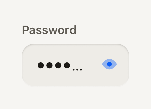
Controls at the end of the well stay tappable and reach the screen reader, so they name themselves.
```tsx
import ViewIcon from "@hugeicons-pro/core-bulk-rounded/ViewIcon";
import ViewOffIcon from "@hugeicons-pro/core-bulk-rounded/ViewOffIcon";
import { HugeiconsIcon } from "@hugeicons/react-native";
import { ButtonIcon, Field, IconButton, Input, Label } from "@terratcg/ui";
import { useState } from "react";
export default function InputEndSlot() {
const [password, setPassword] = useState("tidepool");
const [shown, setShown] = useState(false);
return (
setShown((value) => !value)}
>
{({ color, size }) => }
}
/>
);
}
```
### Without a Field
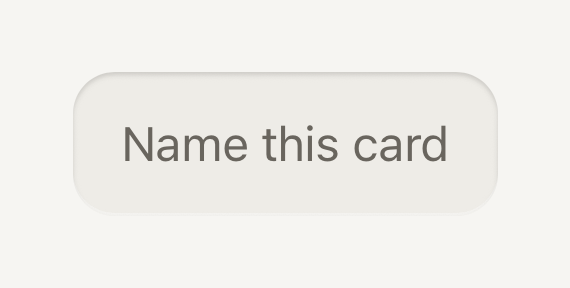
Standing alone, an Input needs its own accessibility label; a placeholder is not a label.
```tsx
import { Input } from "@terratcg/ui";
import { useState } from "react";
export default function InputStandalone() {
const [name, setName] = useState("");
return (
);
}
```
## Props
### InputProps
| Prop | Type | Description |
| ----------------- | ---------------------- | ------------------------------------------------------------------------------------------------------------------------------------------------------------------------------------------------------------------------------------------------------------------------ |
| `invalid?` | `boolean` | Failing validation: danger stroke. Inherited from the enclosing Field. |
| `disabled?` | `boolean` | Inactive: flat readable well, not editable. Inherited from the enclosing Field. |
| `startAdornment?` | `ReactNode` | A mark at the start of the well (the currency an amount is in), never covered by the value. Visual only, like the end adornment. |
| `endAdornment?` | `string` | Quiet text at the end of the well ("/ 5,000" after an amount), never covered by the value. Visual only: say the same in the label or hint for screen readers. |
| `endSlot?` | `ReactNode` | Controls at the end of the well (a clear key), never covering the value. Unlike the adornments they stay tappable and reach the screen reader, so they name themselves. Pass `null` while there is nothing to show: the wrapper stays and the text view keeps its focus. |
| `containerStyle?` | `StyleProp` | Lays out the wrapper an adorned well sits in (flex, margins), where `style` still styles the well itself. A well without an adornment has no wrapper: its `style` lays it out. |
Input also accepts React Native's `TextInput` props except `editable`. `style` styles the well itself; once the Input has an adornment or an `endSlot`, it sits in a wrapper that `containerStyle` lays out. Pass `endSlot={null}` while there is nothing to show, so the wrapper stays and the text keeps its focus when the slot comes back.
## Accessibility
- **Name:** inside a Field, the Label names the Input. Standing alone, pass `accessibilityLabel`: a placeholder disappears as soon as there is text.
- **State:** `accessibilityState.disabled` follows `disabled`; your own `accessibilityState` is merged on top.
- **Focus:** a 2 point accent stroke shows focus, and a danger stroke shows an invalid value. The text never moves when the stroke appears.
- **Adornments:** `startAdornment` and `endAdornment` are visual only and hidden from screen readers. Say the same thing in the label or the hint ("Credits to send, out of 5,000").
- **End slot:** its controls stay tappable and reach the screen reader, so give each one its own `accessibilityLabel`.
- **Larger text:** the value scales with the system text size and the well grows taller from its 48 point minimum.
## Platform differences
- **Keyboard and text:** the keyboard, autofill, autocorrect, the secure-entry dots and the selection handles are each platform's own.
- **Labelling:** on Android the Input also points at its Label through `accessibilityLabelledBy`.
- **Web:** Input renders through react-native-web for these docs, but the web is not a supported target.
## Rules
- Keep it controlled: pass `value` and `onChangeText`, and own validation in your screen.
- Use `disabled`, never `editable={false}`, so the well and the accessibility state follow. A disabled Input keeps the flat disabled grey, with no recess.
- Never use the placeholder as the label; it is an example of the value, at most.
- Use an adornment for a unit or a limit, and the end slot for a control. Never put a control in an adornment: it can't be tapped.
- For search, use [Search field](/docs/search-field) instead of building the magnifier and clear key yourself.