# Notice
Empty, error and informational states composed from an icon, a title, a description and actions. InlineNotice is the one-line status beside content.
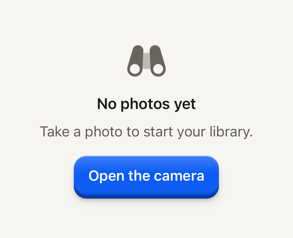
```tsx
import BinocularsIcon from "@hugeicons-pro/core-bulk-rounded/BinocularsIcon";
import { HugeiconsIcon } from "@hugeicons/react-native";
import { Button, ButtonText, Notice, NoticeActions, NoticeDescription, NoticeIcon, NoticeTitle } from "@terratcg/ui";
export default function NoticeEmptyState() {
return (
{({ color, size }) => }No photos yetTake a photo to start your library.
);
}
```
## Import
```tsx
import { InlineNotice, Notice, NoticeActions, NoticeDescription, NoticeIcon, NoticeTitle } from "@terratcg/ui";
```
## Usage
```tsx
No photos yetTake a photo to start your library.
```
Compose a Notice from the parts you need: each one is optional. The parts read their tone, alignment and layout from the Notice they sit in. `layout="screen"` makes the Notice the whole screen's state: it fills its parent (`flex: 1`), centres on the bare ground, sets the title as a headline and stacks the actions in a column. Give each Button `block` there.
## Examples
### Error
The danger tone frames the notice in the danger palette, and its title is announced as an alert.
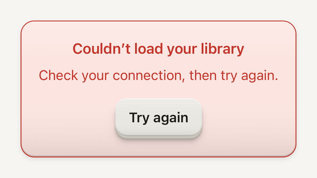
```tsx
import { Button, ButtonText, Notice, NoticeActions, NoticeDescription, NoticeTitle } from "@terratcg/ui";
export default function NoticeError() {
return (
Couldn’t load your libraryCheck your connection, then try again.
);
}
```
### Framed banner
framed puts the copy on a bordered surface; align="start" leads it like a banner in a page's flow.
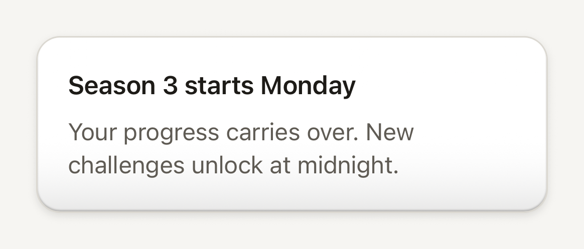
```tsx
import { Notice, NoticeDescription, NoticeTitle } from "@terratcg/ui";
export default function NoticeBanner() {
return (
Season 3 starts MondayYour progress carries over. New challenges unlock at midnight.
);
}
```
### Inline notice
InlineNotice is one line of status on a soft tint, next to the content it describes.
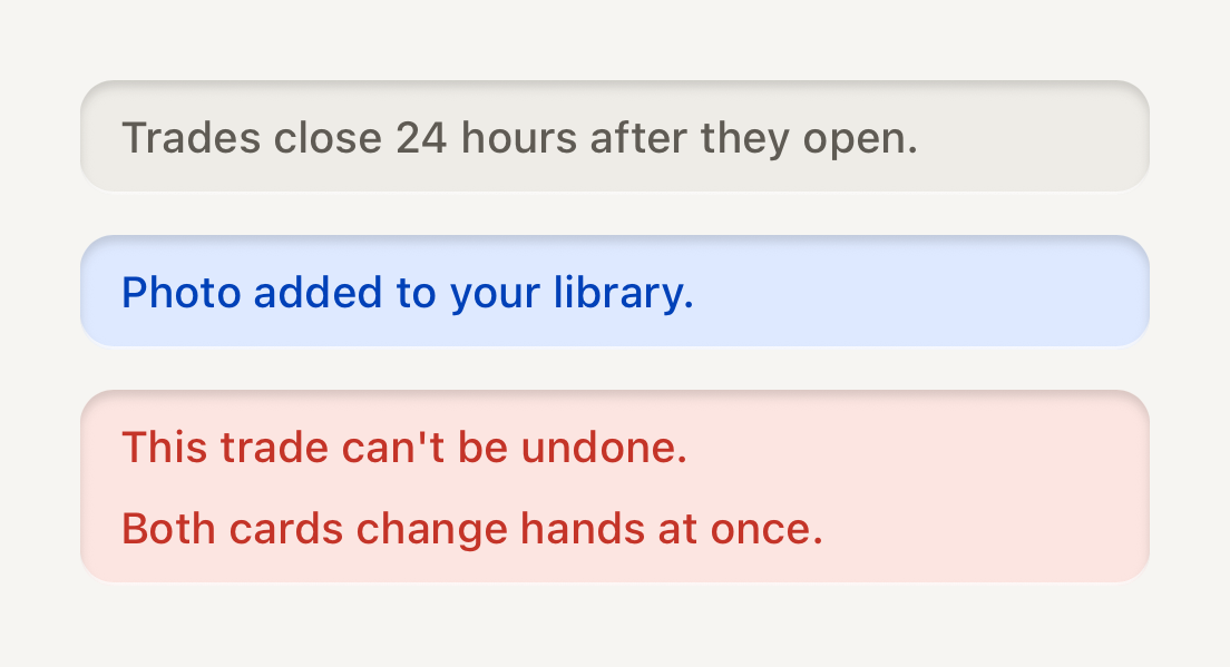
```tsx
import { InlineNotice } from "@terratcg/ui";
import { View } from "react-native";
export default function NoticeInline() {
return (
Trades close 24 hours after they open.Photo added to your library.{["This trade can't be undone.", "Both cards change hands at once."]}
);
}
```
## Props
### Notice
### NoticeProps
| Prop | Type | Description |
| --------- | ----------------------- | ----------------------------------------------------------------------------------------------------- |
| `tone?` | `"danger" \| "default"` | "danger" presents an error with the danger palette; inline it is always framed. Default: `"default"` |
| `framed?` | `boolean` | Draw on a bordered surface (a quiet banner) instead of the bare ground. Inline only. Default: `false` |
| `align?` | `"center" \| "start"` | Center the copy (empty states) or lead it (inline banners). Default: `"center"` |
| `layout?` | `"inline" \| "screen"` | Inline block or a full-screen state that replaces the screen. Default: `"inline"` |
Notice also accepts React Native's `View` props. A `danger` Notice is always framed inline; on a screen Notice, `framed` does nothing.
### NoticeIcon
### NoticeIconProps
| Prop | Type | Description |
| ---------- | ---------------------------------------------------- | ------------------------------------------------------------------------- |
| `size?` | `number` | Icon box size in points. Default: `48` |
| `children` | `((slot: NoticeIconSlot) => ReactNode) \| ReactNode` | A host icon node, or a render function receiving the slot color and size. |
The render function receives the slot's colour: the muted ink, or the danger colour on a `danger` Notice. TerraUI ships no icons.
### NoticeTitle, NoticeDescription and NoticeActions
NoticeTitle and NoticeDescription take TerraUI's `Text` props except `variant`, which the Notice decides. NoticeActions takes `View` props: it is a wrapping row inline and a column on a screen Notice.
### InlineNotice
### InlineNoticeProps
| Prop | Type | Description |
| ---------- | ------------------------------------ | --------------------------------------------------------------------------------------------------------------------- |
| `tone?` | `"danger" \| "default" \| "success"` | "danger" is announced as an alert; the others are polite live text. Default: `"default"` |
| `icon?` | `ReactNode` | Host icon node placed before the text. |
| `children` | `string \| readonly string[]` | The message, or a few short lines of it (a list of consequences), set one under the other with the icon on the first. |
InlineNotice is a well cut into its surface, not a raised shell. It also accepts React Native's `View` props.
## Accessibility
- **Live region:** a screen Notice is a polite live region, and a `danger` one is also an `alert`. Inline, the `danger` NoticeTitle is the alert.
- **Headings:** the title of a screen Notice has the `header` role, so it is where a screen reader lands.
- **InlineNotice:** one accessible element, read as polite live text; the `danger` tone is announced as an alert. The icon is decorative.
- **Larger text:** the copy wraps; a screen Notice keeps a readable measure of 400 pt on wide screens.
## Platform differences
- **iOS and Android:** the same layout, roles and live region. Notice plays no feedback: it has no press of its own.
- **Web:** Notice renders through react-native-web for these docs, but the web is not a supported target.
## Rules
- Title the state, not the screen: "No photos yet", not "Photos".
- Give an empty state the one action that fills it, and an error the action that retries.
- Keep a Notice to a short title and a sentence or two. Long copy belongs on a page.
- Use InlineNotice for one line of status beside the content it describes, not for a state that replaces a screen.
- Keep `danger` for errors. An empty state is not a failure, so it stays on the default tone.