# Progress
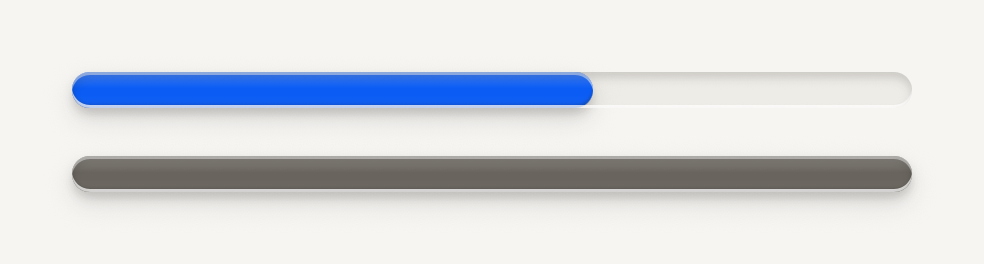
A pill track cut into the surface with a raised accent bar riding in it. Counter writes the numbers beside it.
```tsx
import { Progress } from "@terratcg/ui";
import { View } from "react-native";
export default function ProgressTones() {
return (
);
}
```
## Import
```tsx
import { Progress } from "@terratcg/ui";
```
## Usage
```tsx
```
The track is a well cut into the surface, 12 pt tall by default. The bar rides in it as a raised accent face with a key's gloss and shadow, under the groove's lip. `value` runs from 0 to 1; anything outside is clamped. The track fills its parent's width, so size it with the parent or `style`. When `value` changes, the bar springs to it.
## Examples
### Reach
reach draws a faint second fill under the bar, for progress that counts toward a goal but not the headline.

```tsx
import { Progress } from "@terratcg/ui";
import { View } from "react-native";
export default function ProgressReach() {
return (
);
}
```
### With a counter
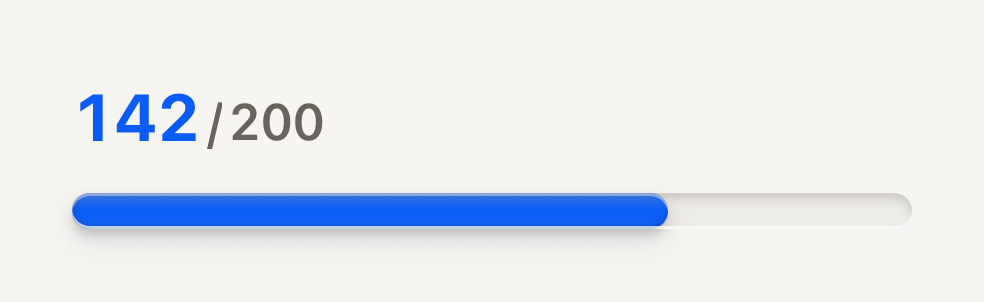
Counter writes the numbers beside a bar: a bold numerator against a muted total.
```tsx
import { Counter, Progress } from "@terratcg/ui";
import { View } from "react-native";
export default function ProgressCounter() {
return (
);
}
```
To write the numbers beside a bar, use [Counter](/docs/counter), which has its own page.
## Props
### ProgressProps
| Prop | Type | Description |
| -------------- | ------------------------- | ---------------------------------------------------------------------------------------------------------------------------------------------------------------------------------------- |
| `tone?` | `"accent" \| "muted"` | "accent" while live; "muted" once the host marks the work done. Default: `"accent"` |
| `value` | `number` | Completion from 0 to 1. Out-of-range values are clamped. |
| `reach?` | `number` | Optional secondary completion from 0 to 1 drawn faintly under the fill, for progress that counts toward reach but not the headline. |
| `height?` | `number` | Track height in points. Default: `12` |
| `translucent?` | `boolean` | For a track resting inside a living shell: a see-through groove whose lower lip keeps a quarter of its light, so it never reads as a white border on a coloured ground. Default: `false` |
| `style?` | `StyleProp` | |
Progress also accepts React Native's `View` props. It draws no children.
## Accessibility
- **Role:** `progressbar`, with `accessibilityValue` from 0 to 100 holding the rounded percentage of `value`. `reach` is not announced: say it in a nearby label if it matters.
- **Label:** give the track an `accessibilityLabel` that says what is progressing, such as "Upload progress".
- **Reduce Motion:** the bar jumps to its new value instead of springing.
## Platform differences
- **iOS and Android:** the same groove and bar. On iOS the bar is rasterized while it rests and redrawn only while it moves.
- **Web:** Progress renders through react-native-web for these docs, but the web is not a supported target.
## Rules
- Show Progress for work with a known end. For a wait without one, use a Spinner.
- Switch `tone` to `muted` once the work is done, so a finished bar stops calling for attention.
- Use `reach` for a second measure that counts toward a goal, never for a buffer or an estimate.