# Row
One line of a list, with a leading element, its content and an optional trailing control. A pressable row is a button.
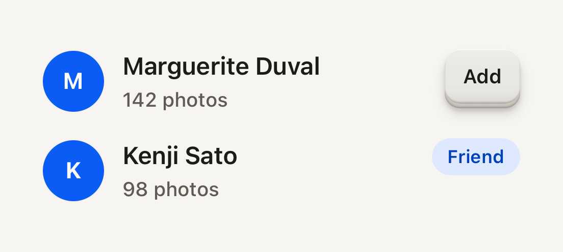
```tsx
import { Avatar, AvatarFallback, Badge, Button, ButtonText, Row, RowContent, RowDescription, RowTitle } from "@terratcg/ui";
import { View } from "react-native";
export default function RowList() {
return (
MMarguerite Duval142 photosKKenji Sato98 photosFriend
);
}
```
## Import
```tsx
import { Row, RowContent, RowDescription, RowTitle } from "@terratcg/ui";
```
## Usage
```tsx
router.push("/settings/notifications")}>
NotificationsFriend requests and trades
```
RowContent is the flexible middle: it takes the space between a leading element, such as an Avatar, and a trailing control, such as a Button or a Switch. RowTitle and RowDescription each stay on one line and truncate.
## Examples
### Pressable rows
With onPress the whole row is a button that dims under the press tint; disabled blocks the press. A title can wrap when you lift its line cap.
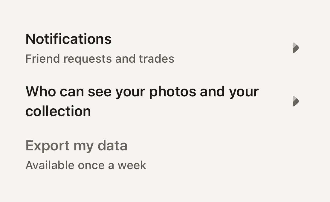
```tsx
import ArrowRight01Icon from "@hugeicons-pro/core-bulk-rounded/ArrowRight01Icon";
import { HugeiconsIcon } from "@hugeicons/react-native";
import { Row, RowContent, RowDescription, RowTitle, useTheme } from "@terratcg/ui";
import { View } from "react-native";
export default function RowPressable() {
const theme = useTheme();
const chevron = ;
return (
{}}>
NotificationsFriend requests and trades
{chevron}
{}}>
Who can see your photos and your collection
{chevron}
{}} disabled>
Export my dataAvailable once a week
);
}
```
## Props
### Row
### RowProps
| Prop | Type | Description |
| ----------------- | ---------------------- | --------------------------------------------------------------------------------------------------- |
| `children?` | `ReactNode` | Leading, content and trailing parts laid out on one line. |
| `style?` | `StyleProp` | Outer style: layout and margins. |
| `feedbackIntent?` | `"press" \| "select"` | What a press reports to the host. A row that changes a setting reports `select`. Default: `"press"` |
Row also accepts React Native's `Pressable` props, such as `onLongPress`, `accessibilityLabel` and `testID`. `disabled` applies to a pressable Row only; a static Row ignores it.
### Parts
RowContent takes React Native's `View` props. RowTitle (body type, semibold) and RowDescription (label type, secondary) take React Native's `Text` props and Text's `tone` and `weight`. Pass `numberOfLines={2}` to let a title wrap.
## Accessibility
- **Role:** `button` when the Row has `onPress`, with `disabled` merged into your `accessibilityState`. Without `onPress` it is a plain container and its parts are read one by one.
- **Label:** a pressable Row is read as the text inside it. Pass an `accessibilityLabel` when that text alone doesn't say what the press does.
- **Touch target:** at least 48 pt tall.
- **Larger text:** titles truncate by default. Under enlarged text, prefer `numberOfLines={2}` (or `undefined`) on titles that matter.
## Platform differences
- **iOS and Android:** the same row and press tint, with no ripple. A press calls ThemeProvider's `feedback` handler with `feedbackIntent`: `"press"` by default, `"select"` for a row that changes a setting.
- **Web:** Row renders through react-native-web for these docs, but the web is not a supported target. There a pressable Row is a focusable element with `role="button"`, so a trailing Button inside it doesn't nest one button in another.
## Rules
- Give a Row `onPress` or a trailing control, not both doing the same thing.
- Keep depth on the controls inside a Row: the Row itself never lifts.
- Put text in RowTitle and RowDescription, not in bare strings.
- A Row that toggles a setting reports `feedbackIntent="select"`.