# Section
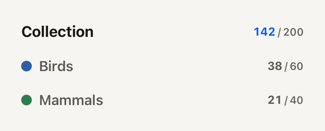
Structure for a page of grouped content. SectionHeader heads a group, and Divider marks where one group ends.
```tsx
import { Counter, SectionHeader } from "@terratcg/ui";
import { View } from "react-native";
export default function SectionHeaders() {
return (
);
}
```
## Import
```tsx
import { Divider, SectionHeader } from "@terratcg/ui";
```
## Usage
```tsx
```
The title wraps and fills the row; the children sit at its end. A `marker` (a colour swatch) or a `leading` glyph goes before the title.
## Examples
### Divider
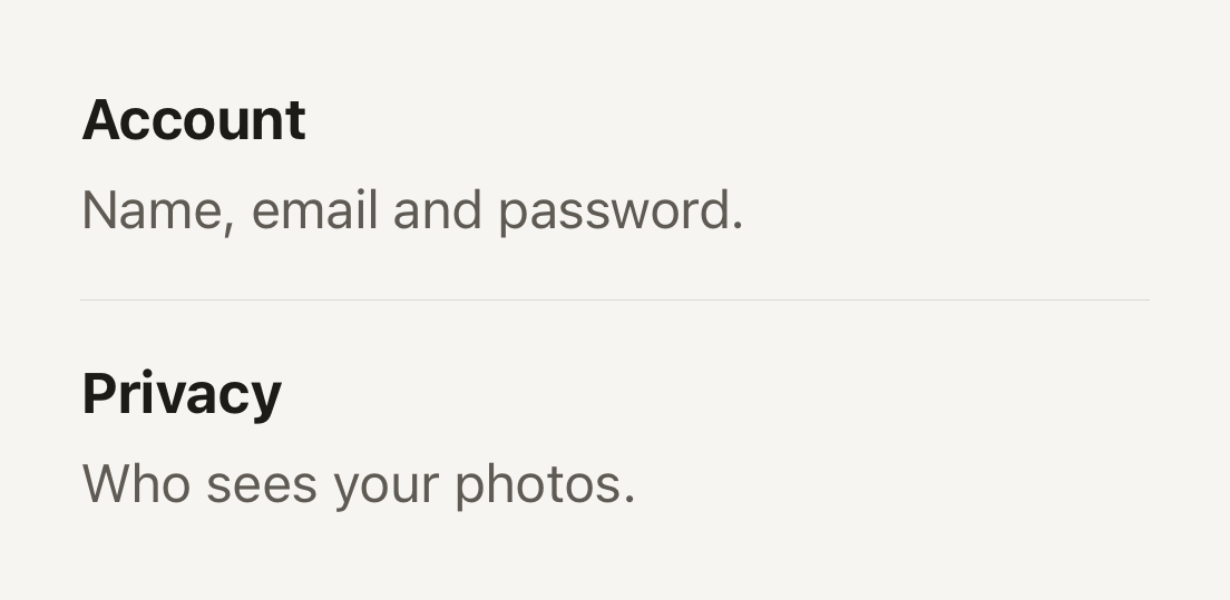
A hairline where one group of content ends and the next begins. The headers carry the structure; the Divider is hidden from screen readers.
```tsx
import { Divider, SectionHeader, Text } from "@terratcg/ui";
import { View } from "react-native";
export default function SectionDivider() {
return (
Name, email and password.
Who sees your photos.
);
}
```
## Props
### SectionHeader
### SectionHeaderProps
| Prop | Type | Description |
| ----------- | -------------------------- | ------------------------------------------------------------------------------------------------------- |
| `title` | `string` | The heading, announced as a header. |
| `level?` | `"primary" \| "secondary"` | "primary" heads a group; "secondary" heads a subgroup, quieter. Default: `"primary"` |
| `marker?` | `string` | Host color swatch before the title, for example a taxonomy class color. |
| `leading?` | `ReactNode` | A glyph before the title, for example a section's accent icon; decorative, the title names the section. |
| `children?` | `ReactNode` | Trailing content, typically a Counter. |
SectionHeader also accepts React Native's `View` props. A `testID` also names the marker, as `-marker`.
### Divider
Divider takes React Native's `View` props: a hairline in the theme's border colour, stretched across its parent.
## Accessibility
- **Heading:** the title is announced with the `header` role, so screen reader users can move from section to section.
- **Decoration:** the `marker` swatch is not announced, and the `leading` glyph and the Divider are hidden from assistive technology. The title names the section on its own.
- **Larger text:** the title wraps instead of truncating; the trailing content stays at the end of the row.
## Platform differences
- **iOS and Android:** the same headers. The Divider is one physical pixel thick on each screen.
- **Web:** Section renders through react-native-web for these docs, but the web is not a supported target.
## Rules
- Use `primary` for a page's groups and `secondary` for the subgroups inside one.
- Keep the marker for category colours (a photo category, a set); it must never be the only way to tell sections apart.
- Put a Divider between groups, not under every header: the headers carry the structure.