# Skeleton
A quiet placeholder shape in the size of what is loading. Still on purpose, with no shimmer.

```tsx
import { Skeleton } from "@terratcg/ui";
import { View } from "react-native";
export default function SkeletonRow() {
return (
{[0, 1].map((row) => (
))}
);
}
```
## Import
```tsx
import { Skeleton } from "@terratcg/ui";
```
## Usage
```tsx
```
A Skeleton is a recessed well: give it the width and height of the content it stands in for through `style`. It has no size of its own.
## Examples
### Radii
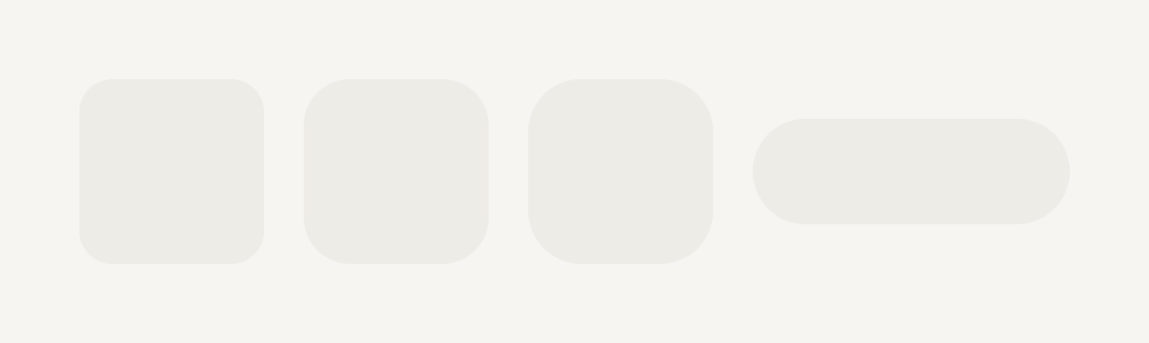
radius follows the theme's shape scale, so a placeholder rounds like the thing it replaces.
```tsx
import { Skeleton } from "@terratcg/ui";
import { View } from "react-native";
export default function SkeletonRadii() {
return (
);
}
```
## Props
### SkeletonProps
| Prop | Type | Description |
| --------------------- | -------------------------------- | ---------------------------------------------------------------------------------------------------------------------------- |
| `radius?` | `"lg" \| "md" \| "pill" \| "sm"` | Corner radius from the theme shape scale. Default: `"sm"` |
| `accessibilityLabel?` | `string` | Silent for assistive technology by default. With a label, this one block announces the whole loading group as busy progress. |
Skeleton also accepts React Native's `View` props.
## Accessibility
- **Hidden by default:** a Skeleton is hidden from assistive technology, so a screen of shapes is not read shape by shape.
- **One label per group:** give one Skeleton in the group an `accessibilityLabel`. That block becomes a `progressbar` with the busy state, and announces the whole group's loading once.
- **Reduce Motion:** nothing to reduce. A Skeleton never moves.
## Platform differences
- **iOS and Android:** the same still shape on the theme's muted surface.
- **Web:** Skeleton renders through react-native-web for these docs, but the web is not a supported target.
## Rules
- Shape a Skeleton like what it replaces: the same size, and the radius of the real thing.
- Label one Skeleton per loading group, never each one.
- Don't animate Skeletons with a shimmer: loading stays quiet.
- Swap the shapes for the content in place, without a layout jump.