# Switch
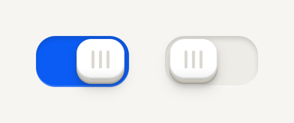
An on and off key that slides in a recessed slot. Use SwitchRow in a settings list, so a press anywhere on the row flips it.
```tsx
import { Switch } from "@terratcg/ui";
import { useState } from "react";
import { View } from "react-native";
export default function SwitchDefault() {
const [haptics, setHaptics] = useState(true);
const [sounds, setSounds] = useState(false);
return (
);
}
```
## Import
```tsx
import { Switch, SwitchRow } from "@terratcg/ui";
```
## Usage
```tsx
Haptics
```
A Switch is controlled: it shows `value` and asks for the other one through `onValueChange`. A tap flips it with a short spring; the key also drags, and let go past the middle it flips to the far side. In a list, use `SwitchRow`, a Row ending in the Switch, and compose its `RowContent` as with any Row. Use `Switch` on its own only where there is no row to press.
## Examples
### In a settings list
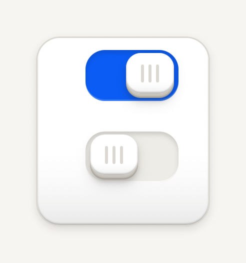
A SwitchRow is one control: a press anywhere on the row flips its key, and the key still drags.
```tsx
import { Card, CardContent, RowContent, RowDescription, RowTitle, SwitchRow } from "@terratcg/ui";
import { useState } from "react";
export default function SwitchRows() {
const [sounds, setSounds] = useState(true);
const [reveal, setReveal] = useState(false);
return (
UI sounds
Reveal sounds
Muted by the silent switch
);
}
```
### States
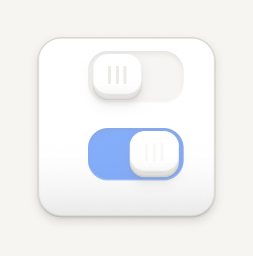
Disabled sits at half opacity; busy looks disabled while a slow wave runs along the grip bars.
```tsx
import { Card, CardContent, RowContent, RowTitle, SwitchRow } from "@terratcg/ui";
export default function SwitchStates() {
return (
Disabled
Saving
);
}
```
## Props
### Switch
### SwitchProps
| Prop | Type | Description |
| ---------------- | ---------------------------- | -------------------------------------------------------------------------------------------------------- |
| `style?` | `StyleProp` | Outer style: layout and margins. |
| `value` | `boolean` | On or off: the key's position says which. |
| `onValueChange?` | `((value: boolean) => void)` | Called with the other value when a tap or a drag flips the key. The host sets `value`. |
| `disabled?` | `boolean` | Inactive: the whole Switch at half opacity. Default: `false` |
| `busy?` | `boolean` | Saving: looks disabled, and the grip bars run a slow wave. The host owns the operation. Default: `false` |
Switch also accepts `accessibilityLabel`, `accessibilityHint` and `testID` from React Native's `Pressable`, and `style` for layout and margins.
### SwitchRow
### SwitchRowProps
| Prop | Type | Description |
| ---------------- | ---------------------------- | -------------------------------------------------------------------------------------------------------- |
| `children?` | `React.ReactNode` | Leading, content and trailing parts laid out on one line. |
| `style?` | `StyleProp` | Outer style: layout and margins. |
| `value` | `boolean` | On or off: the key's position says which. |
| `onValueChange?` | `((value: boolean) => void)` | Called with the other value when a tap or a drag flips the key. The host sets `value`. |
| `disabled?` | `boolean` | Inactive: the whole Switch at half opacity. Default: `false` |
| `busy?` | `boolean` | Saving: looks disabled, and the grip bars run a slow wave. The host owns the operation. Default: `false` |
SwitchRow also accepts the Row's `Pressable` props, except `accessibilityRole`, `onPress` and `feedbackIntent`, which it sets itself.
## Accessibility
- **Role:** `switch`, with `accessibilityState` keeping `checked`, `disabled` and `busy` in sync.
- **Label:** pass `accessibilityLabel`. A SwitchRow is one element to a screen reader, so name it with the row's title, and put its description in `accessibilityHint`.
- **Not by colour alone:** the key's position carries the state; the accent fill only repeats it.
- **Touch target:** the slot is 62 by 34 points and its touch area reaches 8 points past it on every side. In a SwitchRow, the whole row is the target.
- **Reduce Motion:** the key moves at once instead of springing, stays level when pressed, and the busy wave stands still.
## Platform differences
- **iOS and Android:** the same Slide key on both, not the system switch. A drag works the same way, and a scroll can take the touch until the key has started to move.
- **Feedback:** a flip calls ThemeProvider's `feedback` handler with `"select"`, once per change. TerraUI plays no haptic or sound itself.
- **Web:** Switch renders through react-native-web for these docs, but the web is not a supported target.
## Rules
- In a list, use SwitchRow, never a Row with a Switch inside it.
- A Switch changes a setting at once. For a choice that waits for a Save, use a [Selectable cell](/docs/selectable-cell) or a selected [Button](/docs/button).
- Set `busy` while saving the change, and clear it yourself. If saving fails, set `value` back.
- Label the setting, not the action: "Haptics", not "Turn on haptics".
- Keep the key as drawn: a domed key with three grip bars in a recessed slot, 62 by 34 points. Position carries the state, with no marks in either state; off leaves the slot as a well, on fills it with the accent.
- A press sinks the key 2 points under a tint, and a short spring throws it across. Disabled is the whole Switch at half opacity. Busy looks exactly like disabled, and a band of light sweeps across the grip bars, left to right, without resizing them.