# Tab bar
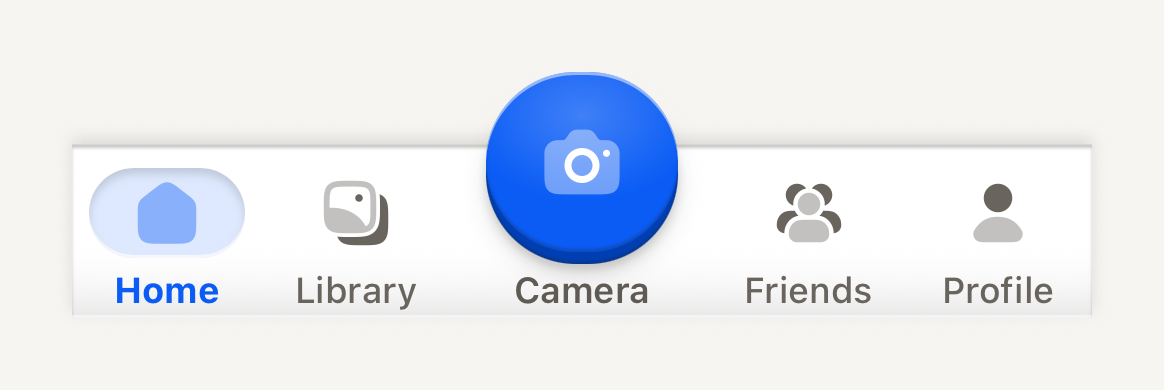
A quiet bottom deck of destinations around one raised central action. It only presents, so your navigator owns the routes and the selection.
```tsx
import Album02Icon from "@hugeicons-pro/core-bulk-rounded/Album02Icon";
import Camera01Icon from "@hugeicons-pro/core-bulk-rounded/Camera01Icon";
import Home01Icon from "@hugeicons-pro/core-bulk-rounded/Home01Icon";
import UserIcon from "@hugeicons-pro/core-bulk-rounded/UserIcon";
import UserGroup03Icon from "@hugeicons-pro/core-bulk-rounded/UserGroup03Icon";
import { HugeiconsIcon, type IconSvgElement } from "@hugeicons/react-native";
import { TabBar, TabBarAction, TabBarItem } from "@terratcg/ui";
import { useState } from "react";
import { View } from "react-native";
const icon = (glyph: IconSvgElement) =>
function TabIcon({ color, size }: { color: string; size: number }) {
return ;
};
export default function TabBarScene() {
const [tab, setTab] = useState("home");
return (
setTab("home")} />
setTab("library")} />
setTab("friends")} />
setTab("profile")} />
);
}
```
## Import
```tsx
import { TabBar, TabBarAction, TabBarItem } from "@terratcg/ui";
```
## Usage
```tsx
navigate("home")} />
navigate("profile")} />
```
The deck is `TAB_BAR_CONTENT_HEIGHT` (58 pt) tall plus the `bottomInset` you pass from the safe area. Above it, a transparent `TAB_BAR_LIFT` (24 pt) strip overlays the page for the raised action to rise into; elsewhere in that strip, touches fall through to the page. Items share the row equally and the action keeps a fixed column.
The deck fills with the theme's `bar` colour and runs square across the screen, with only its outer corners following the device's rounded glass through `cornerRadius`. It is a shell under a hairline that keeps its sheen along the top but casts its lift upward, so its page-facing top edge shows the same turned-under line, hairline and shadow a HeaderBar shows the page. Captions, the action's included, share one baseline, and icons rest in the muted ink. The selected item sits on a soft accent well recessed into the deck behind its icon, with a bold accent label. The TabBarAction is a 60 pt domed accent face with a radial catch light, its glyph in the light ink in dark and the on-accent colour in light, over its edge, contact shadow and halo; it rises 24 pt above the deck and travels when pressed like every TerraUI key.
## Examples
### Badges and a disabled item
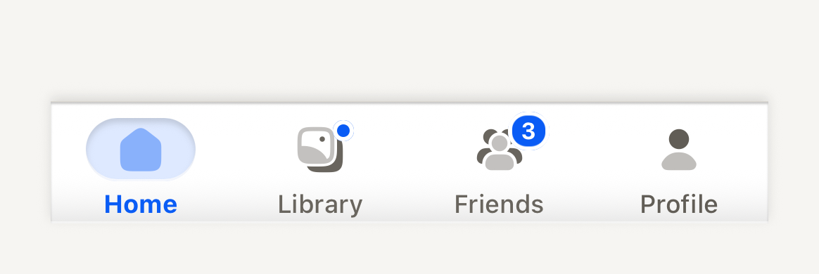
A count pill or a dot says something waits at a destination, spoken through badgeLabel; a disabled item stays readable but takes no press.
```tsx
import Album02Icon from "@hugeicons-pro/core-bulk-rounded/Album02Icon";
import Home01Icon from "@hugeicons-pro/core-bulk-rounded/Home01Icon";
import UserIcon from "@hugeicons-pro/core-bulk-rounded/UserIcon";
import UserGroup03Icon from "@hugeicons-pro/core-bulk-rounded/UserGroup03Icon";
import { HugeiconsIcon, type IconSvgElement } from "@hugeicons/react-native";
import { TabBar, TabBarItem } from "@terratcg/ui";
import { View } from "react-native";
const icon = (glyph: IconSvgElement) =>
function TabIcon({ color, size }: { color: string; size: number }) {
return ;
};
export default function TabBarBadges() {
return (
);
}
```
## Props
### TabBar
### TabBarProps
| Prop | Type | Description |
| --------------- | ----------- | --------------------------------------------------------------------------------------------------------------------------------------------------------------- |
| `bottomInset?` | `number` | Bottom safe-area inset supplied by the host (for example the navigator's insets). The deck extends through the inset and keeps the items above it. Default: `0` |
| `cornerRadius?` | `number` | Radius of the device's bottom screen corners, in points. The deck rounds its bottom corners to it so its edge follows the glass. Default: `0` |
| `children?` | `ReactNode` | Compose TabBarItem and TabBarAction. |
TabBar also accepts React Native's `View` props.
### TabBarItem
### TabBarItemProps
| Prop | Type | Description |
| ------------- | ---------------------------------------------------- | --------------------------------------------------------------------------------------------------------------------------------------------- |
| `label` | `string` | Visible destination label, also the default accessibility label. |
| `icon?` | `((slot: TabBarIconSlot) => ReactNode) \| ReactNode` | Host icon node, or a render function receiving the slot color, size and selection. |
| `selected` | `boolean` | Whether this destination is the navigator's current one. |
| `disabled?` | `boolean` | Inactive: readable, no action, no feedback. Default: `false` |
| `style?` | `StyleProp` | Outer style: layout only. Colors come from the theme. |
| `badge?` | `number \| "dot"` | Something waits at this destination: a count pill, or a dot when only presence matters. Pair it with `badgeLabel`; color never says it alone. |
| `badgeLabel?` | `string` | Spoken with the destination while a badge shows, for example "1 reward waiting". |
TabBarItem also accepts React Native's `Pressable` props, except `disabled` and `style`, which it defines itself.
### TabBarAction
### TabBarActionProps
| Prop | Type | Description |
| -------------------- | ---------------------------------------------------------- | ---------------------------------------------------------------------------- |
| `accessibilityLabel` | `string` | Required: the face carries an icon only. |
| `icon` | `((slot: TabBarActionIconSlot) => ReactNode) \| ReactNode` | Host icon node, or a render function receiving the face color and icon size. |
| `label?` | `string` | Optional caption under the face. |
| `disabled?` | `boolean` | Inactive: flat readable face, no action, no feedback. Default: `false` |
| `style?` | `StyleProp` | Outer style: layout only. |
TabBarAction also accepts React Native's `Pressable` props. The face is `TAB_BAR_ACTION_SIZE` (60 pt) across.
## Accessibility
- **Roles:** the bar is a `tablist`. An item is a `tab` on Android and a `button` on iOS, where VoiceOver does not announce tabs reliably; its `accessibilityState` carries `selected` and `disabled`. The action is always a `button`, never a tab.
- **Labels:** an item is read by its `label`. The action shows an icon only, so its `accessibilityLabel` is required.
- **Badges:** a badge is never told by colour alone: pair it with `badgeLabel` ("3 friend requests"), which is read as the item's value while the badge shows. Counts over 99 show as "99+".
- **Selection:** shown by a soft accent well behind the icon and a bolder label, not by colour alone.
- **Larger text:** captions scale with the system text size up to 1.3 times, then stop, so they still fit the fixed deck.
- **Press:** an item dims while pressed. Nothing moves, so this stays under Reduce Motion.
## Platform differences
- **iOS:** items take the `button` role, as above, and the deck's bottom corners follow the screen with a continuous curve.
- **Android:** items take the `tab` role, and the corners are circular arcs.
- **Feedback:** an item press calls ThemeProvider's `feedback` handler with `"select"`, the action with `"press"`. TerraUI plays no haptic or sound itself.
- **Web:** TabBar renders through react-native-web for these docs, but the web is not a supported target.
## Rules
- Your navigator owns the routes. Set `selected` from the current route, and handle every press, including a press on the selected item, which TabBarItem delivers so you can scroll to the top or pop to the root.
- Use one TabBarAction at most, for the app's central action, not a destination.
- Keep to four or five destinations with one-word labels.
- Pass the bottom safe-area inset to `bottomInset` and your screen's corner radius to `cornerRadius`.
- Give the page under the bar a bottom padding of `TAB_BAR_CONTENT_HEIGHT` plus the inset, so nothing hides behind the deck.