# Text
Native text with the theme's type roles and semantic tones. Every word TerraUI draws goes through it.
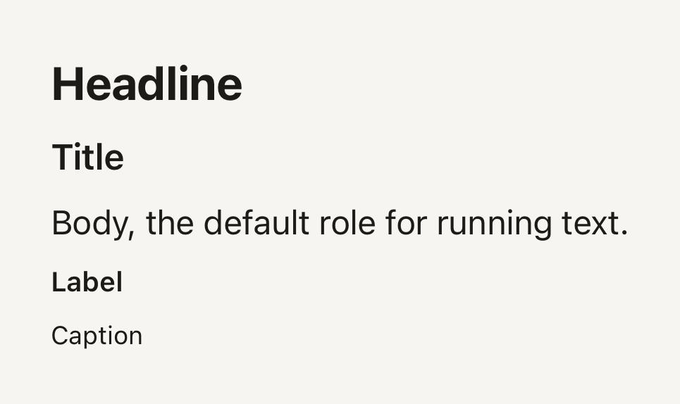
```tsx
import { Text } from "@terratcg/ui";
import { View } from "react-native";
export default function TextVariants() {
return (
Headline
Title
Body, the default role for running text.
Label
Caption
);
}
```
## Import
```tsx
import { Text } from "@terratcg/ui";
```
## Usage
```tsx
Your collection
142 photos so far.
```
Text renders a React Native `Text` styled from the theme: `variant` picks the size, line height and default weight, `tone` the colour. The `style` you pass is applied last, on top of the role.
## Examples
### Tones
Semantic tones take their colour from the theme: default, secondary, muted, accent and danger.
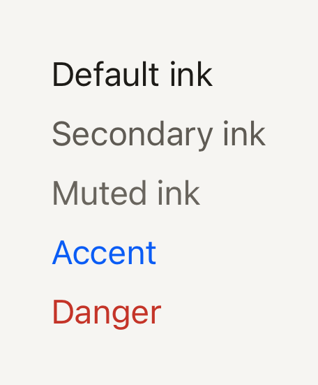
```tsx
import { Text } from "@terratcg/ui";
import { View } from "react-native";
export default function TextTones() {
return (
Default ink
Secondary ink
Muted ink
Accent
Danger
);
}
```
### Weight and tabular figures
weight overrides the role's default; tabular gives every digit the same width, so numbers line up.
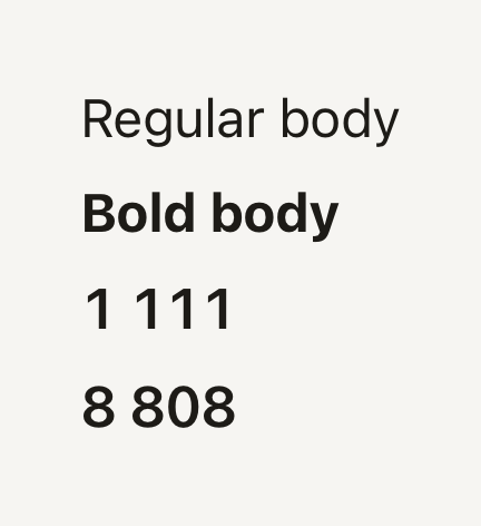
```tsx
import { Text } from "@terratcg/ui";
import { View } from "react-native";
export default function TextWeights() {
return (
Regular body
Bold body
1 111
8 808
);
}
```
## Props
### TextProps
| Prop | Type | Description |
| ---------- | ------------------------------------------------------------- | --------------------------------------------------------------------------------------------------------------- |
| `variant?` | `"body" \| "caption" \| "headline" \| "label" \| "title"` | Type role. Sets size, line height and default weight. Default: `"body"` |
| `tone?` | `"accent" \| "danger" \| "default" \| "muted" \| "secondary"` | Semantic colour from the theme. Default: `"default"` |
| `weight?` | `"bold" \| "medium" \| "regular" \| "semibold"` | Overrides the variant's default weight (`label`, `title` and `headline` are heavier than `body` and `caption`). |
| `tabular?` | `boolean` | Tabular figures for counters and stats. Default: `false` |
Text also accepts React Native's `Text` props, such as `numberOfLines`, `accessibilityRole` and `selectable`. The weights are `regular`, `medium`, `semibold` and `bold`, as the theme defines them; `label`, `title` and `headline` default to the theme's strong font family when it has one.
## Accessibility
- **Role:** none of its own. A heading passes `accessibilityRole="header"`, as SectionHeader does for its title.
- **Larger text:** sizes follow the system text size, like any React Native `Text`. The line height is 1.35 times the size, so enlarged text keeps its spacing.
- **Colour:** every tone comes from the theme, whose default pairs meet WCAG AA on the page and surface colours. Don't tint text with a raw colour through `style` unless you have checked its contrast.
## Platform differences
- **iOS and Android:** the same roles and tones. `tabular` sets `fontVariant: ["tabular-nums"]`, which both platforms honour when the font has tabular figures.
- **Web:** Text renders through react-native-web for these docs, but the web is not a supported target.
## Rules
- Put every string in a Text (or a component's own text part, such as ButtonText): a bare string outside one does not render on React Native.
- Pick a `variant`, not a `fontSize`: the roles keep the type scale consistent across a view.
- Use `tone` for meaning: `danger` for errors, `accent` for what the user should act on, `secondary` and `muted` to step text back.
- Set `tabular` on numbers that change or line up in columns, so they don't shift as they count.