# TerraUI
> Tactile React Native components (@terratcg/ui) for iOS and Android: raised keys, wells and shells with a typed theme. Every page below is Markdown; append .md to any docs URL.
TerraUI is React Native for iOS and Android, not web React. Follow these rules before writing code with it:
- **Versions:** `react ~19.3.0`, `react-native ~0.88.0` and `react-native-screens ~4.30.0`. Expo is optional.
- **Style props, not `className`:** style through each component's props and React Native's `style` prop. There is no CSS and no class name.
- **`onPress`, not `onClick`:** every pressable control takes `onPress`.
- **Text inside text components:** put every string inside a text component, such as `ButtonText`, `Text`, `RowTitle` or `NoticeTitle`. A bare string inside a `Button` or a `View` does not render.
- **One `ThemeProvider`, one `OverlayHost`:** mount each once, at the root of the app, with `OverlayHost` inside `ThemeProvider` and after your navigator. Dialogs, menus and toasts open through them, from anywhere.
- **Native first:** import from `@terratcg/ui`, never a web component library. Haptics, sounds, icons and navigation stay in your app.
# Action tray
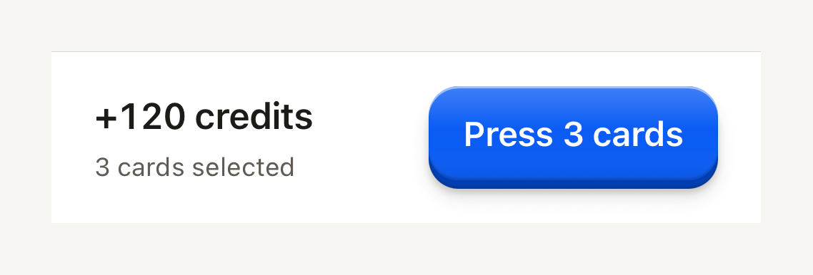
A fixed bottom tray for a screen's essential figures and its confirming action. Compose it from ActionTrayNotice, ActionTrayRow and ActionTrayDetails.
```tsx
import { ActionTray, ActionTrayDetails, ActionTrayRow, Button, ButtonText, Text } from "@terratcg/ui";
export default function ActionTraySummary() {
return (
+120 credits3 cards selected
);
}
```
## Import
```tsx
import { ActionTray, ActionTrayDetails, ActionTrayNotice, ActionTrayRow } from "@terratcg/ui";
```
## Usage
```tsx
+120 credits
```
The tray draws its surface, its hairline and its padding, and nothing else: you position it at the bottom of the screen, pass the bottom safe-area inset, and own the operation its action starts. `ActionTrayRow` lays the details out on the left and the action on the right, and wraps the action below them when the text grows or the screen is narrow.
## Examples
### With a notice
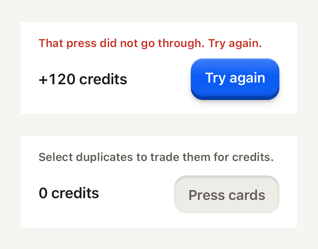
A one-line notice above the row: a danger notice is announced as an alert, a default one is a quiet hint.
```tsx
import { ActionTray, ActionTrayDetails, ActionTrayNotice, ActionTrayRow, Button, ButtonText, Text } from "@terratcg/ui";
import { View } from "react-native";
export default function ActionTrayWithNotice() {
return (
That press did not go through. Try again.+120 creditsSelect duplicates to trade them for credits.0 credits
);
}
```
## Props
### ActionTray
### ActionTrayProps
| Prop | Type | Description |
| -------------- | -------- | ------------------------------------------------------------------------------------------------- |
| `bottomInset?` | `number` | Bottom safe-area inset supplied by the host; the tray pads at least its own spacing. Default: `0` |
ActionTray also accepts React Native's `View` props, such as `style` and `testID`. Its bottom padding is the larger of `bottomInset` and its own spacing.
### ActionTrayNotice
### ActionTrayNoticeProps
| Prop | Type | Description |
| ---------- | ----------------------------------------------- | --------------------------------------------------------------------------------------------------------------- |
| `tone?` | `"danger" \| "default"` | "danger" announces as an alert; "default" is a quiet hint. Default: `"danger"` |
| `weight?` | `"bold" \| "medium" \| "regular" \| "semibold"` | Overrides the variant's default weight (`label`, `title` and `headline` are heavier than `body` and `caption`). |
| `tabular?` | `boolean` | Tabular figures for counters and stats. Default: `false` |
ActionTrayNotice also accepts React Native's `Text` props, such as `numberOfLines`. A notice is `danger` unless you pass `tone="default"`.
### ActionTrayRow and ActionTrayDetails
Both take React Native's `View` props and nothing of their own. ActionTrayDetails grows first and keeps at least 140 points, so the action wraps below it before the figures get squeezed.
## Accessibility
- **Reading order:** put the notice first, then the row. Screen readers announce a failure before the figures and the action it concerns.
- **Danger notice:** a polite live region with the `alert` role, so a new failure is announced without stealing focus.
- **Default notice:** a polite live region with no role, read as a quiet hint.
- **Larger text:** the row wraps, putting the action under the details instead of clipping either.
## Platform differences
- **iOS and Android:** the same tray, hairline and spacing. The bottom inset comes from you, so read it from your safe-area provider on each platform.
- **Web:** ActionTray renders through react-native-web for these docs, but the web is not a supported target.
## Rules
- Keep one confirming action in the tray, the screen's primary Button, and nothing that scrolls.
- Show only the figures needed to confirm: a total, a count, a chip. Everything else stays on the screen above.
- Pass the bottom safe-area inset as `bottomInset`; never pad the tray yourself.
- Use a `danger` notice for a failure the user must act on, `default` for a hint. Keep it to one line.
# Avatar
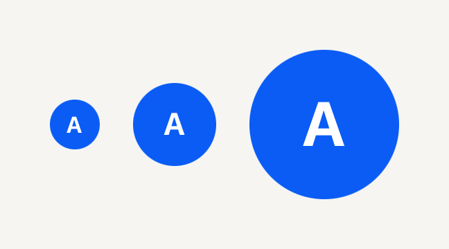
A round portrait on the accent fill that falls back to an initial when there is no photo to show.
```tsx
import { Avatar, AvatarFallback } from "@terratcg/ui";
import { View } from "react-native";
export default function AvatarSizes() {
return (
AAA
);
}
```
## Import
```tsx
import { Avatar, AvatarFallback, AvatarImage } from "@terratcg/ui";
```
## Usage
```tsx
{user.name[0]}
```
Compose an AvatarImage and an AvatarFallback inside the Avatar. While the photo loads, the circle shows its accent fill; once it loads, the photo covers it. With no source, an empty uri, or a failed load, the fallback shows instead, so a missing photo never leaves an empty circle.
## Examples
### Beside a name
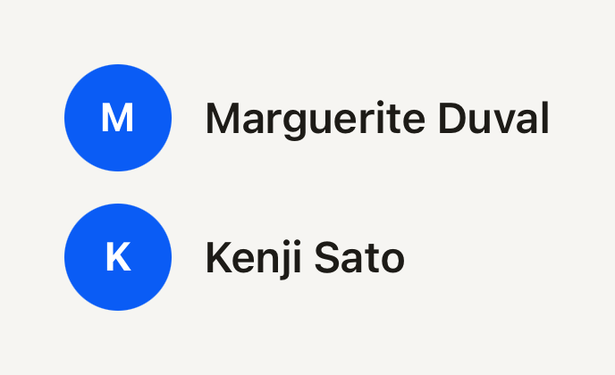
The default size fits a list line: the Avatar is named for screen readers, and the name beside it repeats it for everyone.
```tsx
import { Avatar, AvatarFallback, Text } from "@terratcg/ui";
import { View } from "react-native";
export default function AvatarBesideAName() {
return (
MMarguerite DuvalKKenji Sato
);
}
```
## Props
### Avatar
### AvatarProps
| Prop | Type | Description |
| ----------- | --------------------------- | -------------------------------------------------------------------------------------------------------------------------- |
| `size?` | `"default" \| "lg" \| "sm"` | Diameter: 24 pt (`sm`, beside captions), 40 pt (`default`, in rows) or 72 pt (`lg`, profile headers). Default: `"default"` |
| `children?` | `ReactNode` | Compose AvatarImage and AvatarFallback. |
Avatar also accepts React Native's `View` props, such as `accessibilityLabel` and `testID`.
### AvatarImage
### AvatarImageProps
| Prop | Type | Description |
| --------- | ------------- | ------------------------------------------------------------------ |
| `source?` | `ImageSource` | A React Native image source. A uri-less source counts as no image. |
AvatarImage also accepts React Native's `Image` props, such as `onLoad`, `onError` and `resizeMode`. It fills the circle.
### AvatarFallback
AvatarFallback takes React Native's `Text` props, except `variant` and `tone`: its size follows the Avatar's and its colour is the on-accent ink.
## Accessibility
- **Role:** `image`, on the Avatar itself, which is one accessible element. Its parts are decorative.
- **Label:** pass the person's name as `accessibilityLabel`. The initial alone is not a name.
- **Photo:** the image ignores Smart Invert on iOS (`accessibilityIgnoresInvertColors`), so a face is never shown in negative.
- **No flash:** the fallback decision is made before paint, so a photo that is there never shows the initial for a frame.
## Platform differences
- **iOS and Android:** the same circle, sizes and fallback.
- **Web:** Avatar renders through react-native-web for these docs, but the web is not a supported target.
## Rules
- Always include an AvatarFallback: it is what shows while there is no usable photo.
- Render AvatarImage and AvatarFallback only inside an Avatar; outside one they throw.
- Keep the fallback to one or two characters: the circle is sized for an initial.
- Pick the size by place: `sm` beside a caption, `default` in a Row, `lg` in a profile header.
# Badge
A small pill label for a category, a count or a status. Quiet by default.
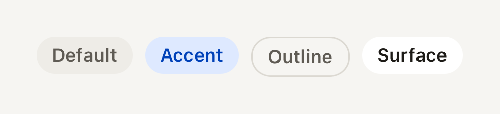
```tsx
import { Badge } from "@terratcg/ui";
import { View } from "react-native";
export default function BadgeVariants() {
return (
DefaultAccentOutlineSurface
);
}
```
## Import
```tsx
import { Badge } from "@terratcg/ui";
```
## Usage
```tsx
New
```
A string or number child is set in themed caption text on one line. Any other child (an icon and a Text, say) passes through, laid out in a row. A Badge hugs its content (`alignSelf: "flex-start"`).
## Examples
### Sizes
The small pill sits beside a caption; the default one beside a title. A number is set like a string.
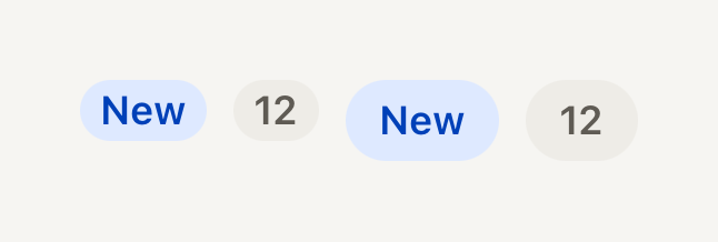
```tsx
import { Badge } from "@terratcg/ui";
import { View } from "react-native";
export default function BadgeSizes() {
return (
New
{12}New{12}
);
}
```
### Host colours
color and textColor replace the variant's fill with a category colour of your own, for content, never for chrome.
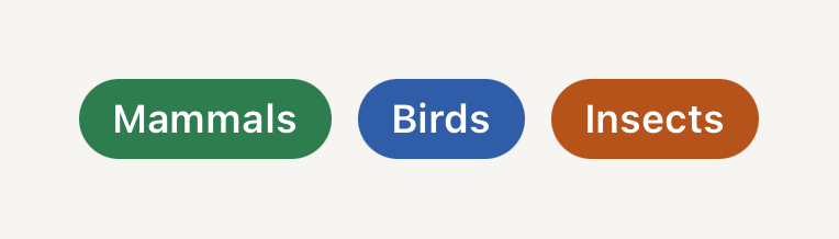
```tsx
import { Badge } from "@terratcg/ui";
import { View } from "react-native";
export default function BadgeHostColor() {
return (
Mammals
Birds
Insects
);
}
```
## Props
### BadgeProps
| Prop | Type | Description |
| ------------ | ------------------------------------------------- | ------------------------------------------------------------------------------------------------------------------------- |
| `variant?` | `"accent" \| "default" \| "outline" \| "surface"` | The pill's fill: a quiet muted `default`, a soft `accent`, a bordered `outline` or a `surface` fill. Default: `"default"` |
| `size?` | `"default" \| "sm"` | Height 18 (`sm`) or 24 (`default`). Default: `"default"` |
| `color?` | `string` | Host fill color, for example a taxonomy class color. Overrides the variant fill. |
| `textColor?` | `string` | Label color paired with `color`. |
| `children?` | `ReactNode` | A string is set in themed caption text; nodes pass through. |
Badge also accepts React Native's `View` props, such as `accessibilityLabel` and `testID`. `color` and `textColor` work together: when you replace the fill, set a label colour that reads on it.
## Accessibility
- **Role:** none. A Badge is read as its text, in the order it appears.
- **Label:** a count such as "12" means little alone. Give the Badge an `accessibilityLabel` ("12 new cards"), or say it in the text next to it.
- **Truncation:** a string label stays on one line and truncates when space runs out; keep labels to a word or two.
- **Colour:** the variants use theme pairs. With `color` and `textColor` the contrast is yours to check.
## Platform differences
- **iOS and Android:** the same pill and metrics.
- **Web:** Badge renders through react-native-web for these docs, but the web is not a supported target.
## Rules
- Use a Badge for information, never as a control: it has no press. Reach for a Button or Selectable for anything tappable.
- Keep host colours for content (a photo category, a set), never for chrome such as headers and tabs.
- One word or a short number: a Badge that needs a sentence wants to be a Notice.
# Button
A raised key that runs an action when pressed. Compose its label with ButtonText and an optional ButtonIcon.
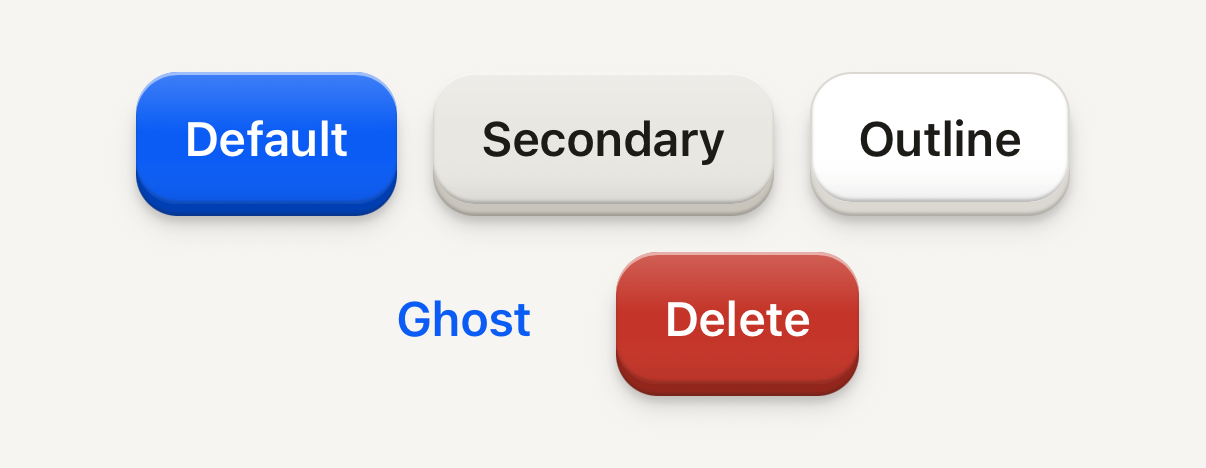
```tsx
import { Button, ButtonText } from "@terratcg/ui";
import { View } from "react-native";
export default function ButtonVariants() {
return (
);
}
```
## Import
```tsx
import { Button, ButtonIcon, ButtonText } from "@terratcg/ui";
```
## Usage
```tsx
```
A Button hugs its label; pass `block` to stretch it across its parent. Put text inside `ButtonText`: a bare string child does not render on React Native.
## Examples
### Sizes
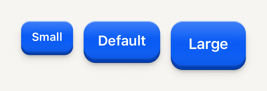
Small, default and large keys: the label steps up with the key.
```tsx
import { Button, ButtonText } from "@terratcg/ui";
import { View } from "react-native";
export default function ButtonSizes() {
return (
);
}
```
### States
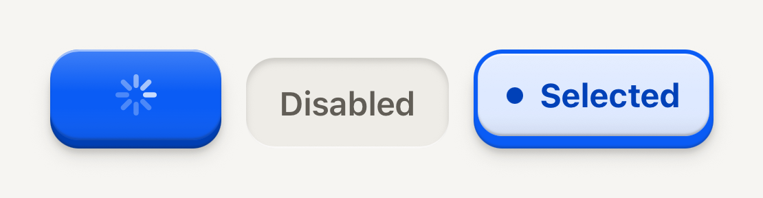
Loading holds the key's width with a spinner; disabled is molded flat; selected sits pressed in its well.
```tsx
import { Button, ButtonText } from "@terratcg/ui";
import { View } from "react-native";
export default function ButtonStates() {
return (
);
}
```
### With an icon
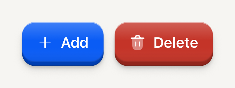
ButtonIcon takes a render function: the key hands your icon its colour and size.
```tsx
import Add01Icon from "@hugeicons-pro/core-bulk-rounded/Add01Icon";
import Delete02Icon from "@hugeicons-pro/core-bulk-rounded/Delete02Icon";
import { HugeiconsIcon } from "@hugeicons/react-native";
import { Button, ButtonIcon, ButtonText } from "@terratcg/ui";
import { View } from "react-native";
export default function ButtonWithIcon() {
return (
);
}
```
## Props
### Button
### ButtonProps
| Prop | Type | Description |
| ----------- | ------------------------------------------------------------------- | -------------------------------------------------------------------------------------------------------------------------------------------------------------------------------------------------------------------------------------------------------------------------------------------------- |
| `variant?` | `"default" \| "destructive" \| "ghost" \| "outline" \| "secondary"` | The key's look and weight: one `default` key per view, `secondary`, `outline` and `ghost` for the actions around it, `destructive` for what can't be undone. Default: `"default"` |
| `size?` | `"default" \| "icon" \| "icon-lg" \| "icon-sm" \| "lg" \| "sm"` | Height 36 (`sm`), 44 (`default`) or 52 (`lg`); the `icon` sizes are square faces of the same heights. Default: `"default"` |
| `disabled?` | `boolean` | Inactive: readable, flat, no action and no feedback. Default: `false` |
| `loading?` | `boolean` | Busy: keeps its size, shows a spinner over the label, blocks activation and exposes accessibilityState.busy. The host owns the operation. Default: `false` |
| `selected?` | `boolean` | Selection cue (border, marker, weight) plus accessibilityState.selected. Omit for plain actions. |
| `tint?` | `string` | A hue the selection wears instead of the accent, for a choice that owns a colour (a label or a category): selected, the face is washed in it and its border and edge take it, with no leading marker: the hue is the cue. The label stays in ink. Ignored on the default and destructive variants. |
| `block?` | `boolean` | Fill the parent's cross axis (alignSelf "stretch") instead of hugging the label. For stacked full-width actions such as a notice's column. Default: `false` |
| `children?` | `ReactNode` | Compose ButtonText, ButtonIcon or host nodes. |
| `style?` | `StyleProp` | Outer style: layout, margins, width. Face colors come from variant and theme. |
Button also accepts React Native's `Pressable` props, such as `accessibilityLabel`, `hitSlop` and `testID`. `onPress` receives the native press event, and a ref points at the underlying `Pressable` view. `selected` and `tint` work together: `tint` only shows on a selected `secondary`, `outline` or `ghost` key.
### ButtonText
### ButtonTextProps
| Prop | Type | Description |
| ---------- | ----------------------------------------------- | --------------------------------------------------------------------------------------------------------------- |
| `weight?` | `"bold" \| "medium" \| "regular" \| "semibold"` | Overrides the variant's default weight (`label`, `title` and `headline` are heavier than `body` and `caption`). |
| `tabular?` | `boolean` | Tabular figures for counters and stats. Default: `false` |
ButtonText also accepts React Native's `Text` props, such as `numberOfLines`. Its size and colour come from the Button it sits in.
### ButtonIcon
### ButtonIconProps
| Prop | Type | Description |
| ---------- | ---------------------------------------------------- | ------------------------------------------------------------------------- |
| `children` | `((slot: ButtonIconSlot) => ReactNode) \| ReactNode` | A host icon node, or a render function receiving the slot color and size. |
### useButtonContext
A label or icon of your own inside a Button reads the key it sits on with `useButtonContext()`: its `variant`, `size`, `foregroundColor`, `iconSize`, `textVariant` and its `disabled`, `selected` and `loading` states. Draw with `foregroundColor` and `iconSize` so your part matches ButtonText and ButtonIcon. It throws outside a Button.
## Accessibility
- **Role:** `button`, with `accessibilityState` keeping `disabled`, `busy` (while `loading`) and `selected` in sync. Your own `accessibilityState` is merged on top.
- **Label:** the ButtonText string. A key without text, such as an icon-only key, needs an `accessibilityLabel`.
- **Touch target:** at least 44 pt on iOS and 48 dp on Android. A smaller key keeps its face and grows its touch area with `hitSlop`.
- **Larger text:** under enlarged system text the label wraps and the face grows with it, so the action stays readable instead of clipping.
- **Reduce Motion:** the face no longer travels when pressed; the press tint stays.
## Platform differences
- **iOS and Android:** the same key, the same travel and no ripple. The minimum touch target follows each platform: 44 pt on iOS, 48 dp on Android.
- **Feedback:** a press calls ThemeProvider's `feedback` handler with `"press"`, or `"select"` when `selected` is set. TerraUI plays no haptic or sound itself; your handler decides.
- **Web:** Button renders through react-native-web for these docs, but the web is not a supported target.
## Rules
- Use `onPress`, never `onClick`, and style props, never `className`.
- Put text inside `ButtonText`; a bare string child does not render.
- Keep one `default` key per view. The actions around it step down to `secondary`, `outline` or `ghost`.
- Label the action with a verb and its object: "Delete playlist", not "OK".
- `loading` is yours to clear: the key stays busy until you set it back to `false`.
- Confirm a `destructive` action that can't be undone in a Dialog first.
# Card
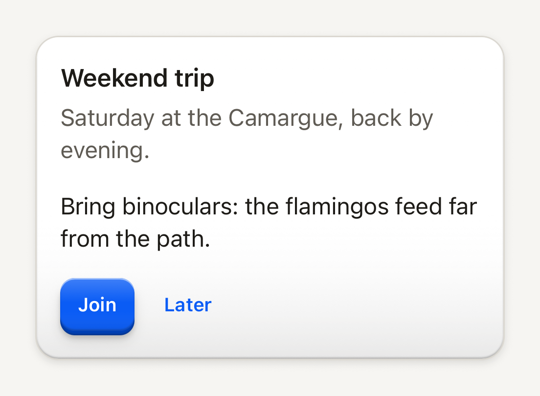
A generic content surface with shallow depth. It holds content and is not meant to stand in for your app's own signature objects.
```tsx
import { Button, ButtonText, Card, CardContent, CardDescription, CardFooter, CardHeader, CardTitle, Text } from "@terratcg/ui";
import { View } from "react-native";
export default function CardAnatomy() {
return (
Weekend tripSaturday at the Camargue, back by evening.Bring binoculars: the flamingos feed far from the path.
);
}
```
## Import
```tsx
import { Card, CardContent, CardDescription, CardFooter, CardHeader, CardTitle } from "@terratcg/ui";
```
## Usage
```tsx
Weekend tripSaturday at the Camargue.Bring binoculars.
```
CardHeader pads its title and description, CardContent and CardFooter continue under it with the same side padding, and CardFooter lays its actions in a row. A Card inside another Card (or inside any TerraUI surface) takes a shallower lift on its own.
## Examples
### Raised, nested and well
A raised Card lifts off the page; a Card inside it takes the shallower nested lift; a well is cut into the page for quiet, empty content.
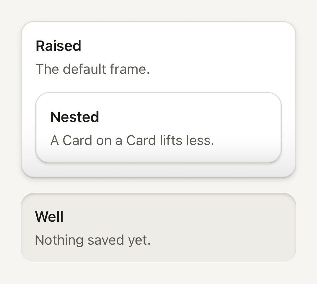
```tsx
import { Card, CardDescription, CardHeader, CardTitle } from "@terratcg/ui";
import { View } from "react-native";
export default function CardFrames() {
return (
RaisedThe default frame.NestedA Card on a Card lifts less.WellNothing saved yet.
);
}
```
### Danger tone
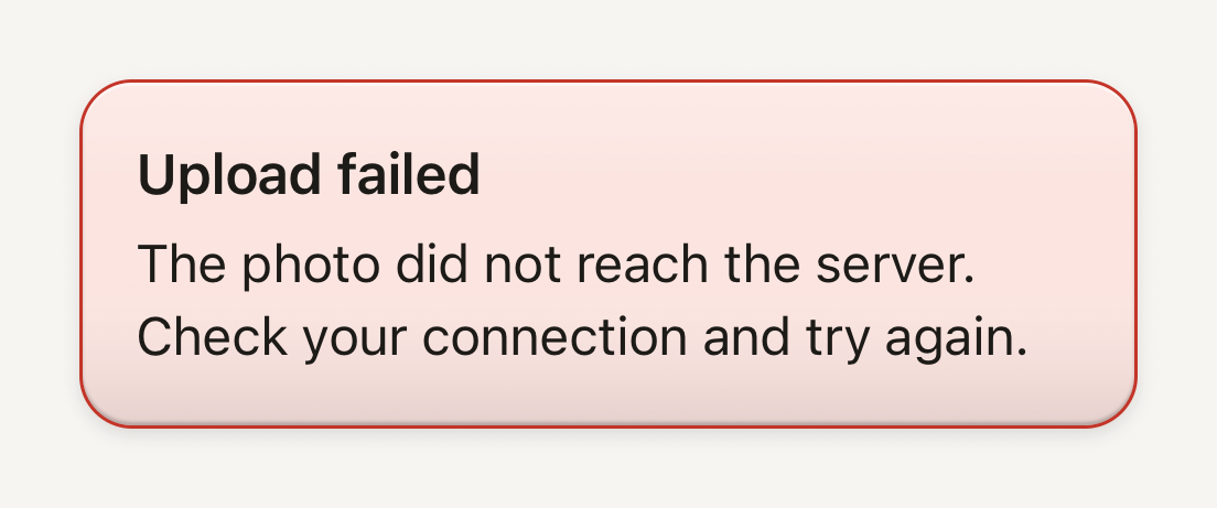
tone="danger" turns the Card into an error notice: a danger border on the soft danger floor. Here the text keeps the default ink, which reads better on that floor.
```tsx
import { Card, CardDescription, CardHeader, CardTitle } from "@terratcg/ui";
import { View } from "react-native";
export default function CardDanger() {
return (
Upload failedThe photo did not reach the server. Check your connection and try again.
);
}
```
### Selectable
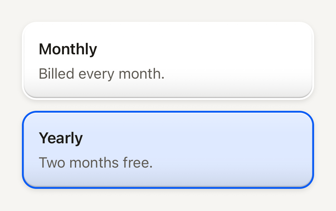
selectable turns the border into a 2 pt ring, clear until selected: choosing never moves the layout.
```tsx
import { Card, CardDescription, CardHeader, CardTitle } from "@terratcg/ui";
import { useState } from "react";
import { Pressable, View } from "react-native";
const PLANS = [
{ id: "monthly", title: "Monthly", description: "Billed every month." },
{ id: "yearly", title: "Yearly", description: "Two months free." },
];
export default function CardSelectable() {
const [plan, setPlan] = useState("yearly");
return (
{PLANS.map(({ id, title, description }) => (
setPlan(id)}
>
{title}{description}
))}
);
}
```
## Props
### Card
### CardProps
| Prop | Type | Description |
| -------------- | ------------------------- | -------------------------------------------------------------------------------------------------------------------------------------------------------------------------------------------------- |
| `style?` | `StyleProp` | |
| `tone?` | `"danger" \| "default"` | "danger" presents an error notice with the danger palette. Default: `"default"` |
| `nested?` | `boolean` | Force the shallower lift of a shell resting on another shell, even on the bare page: a quieter surface beneath a full Card. Default: `false` |
| `translucent?` | `boolean` | A see-through floor (72% of its colour), for a surface resting inside a living shell: its ground shows through, the rims and shadows stay. Default: `false` |
| `ground?` | `ReactNode` | A layer painted on the shell's floor, under its rims, sheen and content, clipped to the shell (a game surface's living sky). Pointer events pass through it. |
| `radius?` | `number` | Corner radius, `theme.shape.radiusLg` by default; half the side for a round key. |
| `clip?` | `boolean` | Cut the children to the Card's shape (a stage light reaching its edge). The Card then carries its material itself rather than on rasterized layers, which its own clip would cut. Default: `false` |
| `frame?` | `"raised" \| "well"` | Raised by default; "well" recesses it below the page. |
| `borderless?` | `boolean` | No border: the surface's edge is its rims alone (a stage). A well has no border either way. |
| `selectable?` | `boolean` | A Card the user can choose: its border becomes a 2 pt ring, clear until `selected`, so choosing never moves the layout. |
| `selected?` | `boolean` | Chosen: an accent ring on the accent floor. |
Card also accepts React Native's `View` props. Its frame props combine in four ways only, and TypeScript holds you to them:
- `frame="raised"` (the default), bordered.
- Raised and `selectable`, with `selected`: the border becomes a 2 pt ring, clear until selected, so choosing never moves the layout. Selected, the ring turns accent over the accent-soft floor.
- Raised and `borderless`: the edge is the rims alone, for a stage.
- `frame="well"`: recessed below the page, for quiet, empty or placeholder content. A well has no border, and can't be selectable.
`ground` paints a layer on the Card's floor, under its rims, sheen and content, clipped to its shape; touches pass through it. `clip` cuts the children to the Card's shape. `radius` replaces the theme's large radius.
### Parts
CardHeader, CardContent and CardFooter take React Native's `View` props. CardTitle (title type) and CardDescription (body type, secondary) take React Native's `Text` props and Text's `tone` and `weight`; in a `danger` Card both default to the danger tone.
## Accessibility
- **Role:** none. A Card groups content visually; the controls in it carry the roles.
- **Selectable:** a selectable Card is not pressable by itself. Wrap it in a `Pressable` with the role that fits, such as `radio` in a `radiogroup`, and its `accessibilityState`, as the Selectable example does.
- **Title:** CardTitle is not announced as a header. Pass `accessibilityRole="header"` when the Card heads a section of the page.
- **Danger contrast:** in Electric the danger ink on the soft danger floor reaches 4.5:1, AA for body text with no room to spare. A theme that changes `danger` or `dangerSoft` should check that pair, or give the title and description `tone="default"`, as the Danger example does.
## Platform differences
- **iOS and Android:** the same surfaces, depths and rings.
- **Web:** Card renders through react-native-web for these docs, but the web is not a supported target.
## Rules
- Use a Card for content, not for a control: a pressable surface wants a Button, a Row or a Cell.
- Don't use a Card for your app's own signature objects (a trading card, a ticket): draw those yourself.
- Keep one level of nesting. A Card on a Card lifts less; a third level reads as noise.
- Choose the frame by meaning: `raised` for content, `well` for what is empty or waiting.
- Set `translucent` only on a surface resting inside a living layer, such as a Card's `ground`, never on the bare page: the floor keeps 72% of its colour so the layer shows through, while the rims and shadows stay.
# Cell
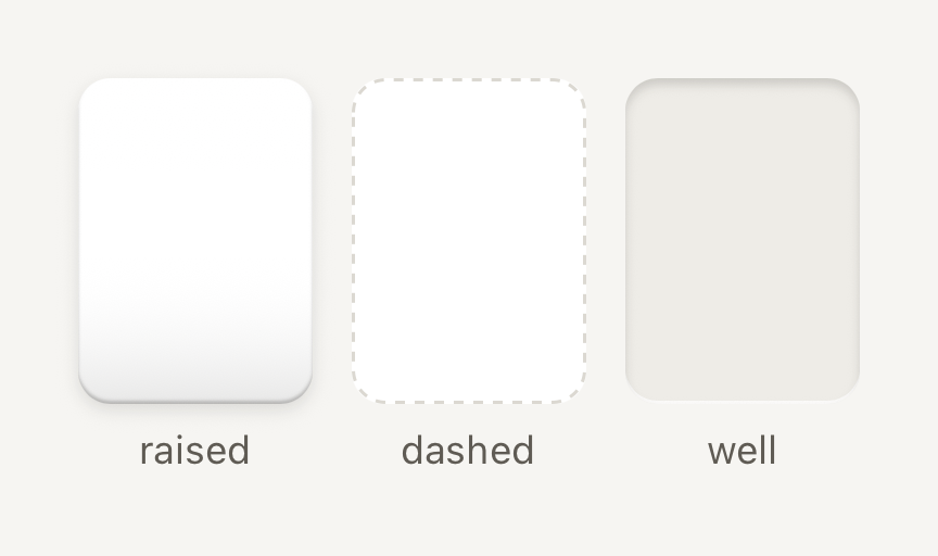
One pocket in a dense grid or shelf. Quiet framing keeps the art inside as the subject.
```tsx
import { Cell, Text } from "@terratcg/ui";
import { View } from "react-native";
export default function CellFrames() {
return (
raised
dashed
well
);
}
```
## Import
```tsx
import { Cell, resolveGridColumns } from "@terratcg/ui";
```
## Usage
```tsx
open(card)} accessibilityLabel={card.name} style={{ width: 72, height: 100 }}>
```
Give a Cell its size through `style`; the frame and colours come from the theme, and your content is clipped to the frame. The three `frame` treatments tell a Cell's states apart: a raised shell, a dashed outline and a recessed well. With `onPress` the Cell is a button that dips to 94% and tints when pressed. Without it, it is a static frame.
## Examples
### Pressable and selected
With onPress the pocket is a button that dips and tints when pressed; selected adds a 2 pt accent border.
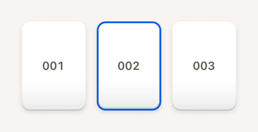
```tsx
import { Cell, Text } from "@terratcg/ui";
import { useState } from "react";
import { View } from "react-native";
const POCKETS = ["001", "002", "003"];
export default function CellSelected() {
const [selected, setSelected] = useState("002");
return (
{POCKETS.map((number) => (
setSelected(number)}
accessibilityLabel={`Pocket ${number}`}
style={{ width: 72, height: 100 }}
>
{number}
))}
);
}
```
### In a grid
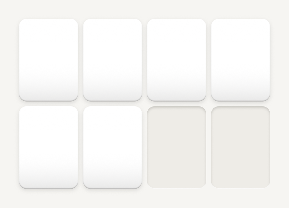
resolveGridColumns picks the column count and cell width for a width: columns drop before cells shrink below minCell.
```tsx
import { Cell, resolveGridColumns } from "@terratcg/ui";
import { View } from "react-native";
const WIDTH = 320;
const GAP = 6;
export default function CellGrid() {
const { columns, cellWidth } = resolveGridColumns({ width: WIDTH, padding: 0, gap: GAP });
return (
{Array.from({ length: columns * 2 }, (_, index) => (
))}
);
}
```
## Props
### Cell
### CellProps
| Prop | Type | Description |
| -------------- | -------------------------------- | ------------------------------------------------------------------------------------------------------ |
| `frame?` | `"dashed" \| "raised" \| "well"` | `raised` for a filled pocket, `dashed` for a placeholder, `well` for an empty one. Default: `"raised"` |
| `selected?` | `boolean` | Selection cue: a 2 pt accent border. Default: `false` |
| `children?` | `ReactNode` | Host content, clipped to the frame. |
| `style?` | `StyleProp` | Outer style: width, height, margins. Colors come from the frame and theme. |
| `translucent?` | `boolean` | A see-through floor, for a pocket resting inside a living shell (see Card). Default: `false` |
Cell also accepts React Native's `Pressable` props, such as `onLongPress`, `hitSlop` and `testID`.
### resolveGridColumns
`resolveGridColumns(input)` returns `{ columns, cellWidth }` for a dense grid: on narrow phones columns drop before cells shrink below `minCell`, and wide screens gain columns up to `maxColumns`. `minColumns` wins over `minCell`: at the floor, cells shrink instead (with the defaults, a 200 pt width yields three 52 pt cells).
### GridLayoutInput
| Prop | Type | Description |
| ------------- | -------- | ------------------------------------------------------------------------------------------------------------------------ |
| `width` | `number` | Available container width in points, before padding. |
| `padding?` | `number` | Horizontal padding on each side. Default: `16` |
| `gap?` | `number` | Gap between cells. Default: `6` |
| `minCell?` | `number` | Smallest cell width that keeps art legible. Columns drop before cells shrink below it, down to minColumns. Default: `62` |
| `minColumns?` | `number` | Column floor. Wins over minCell: at the floor, cells shrink instead. Default: `3` |
| `maxColumns?` | `number` | Column ceiling, reached on wide screens. Default: `10` |
## Accessibility
- **Role:** `button` when the Cell has `onPress`, with `accessibilityState` keeping `disabled` and `selected` in sync. A static Cell is one accessible element with no role.
- **Label:** a Cell holds art, not text. Give it an `accessibilityLabel` that names what it holds.
- **Selection:** `selected` is shown by a 2 pt accent border and exposed through `accessibilityState`, not by colour alone.
- **Reduce Motion:** the pressed dip is dropped; the press tint stays.
## Platform differences
- **iOS and Android:** the same frames, dip and tint, with no ripple. A press waits 70 ms before it shows, so a scrolling grid doesn't flash its Cells.
- **Feedback:** a press calls ThemeProvider's `feedback` handler with `"press"`; TerraUI plays no haptic or sound itself.
- **Web:** Cell renders through react-native-web for these docs, but the web is not a supported target.
## Rules
- Size Cells with `resolveGridColumns`, so cards keep their geometry at every width.
- Use `raised` for a filled pocket, `well` for an empty one and `dashed` for a placeholder the user can fill.
- Label every pressable Cell.
- Set `translucent` only inside a Card with a `ground`.
# Compatibility
The React, React Native and react-native-screens versions TerraUI supports, the platforms it targets, and how its versions move.
## Peer versions
TerraUI supports exactly the versions it is built and tested with:
| Peer | Range | Version |
| --- | --- | --- |
| `react` | `~19.3.0` | React 19.3 |
| `react-native` | `~0.88.0` | React Native 0.88 |
| `react-native-screens` | `~4.30.0` | react-native-screens 4.30 |
These are the versions Expo SDK 58 ships. Older and newer releases are not claimed. A range widens only after a CI run proves the wider one works.
TerraUI needs nothing else: no Expo module, no styling library, no animation library and no icon set. Expo is optional.
## Platforms
- **iOS and Android:** the supported targets.
- **Web:** not supported. These docs render components through react-native-web for the "Try it (web)" tabs, as an approximation; the iOS and Android captures are the reference.
## What the package ships
- **Compiled JavaScript:** unminified ES modules, so your bundler needs no extra setup to compile TerraUI.
- **Type declarations:** `.d.ts` files that keep their documentation comments, so your editor explains every prop.
- **Docs:** these pages as Markdown, in the version you installed.
There is no source and there are no source maps.
## Entry points
The root, `@terratcg/ui`, exports everything public. Each component family also has a subpath, such as `@terratcg/ui/button` or `@terratcg/ui/theme`. Anything not listed in the package's `exports` is internal, and may change in any release.
## Versions
TerraUI is on 0.x. Until 1.0:
- **Minor** (0.1 to 0.2): may break your code. Read the changelog before upgrading.
- **Patch** (0.1.0 to 0.1.1): compatible fixes.
Pin a minor range, such as `~0.1.0`, and upgrade deliberately. Every release has a changelog entry. These docs describe the latest release, whose version is in the header.
# Counter
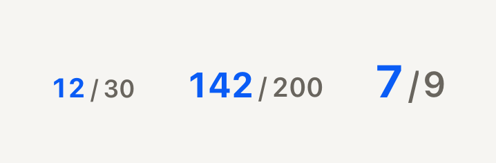
A count against its total, such as "142 / 200". A bold accent count over a muted total.
```tsx
import { Counter } from "@terratcg/ui";
import { View } from "react-native";
export default function CounterSizes() {
return (
);
}
```
## Import
```tsx
import { Counter } from "@terratcg/ui";
```
## Usage
```tsx
```
Counter sits wherever progress is read as numbers: beside a SectionHeader, in a Shelf's header, or next to a Progress track in a Task footer.
## Examples
### Tone and format
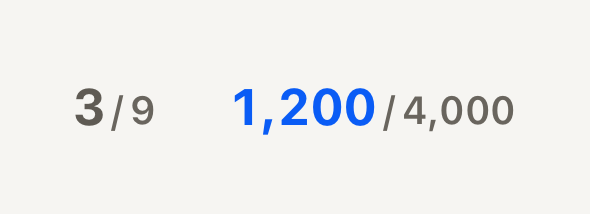
tone changes the count only, the total stays muted; format writes both numbers in your locale.
```tsx
import { Counter } from "@terratcg/ui";
import { View } from "react-native";
const thousands = new Intl.NumberFormat("en-US");
export default function CounterTones() {
return (
thousands.format(n)} />
);
}
```
## Props
### CounterProps
| Prop | Type | Description |
| --------- | ------------------------------------------------------------- | ------------------------------------------------------------------------------------------------------------ |
| `value` | `number` | The count so far, the numerator. |
| `total` | `number` | The count to reach, the denominator. |
| `size?` | `"default" \| "lg" \| "sm"` | The count's type role: `label`, `title` or `headline`, with the total one step smaller. Default: `"default"` |
| `tone?` | `"accent" \| "danger" \| "default" \| "muted" \| "secondary"` | Numerator tone. The denominator is always muted. Default: `"accent"` |
| `format?` | `((value: number) => string)` | Writes each number; the host passes its locale's formatter. Plain digits by default. |
Counter also accepts React Native's `View` props, such as `accessibilityLabel` and `testID`.
## Accessibility
- **Label:** one accessible element, read as "142 of 200" by default. That label is English: pass your own `accessibilityLabel` in other languages ("142 sur 200").
- **Format:** `format` writes both the shown numbers and the default label, so a locale formatter reaches screen readers too.
- **Figures:** both numbers use tabular figures, so a count that ticks up doesn't shift its neighbours.
## Platform differences
- **iOS and Android:** the same layout, on the text baseline.
- **Web:** Counter renders through react-native-web for these docs, but the web is not a supported target.
## Rules
- Pass numbers, not strings: `format` is where your locale's grouping goes.
- Keep the total muted. `tone` changes the count only; use `secondary` when the count is not the subject of the view.
- Pick `sm` inside headers and footers, `default` on its own, `lg` when the count is the page's headline.
# Dialog
A centred plate over a dimmed page that asks before an action, or says something to know. Open one from anywhere with showDialog.
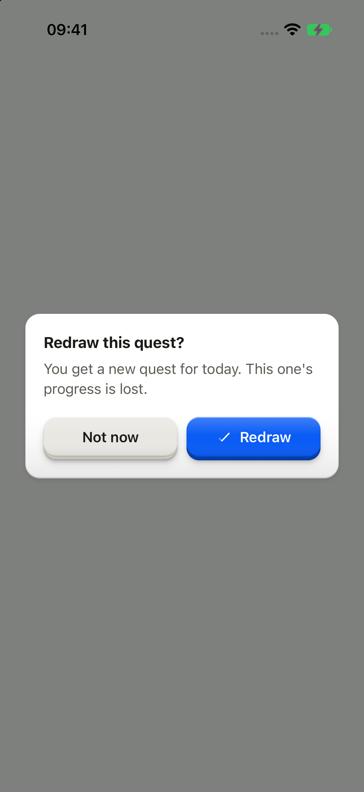
_iOS and Android only: no web preview._
```tsx
import { Button, ButtonText, showDialog, type OverlayTrigger } from "@terratcg/ui";
import { useEffect, useRef, type RefObject } from "react";
import type { ViewInstance } from "react-native";
function confirmRedraw(trigger: RefObject) {
void showDialog({
tone: "confirm",
title: "Redraw this quest?",
body: "You get a new quest for today. This one's progress is lost.",
cancel: "Not now",
confirm: "Redraw",
trigger,
});
}
export default function DialogConfirm({ capture }: SceneProps) {
const trigger = useRef(null);
useEffect(() => {
if (capture) confirmRedraw(trigger);
}, [capture]);
return (
);
}
```
## Import
```tsx
import { showDialog } from "@terratcg/ui";
```
## Usage
```tsx
const deleted = await showDialog({
tone: "destructive",
title: "Delete Red fox?",
body: "The photo leaves your library for good.",
cancel: "Keep it",
confirm: "Delete",
onConfirm: deletePhoto,
trigger,
});
if (deleted) router.back();
```
Dialogs appear in the `OverlayHost`, which you mount once at the root inside `ThemeProvider`. `showDialog` works from anywhere and resolves once the Dialog has left the screen: `true` when its action went through, `false` when the user backed out. Dialogs queue, one at a time.
When `onConfirm` returns a promise, the Dialog stays open with its key loading until it settles. A rejection shows the host's `failureText` inside the Dialog, and the same key retries. Navigate after `showDialog` resolves, never from `onConfirm`.
## Examples
### Destructive
A red key that repeats the icon you pressed. An outside tap does nothing; while the work runs, the key loads.
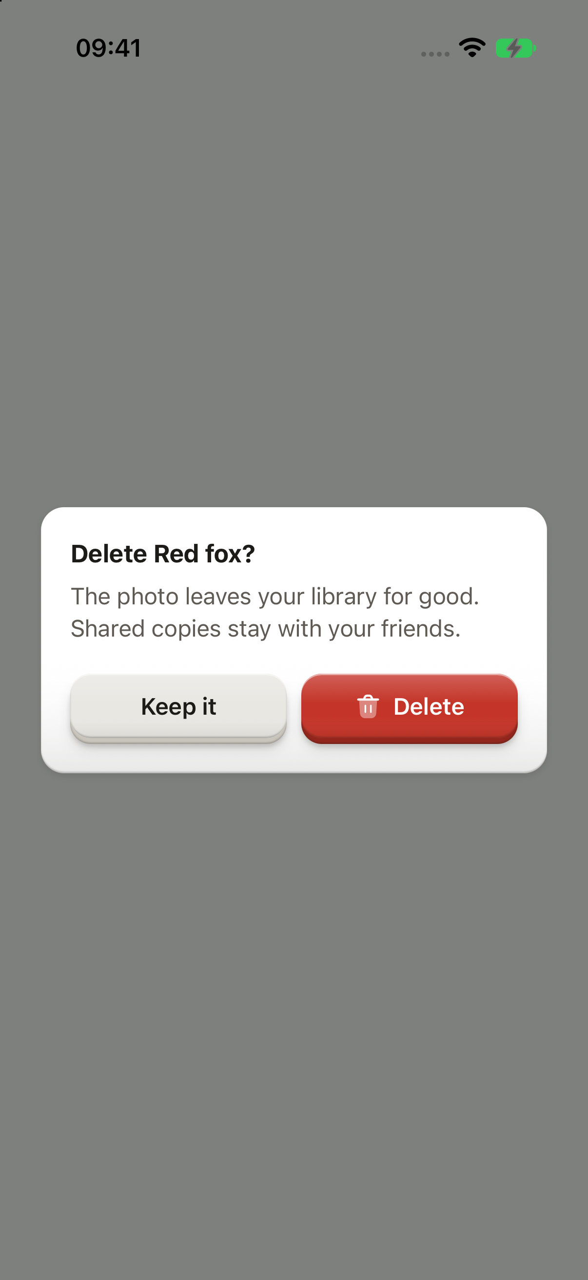
_iOS and Android only: no web preview._
```tsx
import Delete02Icon from "@hugeicons-pro/core-bulk-rounded/Delete02Icon";
import { HugeiconsIcon } from "@hugeicons/react-native";
import { Button, ButtonIcon, ButtonText, showDialog, type ButtonIconProps, type OverlayTrigger } from "@terratcg/ui";
import { useEffect, useRef, type RefObject } from "react";
import type { ViewInstance } from "react-native";
const deleteIcon: ButtonIconProps["children"] = ({ color, size }) => ;
/** Your request: the Dialog stays open, its key loading, until it settles. */
const deletePhoto = () => new Promise((resolve) => setTimeout(resolve, 900));
function confirmDelete(trigger: RefObject) {
void showDialog({
tone: "destructive",
title: "Delete Red fox?",
body: "The photo leaves your library for good. Shared copies stay with your friends.",
cancel: "Keep it",
confirm: "Delete",
icon: deleteIcon,
onConfirm: deletePhoto,
trigger,
});
}
export default function DialogDestructive({ capture }: SceneProps) {
const trigger = useRef(null);
useEffect(() => {
if (capture) confirmDelete(trigger);
}, [capture]);
return (
);
}
```
### Info
Something to know before going on: no cancel, a single key.
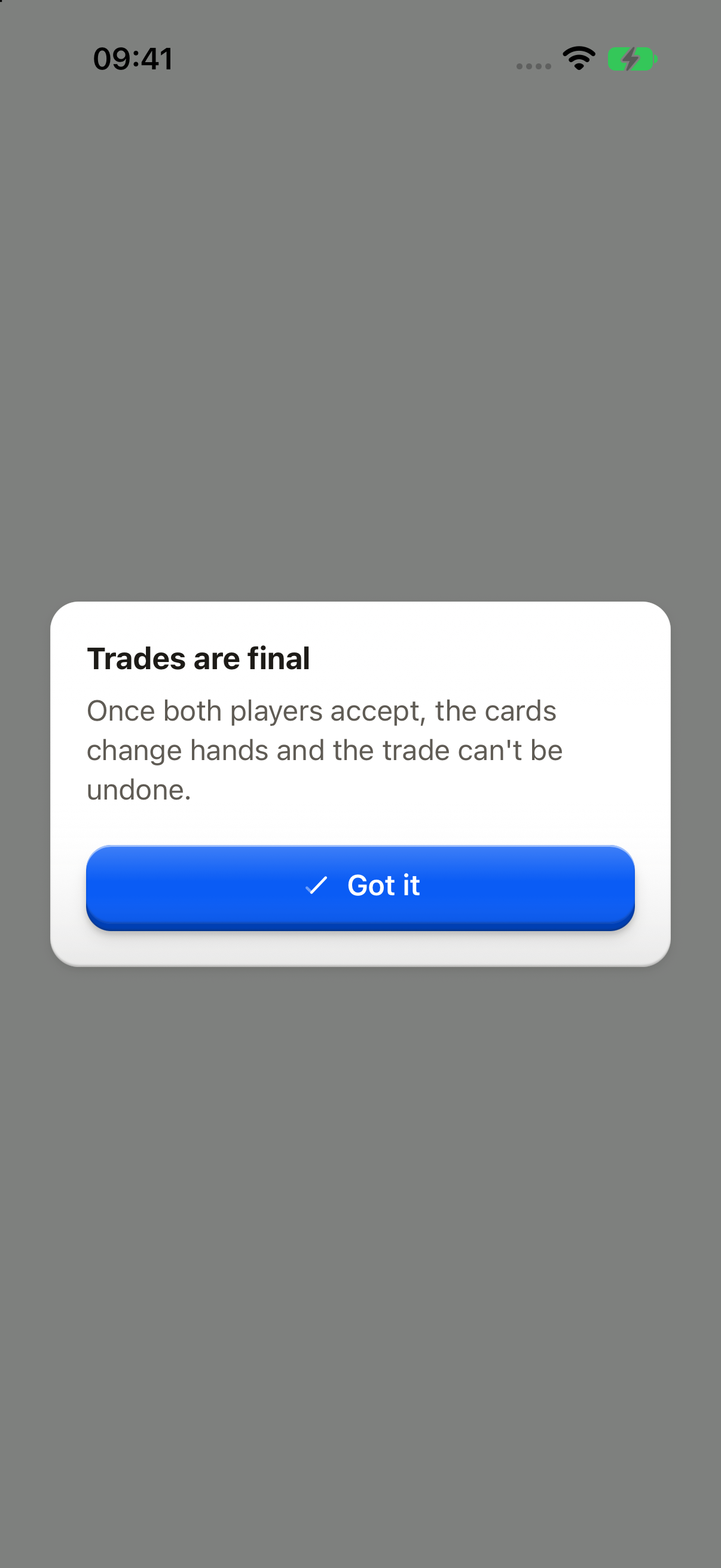
_iOS and Android only: no web preview._
```tsx
import { Button, ButtonText, showDialog, type OverlayTrigger } from "@terratcg/ui";
import { useEffect, useRef, type RefObject } from "react";
import type { ViewInstance } from "react-native";
function explainTrades(trigger: RefObject) {
void showDialog({
tone: "info",
title: "Trades are final",
body: "Once both players accept, the cards change hands and the trade can't be undone.",
confirm: "Got it",
trigger,
});
}
export default function DialogInfo({ capture }: SceneProps) {
const trigger = useRef(null);
useEffect(() => {
if (capture) explainTrades(trigger);
}, [capture]);
return (
);
}
```
## Props
### DialogSpec
| Prop | Type | Description |
| ------------ | ---------------------------------------------------------------- | ------------------------------------------------------------------------------------------------------------------------------------------------------------------------------------------------------------------------------------------------------------------------- |
| `title` | `string` | The question or the fact, as the plate's header. |
| `body?` | `string` | What happens next, under the title. |
| `confirm` | `string` | The action key's label: a verb, "Release", never "OK". |
| `cancel?` | `string` | The way out. Absent on info Dialogs, which have a single key. |
| `tone` | `"confirm" \| "destructive" \| "info"` | "confirm" asks before an action; "destructive" draws a red key and ignores an outside tap; "info" is something to know, with a single key. |
| `icon?` | `((slot: ButtonIconSlot) => React.ReactNode) \| React.ReactNode` | The confirm key's icon: the icon of the control that opened the Dialog, so the key repeats what the user pressed. Falls back to the host's `confirmIcon`. |
| `onConfirm?` | `(() => void \| Promise)` | The work behind the confirm key. A promise holds the Dialog open with its key loading; a rejection shows its failure in the Dialog and the key retries. Navigate after `showDialog` resolves, never from here: a screen presented while the overlay is up lands above it. |
| `trigger?` | `RefObject` | The control that opened the Dialog, where screen-reader focus goes back once it closes. From a Menu item, pass the `trigger` its `onSelect` receives. |
`dismissOverlays()` closes every Dialog and Menu at once, as if the user had backed out, for when the app moves on (a sign-out, a deep link).
## Accessibility
- **Focus:** once the Dialog is up, screen-reader focus moves to its title, which has the `header` role. When it closes, focus goes back to `trigger`. From a Menu item, pass the `trigger` its `onSelect` receives.
- **Modal:** the plate is an `alert` in a modal layer, so a screen reader stays inside it. The escape gesture cancels.
- **Busy:** while the action runs, the key is busy and the way out is shut. A failure is announced.
- **Larger text:** the way out sits on the left and the action on the right; when a key's label wraps, the keys stack with the action on top. The copy scrolls when it outgrows the screen.
- **Reduce Motion:** the plate fades in without rising or scaling.
## Platform differences
- **iOS:** the Dialog sits in a full-window overlay, above native sheets.
- **Android:** the Dialog is a transparent `Modal`, so Back cancels it, a destructive Dialog included.
- **Outside tap:** it cancels a `confirm` or `info` Dialog. A `destructive` one ignores it.
- **Feedback:** each key calls ThemeProvider's `feedback` handler with `"press"`. The keyboard is dismissed before the Dialog opens.
- **No web tab:** a live Dialog on a desktop browser stretches to the full window width and covers the whole page, because nothing caps its width yet. Until it gets a width cap (#702), this page shows only the iOS and Android captures.
## Rules
- Ask a question in the title, and say what happens next in the body.
- Label the action with a verb ("Release"), never "OK" or "Yes". Label the way out with what it keeps ("Keep it"), or "Cancel".
- Confirm a destructive action that can't be undone; don't confirm one that can.
- Pass `trigger`, so focus goes back where the user was.
- Give the confirm key the icon of the control that opened the Dialog (`icon`), so it repeats what the user pressed. A `destructive` Dialog whose trigger had no icon keeps a text-only key.
- Put the work in `onConfirm` and navigate after `showDialog` resolves.
- Don't open a `Modal` or a navigator inside the OverlayHost.
# Field
One form field. A Label, an Input and an optional FieldMessage stacked together, sharing the field's invalid and disabled state.
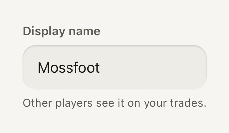
```tsx
import { Field, FieldMessage, Input, Label } from "@terratcg/ui";
import { useState } from "react";
export default function FieldDefault() {
const [name, setName] = useState("Mossfoot");
return (
Other players see it on your trades.
);
}
```
## Import
```tsx
import { Field, FieldMessage, Input, Label } from "@terratcg/ui";
```
## Usage
```tsx
{tooShort ? "Use at least 3 characters." : "Other players see it."}
```
A Field only presents its parts: you own the value, the validation and the submission. Set `invalid` and `disabled` on the Field and its Label, [Input](/docs/input) and FieldMessage follow. An Input's own `invalid` or `disabled` wins over the Field's.
## Examples
### Invalid
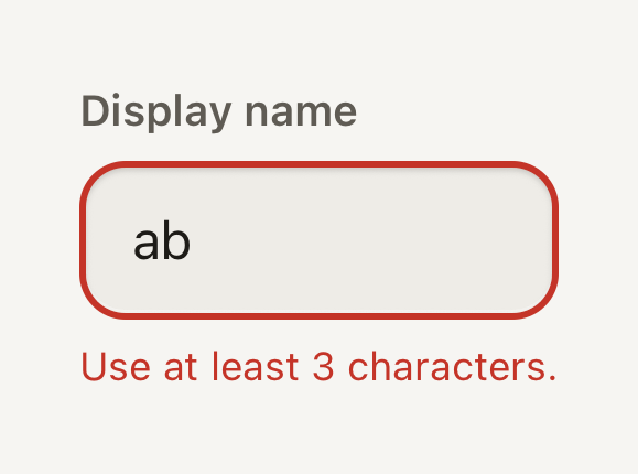
An invalid field draws a danger stroke and turns its message into an announced alert.
```tsx
import { Field, FieldMessage, Input, Label } from "@terratcg/ui";
import { useState } from "react";
export default function FieldInvalid() {
const [name, setName] = useState("ab");
return (
Use at least 3 characters.
);
}
```
### Disabled
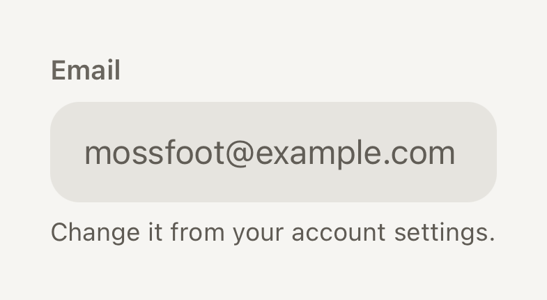
A disabled field keeps its label and value readable on a flat grey well that takes no input.
```tsx
import { Field, FieldMessage, Input, Label } from "@terratcg/ui";
export default function FieldDisabled() {
return (
Change it from your account settings.
);
}
```
## Props
### Field
### FieldProps
| Prop | Type | Description |
| ----------- | ----------- | ----------------------------------------------------------------------------------------------- |
| `invalid?` | `boolean` | Marks the field as failing validation: danger stroke and an announced message. Default: `false` |
| `disabled?` | `boolean` | Inactive: the input is not editable, the label stays readable. Default: `false` |
| `children?` | `ReactNode` | |
Field also accepts React Native's `View` props, such as `style` and `testID`. It stacks its children with a small gap and adds nothing else.
### Label
### LabelProps
| Prop | Type | Description |
| ---------- | ------------------------------------------------------------- | --------------------------------------------------------------------------------------------------------------- |
| `tone?` | `"accent" \| "danger" \| "default" \| "muted" \| "secondary"` | Semantic colour from the theme. Default: `"default"` |
| `weight?` | `"bold" \| "medium" \| "regular" \| "semibold"` | Overrides the variant's default weight (`label`, `title` and `headline` are heavier than `body` and `caption`). |
| `tabular?` | `boolean` | Tabular figures for counters and stats. Default: `false` |
Label also accepts React Native's `Text` props. It is always the `label` text role. Without a `tone`, it is `secondary`, or `muted` while the Field is disabled.
### FieldMessage
### FieldMessageProps
| Prop | Type | Description |
| ---------- | ------------------------------------------------------------- | --------------------------------------------------------------------------------------------------------------- |
| `tone?` | `"accent" \| "danger" \| "default" \| "muted" \| "secondary"` | Semantic colour from the theme. Default: `"default"` |
| `weight?` | `"bold" \| "medium" \| "regular" \| "semibold"` | Overrides the variant's default weight (`label`, `title` and `headline` are heavier than `body` and `caption`). |
| `tabular?` | `boolean` | Tabular figures for counters and stats. Default: `false` |
FieldMessage also accepts React Native's `Text` props. It is always the `caption` text role. Without a `tone`, it is `secondary`, or `danger` while the Field is invalid.
## Accessibility
- **Name:** a Label whose child is a plain string names the Input inside the same Field, from its first frame. With any other child, such as a Text with a link, the Label names nothing: pass `accessibilityLabel` to the Input yourself.
- **Error:** while the Field is invalid, FieldMessage takes the `alert` role so screen readers announce it, and the Input draws a danger stroke. The error never relies on colour alone: say what is wrong in the message.
- **Disabled:** the Input is not editable and exposes `accessibilityState.disabled`; the Label stays readable in a muted tone.
- **Larger text:** the label, the value and the message all scale with the system text size; the well grows taller with its text.
## Platform differences
- **iOS:** the Input is named through its `accessibilityLabel`, filled from the Label.
- **Android:** the Input also points at the Label with `accessibilityLabelledBy`, so TalkBack reads the visible label.
- **Web:** Field renders through react-native-web for these docs, but the web is not a supported target.
## Rules
- One Label, one Input and at most one FieldMessage per Field.
- Write the Label as a plain string so it names the Input. A placeholder is never the label.
- Use the FieldMessage for one hint or one error, not both: while invalid, replace the hint with what to fix.
- Validate on submit or on blur, then set `invalid`; don't flash an error while the user is still typing.
# Header bar
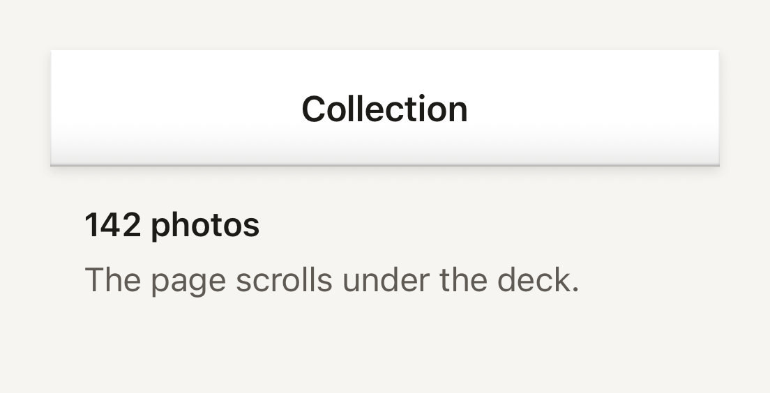
The plastic shell a navigator lays behind its native title and buttons. It is a surface slab over a hairline that casts its lift onto the page.
```tsx
import { HeaderBar, Text, useTheme } from "@terratcg/ui";
import { View } from "react-native";
const HEIGHT = 56;
export default function HeaderBarDeck() {
const theme = useTheme();
return (
Collection142 photosThe page scrolls under the deck.
);
}
```
## Import
```tsx
import { HeaderBar } from "@terratcg/ui";
```
## Usage
```tsx
,
}}
/>
```
HeaderBar draws only the deck: your navigator keeps its own native title, back button and actions on top. It is absolutely positioned at the top of its parent. Without `height` it fills that parent, which suits a navigator's header background slot; with `height` it hangs from the top at that height, for a header you lay over the page yourself.
The deck fills with the theme's `bar` colour and runs square across the screen, with only its outer corners following the device's rounded glass through `cornerRadius`. Along its page-facing bottom edge it shows a turned-under line, a hairline and the shadow it casts onto the page, the same edge a TabBar shows along its top.
## Examples
### Following the screen corners
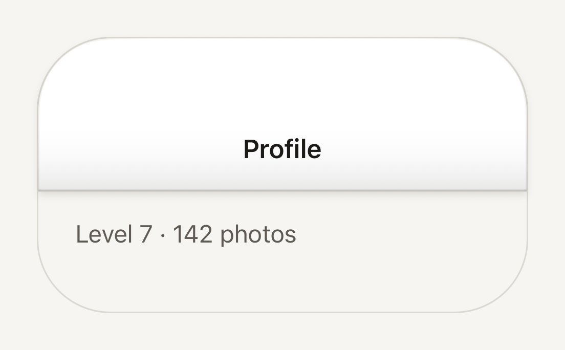
cornerRadius rounds the deck's top corners with the screen's continuous curve, so its edge follows the glass.
```tsx
import { HeaderBar, Text, useTheme } from "@terratcg/ui";
import { View } from "react-native";
const HEIGHT = 100;
const SCREEN_CORNER = 48;
export default function HeaderBarRounded() {
const theme = useTheme();
return (
ProfileLevel 7 · 142 photos
);
}
```
## Props
### HeaderBarProps
| Prop | Type | Description |
| --------------- | -------- | ----------------------------------------------------------------------------------------------------------------------------------------------------------------------------------------------------------------- |
| `height?` | `number` | Height of the deck, in points. Without it the deck fills its frame; with it the deck hangs from the top of the frame at that height, for a host that lays the bar over its page and knows how tall its header is. |
| `cornerRadius?` | `number` | Radius of the device's top screen corners, in points. The deck rounds its top corners to it so its edge follows the glass. Default: `0` |
HeaderBar also accepts React Native's `View` props, such as `style` and `testID`.
## Accessibility
- **Not announced:** HeaderBar holds no content and takes no touches (`pointerEvents="none"`). The navigator's title and buttons, drawn over it, carry the header's accessibility.
- **Colour:** the deck is the theme's `bar` colour; check the navigator's title colour against it when you customise the theme.
## Platform differences
- **iOS:** the top corners follow the screen with a continuous curve (`borderCurve: "continuous"`), the shape of the iPhone's glass.
- **Android:** `borderCurve` is ignored and the corners are circular arcs of the same radius.
- **Web:** HeaderBar renders through react-native-web for these docs, but the web is not a supported target.
## Rules
- Lay the HeaderBar over the page, not in a clipped frame, so its lift has room to fall.
- Leave the title and buttons to your navigator; don't draw them into the deck.
- Pass the device's screen corner radius to `cornerRadius` on a full-bleed header, and nothing on one that sits inside a sheet.
# Icon button
A square Button for a single icon, for actions that a glyph names on its own. It always carries an accessibility label.
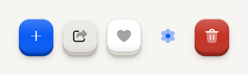
```tsx
import Add01Icon from "@hugeicons-pro/core-bulk-rounded/Add01Icon";
import Delete02Icon from "@hugeicons-pro/core-bulk-rounded/Delete02Icon";
import FavouriteIcon from "@hugeicons-pro/core-bulk-rounded/FavouriteIcon";
import Settings01Icon from "@hugeicons-pro/core-bulk-rounded/Settings01Icon";
import Share01Icon from "@hugeicons-pro/core-bulk-rounded/Share01Icon";
import { HugeiconsIcon } from "@hugeicons/react-native";
import { ButtonIcon, IconButton } from "@terratcg/ui";
import { View } from "react-native";
export default function IconButtonVariants() {
return (
{({ color, size }) => }{({ color, size }) => }{({ color, size }) => }{({ color, size }) => }{({ color, size }) => }
);
}
```
## Import
```tsx
import { ButtonIcon, IconButton } from "@terratcg/ui";
```
## Usage
```tsx
{({ color, size }) => }
```
IconButton is a [Button](/docs/button) with a square face: it takes the same variants, states and feedback, and only its sizes change. Hand it the icon through `ButtonIcon`, whose render function gives you the face's colour and the icon size. TerraUI ships no icons; bring your own.
## Examples
### Sizes
Small, default and large: 36, 44 and 52 point squares, the icon stepping up with the face.
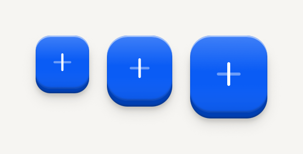
```tsx
import Add01Icon from "@hugeicons-pro/core-bulk-rounded/Add01Icon";
import { HugeiconsIcon } from "@hugeicons/react-native";
import { ButtonIcon, IconButton } from "@terratcg/ui";
import { View } from "react-native";
export default function IconButtonSizes() {
return (
{({ color, size }) => }{({ color, size }) => }{({ color, size }) => }
);
}
```
### States
Loading swaps the icon for a spinner at the same size; disabled is molded flat; selected sits pressed in its well.
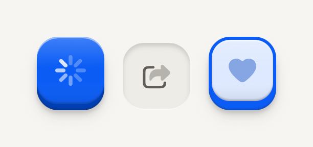
```tsx
import FavouriteIcon from "@hugeicons-pro/core-bulk-rounded/FavouriteIcon";
import Share01Icon from "@hugeicons-pro/core-bulk-rounded/Share01Icon";
import { HugeiconsIcon } from "@hugeicons/react-native";
import { ButtonIcon, IconButton } from "@terratcg/ui";
import { View } from "react-native";
export default function IconButtonStates() {
return (
{({ color, size }) => }{({ color, size }) => }{({ color, size }) => }
);
}
```
## Props
### IconButtonProps
| Prop | Type | Description |
| -------------------- | ------------------------------------------------------------------- | -------------------------------------------------------------------------------------------------------------------------------------------------------------------------------------------------------------------------------------------------------------------------------------------------- |
| `size?` | `"default" \| "lg" \| "sm"` | A square face 36 (`sm`), 44 (`default`) or 52 (`lg`) points across. Default: `"default"` |
| `accessibilityLabel` | `string` | Required: an icon-only control has no visible label to announce. |
| `variant?` | `"default" \| "destructive" \| "ghost" \| "outline" \| "secondary"` | The key's look and weight: one `default` key per view, `secondary`, `outline` and `ghost` for the actions around it, `destructive` for what can't be undone. Default: `"default"` |
| `disabled?` | `boolean` | Inactive: readable, flat, no action and no feedback. Default: `false` |
| `loading?` | `boolean` | Busy: keeps its size, shows a spinner over the label, blocks activation and exposes accessibilityState.busy. The host owns the operation. Default: `false` |
| `selected?` | `boolean` | Selection cue (border, marker, weight) plus accessibilityState.selected. Omit for plain actions. |
| `tint?` | `string` | A hue the selection wears instead of the accent, for a choice that owns a colour (a label or a category): selected, the face is washed in it and its border and edge take it, with no leading marker: the hue is the cue. The label stays in ink. Ignored on the default and destructive variants. |
| `block?` | `boolean` | Fill the parent's cross axis (alignSelf "stretch") instead of hugging the label. For stacked full-width actions such as a notice's column. Default: `false` |
| `children?` | `React.ReactNode` | Compose ButtonText, ButtonIcon or host nodes. |
| `style?` | `StyleProp` | Outer style: layout, margins, width. Face colors come from variant and theme. |
IconButton also accepts React Native's `Pressable` props, such as `hitSlop` and `testID`. `size` maps to Button's square sizes: `sm` is `icon-sm`, `default` is `icon` and `lg` is `icon-lg`. `selected` and `tint` work together as on [Button](/docs/button#props).
## Accessibility
- **Role:** `button`, with `accessibilityState` keeping `disabled`, `busy` (while `loading`) and `selected` in sync, as on Button.
- **Label:** `accessibilityLabel` is required: the face shows no text, so the label is the only name a screen reader has. Name the action ("Share card"), not the glyph ("Arrow").
- **Touch target:** at least 44 pt on iOS and 48 dp on Android. The 36 pt `sm` face keeps its size and grows its touch area with `hitSlop`.
- **Reduce Motion:** the face no longer travels when pressed; the press tint stays.
## Platform differences
- **iOS and Android:** the same square key and the same travel, with no ripple. Only the minimum touch target differs: 44 pt on iOS, 48 dp on Android.
- **Feedback:** a press calls ThemeProvider's `feedback` handler with `"press"`, or `"select"` when `selected` is set. TerraUI plays no haptic or sound itself.
- **Web:** IconButton renders through react-native-web for these docs, but the web is not a supported target.
## Rules
- Use an IconButton only when the icon is unmistakable on its own; otherwise use a Button with a ButtonText.
- Always pass `accessibilityLabel`, and keep it in step with what the icon means.
- Put one icon inside `ButtonIcon`, and draw it with the colour and size the render function hands you.
- Use `onPress`, never `onClick`, and style props, never `className`.
- `loading` is yours to clear: the key stays busy until you set it back to `false`.
# Getting started
Install @terratcg/ui, mount ThemeProvider and OverlayHost once at the root, and press your first Button.
## Install
```sh
npm install @terratcg/ui react-native-screens
```
TerraUI runs on plain React Native for iOS and Android, with or without Expo. Its peers are React, React Native and react-native-screens; only the overlay layer (Dialogs, Menus and toasts) uses Screens. The supported versions are on [Compatibility](/docs/compatibility).
## Set up
Mount one `ThemeProvider` and one `OverlayHost` at the root of your app:
```tsx
import { Button, ButtonText, OverlayHost, ThemeProvider, defaultDark, defaultLight, showDialog } from "@terratcg/ui";
import { useColorScheme } from "react-native";
export function App() {
const dark = useColorScheme() === "dark";
return (
);
}
```
- **`ThemeProvider`** gives every component its theme, and your feedback handler if you have one. Without a provider, components fall back to `defaultLight`. See [ThemeProvider and feedback](/docs/theme-provider).
- **`OverlayHost`** draws the Dialogs, Menus and toasts that `showDialog`, `showMenu` and `showToast` open from anywhere. Put it after your navigator, inside `ThemeProvider`. See [OverlayHost](/docs/overlay-host).
To match your brand, start from the default theme and override a few tokens with `createTheme`: see [Theming](/docs/theming).
## React Native rules
TerraUI is React Native for iOS and Android, not web React. Follow these rules before writing code with it:
- **Versions:** `react ~19.3.0`, `react-native ~0.88.0` and `react-native-screens ~4.30.0`. Expo is optional.
- **Style props, not `className`:** style through each component's props and React Native's `style` prop. There is no CSS and no class name.
- **`onPress`, not `onClick`:** every pressable control takes `onPress`.
- **Text inside text components:** put every string inside a text component, such as `ButtonText`, `Text`, `RowTitle` or `NoticeTitle`. A bare string inside a `Button` or a `View` does not render.
- **One `ThemeProvider`, one `OverlayHost`:** mount each once, at the root of the app, with `OverlayHost` inside `ThemeProvider` and after your navigator. Dialogs, menus and toasts open through them, from anywhere.
- **Native first:** import from `@terratcg/ui`, never a web component library. Haptics, sounds, icons and navigation stay in your app.
## Imports
Import everything from the root, or one family from its subpath:
```tsx
import { Button, ButtonText } from "@terratcg/ui";
import { Switch } from "@terratcg/ui/switch";
```
Both resolve to the same modules. Anything not listed in the package's `exports` is internal and may change in any release.
## Docs for coding agents
The package carries these docs as Markdown, in the version you installed, at `node_modules/@terratcg/ui/docs/`. `index.md` there opens with the rules above and lists every page.
### AGENTS.md
Paste this section into your project's `AGENTS.md` (or `CLAUDE.md`), so coding agents read the installed docs and the rules before writing TerraUI code:
```md
## TerraUI
This project uses TerraUI (`@terratcg/ui`). Its docs, for the version installed here, are Markdown files in `node_modules/@terratcg/ui/docs/`. Read `index.md` there first, then the page of every component you use, and trust them over what you remember.
TerraUI is React Native for iOS and Android, not web React. Follow these rules before writing code with it:
- **Versions:** `react ~19.3.0`, `react-native ~0.88.0` and `react-native-screens ~4.30.0`. Expo is optional.
- **Style props, not `className`:** style through each component's props and React Native's `style` prop. There is no CSS and no class name.
- **`onPress`, not `onClick`:** every pressable control takes `onPress`.
- **Text inside text components:** put every string inside a text component, such as `ButtonText`, `Text`, `RowTitle` or `NoticeTitle`. A bare string inside a `Button` or a `View` does not render.
- **One `ThemeProvider`, one `OverlayHost`:** mount each once, at the root of the app, with `OverlayHost` inside `ThemeProvider` and after your navigator. Dialogs, menus and toasts open through them, from anywhere.
- **Native first:** import from `@terratcg/ui`, never a web component library. Haptics, sounds, icons and navigation stay in your app.
```
### On the site
Every page is also Markdown: append `.md` to its URL, such as [/docs/button.md](/docs/button.md). [llms.txt](/llms.txt) lists every page and opens with the rules above; [llms-full.txt](/llms-full.txt) holds every page in full. Each page's actions copy its Markdown or open it in ChatGPT, Claude or Cursor.
# Input
A native text input in a recessed well. It is a plain React Native TextInput, with the value, keyboard and events left to the platform.
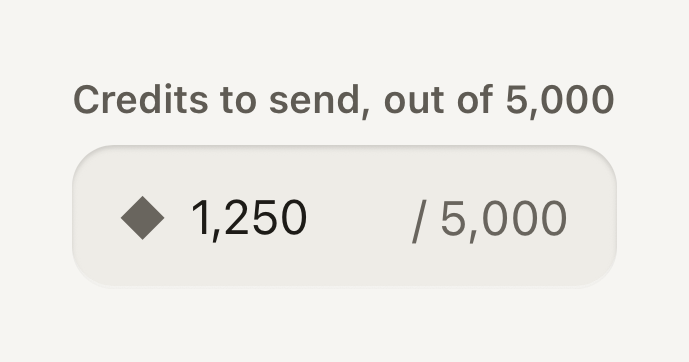
```tsx
import { Field, Input, Label, Text } from "@terratcg/ui";
import { useState } from "react";
export default function InputAdornments() {
const [amount, setAmount] = useState("1,250");
return (
◆}
endAdornment="/ 5,000"
/>
);
}
```
## Import
```tsx
import { Input } from "@terratcg/ui";
```
## Usage
```tsx
```
Put an Input in a [Field](/docs/field): the Field's Label names it and its state reaches it. Everything else is React Native's `TextInput`: `value`, `onChangeText`, `keyboardType`, `secureTextEntry`, `returnKeyType`, `onSubmitEditing` and the ref work as usual. Use `disabled` instead of `editable`.
## Examples
### End slot
Controls at the end of the well stay tappable and reach the screen reader, so they name themselves.
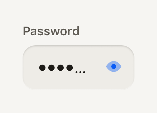
```tsx
import ViewIcon from "@hugeicons-pro/core-bulk-rounded/ViewIcon";
import ViewOffIcon from "@hugeicons-pro/core-bulk-rounded/ViewOffIcon";
import { HugeiconsIcon } from "@hugeicons/react-native";
import { ButtonIcon, Field, IconButton, Input, Label } from "@terratcg/ui";
import { useState } from "react";
export default function InputEndSlot() {
const [password, setPassword] = useState("tidepool");
const [shown, setShown] = useState(false);
return (
setShown((value) => !value)}
>
{({ color, size }) => }
}
/>
);
}
```
### Without a Field
Standing alone, an Input needs its own accessibility label; a placeholder is not a label.
```tsx
import { Input } from "@terratcg/ui";
import { useState } from "react";
export default function InputStandalone() {
const [name, setName] = useState("");
return (
);
}
```
## Props
### InputProps
| Prop | Type | Description |
| ----------------- | ---------------------- | ------------------------------------------------------------------------------------------------------------------------------------------------------------------------------------------------------------------------------------------------------------------------ |
| `invalid?` | `boolean` | Failing validation: danger stroke. Inherited from the enclosing Field. |
| `disabled?` | `boolean` | Inactive: flat readable well, not editable. Inherited from the enclosing Field. |
| `startAdornment?` | `ReactNode` | A mark at the start of the well (the currency an amount is in), never covered by the value. Visual only, like the end adornment. |
| `endAdornment?` | `string` | Quiet text at the end of the well ("/ 5,000" after an amount), never covered by the value. Visual only: say the same in the label or hint for screen readers. |
| `endSlot?` | `ReactNode` | Controls at the end of the well (a clear key), never covering the value. Unlike the adornments they stay tappable and reach the screen reader, so they name themselves. Pass `null` while there is nothing to show: the wrapper stays and the text view keeps its focus. |
| `containerStyle?` | `StyleProp` | Lays out the wrapper an adorned well sits in (flex, margins), where `style` still styles the well itself. A well without an adornment has no wrapper: its `style` lays it out. |
Input also accepts React Native's `TextInput` props except `editable`. `style` styles the well itself; once the Input has an adornment or an `endSlot`, it sits in a wrapper that `containerStyle` lays out. Pass `endSlot={null}` while there is nothing to show, so the wrapper stays and the text keeps its focus when the slot comes back.
## Accessibility
- **Name:** inside a Field, the Label names the Input. Standing alone, pass `accessibilityLabel`: a placeholder disappears as soon as there is text.
- **State:** `accessibilityState.disabled` follows `disabled`; your own `accessibilityState` is merged on top.
- **Focus:** a 2 point accent stroke shows focus, and a danger stroke shows an invalid value. The text never moves when the stroke appears.
- **Adornments:** `startAdornment` and `endAdornment` are visual only and hidden from screen readers. Say the same thing in the label or the hint ("Credits to send, out of 5,000").
- **End slot:** its controls stay tappable and reach the screen reader, so give each one its own `accessibilityLabel`.
- **Larger text:** the value scales with the system text size and the well grows taller from its 48 point minimum.
## Platform differences
- **Keyboard and text:** the keyboard, autofill, autocorrect, the secure-entry dots and the selection handles are each platform's own.
- **Labelling:** on Android the Input also points at its Label through `accessibilityLabelledBy`.
- **Web:** Input renders through react-native-web for these docs, but the web is not a supported target.
## Rules
- Keep it controlled: pass `value` and `onChangeText`, and own validation in your screen.
- Use `disabled`, never `editable={false}`, so the well and the accessibility state follow. A disabled Input keeps the flat disabled grey, with no recess.
- Never use the placeholder as the label; it is an example of the value, at most.
- Use an adornment for a unit or a limit, and the end slot for a control. Never put a control in an adornment: it can't be tapped.
- For search, use [Search field](/docs/search-field) instead of building the magnifier and clear key yourself.
# Licence
TerraUI is proprietary and free to use, commercial apps included. You may not modify, redistribute or resell it.
`@terratcg/ui` is proprietary software. It is free to use but not open source. The full terms ship with the package, in `LICENSE.md`. They are a draft until a lawyer reviews them, before the first publication on npm, and may change until then.
## What you may do
- Install the package and use it free of charge in your own apps, commercial ones included.
- Ship those apps to their users with TerraUI compiled into them.
## What you may not do
- Modify the package, or distribute modified copies of it.
- Redistribute, sublicense, sell or resell the package, on its own or inside another package, outside an app that uses it.
- Publish a component library, design system or similar product derived from TerraUI, its components or its documentation.
## No warranty
The package is provided as is, without warranty of any kind. The authors are not liable for any claim or damage arising from it or its use.
## Future versions
The terms apply to the version they ship with. A future version may come with different terms; read its `LICENSE.md` when you upgrade.
# Material
TerraUI's controls are molded plastic lit from above. Raised keys travel onto their edge, surfaces are shells, and wells are cut into them.
Every TerraUI component is cut from one material: molded plastic under a single light above the screen. Three treatments come from it. A **key** is raised and acts, a **shell** holds content, and a **well** is cut into a shell. Each one is box shadows and a gradient, so it looks the same on iOS and Android and never animates on its own.
## Keys
A key is every raised control face: Button, IconButton, Shutter, the Switch key and the tab bar's central action.
- **Face over edge:** a softly domed face sits on a visible lower edge in a darker tone of its colour (`accentEdge` under `accent`). The edge is `depth.travel` deep, 4 pt by default, or `depth.travelSm`, 3 pt, on a small key.
- **Light:** a rim light runs along the top (`depth.highlight`), a sheen falls down the face (`depth.sheen`) and a shade sits where the face turns under (`depth.shade`). Round faces, the Shutter and the tab bar's action, catch the light in a spot near the top instead.
- **Seated on the shell:** a short contact shadow under the edge (`depth.contact`) and a soft halo on the shell around its base (`depth.halo`).
### Press
Pressing travels the face down onto its edge in `motion.pressIn` (70 ms) and lays `colors.pressTint` over it. Releasing relaxes it back in `motion.pressOut` (160 ms). The press is the feedback: no ripple, no scale and no glow.
A key whose face is smaller than the platform's touch minimum, 44 pt on iOS and 48 dp on Android, keeps its face and grows its touch area around it.
### Flat faces
A `ghost` Button has no edge: it is a matte face that tints when pressed and never travels. Use it for actions that should read as links.
## Shells
A shell is a content surface resting on the page: Card, Notice, Stat, Task, a raised Cell, the tab bar deck and the header bar.
- **Lift:** a shallow shadow seats it on the page (`depth.surface`).
- **Rims:** a 1 pt rim light inside the top edge, a sheen from lit to clear across the top, and a 1 pt turned-under line inside the bottom edge (`depth.shell.rim`).
- **Light and dark:** in light, the lower half also falls into a faint shade (`depth.shell.shade`), because a white shell cannot get lighter. In dark, the rim light carries it alone.
- **Stacking:** a shell resting on another shell (a Notice in a Card, a Cell in a panel) takes the shallower `depth.surfaceNested` lift, so the two read as one molded part. Keys keep their full edge and halo wherever they sit.
- **Bars:** the header bar is a shell hung from the top, casting its lift down. The tab bar deck casts its lift upward onto the page.
## Wells
A well is the inverse of a key: a recess cut into the shell. It holds the Progress track, an empty Cell, an Input, a selected tab and a disabled Button.
- **Lips:** the upper lip casts a shadow down into the recess (`depth.recess`) and the lower lip catches a line of light (`depth.lip`).
- **Floor:** `colors.surfaceMuted`. In dark it sits below `surface`, never beside it, so the recess reads as lower.
- **Inputs:** an Input is a well sunk half as deep. It shows no stroke at rest; focus and error draw a 2 pt stroke.
## Material helpers
For a surface of your own, take the material from the theme instead of drawing shadows by hand. Each helper takes the theme from `useTheme()` and returns style to spread on a `View`:
- `recessedWell(theme, { softLip, depth })`: a well's lips as inset shadows. `softLip` keeps a quarter of the lower lip's light, for a well on a coloured or living ground; `depth` scales how far it sinks (1 by default).
- `wellSurface(theme)`: a full well, the `surfaceMuted` floor plus `recessedWell`. The shape and padding stay yours.
- `discLift(theme)`: the contact shadow of a key, for a small object resting on a surface, such as an avatar disc.
- `surfaceLift(theme)`: a shell's lift, for a floating panel such as a callout.
```tsx
const theme = useTheme();
```
## States
One grammar covers every control:
- **Pressed:** travel plus tint, as above.
- **Selected:** a 2 pt accent border, the soft accent fill, and a marker and bolder label in `onAccentSoft`. Selection reads through shape and label, never through colour alone.
- **Disabled reads recessed:** a disabled key sinks into the shell as a well, with the `surfaceMuted` floor, no edge and no action. Raised means it acts and recessed means it does not, so a grey `secondary` key and a disabled one never look alike. Its label stays readable (`onDisabled`).
- **Loading:** the key keeps its size, shows a Spinner in its label's colour over its hidden label, stops acting and reports itself busy.
- **Error:** shown next to the control that caused it, without discarding what the user entered.
## Reduce Motion
TerraUI follows the system Reduce Motion setting live, through `useReducedMotion`. When it is on:
- keys no longer travel, but keep their edge and their press tint, so the pressed state stays legible;
- springs jump to their end, such as a Progress fill or a Switch key;
- decorative motion stops, such as the busy wave along a Switch's grip bars.
Your own animated components can read the same setting with `useReducedMotion()`.
## Rules
- Let the material carry depth. Don't add borders, glows or extra shadows to TerraUI surfaces.
- Keep physical depth on controls. Content surfaces stay shallow.
- Keep coloured glows off chrome: shells and keys cast neutral shadows.
- Never fake a key with a `View` and a shadow. Use a Button, which brings the travel, the tint, the touch target and the accessibility state.
- Tune the material through `depth` in your theme, not with styles on each component. See [Theming](/docs/theming#advanced-depth).
# Menu
A popover of actions or choices beside the control that opened it. Open one from anywhere with showMenu.
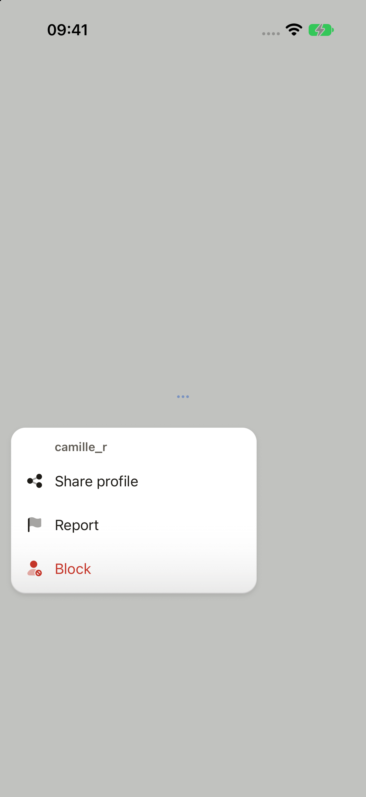
_iOS and Android only: no web preview._
```tsx
import Flag02Icon from "@hugeicons-pro/core-bulk-rounded/Flag02Icon";
import MoreHorizontalIcon from "@hugeicons-pro/core-bulk-rounded/MoreHorizontalIcon";
import Share08Icon from "@hugeicons-pro/core-bulk-rounded/Share08Icon";
import UserBlock01Icon from "@hugeicons-pro/core-bulk-rounded/UserBlock01Icon";
import { HugeiconsIcon, type IconSvgElement } from "@hugeicons/react-native";
import { Button, ButtonIcon, showDialog, showMenu, type ButtonIconProps, type OverlayTrigger } from "@terratcg/ui";
import { useRef, type RefObject } from "react";
import type { ViewInstance } from "react-native";
function icon(svg: IconSvgElement): ButtonIconProps["children"] {
return function SlotIcon({ color, size }) {
return ;
};
}
function openPersonMenu(trigger: RefObject) {
void showMenu(trigger, {
title: "camille_r",
items: [
{ label: "Share profile", icon: icon(Share08Icon), onSelect: () => {} },
{ label: "Report", icon: icon(Flag02Icon), onSelect: () => {} },
{
label: "Block",
icon: icon(UserBlock01Icon),
destructive: true,
onSelect: ({ trigger: from }) =>
void showDialog({
tone: "destructive",
title: "Block camille_r?",
body: "They can't message you or see your library.",
cancel: "Cancel",
confirm: "Block",
icon: icon(UserBlock01Icon),
trigger: from,
}),
},
],
});
}
export default function MenuActions({ capture }: SceneProps) {
const trigger = useRef(null);
return (
);
}
```
## Import
```tsx
import { showMenu } from "@terratcg/ui";
```
## Usage
```tsx
const trigger = useRef(null);
const openMenu = () =>
showMenu(trigger, {
title: "camille_r",
items: [
{ label: "Share profile", onSelect: share },
{ label: "Block", destructive: true, onSelect: ({ trigger }) => confirmBlock(trigger) },
],
});
;
```
Menus appear in the `OverlayHost`, which you mount once at the root inside `ThemeProvider`. `showMenu` measures `trigger` and opens beside it, aligned to its trailing edge: below it, or above when there is no room. It closes on a pick, an outside tap or Back, and runs the picked item's `onSelect` only once it has left the screen, so `onSelect` may navigate or open a Dialog. Inside a native sheet, wrap the sheet's content in `SheetOrigin` so the menu opens in the sheet.
The plate stays on screen. A small title names what the menu acts on, and the items' text lines up with it. A `destructive` item is drawn in the danger colour, and the current choice of a value menu wears an accent dot and a bold label. There is no Cancel item: an outside tap or Back closes the menu.
## Examples
### Picking a value
Mark the current choice selected: it takes the dot and a bold label.
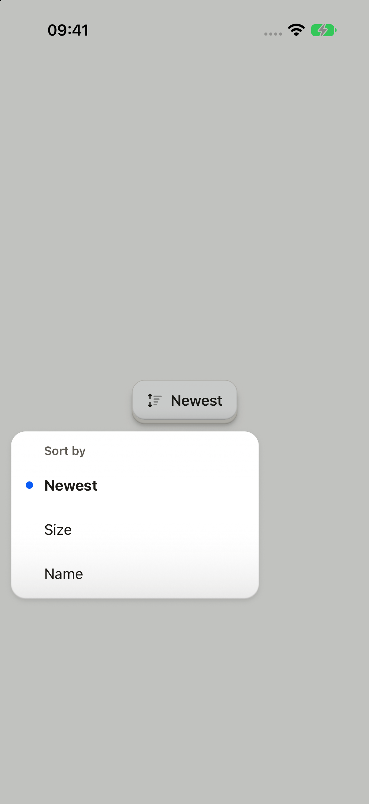
_iOS and Android only: no web preview._
```tsx
import Sorting05Icon from "@hugeicons-pro/core-bulk-rounded/Sorting05Icon";
import { HugeiconsIcon } from "@hugeicons/react-native";
import { Button, ButtonIcon, ButtonText, showMenu } from "@terratcg/ui";
import { useRef, useState } from "react";
import type { ViewInstance } from "react-native";
const SORTS = ["Newest", "Size", "Name"] as const;
export default function MenuPicker({ capture }: SceneProps) {
const trigger = useRef(null);
const [sort, setSort] = useState<(typeof SORTS)[number]>("Newest");
const open = () =>
void showMenu(trigger, {
title: "Sort by",
items: SORTS.map((label) => ({ label, selected: label === sort, onSelect: () => setSort(label) })),
});
return (
);
}
```
## Props
### showMenu
### MenuSpec
| Prop | Type | Description |
| ------- | --------------------- | --------------------------------------------------------------- |
| `title` | `string` | What the menu is about: a person's name, "Sort by". |
| `items` | `readonly MenuItem[]` | The actions or values, in order. Put a destructive action last. |
### MenuItem
### MenuItem
| Prop | Type | Description |
| -------------- | ---------------------------------------------------------------- | -------------------------------------------------------------------------------------------------------------------------------------------------------- |
| `label` | `string` | What the item does, or the value it picks. |
| `icon?` | `((slot: ButtonIconSlot) => React.ReactNode) \| React.ReactNode` | Leading icon, in the item's colour. A Dialog opened from the item repeats it on its confirm key. |
| `destructive?` | `boolean` | Red. Confirm it with a Dialog from `onSelect`. |
| `selected?` | `boolean` | The current choice of a menu that picks a value. |
| `onSelect` | `(pick: MenuPick) => void` | Runs once the menu has left the screen, so it may navigate or open a Dialog. A Dialog it opens takes `trigger` to hand focus back to the Menu's trigger. |
### MenuPick
What an item's `onSelect` receives.
### MenuPick
What a picked item's `onSelect` receives.
| Prop | Type | Description |
| --------- | ----------------------------------- | ----------------------------------------------------------------------------- |
| `trigger` | `RefObject` | The Menu's trigger: pass it as a Dialog's `trigger` so focus goes back there. |
## Accessibility
- **Roles:** the plate is a `menu`, each item a `menuitem`, and the current choice has the `selected` state. Item icons are hidden from screen readers.
- **Focus:** once the menu is placed, screen-reader focus moves to its title, which has the `header` role. When it closes, focus goes back to the trigger before `onSelect` runs.
- **Modal:** the menu is a modal layer; the escape gesture closes it.
- **Larger text:** labels wrap instead of truncating, and the menu flips above its trigger when the taller plate doesn't fit below.
- **Reduce Motion:** the plate fades in without scaling.
## Platform differences
- **iOS:** the menu sits in a full-window overlay, above native sheets.
- **Android:** the menu is a transparent `Modal`, so Back closes it, and it is placed from the trigger's page coordinates.
- **Feedback:** a pick calls ThemeProvider's `feedback` handler with `"press"`. The keyboard is dismissed before the menu opens.
- **Queue:** a Menu waits behind a Dialog that is up, and a second `showMenu` while one is open does nothing.
- **No web tab:** a live Menu shares the Dialog's overlay layer, which on a desktop browser covers the whole page because nothing caps its width yet. Until it gets a width cap (#702), this page shows only the iOS and Android captures.
## Rules
- Title the menu with what it is about: a person's name, "Sort by".
- Keep items to short verbs or values. A menu that picks a value marks the current one `selected`.
- Put a destructive item last, and confirm it with a Dialog from `onSelect`, passing on its `trigger`.
- Give an icon to every item or to none.
- Open a menu from a control the user pressed, never on its own.
# Notice
Empty, error and informational states composed from an icon, a title, a description and actions. InlineNotice is the one-line status beside content.
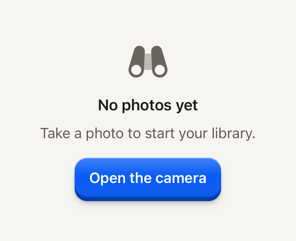
```tsx
import BinocularsIcon from "@hugeicons-pro/core-bulk-rounded/BinocularsIcon";
import { HugeiconsIcon } from "@hugeicons/react-native";
import { Button, ButtonText, Notice, NoticeActions, NoticeDescription, NoticeIcon, NoticeTitle } from "@terratcg/ui";
export default function NoticeEmptyState() {
return (
{({ color, size }) => }No photos yetTake a photo to start your library.
);
}
```
## Import
```tsx
import { InlineNotice, Notice, NoticeActions, NoticeDescription, NoticeIcon, NoticeTitle } from "@terratcg/ui";
```
## Usage
```tsx
No photos yetTake a photo to start your library.
```
Compose a Notice from the parts you need: each one is optional. The parts read their tone, alignment and layout from the Notice they sit in. `layout="screen"` makes the Notice the whole screen's state: it fills its parent (`flex: 1`), centres on the bare ground, sets the title as a headline and stacks the actions in a column. Give each Button `block` there.
## Examples
### Error
The danger tone frames the notice in the danger palette, and its title is announced as an alert.
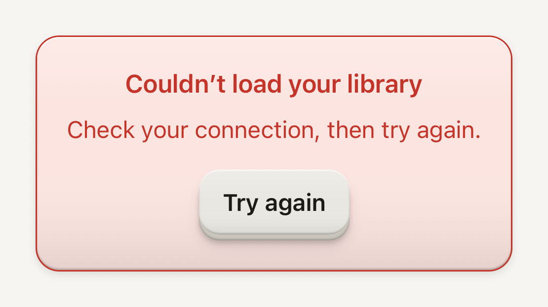
```tsx
import { Button, ButtonText, Notice, NoticeActions, NoticeDescription, NoticeTitle } from "@terratcg/ui";
export default function NoticeError() {
return (
Couldn’t load your libraryCheck your connection, then try again.
);
}
```
### Framed banner
framed puts the copy on a bordered surface; align="start" leads it like a banner in a page's flow.
```tsx
import { Notice, NoticeDescription, NoticeTitle } from "@terratcg/ui";
export default function NoticeBanner() {
return (
Season 3 starts MondayYour progress carries over. New challenges unlock at midnight.
);
}
```
### Inline notice
InlineNotice is one line of status on a soft tint, next to the content it describes.
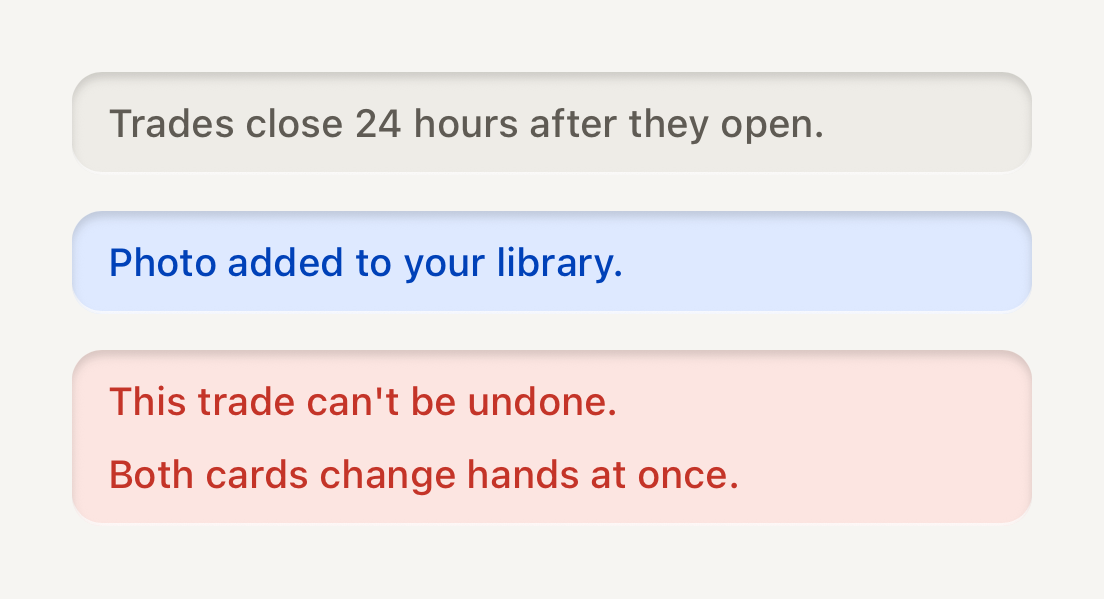
```tsx
import { InlineNotice } from "@terratcg/ui";
import { View } from "react-native";
export default function NoticeInline() {
return (
Trades close 24 hours after they open.Photo added to your library.{["This trade can't be undone.", "Both cards change hands at once."]}
);
}
```
## Props
### Notice
### NoticeProps
| Prop | Type | Description |
| --------- | ----------------------- | ----------------------------------------------------------------------------------------------------- |
| `tone?` | `"danger" \| "default"` | "danger" presents an error with the danger palette; inline it is always framed. Default: `"default"` |
| `framed?` | `boolean` | Draw on a bordered surface (a quiet banner) instead of the bare ground. Inline only. Default: `false` |
| `align?` | `"center" \| "start"` | Center the copy (empty states) or lead it (inline banners). Default: `"center"` |
| `layout?` | `"inline" \| "screen"` | Inline block or a full-screen state that replaces the screen. Default: `"inline"` |
Notice also accepts React Native's `View` props. A `danger` Notice is always framed inline; on a screen Notice, `framed` does nothing.
### NoticeIcon
### NoticeIconProps
| Prop | Type | Description |
| ---------- | ---------------------------------------------------- | ------------------------------------------------------------------------- |
| `size?` | `number` | Icon box size in points. Default: `48` |
| `children` | `((slot: NoticeIconSlot) => ReactNode) \| ReactNode` | A host icon node, or a render function receiving the slot color and size. |
The render function receives the slot's colour: the muted ink, or the danger colour on a `danger` Notice. TerraUI ships no icons.
### NoticeTitle, NoticeDescription and NoticeActions
NoticeTitle and NoticeDescription take TerraUI's `Text` props except `variant`, which the Notice decides. NoticeActions takes `View` props: it is a wrapping row inline and a column on a screen Notice.
### InlineNotice
### InlineNoticeProps
| Prop | Type | Description |
| ---------- | ------------------------------------ | --------------------------------------------------------------------------------------------------------------------- |
| `tone?` | `"danger" \| "default" \| "success"` | "danger" is announced as an alert; the others are polite live text. Default: `"default"` |
| `icon?` | `ReactNode` | Host icon node placed before the text. |
| `children` | `string \| readonly string[]` | The message, or a few short lines of it (a list of consequences), set one under the other with the icon on the first. |
InlineNotice is a well cut into its surface, not a raised shell. It also accepts React Native's `View` props.
## Accessibility
- **Live region:** a screen Notice is a polite live region, and a `danger` one is also an `alert`. Inline, the `danger` NoticeTitle is the alert.
- **Headings:** the title of a screen Notice has the `header` role, so it is where a screen reader lands.
- **InlineNotice:** one accessible element, read as polite live text; the `danger` tone is announced as an alert. The icon is decorative.
- **Larger text:** the copy wraps; a screen Notice keeps a readable measure of 400 pt on wide screens.
## Platform differences
- **iOS and Android:** the same layout, roles and live region. Notice plays no feedback: it has no press of its own.
- **Web:** Notice renders through react-native-web for these docs, but the web is not a supported target.
## Rules
- Title the state, not the screen: "No photos yet", not "Photos".
- Give an empty state the one action that fills it, and an error the action that retries.
- Keep a Notice to a short title and a sentence or two. Long copy belongs on a page.
- Use InlineNotice for one line of status beside the content it describes, not for a state that replaces a screen.
- Keep `danger` for errors. An empty state is not a failure, so it stays on the default tone.
# OverlayHost
The one layer where every Dialog, Menu and toast appears, above native sheets. Mount it once at the root; open overlays from anywhere.
## Usage
Mount one `OverlayHost` at the root of your app, after your navigator and inside `ThemeProvider`:
```tsx
import { OverlayHost, ThemeProvider, type Theme } from "@terratcg/ui";
import { useSafeAreaInsets } from "react-native-safe-area-context";
export function Root({ theme }: { theme: Theme }) {
const insets = useSafeAreaInsets();
return (
);
}
```
Then open overlays from anywhere, like `Alert.alert`, with no state or component of your own:
```tsx
const left = await showDialog({
title: "Leave the call?",
body: "The others stay connected.",
confirm: "Leave",
cancel: "Stay",
tone: "destructive",
});
if (left) navigation.goBack();
```
`showDialog`, `showMenu`, `showToast` and `showTopToast` queue their overlay for the host. Each component's page covers its options.
## Props
### OverlayHostProps
| Prop | Type | Description |
| ---------------- | -------------------------------------------------------------------------------- | ----------------------------------------------------------------------------------------------------------------------------------------------- |
| `theme?` | `Theme` | The overlays' theme, for a host whose screen in front wears another one. The surrounding theme by default. |
| `confirmIcon?` | `((slot: ButtonIconSlot) => ReactNode) \| ReactNode` | The confirm key's default icon: primary keys carry one. |
| `failureText` | `string` | The sentence a Dialog shows when its action rejects, in the user's language. The error's own text is never shown: it is written for developers. |
| `onFailure?` | `((error: unknown) => string \| undefined \| void)` | Hears every rejected Dialog action, where the host reports it. May return a sentence to show instead of `failureText`. |
| `insets?` | `SafeInsets` | The window's safe area: what a menu keeps clear of. |
| `holdToasts?` | `boolean` | Holds toasts while the app needs the screen to itself. Blocking overlays hold them on their own. |
| `toastInsetTop?` | `number` | How far toasts sit from the top of the window: the host's safe area. |
| `toastIcons?` | `Partial ReactNode) \| ReactNode>>` | Each toast tone's glyph. |
## What the host does
- **Above everything:** Dialogs and Menus are drawn in a `FullWindowOverlay` on iOS and a transparent `Modal` on Android, so they cover native sheets and headers. The layer is mounted only while something shows.
- **One at a time:** Dialogs and Menus wait their turn. Opening a Dialog dismisses the keyboard.
- **Toasts:** one queue at the top of the window, one toast at a time. Toasts wait while a Dialog or Menu is up, or while `holdToasts` is set; one already in view steps aside and comes back with its whole time.
- **Failures:** when a Dialog's `onConfirm` rejects, the Dialog stays open and shows `failureText`, a sentence in the user's language. The error's own message is written for developers and never shown. `onFailure` hears every rejection, where you report it, and may return a sentence to show instead.
- **Theme and feedback:** overlays wear the surrounding theme, or the host's `theme` when the screen in front wears another one. Their keys report to the surrounding `feedback` handler.
- **Knowing one is up:** `useOverlayUp()` is `true` while a Dialog or Menu is up anywhere, the same signal that holds toasts. Use it to wait before showing something of your own, such as a system prompt.
- **Closing everything:** `dismissOverlays()` closes every open and queued overlay as if the user had backed out. Call it when a session ends or a screen that owns a pending action goes away.
## Accessibility
- **Focus:** screen-reader focus moves to a Dialog's or Menu's title when it opens. Pass the control that opened it as `trigger`, and focus returns there when it closes.
- **Back:** Android Back cancels the Dialog or closes the Menu in front.
- **Toasts:** announced once when they first show. They never take screen-reader focus or block touches around their card.
## Platform differences
- **iOS:** the layer is a `FullWindowOverlay` from react-native-screens. In a native sheet, wrap the sheet's content in `SheetOrigin` so a Menu is placed next to its trigger: iOS measures inside a sheet from the sheet's top.
- **Android:** the layer is a transparent `Modal` that brings Back and focus with it. `SheetOrigin` is a plain view there.
- **Tests:** in Jest, mock `FullWindowOverlay` from `react-native-screens` with a plain `View`, since the test renderer has no native layer.
## Rules
- Mount exactly one `OverlayHost`, at the root, inside `ThemeProvider` and after the navigator.
- Never present a `Modal` or a navigator from inside an overlay.
- Navigate after `showDialog` resolves, not inside `onConfirm`: a screen presented while the Dialog is up lands above it.
- Write `failureText` in the user's language, as a neutral sentence.
- Pass the safe area through `insets` and `toastInsetTop`. TerraUI has no safe area of its own.
# Progress
A pill track cut into the surface with a raised accent bar riding in it. Counter writes the numbers beside it.
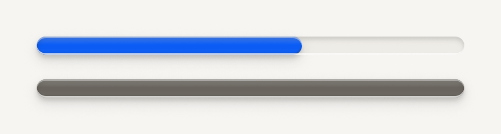
```tsx
import { Progress } from "@terratcg/ui";
import { View } from "react-native";
export default function ProgressTones() {
return (
);
}
```
## Import
```tsx
import { Progress } from "@terratcg/ui";
```
## Usage
```tsx
```
The track is a well cut into the surface, 12 pt tall by default. The bar rides in it as a raised accent face with a key's gloss and shadow, under the groove's lip. `value` runs from 0 to 1; anything outside is clamped. The track fills its parent's width, so size it with the parent or `style`. When `value` changes, the bar springs to it.
## Examples
### Reach
reach draws a faint second fill under the bar, for progress that counts toward a goal but not the headline.

```tsx
import { Progress } from "@terratcg/ui";
import { View } from "react-native";
export default function ProgressReach() {
return (
);
}
```
### With a counter
Counter writes the numbers beside a bar: a bold numerator against a muted total.
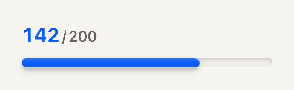
```tsx
import { Counter, Progress } from "@terratcg/ui";
import { View } from "react-native";
export default function ProgressCounter() {
return (
);
}
```
To write the numbers beside a bar, use [Counter](/docs/counter), which has its own page.
## Props
### ProgressProps
| Prop | Type | Description |
| -------------- | ------------------------- | ---------------------------------------------------------------------------------------------------------------------------------------------------------------------------------------- |
| `tone?` | `"accent" \| "muted"` | "accent" while live; "muted" once the host marks the work done. Default: `"accent"` |
| `value` | `number` | Completion from 0 to 1. Out-of-range values are clamped. |
| `reach?` | `number` | Optional secondary completion from 0 to 1 drawn faintly under the fill, for progress that counts toward reach but not the headline. |
| `height?` | `number` | Track height in points. Default: `12` |
| `translucent?` | `boolean` | For a track resting inside a living shell: a see-through groove whose lower lip keeps a quarter of its light, so it never reads as a white border on a coloured ground. Default: `false` |
| `style?` | `StyleProp` | |
Progress also accepts React Native's `View` props. It draws no children.
## Accessibility
- **Role:** `progressbar`, with `accessibilityValue` from 0 to 100 holding the rounded percentage of `value`. `reach` is not announced: say it in a nearby label if it matters.
- **Label:** give the track an `accessibilityLabel` that says what is progressing, such as "Upload progress".
- **Reduce Motion:** the bar jumps to its new value instead of springing.
## Platform differences
- **iOS and Android:** the same groove and bar. On iOS the bar is rasterized while it rests and redrawn only while it moves.
- **Web:** Progress renders through react-native-web for these docs, but the web is not a supported target.
## Rules
- Show Progress for work with a known end. For a wait without one, use a Spinner.
- Switch `tone` to `muted` once the work is done, so a finished bar stops calling for attention.
- Use `reach` for a second measure that counts toward a goal, never for a buffer or an estimate.
# Refresh control
The platform's pull-to-refresh in the theme accent. Pass it as a list's refreshControl.
```tsx
import { RefreshControl, Text } from "@terratcg/ui";
import { useState } from "react";
import { ScrollView, View } from "react-native";
const PHOTOS = ["Red fox", "Grey heron", "European robin", "Fire salamander", "Roe deer"];
export default function RefreshControlList({ capture }: SceneProps) {
// The capture shows it mid-refresh.
const [refreshing, setRefreshing] = useState(capture);
const refresh = () => {
setRefreshing(true);
setTimeout(() => setRefreshing(false), 1200);
};
return (
}
>
{PHOTOS.map((name) => (
{name}
))}
);
}
```
## Import
```tsx
import { RefreshControl } from "@terratcg/ui";
```
## Usage
```tsx
}
/>
```
RefreshControl is React Native's `RefreshControl` with the theme accent set on it. Set `refreshing` to `true` when `onRefresh` starts the work, and back to `false` when it ends.
## Examples
The hero example above is the only one: the control has no variants.
## Props
RefreshControl takes React Native's `RefreshControlProps`, unchanged. TerraUI only sets `tintColor` (iOS) and `colors` (Android) to the theme accent. Every prop you pass wins over those, and reaches the native control.
- `refreshing` (`boolean`, required): whether the spinner shows.
- `onRefresh` (`() => void`): called when the user pulls past the threshold.
- `progressViewOffset` (`number`): moves the spinner down, for a list under a transparent header.
## Accessibility
- **Screen readers:** the platform's own control, with nothing added by TerraUI.
- **Not the only way:** pull to refresh is hard for some people to perform. Keep another way to retry, such as the Try again action of an error Notice.
## Platform differences
- **iOS:** the system spinner above the list, tinted with the accent.
- **Android:** the Material circle that drops from the top edge, drawn in the accent.
- **Web:** react-native-web draws no control, so the live tab shows the list without pull to refresh. The web is not a supported target.
## Rules
- Pass it as a list's `refreshControl`, never on its own.
- Clear `refreshing` when the work ends, failures included.
- Don't show a second Spinner while the control is refreshing.
# Row
One line of a list, with a leading element, its content and an optional trailing control. A pressable row is a button.
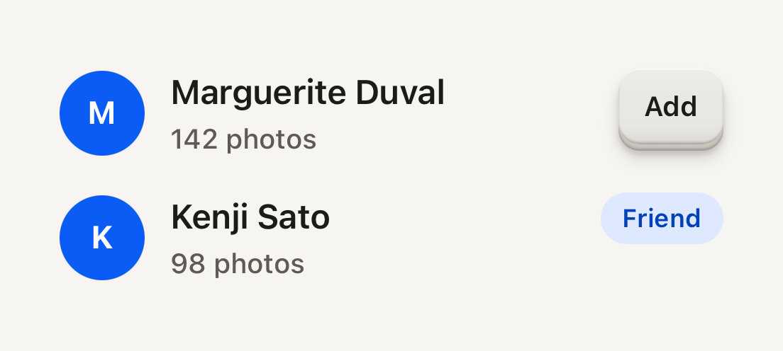
```tsx
import { Avatar, AvatarFallback, Badge, Button, ButtonText, Row, RowContent, RowDescription, RowTitle } from "@terratcg/ui";
import { View } from "react-native";
export default function RowList() {
return (
MMarguerite Duval142 photosKKenji Sato98 photosFriend
);
}
```
## Import
```tsx
import { Row, RowContent, RowDescription, RowTitle } from "@terratcg/ui";
```
## Usage
```tsx
router.push("/settings/notifications")}>
NotificationsFriend requests and trades
```
RowContent is the flexible middle: it takes the space between a leading element, such as an Avatar, and a trailing control, such as a Button or a Switch. RowTitle and RowDescription each stay on one line and truncate.
## Examples
### Pressable rows
With onPress the whole row is a button that dims under the press tint; disabled blocks the press. A title can wrap when you lift its line cap.
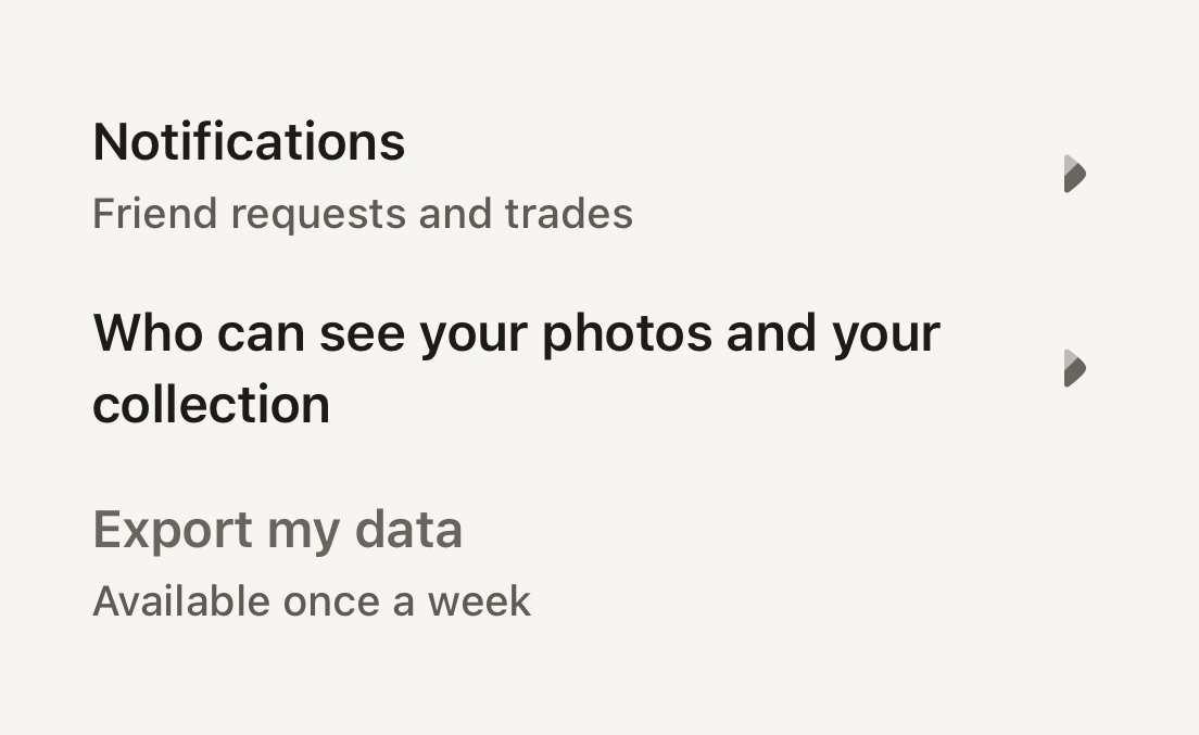
```tsx
import ArrowRight01Icon from "@hugeicons-pro/core-bulk-rounded/ArrowRight01Icon";
import { HugeiconsIcon } from "@hugeicons/react-native";
import { Row, RowContent, RowDescription, RowTitle, useTheme } from "@terratcg/ui";
import { View } from "react-native";
export default function RowPressable() {
const theme = useTheme();
const chevron = ;
return (
{}}>
NotificationsFriend requests and trades
{chevron}
{}}>
Who can see your photos and your collection
{chevron}
{}} disabled>
Export my dataAvailable once a week
);
}
```
## Props
### Row
### RowProps
| Prop | Type | Description |
| ----------------- | ---------------------- | --------------------------------------------------------------------------------------------------- |
| `children?` | `ReactNode` | Leading, content and trailing parts laid out on one line. |
| `style?` | `StyleProp` | Outer style: layout and margins. |
| `feedbackIntent?` | `"press" \| "select"` | What a press reports to the host. A row that changes a setting reports `select`. Default: `"press"` |
Row also accepts React Native's `Pressable` props, such as `onLongPress`, `accessibilityLabel` and `testID`. `disabled` applies to a pressable Row only; a static Row ignores it.
### Parts
RowContent takes React Native's `View` props. RowTitle (body type, semibold) and RowDescription (label type, secondary) take React Native's `Text` props and Text's `tone` and `weight`. Pass `numberOfLines={2}` to let a title wrap.
## Accessibility
- **Role:** `button` when the Row has `onPress`, with `disabled` merged into your `accessibilityState`. Without `onPress` it is a plain container and its parts are read one by one.
- **Label:** a pressable Row is read as the text inside it. Pass an `accessibilityLabel` when that text alone doesn't say what the press does.
- **Touch target:** at least 48 pt tall.
- **Larger text:** titles truncate by default. Under enlarged text, prefer `numberOfLines={2}` (or `undefined`) on titles that matter.
## Platform differences
- **iOS and Android:** the same row and press tint, with no ripple. A press calls ThemeProvider's `feedback` handler with `feedbackIntent`: `"press"` by default, `"select"` for a row that changes a setting.
- **Web:** Row renders through react-native-web for these docs, but the web is not a supported target. There a pressable Row is a focusable element with `role="button"`, so a trailing Button inside it doesn't nest one button in another.
## Rules
- Give a Row `onPress` or a trailing control, not both doing the same thing.
- Keep depth on the controls inside a Row: the Row itself never lifts.
- Put text in RowTitle and RowDescription, not in bare strings.
- A Row that toggles a setting reports `feedbackIntent="select"`.
# Search field
An Input with the magnifier leading it and a clear key while there is text, on the keyboard's search key. Clearing keeps the caret in the field.
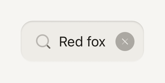
```tsx
import Cancel01Icon from "@hugeicons-pro/core-bulk-rounded/Cancel01Icon";
import Search01Icon from "@hugeicons-pro/core-bulk-rounded/Search01Icon";
import { HugeiconsIcon } from "@hugeicons/react-native";
import { SearchField } from "@terratcg/ui";
import { useState } from "react";
export default function SearchFieldDefault() {
const [query, setQuery] = useState("Red fox");
return (
}
clearIcon={({ color, size }) => }
containerStyle={{ alignSelf: "stretch" }}
/>
);
}
```
## Import
```tsx
import { SearchField } from "@terratcg/ui";
```
## Usage
```tsx
}
clearIcon={({ color, size }) => }
/>
```
SearchField is a controlled [Input](/docs/input): `value` and `onChangeText` are required. The icons come from you, as nodes or as render functions given the colour and size to draw in. The screen around it owns the rest: the results, the filtering and any Cancel link.
## Examples
### Disabled
A disabled search field takes no input and offers no clear key, even with text in it.
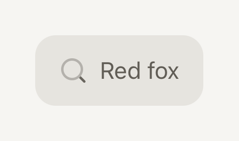
```tsx
import Cancel01Icon from "@hugeicons-pro/core-bulk-rounded/Cancel01Icon";
import Search01Icon from "@hugeicons-pro/core-bulk-rounded/Search01Icon";
import { HugeiconsIcon } from "@hugeicons/react-native";
import { SearchField } from "@terratcg/ui";
export default function SearchFieldDisabled() {
return (
{}}
placeholder="Search your library"
clearLabel="Clear search"
icon={({ color, size }) => }
clearIcon={({ color, size }) => }
containerStyle={{ alignSelf: "stretch" }}
/>
);
}
```
## Props
### SearchFieldProps
| Prop | Type | Description |
| ----------------- | ------------------------ | ------------------------------------------------------------------------------------------------------------------------------------------------------------------------------ |
| `value` | `string` | The query. The field is controlled: the host keeps it in state. |
| `onChangeText` | `(text: string) => void` | Called with the new text on every edit, and with "" when the clear key is pressed. |
| `icon` | `SearchFieldIcon` | The magnifier leading the field: a host icon, or a render function given its colour and size. |
| `clearIcon` | `SearchFieldIcon` | The X cut out of the clear disc: a host icon, or a render function given its colour and size. |
| `clearLabel` | `string` | Names the clear key for screen readers. |
| `invalid?` | `boolean` | Failing validation: danger stroke. Inherited from the enclosing Field. |
| `disabled?` | `boolean` | Inactive: flat readable well, not editable. Inherited from the enclosing Field. |
| `containerStyle?` | `StyleProp` | Lays out the wrapper an adorned well sits in (flex, margins), where `style` still styles the well itself. A well without an adornment has no wrapper: its `style` lays it out. |
SearchField also accepts the [Input](/docs/input#props) props except the adornments and the end slot, which it fills itself. It sets `returnKeyType="search"`, `autoCapitalize="none"` and `autoCorrect={false}`; pass your own to change them.
## Accessibility
- **Name:** `accessibilityLabel` if you pass one, else the `placeholder`. Inside a [Field](/docs/field), the Label names it only when there is neither.
- **Clear key:** an [Icon button](/docs/icon-button) named by `clearLabel`. It only appears while there is text, and pressing it empties the field and puts the caret back in it.
- **Magnifier:** visual only, hidden from screen readers.
- **Disabled:** no clear key, even with text in the field.
## Platform differences
- **Keyboard:** the return key reads Search on both platforms; its label and look are each keyboard's own.
- **Clear key:** drawn the way the system draws it, on iOS and Android alike: a 22 point grey disc (Ink Muted at half strength) with the X cut out in the well's floor colour, centred in the field.
- **Web:** SearchField renders through react-native-web for these docs, but the web is not a supported target.
## Rules
- Keep `value` in your state, and run the search from `onChangeText` or `onSubmitEditing`.
- Always pass `clearLabel`, in the user's language.
- Draw the magnifier and the X from your app's own icons (`icon`, `clearIcon`); TerraUI ships no glyphs.
- Write the placeholder as what can be searched ("Search your library"), since it is also the field's name.
- Put any Cancel link next to the field, outside it.
# Section
Structure for a page of grouped content. SectionHeader heads a group, and Divider marks where one group ends.
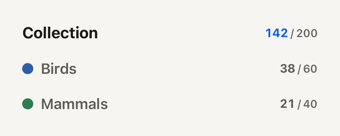
```tsx
import { Counter, SectionHeader } from "@terratcg/ui";
import { View } from "react-native";
export default function SectionHeaders() {
return (
);
}
```
## Import
```tsx
import { Divider, SectionHeader } from "@terratcg/ui";
```
## Usage
```tsx
```
The title wraps and fills the row; the children sit at its end. A `marker` (a colour swatch) or a `leading` glyph goes before the title.
## Examples
### Divider
A hairline where one group of content ends and the next begins. The headers carry the structure; the Divider is hidden from screen readers.
```tsx
import { Divider, SectionHeader, Text } from "@terratcg/ui";
import { View } from "react-native";
export default function SectionDivider() {
return (
Name, email and password.Who sees your photos.
);
}
```
## Props
### SectionHeader
### SectionHeaderProps
| Prop | Type | Description |
| ----------- | -------------------------- | ------------------------------------------------------------------------------------------------------- |
| `title` | `string` | The heading, announced as a header. |
| `level?` | `"primary" \| "secondary"` | "primary" heads a group; "secondary" heads a subgroup, quieter. Default: `"primary"` |
| `marker?` | `string` | Host color swatch before the title, for example a taxonomy class color. |
| `leading?` | `ReactNode` | A glyph before the title, for example a section's accent icon; decorative, the title names the section. |
| `children?` | `ReactNode` | Trailing content, typically a Counter. |
SectionHeader also accepts React Native's `View` props. A `testID` also names the marker, as `-marker`.
### Divider
Divider takes React Native's `View` props: a hairline in the theme's border colour, stretched across its parent.
## Accessibility
- **Heading:** the title is announced with the `header` role, so screen reader users can move from section to section.
- **Decoration:** the `marker` swatch is not announced, and the `leading` glyph and the Divider are hidden from assistive technology. The title names the section on its own.
- **Larger text:** the title wraps instead of truncating; the trailing content stays at the end of the row.
## Platform differences
- **iOS and Android:** the same headers. The Divider is one physical pixel thick on each screen.
- **Web:** Section renders through react-native-web for these docs, but the web is not a supported target.
## Rules
- Use `primary` for a page's groups and `secondary` for the subgroups inside one.
- Keep the marker for category colours (a photo category, a set); it must never be the only way to tell sections apart.
- Put a Divider between groups, not under every header: the headers carry the structure.
# Selectable cell
A quiet cell for picking items in dense grids and rows. Selection reads through its stroke and a check chip, protection through a dashed frame and a text badge.
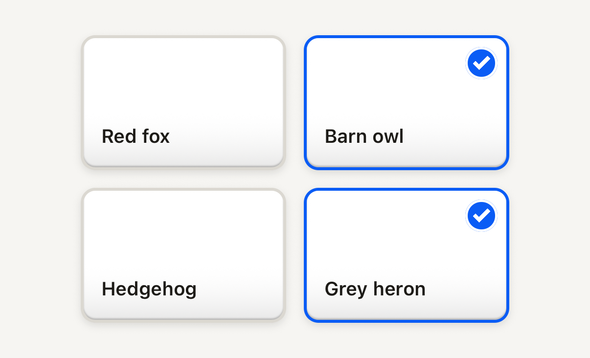
```tsx
import { SelectableCell, Text } from "@terratcg/ui";
import { useState } from "react";
import { View } from "react-native";
const CARDS = ["Red fox", "Barn owl", "Hedgehog", "Grey heron"];
export default function SelectableGrid() {
const [picked, setPicked] = useState(() => new Set(["Barn owl", "Grey heron"]));
const toggle = (card: string) =>
setPicked((current) => {
const next = new Set(current);
if (next.has(card)) next.delete(card);
else next.add(card);
return next;
});
return (
{CARDS.map((card) => (
toggle(card)}
style={{ width: 140 }}
>
{card}
))}
);
}
```
## Import
```tsx
import { SelectableCell } from "@terratcg/ui";
```
## Usage
```tsx
toggle(card.id)}>
```
The cell draws the frame and the selection cue around your content, clipped to its corners, and reports a press. The selection rules are yours: toggle `selected` in `onPress`, and set `protected` on an item your rules keep out of the selection, such as the last copy of a card.
## Examples
### Protected and disabled
A protected cell wears a dashed frame and a text badge and never toggles; a disabled one fades but keeps its cue.
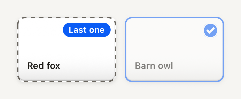
```tsx
import { SelectableCell, Text } from "@terratcg/ui";
import { View } from "react-native";
export default function SelectableProtected() {
return (
Red foxBarn owl
);
}
```
## Props
### SelectableCellProps
| Prop | Type | Description |
| ----------------- | ---------------------- | -------------------------------------------------------------------------------------------------------------------------------------------------------------- |
| `selected` | `boolean` | Whether the cell is part of the current selection. |
| `protected?` | `boolean` | Kept out of selection by the host's rules (for example the one item a user must keep). Shows a labelled badge, stays readable, never toggles. Default: `false` |
| `protectedLabel?` | `string` | Badge text for the protected state. Default: `"Kept"` |
| `disabled?` | `boolean` | Inactive: no action and no feedback; the selection cue stays visible. Default: `false` |
| `children?` | `ReactNode` | Host content, clipped to the cell's corners: a thumbnail, a label, a row. |
| `style?` | `StyleProp` | Outer style: width, margins. Colors come from the theme. |
SelectableCell also accepts React Native's `Pressable` props, such as `accessibilityLabel` and `testID`, and `style` for its width and margins. `SELECTABLE_CELL_BORDER` exports the stroke width, 2 points, by which the content is narrower than the cell on each side.
## Accessibility
- **Role:** `checkbox`, with `accessibilityState` keeping `checked` and `disabled` (while `disabled` or `protected`) in sync. Your own `accessibilityState` is merged on top.
- **Label:** pass `accessibilityLabel` with the item's name. For a protected cell, say why in the label too: the badge is not read on its own.
- **Not by colour alone:** selected adds a check chip, protected a dashed frame and a text badge.
- **Touch target:** the cell is as large as you make it. Keep it at least 44 pt on iOS and 48 dp on Android.
- **Reduce Motion:** the cell no longer shrinks when pressed; the press dim stays.
## Platform differences
- **iOS and Android:** the same frame, chip and press on both, with no ripple.
- **Feedback:** a press calls ThemeProvider's `feedback` handler with `"select"`. A protected or disabled cell reports nothing.
- **Web:** SelectableCell renders through react-native-web for these docs, but the web is not a supported target.
## Rules
- Use it for picking several items among many. For one setting, use a [Switch](/docs/switch).
- Keep the content quiet: a thumbnail and a short label. The cell carries the selection cue; the content shouldn't add another.
- Use `protected` for items your rules keep, with a short `protectedLabel`, and `disabled` only for items that can't be acted on for now.
- Show what the selection will do in an [Action tray](/docs/action-tray) under the grid.
# Shelf
A titled horizontal strip of pockets, such as recent items or favourites. Only a heading and spacing frame it, so the items stay the subject.
```tsx
import { Cell, Counter, Shelf } from "@terratcg/ui";
import { View } from "react-native";
export default function ShelfRecent() {
return (
}>
);
}
```
## Import
```tsx
import { Shelf } from "@terratcg/ui";
```
## Usage
```tsx
}>
{recent.map((card) => (
open(card)} accessibilityLabel={card.name} style={{ width: 72, height: 100 }}>
))}
```
The title is a secondary SectionHeader, with `trailing` at its end. The children sit in a horizontal ScrollView, spaced by the theme.
## Examples
### Without a title, bleeding to the edge
Without title there is no header row; inset pads the strip and bleeds it by the same amount, so items scroll to the edge of the screen.
```tsx
import { Cell, Shelf } from "@terratcg/ui";
import { View } from "react-native";
export default function ShelfUntitled() {
return (
);
}
```
## Props
### ShelfProps
| Prop | Type | Description |
| ----------- | ----------- | ---------------------------------------------------------------------------------------------------------------- |
| `title?` | `string` | Heading above the strip. |
| `trailing?` | `ReactNode` | Trailing header content, typically a Counter. Shown only with a `title`. |
| `inset?` | `number` | Horizontal inset of the strip; the strip bleeds by the same amount so items can scroll to the edge. Default: `0` |
| `children?` | `ReactNode` | |
Shelf also accepts React Native's `View` props. A `testID` also names the strip, as `-strip`.
## Accessibility
- **Heading:** the title is announced as a header, so screen reader users can jump between shelves.
- **Strip:** the items are read in order; give each its own label, as a pressable Cell needs.
- **Scrolling:** the strip scrolls with the platform's own horizontal scrolling, without a scroll indicator. Leave part of the next item visible so it reads as scrollable.
## Platform differences
- **iOS and Android:** the same strip, scrolling natively on each platform.
- **Web:** Shelf renders through react-native-web for these docs, but the web is not a supported target.
## Rules
- Give the shelf a `title`: `trailing` shows only beside one.
- Set `inset` to your page's horizontal padding, so items scroll to the screen edge but rest aligned with the page.
- Keep items one height; a Shelf is a strip, not a masonry grid.
# Shutter
The capture key, a large round console face raised over its edge. Its inner ring reads as a shutter on any ground, a camera preview included.

```tsx
import Camera01Icon from "@hugeicons-pro/core-bulk-rounded/Camera01Icon";
import { HugeiconsIcon } from "@hugeicons/react-native";
import { Shutter } from "@terratcg/ui";
export default function ShutterDefault() {
return (
{}}
icon={({ color, size }) => }
/>
);
}
```
## Import
```tsx
import { Shutter } from "@terratcg/ui";
```
## Usage
```tsx
}
/>
```
The Shutter starts a capture; the camera and the capture are yours. Set `loading` while a capture is in flight: the face keeps its size, shows a spinner in place of the icon and ignores presses until you clear it. The icon is optional: pass a node, or a render function that receives the face's colour and the icon size.
## Examples
### States
Loading holds the face with a spinner while a capture is in flight; disabled is flat and grey.
```tsx
import Camera01Icon from "@hugeicons-pro/core-bulk-rounded/Camera01Icon";
import { HugeiconsIcon } from "@hugeicons/react-native";
import { Shutter } from "@terratcg/ui";
import { View } from "react-native";
export default function ShutterStates() {
return (
}
/>
);
}
```
### Size
The face is 76 points across by default; size sets another diameter and the icon stays 28 points.
```tsx
import Camera01Icon from "@hugeicons-pro/core-bulk-rounded/Camera01Icon";
import { HugeiconsIcon } from "@hugeicons/react-native";
import { Shutter } from "@terratcg/ui";
import { View } from "react-native";
export default function ShutterSizes() {
return (
{}}
icon={({ color, size }) => }
/>
{}}
icon={({ color, size }) => }
/>
);
}
```
## Props
### ShutterProps
| Prop | Type | Description |
| -------------------- | ----------------------------------------------------- | ------------------------------------------------------------------------------------------------------------------------------------------------------------------------------------ |
| `accessibilityLabel` | `string` | Required: the face carries no visible label. |
| `icon?` | `((slot: ShutterIconSlot) => ReactNode) \| ReactNode` | Optional host icon node, or a render function receiving the face color and icon size. |
| `size?` | `number` | Face diameter in points. Default: `76` |
| `disabled?` | `boolean` | Inactive: flat readable face, no action, no feedback. Default: `false` |
| `loading?` | `boolean` | Busy (a capture in flight): keeps its size, shows a spinner in place of the icon, blocks activation and exposes accessibilityState.busy. The host owns the capture. Default: `false` |
| `style?` | `StyleProp` | Outer style: layout only. Face colors come from the theme. |
Shutter also accepts React Native's `Pressable` props, such as `hitSlop` and `testID`. `SHUTTER_SIZE` exports the default diameter, 76 points, for laying out the controls around it.
## Accessibility
- **Role:** `button`, with `accessibilityState` keeping `disabled` (while `disabled` or `loading`) and `busy` (while `loading`) in sync. Your own `accessibilityState` is merged on top.
- **Label:** `accessibilityLabel` is required, since the face carries no text. Name the action: "Take photo".
- **Touch target:** the 76 point face is well over the 44 pt and 48 dp minimums. Keep any smaller `size` at 48 or more.
- **Reduce Motion:** the face no longer travels when pressed; the press tint stays.
## Platform differences
- **iOS and Android:** the same domed face, ring and travel, with no ripple.
- **Feedback:** a press calls ThemeProvider's `feedback` handler with `"press"`. A disabled or loading Shutter reports nothing. TerraUI plays no shutter sound or haptic itself.
- **Web:** Shutter renders through react-native-web for these docs, but the web is not a supported target.
## Rules
- One Shutter per screen, for the capture only. Other camera controls are [Icon buttons](/docs/icon-button).
- Set `loading` for as long as the capture runs, and clear it yourself: the Shutter never clears it.
- Use `onPress`, never `onClick`, and style props for layout only: the face's colours come from the theme.
# Skeleton
A quiet placeholder shape in the size of what is loading. Still on purpose, with no shimmer.
```tsx
import { Skeleton } from "@terratcg/ui";
import { View } from "react-native";
export default function SkeletonRow() {
return (
{[0, 1].map((row) => (
))}
);
}
```
## Import
```tsx
import { Skeleton } from "@terratcg/ui";
```
## Usage
```tsx
```
A Skeleton is a recessed well: give it the width and height of the content it stands in for through `style`. It has no size of its own.
## Examples
### Radii
radius follows the theme's shape scale, so a placeholder rounds like the thing it replaces.
```tsx
import { Skeleton } from "@terratcg/ui";
import { View } from "react-native";
export default function SkeletonRadii() {
return (
);
}
```
## Props
### SkeletonProps
| Prop | Type | Description |
| --------------------- | -------------------------------- | ---------------------------------------------------------------------------------------------------------------------------- |
| `radius?` | `"lg" \| "md" \| "pill" \| "sm"` | Corner radius from the theme shape scale. Default: `"sm"` |
| `accessibilityLabel?` | `string` | Silent for assistive technology by default. With a label, this one block announces the whole loading group as busy progress. |
Skeleton also accepts React Native's `View` props.
## Accessibility
- **Hidden by default:** a Skeleton is hidden from assistive technology, so a screen of shapes is not read shape by shape.
- **One label per group:** give one Skeleton in the group an `accessibilityLabel`. That block becomes a `progressbar` with the busy state, and announces the whole group's loading once.
- **Reduce Motion:** nothing to reduce. A Skeleton never moves.
## Platform differences
- **iOS and Android:** the same still shape on the theme's muted surface.
- **Web:** Skeleton renders through react-native-web for these docs, but the web is not a supported target.
## Rules
- Shape a Skeleton like what it replaces: the same size, and the radius of the real thing.
- Label one Skeleton per loading group, never each one.
- Don't animate Skeletons with a shimmer: loading stays quiet.
- Swap the shapes for the content in place, without a layout jump.
# Spinner
The platform's activity indicator in the theme accent, for a wait without a known end.

```tsx
import { Spinner } from "@terratcg/ui";
import { View } from "react-native";
export default function SpinnerSizes() {
return (
);
}
```
## Import
```tsx
import { Spinner } from "@terratcg/ui";
```
## Usage
```tsx
{loading ? : }
```
A Spinner is React Native's `ActivityIndicator` coloured with the theme accent. For a busy key, set `loading` on the Button instead: it holds its width and shows its own Spinner.
## Examples
### With a label
Beside text, the label says what is loading, and the spinner takes the same words for screen readers.
```tsx
import { Spinner, Text } from "@terratcg/ui";
import { View } from "react-native";
export default function SpinnerWithLabel() {
return (
Syncing your library
);
}
```
## Props
### SpinnerProps
| Prop | Type | Description |
| ------- | --------------------------- | ------------------------------------------------------------------------------------------------ |
| `size?` | `"default" \| "lg" \| "sm"` | "sm" and "default" draw the platform's small indicator, "lg" its large one. Default: `"default"` |
Spinner also accepts React Native's `ActivityIndicator` props except `size`, such as `animating`, `color` and `hidesWhenStopped`. `color` replaces the accent.
## Accessibility
- **Role:** `progressbar`, with the label from `ThemeProvider`'s `labels.loading` ("Loading" by default, see [Labels](/docs/theme-provider#labels)) unless you pass your own `accessibilityLabel`. Say what is loading: "Syncing your library".
- **One per wait:** a screen that is loading shows one Spinner, so it is announced once.
## Platform differences
- **iOS:** the system activity indicator. `sm` and `default` are the small one, `lg` the large one.
- **Android:** the Material circular indicator, at the same two sizes.
- **Web:** react-native-web draws its own indicator for these docs, but the web is not a supported target.
## Rules
- Use a Spinner for a wait without a known end. When you know how far along the work is, show Progress.
- Don't use a Spinner as a page's placeholder: show Skeleton shapes for content that is on its way.
- Keep the accent: pass `color` only on a surface where the accent doesn't read.
# Stat
Figures at a glance, in three forms. StatRow is a panel of counters, StatPill a compact resource counter and StatLine one labelled value in a list.
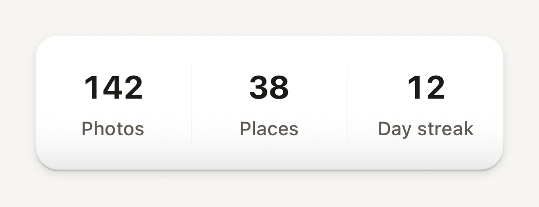
```tsx
import { Stat, StatLabel, StatRow, StatValue } from "@terratcg/ui";
import { View } from "react-native";
export default function StatRowScene() {
return (
142Photos38Places12Day streak
);
}
```
## Import
```tsx
import {
Stat,
StatLabel,
StatLine,
StatLineHint,
StatLineLabel,
StatLineValue,
StatPill,
StatPillIcon,
StatPillRow,
StatPillValue,
StatRow,
StatValue,
} from "@terratcg/ui";
```
## Usage
```tsx
142Photos38Places
```
- **StatRow and Stat:** the counters of an account or profile page. Each Stat is a StatValue over a StatLabel; the row lays them side by side on one surface, with hairlines between them.
- **StatPill:** one resource, such as a currency or a streak, as a raised pill with your icon and a tabular value. Line several up in a StatPillRow. Given a `color`, the pill is washed in a light tint of that hue (20% in light, 30% in dark) under the shell's gloss, with a hairline of the hue around it; the icon keeps the full hue and the value stays in ink, so the pill says which currency it counts without hiding the icon that says it first. Without a `color` it is a quiet surface pill.
- **StatLine:** a label on the left and a value on the right, for a cost, a balance or a requirement. Stack them in a column and add a StatLineHint under a line that needs explaining.
## Examples
### With a header
header adds a full-width first row on the same surface, divided from the Stats by a hairline.
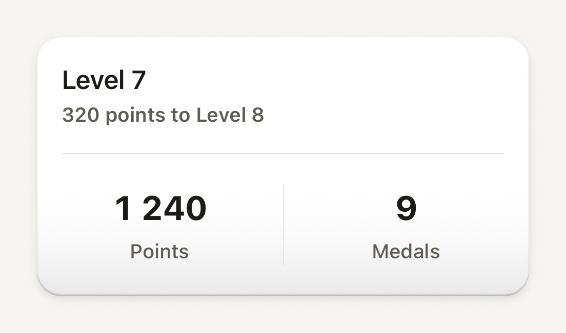
```tsx
import { Stat, StatLabel, StatRow, StatValue, Text } from "@terratcg/ui";
import { View } from "react-native";
export default function StatRowWithHeader() {
return (
Level 7
320 points to Level 8
}
>
1 240Points9Medals
);
}
```
### Stat pills
Compact resource counters on raised plastic: a currency colour washes the pill, without one it stays a quiet surface.
```tsx
import Coins01Icon from "@hugeicons-pro/core-bulk-rounded/Coins01Icon";
import FireIcon from "@hugeicons-pro/core-bulk-rounded/FireIcon";
import { HugeiconsIcon } from "@hugeicons/react-native";
import { StatPill, StatPillIcon, StatPillRow, StatPillValue } from "@terratcg/ui";
export default function StatPills() {
return (
{({ color, size }) => }1 240{({ color, size }) => }12
);
}
```
### Stat lines
Label on the left, tabular value on the right: the accent tone marks a met requirement, the danger tone and a hint an unmet one.
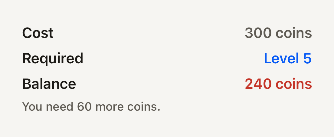
```tsx
import { StatLine, StatLineHint, StatLineLabel, StatLineValue } from "@terratcg/ui";
import { View } from "react-native";
export default function StatLines() {
return (
Cost300 coinsRequiredLevel 5Balance240 coinsYou need 60 more coins.
);
}
```
## Props
### StatRow
### StatRowProps
| Prop | Type | Description |
| ------------- | ----------- | ----------------------------------------------------------------------------------------------------------------------------------------------------------------------------------------- |
| `header?` | `ReactNode` | A full-width first row on the same surface, above the Stats and divided from them by a hairline (for example a level and its progress). |
| `scrollable?` | `boolean` | More Stats than fit: the surface holds still at its width and the Stats scroll sideways inside it, each as wide as its own figure and label. Not combined with `header`. Default: `false` |
StatRow also accepts React Native's `View` props. `Stat` takes `View` props only. StatValue, StatLabel, StatLineLabel and StatLineHint take React Native's `Text` props and Text's `tone` and `weight`; StatLineValue and StatPillValue too, with tabular figures always on.
### StatPill
### StatPillProps
| Prop | Type | Description |
| -------------------- | ------------------------- | -------------------------------------------------------------------------------------------------------------------------------------------------------------------------------------------------------------- |
| `accessibilityLabel` | `string` | Read as one element: the whole meaning including the number, for example "1240 points". The label is the only thing announced, so it must carry the value. |
| `color?` | `string` | The currency's hue. Washes the pill in a light tint of it and hands the full hue to the icon slot, so the counter reads as that currency while its glyph keeps its own color. Omit for the quiet surface pill. |
| `children?` | `ReactNode` | |
| `style?` | `StyleProp` | |
StatPill also accepts React Native's `View` props. StatPillRow takes `View` props and wraps its pills.
### StatPillIcon
### StatPillIconProps
| Prop | Type | Description |
| ---------- | ------------------------------------------------------ | ----------------------------------------------------------------------- |
| `children` | `((slot: StatPillIconSlot) => ReactNode) \| ReactNode` | Host icon node, or a render function receiving the slot color and size. |
## Accessibility
- **Stat:** one accessible element, so a screen reader reads the value and its label together, as one stop.
- **StatPill:** one element with the `text` role, read only through its required `accessibilityLabel`. Put the number in it: "1240 coins", not "Coins".
- **StatLine:** not grouped. The label and the value are read in turn, then the hint.
- **Larger text:** a StatLabel wraps to two lines instead of losing its end; a StatValue and a StatPillValue stay on one line.
- **Colour:** the StatLineValue tones mark a met (`accent`) or unmet (`danger`) requirement, and the hint says it in words. Don't let colour say it alone.
## Platform differences
- **iOS and Android:** the same panels, pills and lines.
- **`scrollable`:** a StatRow with more Stats than fit scrolls them sideways in a native horizontal ScrollView, without a scroll indicator.
- **Web:** Stat renders through react-native-web for these docs, but the web is not a supported target.
## Rules
- Keep a StatRow to a few Stats, three or four. For more, set `scrollable`; `scrollable` and `header` don't combine.
- Give every StatPill an `accessibilityLabel` that carries its value.
- TerraUI ships no icons: StatPillIcon sizes and colours the one you pass, through a render function.
- Format numbers in the user's locale before you pass them in: these parts print what you give them.
# Switch
An on and off key that slides in a recessed slot. Use SwitchRow in a settings list, so a press anywhere on the row flips it.
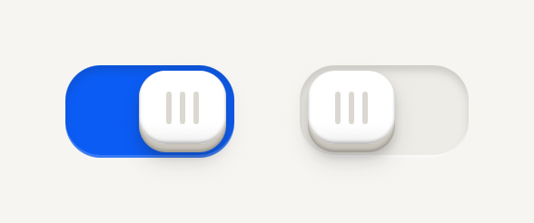
```tsx
import { Switch } from "@terratcg/ui";
import { useState } from "react";
import { View } from "react-native";
export default function SwitchDefault() {
const [haptics, setHaptics] = useState(true);
const [sounds, setSounds] = useState(false);
return (
);
}
```
## Import
```tsx
import { Switch, SwitchRow } from "@terratcg/ui";
```
## Usage
```tsx
Haptics
```
A Switch is controlled: it shows `value` and asks for the other one through `onValueChange`. A tap flips it with a short spring; the key also drags, and let go past the middle it flips to the far side. In a list, use `SwitchRow`, a Row ending in the Switch, and compose its `RowContent` as with any Row. Use `Switch` on its own only where there is no row to press.
## Examples
### In a settings list
A SwitchRow is one control: a press anywhere on the row flips its key, and the key still drags.
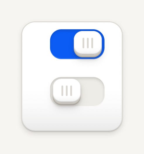
```tsx
import { Card, CardContent, RowContent, RowDescription, RowTitle, SwitchRow } from "@terratcg/ui";
import { useState } from "react";
export default function SwitchRows() {
const [sounds, setSounds] = useState(true);
const [reveal, setReveal] = useState(false);
return (
UI soundsReveal soundsMuted by the silent switch
);
}
```
### States
Disabled sits at half opacity; busy looks disabled while a slow wave runs along the grip bars.
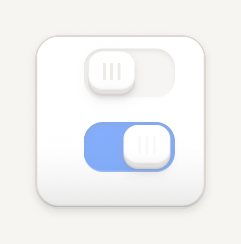
```tsx
import { Card, CardContent, RowContent, RowTitle, SwitchRow } from "@terratcg/ui";
export default function SwitchStates() {
return (
DisabledSaving
);
}
```
## Props
### Switch
### SwitchProps
| Prop | Type | Description |
| ---------------- | ---------------------------- | -------------------------------------------------------------------------------------------------------- |
| `style?` | `StyleProp` | Outer style: layout and margins. |
| `value` | `boolean` | On or off: the key's position says which. |
| `onValueChange?` | `((value: boolean) => void)` | Called with the other value when a tap or a drag flips the key. The host sets `value`. |
| `disabled?` | `boolean` | Inactive: the whole Switch at half opacity. Default: `false` |
| `busy?` | `boolean` | Saving: looks disabled, and the grip bars run a slow wave. The host owns the operation. Default: `false` |
Switch also accepts `accessibilityLabel`, `accessibilityHint` and `testID` from React Native's `Pressable`, and `style` for layout and margins.
### SwitchRow
### SwitchRowProps
| Prop | Type | Description |
| ---------------- | ---------------------------- | -------------------------------------------------------------------------------------------------------- |
| `children?` | `React.ReactNode` | Leading, content and trailing parts laid out on one line. |
| `style?` | `StyleProp` | Outer style: layout and margins. |
| `value` | `boolean` | On or off: the key's position says which. |
| `onValueChange?` | `((value: boolean) => void)` | Called with the other value when a tap or a drag flips the key. The host sets `value`. |
| `disabled?` | `boolean` | Inactive: the whole Switch at half opacity. Default: `false` |
| `busy?` | `boolean` | Saving: looks disabled, and the grip bars run a slow wave. The host owns the operation. Default: `false` |
SwitchRow also accepts the Row's `Pressable` props, except `accessibilityRole`, `onPress` and `feedbackIntent`, which it sets itself.
## Accessibility
- **Role:** `switch`, with `accessibilityState` keeping `checked`, `disabled` and `busy` in sync.
- **Label:** pass `accessibilityLabel`. A SwitchRow is one element to a screen reader, so name it with the row's title, and put its description in `accessibilityHint`.
- **Not by colour alone:** the key's position carries the state; the accent fill only repeats it.
- **Touch target:** the slot is 62 by 34 points and its touch area reaches 8 points past it on every side. In a SwitchRow, the whole row is the target.
- **Reduce Motion:** the key moves at once instead of springing, stays level when pressed, and the busy wave stands still.
## Platform differences
- **iOS and Android:** the same Slide key on both, not the system switch. A drag works the same way, and a scroll can take the touch until the key has started to move.
- **Feedback:** a flip calls ThemeProvider's `feedback` handler with `"select"`, once per change. TerraUI plays no haptic or sound itself.
- **Web:** Switch renders through react-native-web for these docs, but the web is not a supported target.
## Rules
- In a list, use SwitchRow, never a Row with a Switch inside it.
- A Switch changes a setting at once. For a choice that waits for a Save, use a [Selectable cell](/docs/selectable-cell) or a selected [Button](/docs/button).
- Set `busy` while saving the change, and clear it yourself. If saving fails, set `value` back.
- Label the setting, not the action: "Haptics", not "Turn on haptics".
- Keep the key as drawn: a domed key with three grip bars in a recessed slot, 62 by 34 points. Position carries the state, with no marks in either state; off leaves the slot as a well, on fills it with the accent.
- A press sinks the key 2 points under a tint, and a short spring throws it across. Disabled is the whole Switch at half opacity. Busy looks exactly like disabled, and a band of light sweeps across the grip bars, left to right, without resizing them.
# Tab bar
A quiet bottom deck of destinations around one raised central action. It only presents, so your navigator owns the routes and the selection.
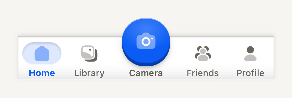
```tsx
import Album02Icon from "@hugeicons-pro/core-bulk-rounded/Album02Icon";
import Camera01Icon from "@hugeicons-pro/core-bulk-rounded/Camera01Icon";
import Home01Icon from "@hugeicons-pro/core-bulk-rounded/Home01Icon";
import UserIcon from "@hugeicons-pro/core-bulk-rounded/UserIcon";
import UserGroup03Icon from "@hugeicons-pro/core-bulk-rounded/UserGroup03Icon";
import { HugeiconsIcon, type IconSvgElement } from "@hugeicons/react-native";
import { TabBar, TabBarAction, TabBarItem } from "@terratcg/ui";
import { useState } from "react";
import { View } from "react-native";
const icon = (glyph: IconSvgElement) =>
function TabIcon({ color, size }: { color: string; size: number }) {
return ;
};
export default function TabBarScene() {
const [tab, setTab] = useState("home");
return (
setTab("home")} />
setTab("library")} />
setTab("friends")} />
setTab("profile")} />
);
}
```
## Import
```tsx
import { TabBar, TabBarAction, TabBarItem } from "@terratcg/ui";
```
## Usage
```tsx
navigate("home")} />
navigate("profile")} />
```
The deck is `TAB_BAR_CONTENT_HEIGHT` (58 pt) tall plus the `bottomInset` you pass from the safe area. Above it, a transparent `TAB_BAR_LIFT` (24 pt) strip overlays the page for the raised action to rise into; elsewhere in that strip, touches fall through to the page. Items share the row equally and the action keeps a fixed column.
The deck fills with the theme's `bar` colour and runs square across the screen, with only its outer corners following the device's rounded glass through `cornerRadius`. It is a shell under a hairline that keeps its sheen along the top but casts its lift upward, so its page-facing top edge shows the same turned-under line, hairline and shadow a HeaderBar shows the page. Captions, the action's included, share one baseline, and icons rest in the muted ink. The selected item sits on a soft accent well recessed into the deck behind its icon, with a bold accent label. The TabBarAction is a 60 pt domed accent face with a radial catch light, its glyph in the light ink in dark and the on-accent colour in light, over its edge, contact shadow and halo; it rises 24 pt above the deck and travels when pressed like every TerraUI key.
## Examples
### Badges and a disabled item
A count pill or a dot says something waits at a destination, spoken through badgeLabel; a disabled item stays readable but takes no press.
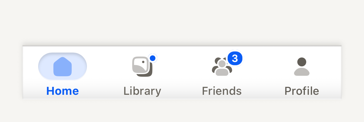
```tsx
import Album02Icon from "@hugeicons-pro/core-bulk-rounded/Album02Icon";
import Home01Icon from "@hugeicons-pro/core-bulk-rounded/Home01Icon";
import UserIcon from "@hugeicons-pro/core-bulk-rounded/UserIcon";
import UserGroup03Icon from "@hugeicons-pro/core-bulk-rounded/UserGroup03Icon";
import { HugeiconsIcon, type IconSvgElement } from "@hugeicons/react-native";
import { TabBar, TabBarItem } from "@terratcg/ui";
import { View } from "react-native";
const icon = (glyph: IconSvgElement) =>
function TabIcon({ color, size }: { color: string; size: number }) {
return ;
};
export default function TabBarBadges() {
return (
);
}
```
## Props
### TabBar
### TabBarProps
| Prop | Type | Description |
| --------------- | ----------- | --------------------------------------------------------------------------------------------------------------------------------------------------------------- |
| `bottomInset?` | `number` | Bottom safe-area inset supplied by the host (for example the navigator's insets). The deck extends through the inset and keeps the items above it. Default: `0` |
| `cornerRadius?` | `number` | Radius of the device's bottom screen corners, in points. The deck rounds its bottom corners to it so its edge follows the glass. Default: `0` |
| `children?` | `ReactNode` | Compose TabBarItem and TabBarAction. |
TabBar also accepts React Native's `View` props.
### TabBarItem
### TabBarItemProps
| Prop | Type | Description |
| ------------- | ---------------------------------------------------- | --------------------------------------------------------------------------------------------------------------------------------------------- |
| `label` | `string` | Visible destination label, also the default accessibility label. |
| `icon?` | `((slot: TabBarIconSlot) => ReactNode) \| ReactNode` | Host icon node, or a render function receiving the slot color, size and selection. |
| `selected` | `boolean` | Whether this destination is the navigator's current one. |
| `disabled?` | `boolean` | Inactive: readable, no action, no feedback. Default: `false` |
| `style?` | `StyleProp` | Outer style: layout only. Colors come from the theme. |
| `badge?` | `number \| "dot"` | Something waits at this destination: a count pill, or a dot when only presence matters. Pair it with `badgeLabel`; color never says it alone. |
| `badgeLabel?` | `string` | Spoken with the destination while a badge shows, for example "1 reward waiting". |
TabBarItem also accepts React Native's `Pressable` props, except `disabled` and `style`, which it defines itself.
### TabBarAction
### TabBarActionProps
| Prop | Type | Description |
| -------------------- | ---------------------------------------------------------- | ---------------------------------------------------------------------------- |
| `accessibilityLabel` | `string` | Required: the face carries an icon only. |
| `icon` | `((slot: TabBarActionIconSlot) => ReactNode) \| ReactNode` | Host icon node, or a render function receiving the face color and icon size. |
| `label?` | `string` | Optional caption under the face. |
| `disabled?` | `boolean` | Inactive: flat readable face, no action, no feedback. Default: `false` |
| `style?` | `StyleProp` | Outer style: layout only. |
TabBarAction also accepts React Native's `Pressable` props. The face is `TAB_BAR_ACTION_SIZE` (60 pt) across.
## Accessibility
- **Roles:** the bar is a `tablist`. An item is a `tab` on Android and a `button` on iOS, where VoiceOver does not announce tabs reliably; its `accessibilityState` carries `selected` and `disabled`. The action is always a `button`, never a tab.
- **Labels:** an item is read by its `label`. The action shows an icon only, so its `accessibilityLabel` is required.
- **Badges:** a badge is never told by colour alone: pair it with `badgeLabel` ("3 friend requests"), which is read as the item's value while the badge shows. Counts over 99 show as "99+".
- **Selection:** shown by a soft accent well behind the icon and a bolder label, not by colour alone.
- **Larger text:** captions scale with the system text size up to 1.3 times, then stop, so they still fit the fixed deck.
- **Press:** an item dims while pressed. Nothing moves, so this stays under Reduce Motion.
## Platform differences
- **iOS:** items take the `button` role, as above, and the deck's bottom corners follow the screen with a continuous curve.
- **Android:** items take the `tab` role, and the corners are circular arcs.
- **Feedback:** an item press calls ThemeProvider's `feedback` handler with `"select"`, the action with `"press"`. TerraUI plays no haptic or sound itself.
- **Web:** TabBar renders through react-native-web for these docs, but the web is not a supported target.
## Rules
- Your navigator owns the routes. Set `selected` from the current route, and handle every press, including a press on the selected item, which TabBarItem delivers so you can scroll to the top or pop to the root.
- Use one TabBarAction at most, for the app's central action, not a destination.
- Keep to four or five destinations with one-word labels.
- Pass the bottom safe-area inset to `bottomInset` and your screen's corner radius to `cornerRadius`.
- Give the page under the bar a bottom padding of `TAB_BAR_CONTENT_HEIGHT` plus the inset, so nothing hides behind the deck.
# Task
One task on a quiet content surface. Its title, tag and reward sit over its progress; your app owns the progress and the claim.
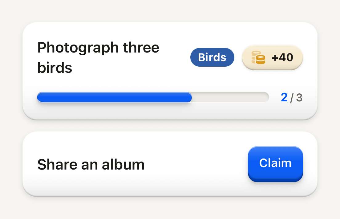
```tsx
import Coins01Icon from "@hugeicons-pro/core-bulk-rounded/Coins01Icon";
import { HugeiconsIcon } from "@hugeicons/react-native";
import { Button, ButtonText, Counter, Progress, Task, TaskFooter, TaskHeader, TaskReward, TaskTag, TaskTitle } from "@terratcg/ui";
import { View } from "react-native";
export default function TaskInProgress() {
return (
Photograph three birds
Birds
}
>
+40
Share an album
);
}
```
## Import
```tsx
import { Task, TaskFooter, TaskHeader, TaskReward, TaskTag, TaskTitle } from "@terratcg/ui";
```
## Usage
```tsx
Scan three birds+40
```
A Task only presents. Your app decides the progress, whether the reward can be claimed, and what a claim does: when it can, swap the TaskReward for a small Button; once claimed, set `completed`. TaskReward is a raised pill washed in its `color` like a StatPill (a light tint of the hue, a hairline of it around the pill); a claimed reward lies flat. Anything else, such as a Notice, can follow the footer.
## Examples
### Completed
completed lays the whole task flat and fades it; a claimed reward lies flat in the muted palette.
```tsx
import { Task, TaskHeader, TaskReward, TaskTitle } from "@terratcg/ui";
import { View } from "react-native";
export default function TaskCompleted() {
return (
Take any photo
Claimed
);
}
```
## Props
### Task
### TaskProps
| Prop | Type | Description |
| -------------- | ------------------------- | ------------------------------------------------------------------------------------------ |
| `completed?` | `boolean` | Dims the whole row once the host marks the task done. Default: `false` |
| `translucent?` | `boolean` | A see-through floor, for a task resting inside a living shell (see Card). Default: `false` |
| `style?` | `StyleProp` | |
Task also accepts React Native's `View` props. TaskHeader and TaskFooter take `View` props; TaskTitle takes React Native's `Text` props and Text's `tone` and `weight`.
### TaskTag
### TaskTagProps
| Prop | Type | Description |
| ------------ | ----------- | --------------------------------------------------------------------- |
| `color?` | `string` | Fill color supplied by the host (for example a taxonomy class color). |
| `textColor?` | `string` | Text color on that fill. |
| `children` | `ReactNode` | |
### TaskReward
### TaskRewardProps
| Prop | Type | Description |
| -------------------- | ------------------------- | ----------------------------------------------------------------------------------- |
| `children` | `string` | The reward text, for example "+40" or "Claimed". |
| `icon?` | `ReactNode` | Host icon node placed before the text (currency bead, check mark). |
| `completed?` | `boolean` | Presents an already-collected reward in the muted palette. Default: `false` |
| `color?` | `string` | The currency's hue: washes the pill in a light tint of it. Omit for a surface pill. |
| `accessibilityLabel` | `string` | Read as one element including the amount, for example "Reward: 40 points". |
| `style?` | `StyleProp` | |
`useTaskCompleted()` returns whether the caller sits in a completed Task, for your own parts inside one: the Task has already faded them.
## Accessibility
- **Reward:** TaskReward is one element with the `text` role, read through its required `accessibilityLabel`, such as "Reward: 40 coins". It is a label, not a button: nothing about it suggests a tap.
- **Tag:** TaskTag is one element with the `text` role. Give it an `accessibilityLabel` when the visible word needs context ("Class of the day: Birds").
- **Larger text:** the header wraps. The title keeps at least 140 pt and wraps rather than truncating; the tag and reward move to the next line.
- **Completed:** the whole Task fades to half opacity and the title turns muted. Say it in words too, as the "Claimed" reward does.
## Platform differences
- **iOS and Android:** the same surface. A completed Task drops its surface shadow and lies flat on both.
- **Web:** Task renders through react-native-web for these docs, but the web is not a supported target.
## Rules
- Keep the claim yours: swap TaskReward for a Button when the reward is earned, never make the reward pressable.
- Give TaskReward an `accessibilityLabel` with the amount.
- Use TaskTag's `color` and `textColor` for a category colour, and check that the pair reads.
- Set `translucent` only inside a Card with a `ground`, where the shell's colour should show through.
# Text
Native text with the theme's type roles and semantic tones. Every word TerraUI draws goes through it.
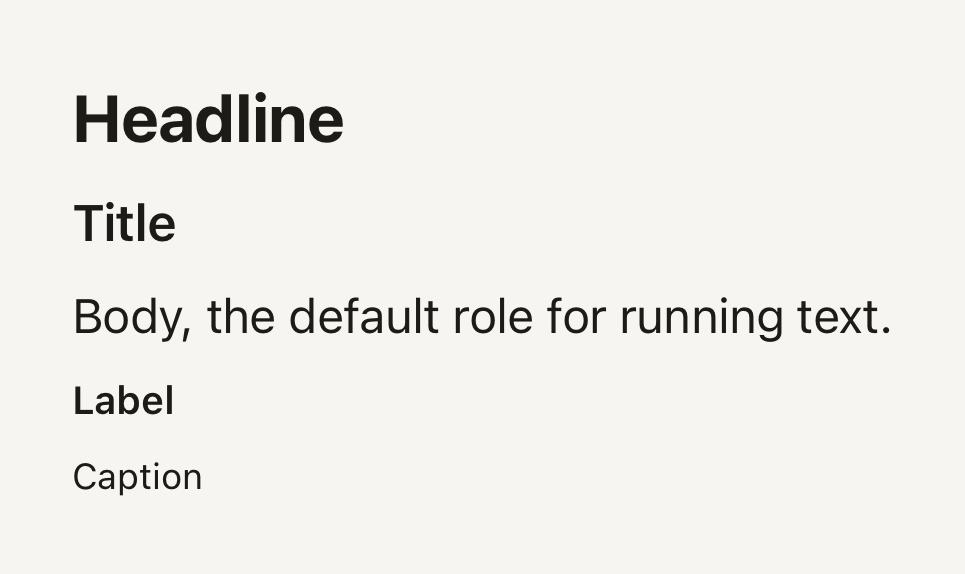
```tsx
import { Text } from "@terratcg/ui";
import { View } from "react-native";
export default function TextVariants() {
return (
HeadlineTitleBody, the default role for running text.LabelCaption
);
}
```
## Import
```tsx
import { Text } from "@terratcg/ui";
```
## Usage
```tsx
Your collection142 photos so far.
```
Text renders a React Native `Text` styled from the theme: `variant` picks the size, line height and default weight, `tone` the colour. The `style` you pass is applied last, on top of the role.
## Examples
### Tones
Semantic tones take their colour from the theme: default, secondary, muted, accent and danger.
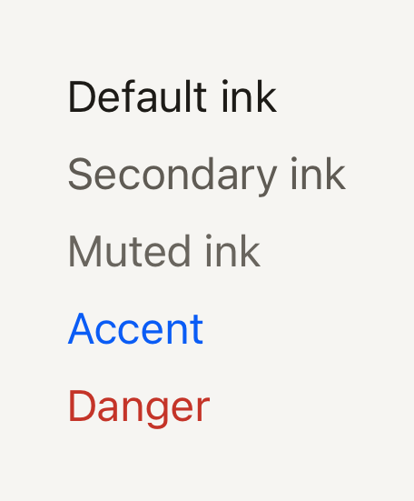
```tsx
import { Text } from "@terratcg/ui";
import { View } from "react-native";
export default function TextTones() {
return (
Default inkSecondary inkMuted inkAccentDanger
);
}
```
### Weight and tabular figures
weight overrides the role's default; tabular gives every digit the same width, so numbers line up.
```tsx
import { Text } from "@terratcg/ui";
import { View } from "react-native";
export default function TextWeights() {
return (
Regular bodyBold body
1 111
8 808
);
}
```
## Props
### TextProps
| Prop | Type | Description |
| ---------- | ------------------------------------------------------------- | --------------------------------------------------------------------------------------------------------------- |
| `variant?` | `"body" \| "caption" \| "headline" \| "label" \| "title"` | Type role. Sets size, line height and default weight. Default: `"body"` |
| `tone?` | `"accent" \| "danger" \| "default" \| "muted" \| "secondary"` | Semantic colour from the theme. Default: `"default"` |
| `weight?` | `"bold" \| "medium" \| "regular" \| "semibold"` | Overrides the variant's default weight (`label`, `title` and `headline` are heavier than `body` and `caption`). |
| `tabular?` | `boolean` | Tabular figures for counters and stats. Default: `false` |
Text also accepts React Native's `Text` props, such as `numberOfLines`, `accessibilityRole` and `selectable`. The weights are `regular`, `medium`, `semibold` and `bold`, as the theme defines them; `label`, `title` and `headline` default to the theme's strong font family when it has one.
## Accessibility
- **Role:** none of its own. A heading passes `accessibilityRole="header"`, as SectionHeader does for its title.
- **Larger text:** sizes follow the system text size, like any React Native `Text`. The line height is 1.35 times the size, so enlarged text keeps its spacing.
- **Colour:** every tone comes from the theme, whose default pairs meet WCAG AA on the page and surface colours. Don't tint text with a raw colour through `style` unless you have checked its contrast.
## Platform differences
- **iOS and Android:** the same roles and tones. `tabular` sets `fontVariant: ["tabular-nums"]`, which both platforms honour when the font has tabular figures.
- **Web:** Text renders through react-native-web for these docs, but the web is not a supported target.
## Rules
- Put every string in a Text (or a component's own text part, such as ButtonText): a bare string outside one does not render on React Native.
- Pick a `variant`, not a `fontSize`: the roles keep the type scale consistent across a view.
- Use `tone` for meaning: `danger` for errors, `accent` for what the user should act on, `secondary` and `muted` to step text back.
- Set `tabular` on numbers that change or line up in columns, so they don't shift as they count.
# ThemeProvider and feedback
ThemeProvider hands every component its theme and an optional feedback handler, where your app plays its own haptics and sounds.
## Usage
Mount one `ThemeProvider` at the root of your app and pass it the theme for the current appearance:
```tsx
import { ThemeProvider, defaultDark, defaultLight, type FeedbackHandler } from "@terratcg/ui";
import * as Haptics from "expo-haptics";
import { useColorScheme } from "react-native";
const feedback: FeedbackHandler = (intent) => {
if (intent === "press") void Haptics.impactAsync(Haptics.ImpactFeedbackStyle.Light);
else void Haptics.selectionAsync();
};
export function Root({ children }: { children: React.ReactNode }) {
const dark = useColorScheme() === "dark";
return (
{children}
);
}
```
Keep `feedback` stable, defined outside the component or in `useCallback`, so the theme context doesn't change on every render.
## Props
### ThemeProviderProps
| Prop | Type | Description |
| ----------- | ------------------- | ------------------------------------------------------------------------------------------------------------------------------------------------------------------------------- |
| `theme?` | `Theme` | Active theme. The host chooses the appearance (for example `defaultLight` or `defaultDark` from `useColorScheme()`) and owns any stored preference. Defaults to `defaultLight`. |
| `feedback?` | `FeedbackHandler` | Optional feedback sink. Missing support is a no-op and never blocks an action. |
| `labels?` | `Partial` | Default words in the host's language. Each one left out keeps the surrounding provider's, so a nested theme switch need not repeat them. |
| `children?` | `ReactNode` | |
## The theme
- **One theme at a time:** `ThemeProvider` takes a single `theme`. Your app decides between light and dark, from `useColorScheme()` or a stored preference it owns. There is no light and dark pair prop.
- **Fallback:** a component rendered with no `ThemeProvider` above it uses `defaultLight`.
- **Nesting:** an inner `ThemeProvider` overrides the theme for everything inside it. Pass its `feedback` again if that part of the screen should keep it.
- **Reading it:** `useTheme()` returns the active `Theme`, for your own components that should match: `useTheme().colors.ink`, `useTheme().spacing.md`.
See [Theming](/docs/theming) for every token and how to build your own theme.
## Labels
TerraUI ships no translations. A few controls speak a word when you give them none of their own, such as a `Spinner`'s accessibility label. Pass those words in your app's language through `labels`:
```tsx
```
- **Default:** English ("Loading") when no provider supplies a label.
- **Nesting:** an inner `ThemeProvider` that leaves a label out keeps the surrounding one, so a theme switch on part of a screen need not repeat them.
- **Reading them:** `useUiLabels()` returns the active `UiLabels`, for your own controls that should say the same words.
## Feedback
TerraUI plays no haptic and no sound. When a user deliberately acts on a control, the control calls your `feedback` handler with an intent, and your app decides what to play.
| Intent | Reported by |
| --- | --- |
| `"press"` | A Button (unless `selected` is set), IconButton, Shutter, the tab bar's central action, a pressable Cell, a pressable Row. |
| `"select"` | A Button with `selected` set, Switch, SwitchRow, SelectableCell, a tab bar item. |
- **Deliberate only:** a control reports on activation, never while disabled or loading.
- **Never blocking:** without a handler, nothing happens and the action still runs. A missing haptics module must not stop a press.
- **Outcomes are yours:** feedback is the intent of a press, not the result of an operation. Report success and failure from your own code, for example with a toast.
- **In overlays:** `OverlayHost` passes the surrounding handler to the keys of its Dialogs and Menus.
`useFeedback()` returns the handler, so your own controls can report the same intents.
## Rules
- Mount one `ThemeProvider` at the root, around your navigator and your `OverlayHost`.
- Let your app own the appearance and any stored preference; pass `ThemeProvider` the resulting theme.
- Keep haptics and sounds in your app, in the `feedback` handler. Don't call them from `onPress` as well, or each press plays twice.
- Respect the user's settings in your handler, such as a sound setting or the silent switch.
# Theming
Start from the default theme and override what your brand needs with createTheme. Every token, the colour pairs that must pass WCAG AA, and a custom theme.
## Override the default
TerraUI ships one theme, Electric, as `defaultLight` and `defaultDark`. To match your brand, start from it and change a few tokens with `createTheme`:
```tsx
import { createTheme, defaultDark, defaultLight } from "@terratcg/ui";
export const brandLight = createTheme(defaultLight, {
colors: { accent: "#7A2BD9", accentEdge: "#4E1A8C", accentSoft: "#EFE3FC", onAccentSoft: "#5A1FA3" },
shape: { radiusMd: 22 },
});
export const brandDark = createTheme(defaultDark, {
colors: { accent: "#B58CFF", accentEdge: "#7A4FCC", accentSoft: "#2A1D45", onAccentSoft: "#CDB2FF", onAccent: "#1A0B33" },
shape: { radiusMd: 22 },
});
```
`createTheme(base, overrides)` deep-merges your overrides over `base` and returns a complete `Theme`. Every token you leave out keeps the base value. Neither input is changed.
It derives nothing: a new `accent` does not compute its `accentEdge`, its soft fill or the text on it. Change a colour together with the tokens that sit beside it (its edge, its soft fill, the text on it), then check the pairs under [Contrast pairs](#contrast-pairs).
A `Theme` is a plain object, so a complete hand-written theme works too. Type it as `Theme` and TypeScript lists every token you still owe. That path is for when you control every value, depth included.
## Light and dark
Your app picks the appearance and owns any stored preference. Give `ThemeProvider` one theme at a time:
```tsx
import { ThemeProvider } from "@terratcg/ui";
import { useColorScheme } from "react-native";
import { brandDark, brandLight } from "./theme";
export function Root({ children }: { children: React.ReactNode }) {
const dark = useColorScheme() === "dark";
return {children};
}
```
Build the light and dark themes from `defaultLight` and `defaultDark` respectively: each carries its own depth, tuned for its ground. See [ThemeProvider and feedback](/docs/theme-provider).
## A custom theme
Tide is a sample theme made with `createTheme`: coral actions on sand and deep navy, rounder corners, longer travel and heavier labels. The same components take on a different identity. Tide is not exported; copy what you need.
### Tide
The same Card, Switch, Progress and Buttons in Tide, a custom theme: coral keys on sand, rounder and deeper.
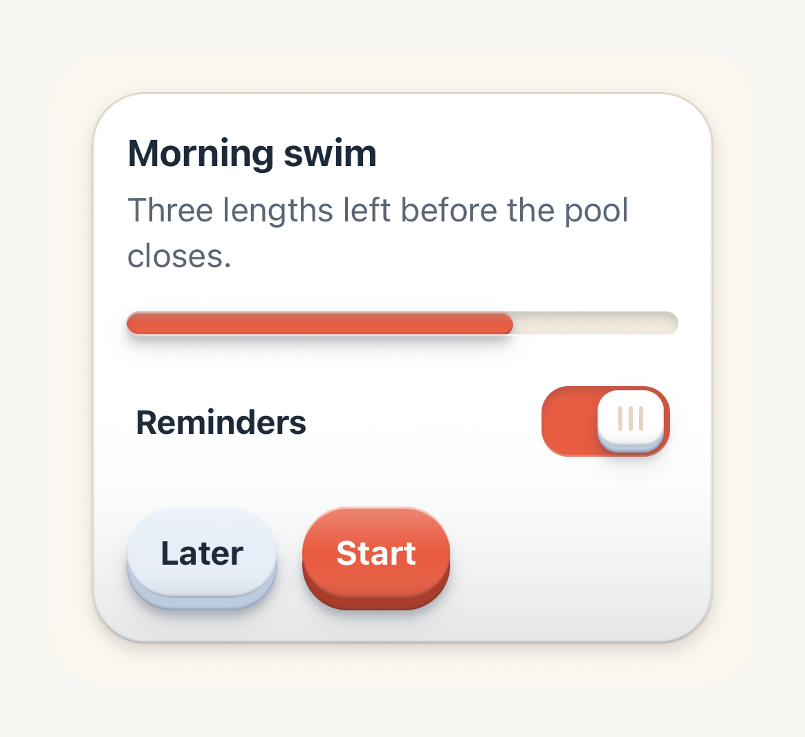
```tsx
import {
Button,
ButtonText,
Card,
CardContent,
CardDescription,
CardFooter,
CardHeader,
CardTitle,
Progress,
RowContent,
RowTitle,
SwitchRow,
ThemeProvider,
useTheme,
} from "@terratcg/ui";
import { useState } from "react";
import { View } from "react-native";
import { tideDark, tideLight } from "../../themes/tide";
export default function TideTheme() {
// Follow the surrounding appearance; an app would read useColorScheme().
const tide = useTheme().scheme === "dark" ? tideDark : tideLight;
const [reminders, setReminders] = useState(true);
return (
Morning swimThree lengths left before the pool closes.Reminders
);
}
```
## Safe to change
Colours, typography, spacing, shape and motion change how TerraUI looks without changing how its material works. Every value below is Electric's.
`name` and `scheme` identify the theme: a family name of your choosing, and `"light"` or `"dark"`.
### Colours
Every control reads its colours from these semantic tokens, never from literals.
| Token | Light | Dark | Role |
| --- | --- | --- | --- |
| `colors.background` | `#F6F5F2` | `#171613` | Page ground. |
| `colors.surface` | `#FFFFFF` | `#22201C` | Raised content surface: cards, panels. |
| `colors.bar` | `#FFFFFF` | `#22201C` | The chrome bars (tab bar deck, header bar): a shell that may differ from `surface` per scheme. |
| `colors.surfaceMuted` | `#EEECE7` | `#1B1A17` | Recessed wells and tracks. In dark, keep it below `surface` so a well reads as lower. |
| `colors.border` | `#DBD8D1` | `#3A3731` | Hairline dividers and outline strokes. |
| `colors.ink` | `#1D1B17` | `#F6F4EF` | Primary text. |
| `colors.inkSecondary` | `#5F5B54` | `#BFBAB1` | Supporting text. |
| `colors.inkMuted` | `#69655E` | `#969188` | Placeholders, timestamps, denominators. |
| `colors.accent` | `#0A5CF5` | `#3F8CFF` | The single UI accent: primary actions, selection, progress. |
| `colors.accentEdge` | `#003FB3` | `#1C5FD6` | Lower edge of an accent control. |
| `colors.accentSoft` | `#DEE9FF` | `#14284A` | Soft accent fill for selected surfaces. |
| `colors.onAccentSoft` | `#0041B8` | `#7DB0FF` | Text and icons on the soft accent fill: accent badges, selected labels, success notices. |
| `colors.onAccent` | `#FFFFFF` | `#001233` | Text and icons on the accent fill. |
| `colors.secondary` | `#E9E7E2` | `#2F2C27` | Secondary control fill. |
| `colors.secondaryEdge` | `#C9C5BC` | `#1C1A17` | Lower edge of a secondary control. |
| `colors.onSecondary` | `#1D1B17` | `#F6F4EF` | Text and icons on the secondary fill. |
| `colors.danger` | `#C43428` | `#FF6F5E` | Destructive and error emphasis. |
| `colors.dangerEdge` | `#93261C` | `#BC4538` | Lower edge of a destructive control. |
| `colors.dangerSoft` | `#FCE5E1` | `#3B1D19` | Soft danger fill for error surfaces. |
| `colors.onDanger` | `#FFFFFF` | `#2B0B07` | Text and icons on the danger fill. |
| `colors.disabled` | `#E6E4DF` | `#2A2824` | Inactive control fill. Stays readable against its text. |
| `colors.onDisabled` | `#615D56` | `#A09B92` | Text and icons on the disabled fill. |
| `colors.pressTint` | `rgba(20, 14, 4, 0.14)` | `rgba(255, 255, 255, 0.12)` | Translucent overlay laid on a face while it is pressed. |
### Typography
Light and dark share these values.
| Token | Light | Dark | Role |
| --- | --- | --- | --- |
| `typography.fontFamily` | none | none | Family for ordinary text, loaded by your app. Unset, the platform font. |
| `typography.fontFamilyStrong` | none | none | Family for emphasised text (titles, labels). Unset, `fontFamily`. |
| `typography.sizes.caption` | `12` | `12` | The `caption` Text variant. |
| `typography.sizes.label` | `13` | `13` | The `label` Text variant, and small button text. |
| `typography.sizes.body` | `16` | `16` | The `body` Text variant, and default button text. |
| `typography.sizes.title` | `17` | `17` | The `title` Text variant, and large button text. |
| `typography.sizes.headline` | `22` | `22` | The `headline` Text variant. |
| `typography.weights.regular` | `400` | `400` | Ordinary text. |
| `typography.weights.medium` | `500` | `500` | Light emphasis. |
| `typography.weights.semibold` | `600` | `600` | Labels and button text. |
| `typography.weights.bold` | `700` | `700` | Strong emphasis, such as a selected label. |
Sizes are in points and scale with the system text size.
### Spacing
| Token | Light | Dark | Role |
| --- | --- | --- | --- |
| `spacing.xs` | `4` | `4` | The smallest step. |
| `spacing.sm` | `8` | `8` | A tight step, inside a control. |
| `spacing.md` | `16` | `16` | The common step: padding inside surfaces. |
| `spacing.lg` | `20` | `20` | A wide step. |
| `spacing.xl` | `24` | `24` | The widest step. |
### Shape
| Token | Light | Dark | Role |
| --- | --- | --- | --- |
| `shape.radiusSm` | `10` | `10` | Small keys, cells and inline notices. |
| `shape.radiusMd` | `14` | `14` | Keys, inputs and rows. |
| `shape.radiusLg` | `16` | `16` | Cards, notices, stats and tasks. |
| `shape.radiusPill` | `999` | `999` | Fully rounded ends: pills and tracks. |
### Motion
| Token | Light | Dark | Role |
| --- | --- | --- | --- |
| `motion.pressIn` | `70` | `70` | Press-in duration, in milliseconds. |
| `motion.pressOut` | `160` | `160` | Release duration, in milliseconds. |
## Advanced: depth
`depth` is the tactile material itself: how far a key travels, the shadows that seat it on the shell, the light along its rims and the recess of a well. The [Material](/docs/material) page explains each treatment. Change these tokens to tune the material for your palette, for example to tint the shadows with your ink, and check every control in both appearances afterwards.
| Token | Light | Dark | What it draws |
| --- | --- | --- | --- |
| `depth.travel` | `4` | `4` | Press travel and visible lower edge of a regular key, in points. |
| `depth.travelSm` | `3` | `3` | Travel and edge of a small key. |
| `depth.contact` | `y 2, blur 3, rgba(29, 27, 23, 0.16)` | `y 2, blur 4, rgba(0, 0, 0, 0.45)` | Contact shadow under a raised key. |
| `depth.surface` | `y 2, blur 5, rgba(29, 27, 23, 0.12)` | `y 1, blur 3, rgba(0, 0, 0, 0.3)` | Lift of a content surface resting on the page. |
| `depth.surfaceNested` | `y 1, blur 2, rgba(29, 27, 23, 0.1)` | `y 1, blur 2, rgba(0, 0, 0, 0.22)` | Shallower lift of a surface resting on another one. |
| `depth.halo` | `y 4, blur 8, rgba(29, 27, 23, 0.12)` | `y 4, blur 10, rgba(0, 0, 0, 0.4)` | Soft occlusion on the shell around the base of a raised key. |
| `depth.highlight` | `rgba(255, 255, 255, 0.5)` | `rgba(255, 255, 255, 0.24)` | Rim light along the top of a key or a surface. |
| `depth.shade` | `rgba(29, 27, 23, 0.24)` | `rgba(0, 0, 0, 0.38)` | Shade along the lower rim of a key, where it turns under. |
| `depth.sheen` | `lit rgba(255, 255, 255, 0.22)` over `shaded rgba(29, 27, 23, 0.08)` | `lit rgba(255, 255, 255, 0.12)` over `shaded rgba(0, 0, 0, 0.16)` | Sheen down a key's face: the lit stop at the top, the shaded stop below. |
| `depth.shell` | `rim rgba(29, 27, 23, 0.24)` over `shade rgba(29, 27, 23, 0.1)` | `rim rgba(0, 0, 0, 0.16)` over `shade rgba(0, 0, 0, 0)` | A surface's lower edge where it turns under, and the shade its lower half falls into. |
| `depth.recess` | `y 2, blur 3, rgba(29, 27, 23, 0.16)` | `y 3, blur 5, rgba(0, 0, 0, 0.65)` | Shadow the upper lip of a well casts into it. |
| `depth.lip` | `rgba(255, 255, 255, 0.75)` | `rgba(255, 255, 255, 0.1)` | Light caught by the lower lip of a well. |
Shadows are written as their vertical offset, blur and colour, in points. Every shadow is a React Native `boxShadow`, so the material looks the same on iOS and Android.
## Contrast pairs
Text and icons sit on these pairs. Each must reach 4.5:1 to pass WCAG AA for body text. Check them whenever you change a colour. These are Electric's ratios, rounded down:
| Pair | Light | Dark | WCAG AA |
| --- | --- | --- | --- |
| `ink` on `background` | 15.7:1 | 16.4:1 | Passes |
| `ink` on `surface` | 17.1:1 | 14.7:1 | Passes |
| `inkSecondary` on `surface` | 6.7:1 | 8.4:1 | Passes |
| `inkMuted` on `background` | 5.3:1 | 5.7:1 | Passes |
| `inkMuted` on `surface` | 5.8:1 | 5.1:1 | Passes |
| `inkMuted` on `surfaceMuted` | 4.9:1 | 5.5:1 | Passes |
| `accent` on `background` | 4.9:1 | 5.5:1 | Passes |
| `accent` on `surface` | 5.4:1 | 4.9:1 | Passes |
| `onAccent` on `accent` | 5.4:1 | 5.6:1 | Passes |
| `onAccentSoft` on `accentSoft` | 7.0:1 | 6.6:1 | Passes |
| `onSecondary` on `secondary` | 13.9:1 | 12.6:1 | Passes |
| `onDanger` on `danger` | 5.4:1 | 6.6:1 | Passes |
| `danger` on `background` | 4.9:1 | 6.6:1 | Passes |
| `danger` on `surface` | 5.4:1 | 5.9:1 | Passes |
| `danger` on `dangerSoft` | 4.5:1 | 5.5:1 | Passes |
| `onDisabled` on `disabled` | 5.1:1 | 5.3:1 | Passes |
`danger` on `dangerSoft` is what a danger `InlineNotice` draws, so a theme that changes either colour should check that pair first: it has the least room.
# Toast
A short message that slides in from the top of the window, one at a time. Open one from anywhere with showToast.
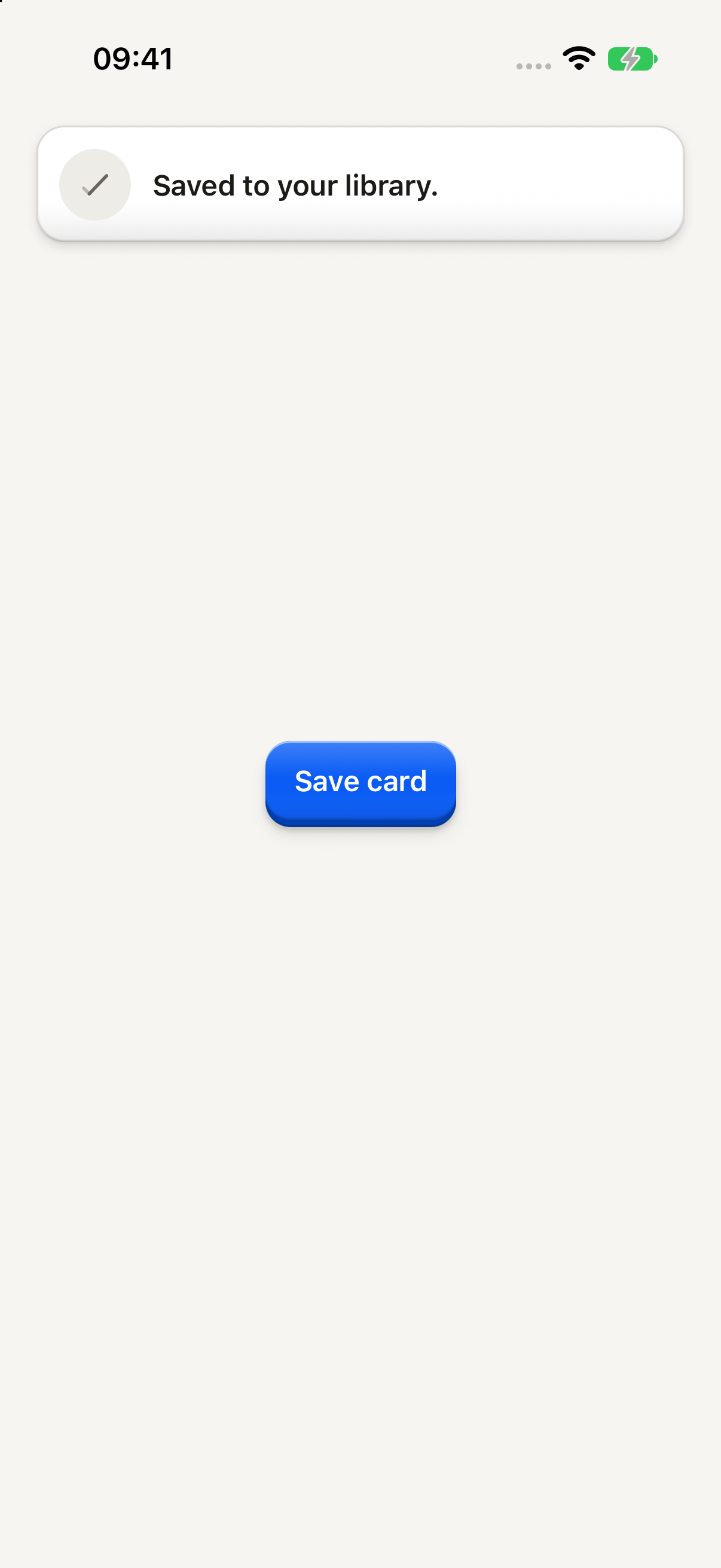
```tsx
import { Button, ButtonText, showToast } from "@terratcg/ui";
import { useEffect } from "react";
const save = () => showToast({ tone: "neutral", message: "Saved to your library." });
export default function ToastNeutral({ capture }: SceneProps) {
useEffect(() => {
// A neutral toast leaves after about 3 seconds, sooner than a simulator
// screenshot lands: the capture queues it back to back to keep it up.
if (capture) for (let shown = 0; shown < 4; shown++) save();
}, [capture]);
return (
);
}
```
## Import
```tsx
import { showToast } from "@terratcg/ui";
```
## Usage
```tsx
showToast({ tone: "neutral", message: "Saved to your library." });
```
Toasts appear in the `OverlayHost`, which you mount once at the root inside `ThemeProvider`. `showToast` works from anywhere, inside a render or not. Toasts queue: each one shows after the one before it has gone.
The host draws each tone's glyph from its `toastIcons` prop, and keeps toasts below the status bar by `toastInsetTop`: pass your safe-area top inset.
## Examples
### Danger
A failure with no place on screen: one sentence for about 6 seconds, and a tap sends it away.
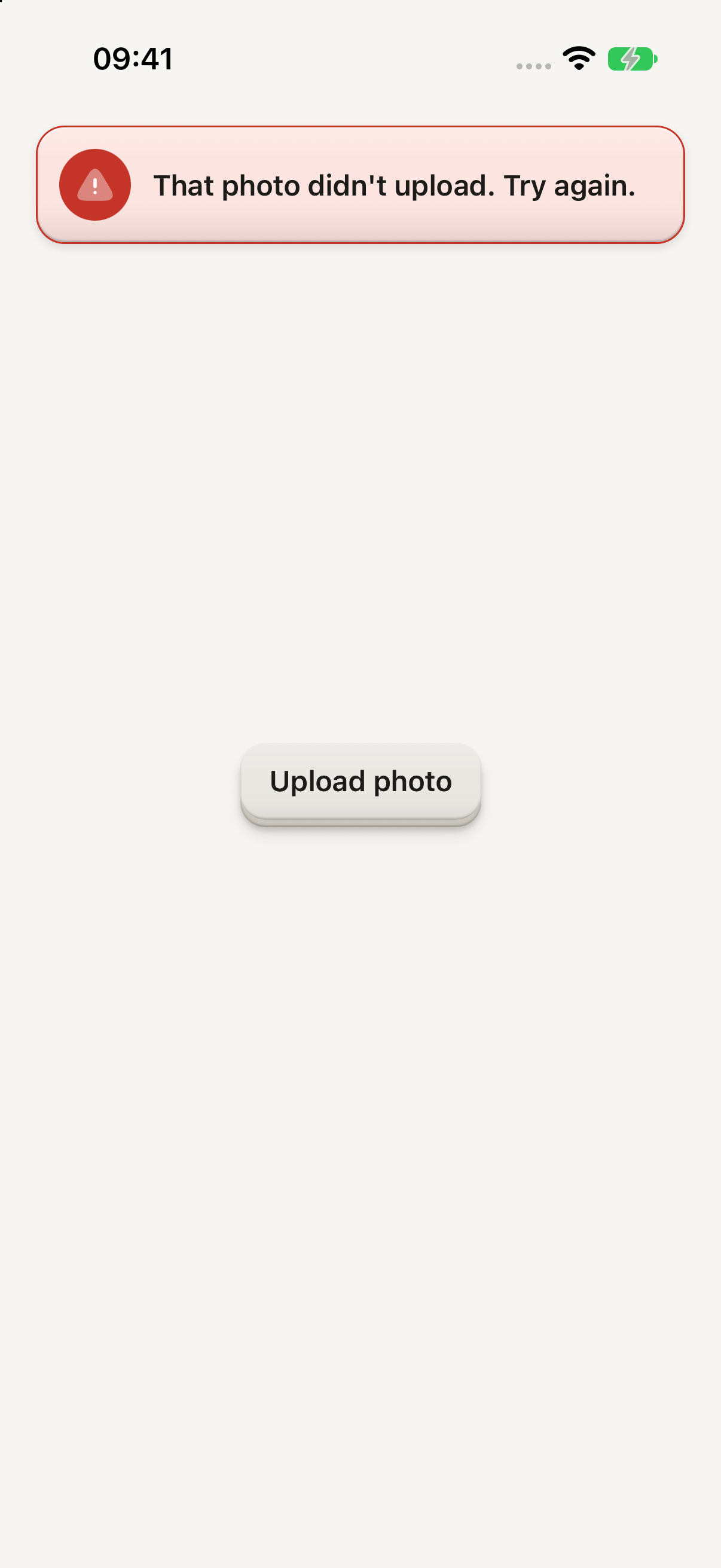
```tsx
import { Button, ButtonText, showToast } from "@terratcg/ui";
import { useEffect } from "react";
const fail = () => showToast({ tone: "danger", message: "That photo didn't upload. Try again." });
export default function ToastDanger({ capture }: SceneProps) {
useEffect(() => {
if (capture) fail();
}, [capture]);
return (
);
}
```
## Props
### showToast
### ToastSpec
| Prop | Type | Description |
| --------- | ----------------------- | -------------------------------------------------------------------------- |
| `tone` | `"danger" \| "neutral"` | "neutral" stays about 3 seconds; "danger" about 6, and a tap dismisses it. |
| `message` | `string` | One short sentence. |
| `owner?` | `string` | Who queued it, so `clearTopToasts(owner)` clears only its own. |
`clearTopToasts(owner)` drops one owner's toasts, the one in view included; with no owner, it drops every toast.
### TopToastCard
For a toast of your own, such as one with an action, build it on `TopToastCard` and queue it with `showTopToast({ content, durationMs, owner })`. Size a custom `disc` glyph with `TOP_TOAST_GLYPH` (22 pt), the size the built-in toasts use.
### TopToastCardProps
| Prop | Type | Description |
| -------------- | ----------------------- | -------------------------------------------------------------------------- |
| `disc?` | `ReactNode` | The glyph in the round disc at the start, from the host. |
| `discColor?` | `string` | The disc's fill. |
| `title` | `string` | The message, in the body's semibold. |
| `body?` | `string \| null` | A second line in the secondary ink. |
| `tone?` | `"danger" \| "default"` | The card's tone. Default: `"default"` |
| `dismissible?` | `boolean` | A tap sends it away. Only for a toast with no `onPress`. |
| `onPress?` | `(() => void)` | Makes the toast a button that leaves as it acts; `hint` says what it does. |
| `hint?` | `string` | What a press does, for screen readers. With `onPress` only. |
## Accessibility
- **Announced once:** a toast is announced when it shows, and never takes screen-reader focus.
- **Role:** an `alert`. A neutral toast lets touches through to the page under it. A `danger` toast dismisses on a tap, and a toast with `onPress` is a `button` that says what it does through `hint`.
- **Time:** a neutral toast stays about 3 seconds, a `danger` one about 6.
- **Reduce Motion:** the toast fades in and out without sliding.
## Platform differences
- **iOS:** toasts sit in a full-window overlay above native sheets, which VoiceOver does not treat as modal.
- **Android:** toasts are a plain layer of the root view, above the page and sheets in the same window.
- **Holds:** toasts wait while a Dialog or Menu is up, or while the host's `holdToasts` is set. A toast in view steps aside and comes back with its whole time.
- **Web:** the live tab mounts its own OverlayHost in the preview frame, so the toast shows inside the frame. The web is not a supported target.
## Rules
- Write one short sentence. A toast has no title.
- Use `neutral` for a result that needs nothing from the user, and `danger` for a failure with no place on screen.
- Show an error next to its field or in its Dialog when it has one: a toast is for what has nowhere else to go.
- Never put the only way to do something in a toast: it leaves on its own.
- Clear a feature's toasts with `clearTopToasts(owner)` when the user leaves it.