Action tray
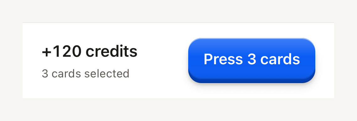
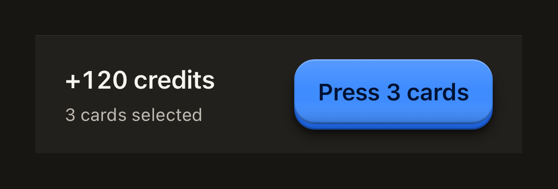
A fixed bottom tray for a screen's essential figures and its confirming action. Compose it from ActionTrayNotice, ActionTrayRow and ActionTrayDetails.
import { ActionTray, ActionTrayDetails, ActionTrayRow, Button, ButtonText, Text } from "@terratcg/ui";

export default function ActionTraySummary() {
  return (
    <ActionTray style={{ alignSelf: "stretch" }}>
      <ActionTrayRow>
        <ActionTrayDetails>
          <Text variant="title" tabular>+120 credits</Text>
          <Text variant="caption" tone="secondary">3 cards selected</Text>
        </ActionTrayDetails>
        <Button onPress={() => {}}>
          <ButtonText>Press 3 cards</ButtonText>
        </Button>
      </ActionTrayRow>
    </ActionTray>
  );
}
Import
import { ActionTray, ActionTrayDetails, ActionTrayNotice, ActionTrayRow } from "@terratcg/ui";Usage
<ActionTray bottomInset={insets.bottom}>
  <ActionTrayRow>
    <ActionTrayDetails>
      <Text variant="title">+120 credits</Text>
    </ActionTrayDetails>
    <Button onPress={confirm}>
      <ButtonText>Press 3 cards</ButtonText>
    </Button>
  </ActionTrayRow>
</ActionTray>
The tray draws its surface, its hairline and its padding, and nothing else: you position it at the bottom of the screen, pass the bottom safe-area inset, and own the operation its action starts. ActionTrayRow lays the details out on the left and the action on the right, and wraps the action below them when the text grows or the screen is narrow.
Examples
With a notice
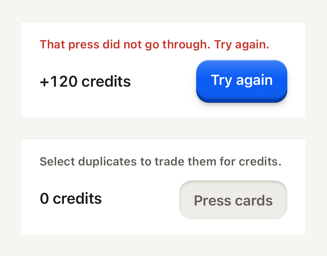
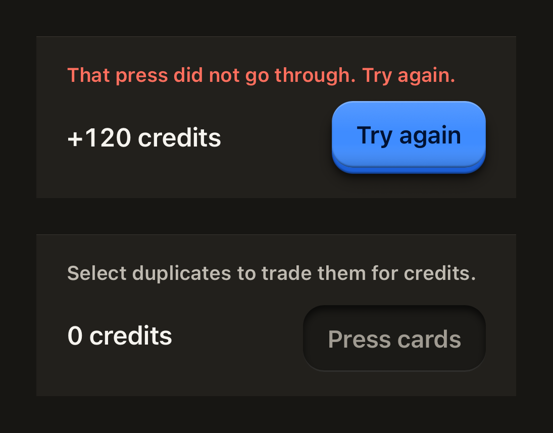
A one-line notice above the row: a danger notice is announced as an alert, a default one is a quiet hint.
import { ActionTray, ActionTrayDetails, ActionTrayNotice, ActionTrayRow, Button, ButtonText, Text } from "@terratcg/ui";
import { View } from "react-native";

export default function ActionTrayWithNotice() {
  return (
    <View style={{ alignSelf: "stretch", gap: 24 }}>
      <ActionTray>
        <ActionTrayNotice>That press did not go through. Try again.</ActionTrayNotice>
        <ActionTrayRow>
          <ActionTrayDetails>
            <Text variant="title" tabular>+120 credits</Text>
          </ActionTrayDetails>
          <Button onPress={() => {}}>
            <ButtonText>Try again</ButtonText>
          </Button>
        </ActionTrayRow>
      </ActionTray>
      <ActionTray>
        <ActionTrayNotice tone="default">Select duplicates to trade them for credits.</ActionTrayNotice>
        <ActionTrayRow>
          <ActionTrayDetails>
            <Text variant="title" tabular>0 credits</Text>
          </ActionTrayDetails>
          <Button disabled>
            <ButtonText>Press cards</ButtonText>
          </Button>
        </ActionTrayRow>
      </ActionTray>
    </View>
  );
}
Props
ActionTray
Prop
Type
ActionTray also accepts React Native's View props, such as style and testID. Its bottom padding is the larger of bottomInset and its own spacing.
ActionTrayNotice
Prop
Type
ActionTrayNotice also accepts React Native's Text props, such as numberOfLines. A notice is danger unless you pass tone="default".
ActionTrayRow and ActionTrayDetails
Both take React Native's View props and nothing of their own. ActionTrayDetails grows first and keeps at least 140 points, so the action wraps below it before the figures get squeezed.
Accessibility
- Reading order: put the notice first, then the row. Screen readers announce a failure before the figures and the action it concerns.
- Danger notice: a polite live region with the
alertrole, so a new failure is announced without stealing focus. - Default notice: a polite live region with no role, read as a quiet hint.
- Larger text: the row wraps, putting the action under the details instead of clipping either.
Platform differences
- iOS and Android: the same tray, hairline and spacing. The bottom inset comes from you, so read it from your safe-area provider on each platform.
- Web: ActionTray renders through react-native-web for these docs, but the web is not a supported target.
Rules
- Keep one confirming action in the tray, the screen's primary Button, and nothing that scrolls.
- Show only the figures needed to confirm: a total, a count, a chip. Everything else stays on the screen above.
- Pass the bottom safe-area inset as
bottomInset; never pad the tray yourself. - Use a
dangernotice for a failure the user must act on,defaultfor a hint. Keep it to one line.