Icon button
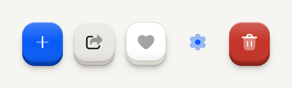
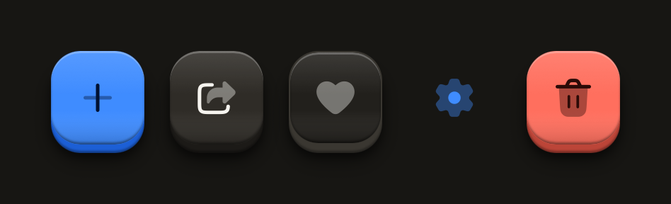
A square Button for a single icon, for actions that a glyph names on its own. It always carries an accessibility label.
import Add01Icon from "@hugeicons-pro/core-bulk-rounded/Add01Icon";
import Delete02Icon from "@hugeicons-pro/core-bulk-rounded/Delete02Icon";
import FavouriteIcon from "@hugeicons-pro/core-bulk-rounded/FavouriteIcon";
import Settings01Icon from "@hugeicons-pro/core-bulk-rounded/Settings01Icon";
import Share01Icon from "@hugeicons-pro/core-bulk-rounded/Share01Icon";
import { HugeiconsIcon } from "@hugeicons/react-native";
import { ButtonIcon, IconButton } from "@terratcg/ui";
import { View } from "react-native";

export default function IconButtonVariants() {
  return (
    <View style={{ flexDirection: "row", flexWrap: "wrap", justifyContent: "center", gap: 12 }}>
      <IconButton accessibilityLabel="Add">
        <ButtonIcon>{({ color, size }) => <HugeiconsIcon icon={Add01Icon} color={color} size={size} />}</ButtonIcon>
      </IconButton>
      <IconButton variant="secondary" accessibilityLabel="Share">
        <ButtonIcon>{({ color, size }) => <HugeiconsIcon icon={Share01Icon} color={color} size={size} />}</ButtonIcon>
      </IconButton>
      <IconButton variant="outline" accessibilityLabel="Favourite">
        <ButtonIcon>{({ color, size }) => <HugeiconsIcon icon={FavouriteIcon} color={color} size={size} />}</ButtonIcon>
      </IconButton>
      <IconButton variant="ghost" accessibilityLabel="Settings">
        <ButtonIcon>{({ color, size }) => <HugeiconsIcon icon={Settings01Icon} color={color} size={size} />}</ButtonIcon>
      </IconButton>
      <IconButton variant="destructive" accessibilityLabel="Delete">
        <ButtonIcon>{({ color, size }) => <HugeiconsIcon icon={Delete02Icon} color={color} size={size} />}</ButtonIcon>
      </IconButton>
    </View>
  );
}
Import
import { ButtonIcon, IconButton } from "@terratcg/ui";Usage
<IconButton variant="ghost" accessibilityLabel="Settings" onPress={openSettings}>
  <ButtonIcon>{({ color, size }) => <SettingsIcon color={color} size={size} />}</ButtonIcon>
</IconButton>
IconButton is a Button with a square face: it takes the same variants, states and feedback, and only its sizes change. Hand it the icon through ButtonIcon, whose render function gives you the face's colour and the icon size. TerraUI ships no icons; bring your own.
Examples
Sizes
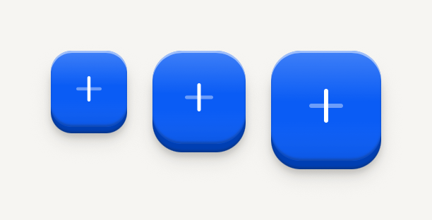
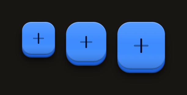
Small, default and large: 36, 44 and 52 point squares, the icon stepping up with the face.
import Add01Icon from "@hugeicons-pro/core-bulk-rounded/Add01Icon";
import { HugeiconsIcon } from "@hugeicons/react-native";
import { ButtonIcon, IconButton } from "@terratcg/ui";
import { View } from "react-native";

export default function IconButtonSizes() {
  return (
    <View style={{ flexDirection: "row", flexWrap: "wrap", justifyContent: "center", alignItems: "center", gap: 12 }}>
      <IconButton size="sm" accessibilityLabel="Add, small">
        <ButtonIcon>{({ color, size }) => <HugeiconsIcon icon={Add01Icon} color={color} size={size} />}</ButtonIcon>
      </IconButton>
      <IconButton accessibilityLabel="Add">
        <ButtonIcon>{({ color, size }) => <HugeiconsIcon icon={Add01Icon} color={color} size={size} />}</ButtonIcon>
      </IconButton>
      <IconButton size="lg" accessibilityLabel="Add, large">
        <ButtonIcon>{({ color, size }) => <HugeiconsIcon icon={Add01Icon} color={color} size={size} />}</ButtonIcon>
      </IconButton>
    </View>
  );
}
States
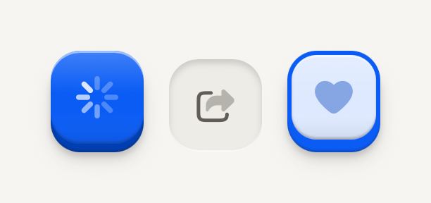
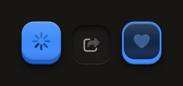
Loading swaps the icon for a spinner at the same size; disabled is molded flat; selected sits pressed in its well.
import FavouriteIcon from "@hugeicons-pro/core-bulk-rounded/FavouriteIcon";
import Share01Icon from "@hugeicons-pro/core-bulk-rounded/Share01Icon";
import { HugeiconsIcon } from "@hugeicons/react-native";
import { ButtonIcon, IconButton } from "@terratcg/ui";
import { View } from "react-native";

export default function IconButtonStates() {
  return (
    <View style={{ flexDirection: "row", flexWrap: "wrap", justifyContent: "center", gap: 12 }}>
      <IconButton loading accessibilityLabel="Saving">
        <ButtonIcon>{({ color, size }) => <HugeiconsIcon icon={Share01Icon} color={color} size={size} />}</ButtonIcon>
      </IconButton>
      <IconButton disabled accessibilityLabel="Share">
        <ButtonIcon>{({ color, size }) => <HugeiconsIcon icon={Share01Icon} color={color} size={size} />}</ButtonIcon>
      </IconButton>
      <IconButton variant="outline" selected accessibilityLabel="Favourite">
        <ButtonIcon>{({ color, size }) => <HugeiconsIcon icon={FavouriteIcon} color={color} size={size} />}</ButtonIcon>
      </IconButton>
    </View>
  );
}
Props
Prop
Type
IconButton also accepts React Native's Pressable props, such as hitSlop and testID. size maps to Button's square sizes: sm is icon-sm, default is icon and lg is icon-lg. selected and tint work together as on Button.
Accessibility
- Role:
button, withaccessibilityStatekeepingdisabled,busy(whileloading) andselectedin sync, as on Button. - Label:
accessibilityLabelis required: the face shows no text, so the label is the only name a screen reader has. Name the action ("Share card"), not the glyph ("Arrow"). - Touch target: at least 44 pt on iOS and 48 dp on Android. The 36 pt
smface keeps its size and grows its touch area withhitSlop. - Reduce Motion: the face no longer travels when pressed; the press tint stays.
Platform differences
- iOS and Android: the same square key and the same travel, with no ripple. Only the minimum touch target differs: 44 pt on iOS, 48 dp on Android.
- Feedback: a press calls ThemeProvider's
feedbackhandler with"press", or"select"whenselectedis set. TerraUI plays no haptic or sound itself. - Web: IconButton renders through react-native-web for these docs, but the web is not a supported target.
Rules
- Use an IconButton only when the icon is unmistakable on its own; otherwise use a Button with a ButtonText.
- Always pass
accessibilityLabel, and keep it in step with what the icon means. - Put one icon inside
ButtonIcon, and draw it with the colour and size the render function hands you. - Use
onPress, neveronClick, and style props, neverclassName. loadingis yours to clear: the key stays busy until you set it back tofalse.