Theming
Start from the default theme and override what your brand needs with createTheme. Every token, the colour pairs that must pass WCAG AA, and a custom theme.
Override the default
TerraUI ships one theme, Electric, as defaultLight and defaultDark. To match your brand, start from it and change a few tokens with createTheme:
import { createTheme, defaultDark, defaultLight } from "@terratcg/ui";

export const brandLight = createTheme(defaultLight, {
  colors: { accent: "#7A2BD9", accentEdge: "#4E1A8C", accentSoft: "#EFE3FC", onAccentSoft: "#5A1FA3" },
  shape: { radiusMd: 22 },
});

export const brandDark = createTheme(defaultDark, {
  colors: { accent: "#B58CFF", accentEdge: "#7A4FCC", accentSoft: "#2A1D45", onAccentSoft: "#CDB2FF", onAccent: "#1A0B33" },
  shape: { radiusMd: 22 },
});
createTheme(base, overrides) deep-merges your overrides over base and returns a complete Theme. Every token you leave out keeps the base value. Neither input is changed.
It derives nothing: a new accent does not compute its accentEdge, its soft fill or the text on it. Change a colour together with the tokens that sit beside it (its edge, its soft fill, the text on it), then check the pairs under Contrast pairs.
A Theme is a plain object, so a complete hand-written theme works too. Type it as Theme and TypeScript lists every token you still owe. That path is for when you control every value, depth included.
Light and dark
Your app picks the appearance and owns any stored preference. Give ThemeProvider one theme at a time:
import { ThemeProvider } from "@terratcg/ui";
import { useColorScheme } from "react-native";

import { brandDark, brandLight } from "./theme";

export function Root({ children }: { children: React.ReactNode }) {
  const dark = useColorScheme() === "dark";
  return <ThemeProvider theme={dark ? brandDark : brandLight}>{children}</ThemeProvider>;
}
Build the light and dark themes from defaultLight and defaultDark respectively: each carries its own depth, tuned for its ground. See ThemeProvider and feedback.
A custom theme
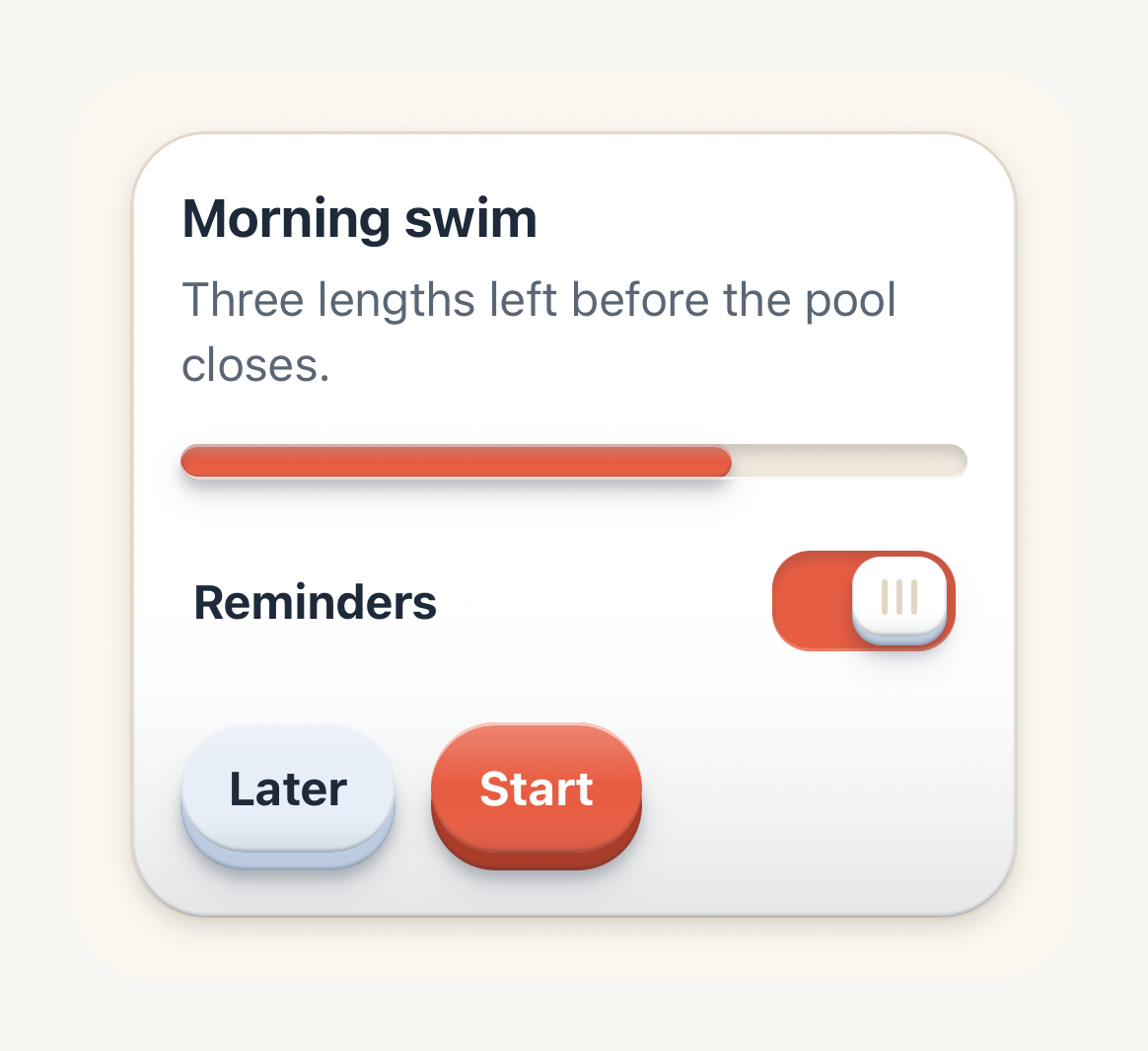
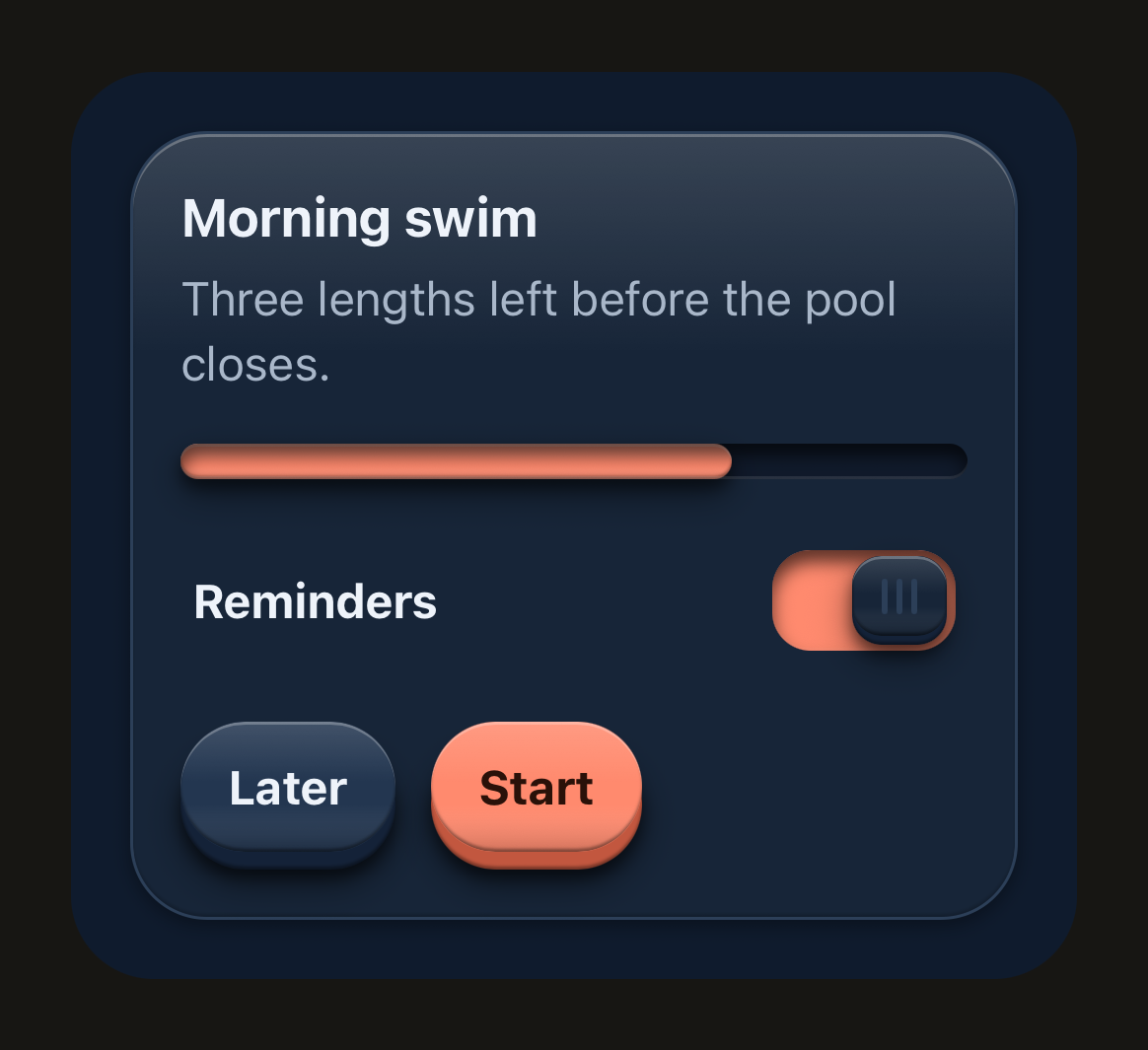
Tide is a sample theme made with createTheme: coral actions on sand and deep navy, rounder corners, longer travel and heavier labels. The same components take on a different identity. Tide is not exported; copy what you need.
Tide
The same Card, Switch, Progress and Buttons in Tide, a custom theme: coral keys on sand, rounder and deeper.
import {
  Button,
  ButtonText,
  Card,
  CardContent,
  CardDescription,
  CardFooter,
  CardHeader,
  CardTitle,
  Progress,
  RowContent,
  RowTitle,
  SwitchRow,
  ThemeProvider,
  useTheme,
} from "@terratcg/ui";
import { useState } from "react";
import { View } from "react-native";

import { tideDark, tideLight } from "../../themes/tide";

export default function TideTheme() {
  // Follow the surrounding appearance; an app would read useColorScheme().
  const tide = useTheme().scheme === "dark" ? tideDark : tideLight;
  const [reminders, setReminders] = useState(true);
  return (
    <ThemeProvider theme={tide}>
      <View style={{ backgroundColor: tide.colors.background, borderRadius: 28, padding: 20, width: 340, maxWidth: "100%" }}>
        <Card>
          <CardHeader>
            <CardTitle>Morning swim</CardTitle>
            <CardDescription>Three lengths left before the pool closes.</CardDescription>
          </CardHeader>
          <CardContent style={{ gap: 16 }}>
            <Progress value={0.7} accessibilityLabel="Swim progress" />
            <SwitchRow value={reminders} onValueChange={setReminders} accessibilityLabel="Reminders">
              <RowContent>
                <RowTitle>Reminders</RowTitle>
              </RowContent>
            </SwitchRow>
          </CardContent>
          <CardFooter style={{ gap: 12 }}>
            <Button variant="secondary">
              <ButtonText>Later</ButtonText>
            </Button>
            <Button>
              <ButtonText>Start</ButtonText>
            </Button>
          </CardFooter>
        </Card>
      </View>
    </ThemeProvider>
  );
}
Safe to change
Colours, typography, spacing, shape and motion change how TerraUI looks without changing how its material works. Every value below is Electric's.
name and scheme identify the theme: a family name of your choosing, and "light" or "dark".
Colours
Every control reads its colours from these semantic tokens, never from literals.
| Token | Light | Dark | Role |
|---|---|---|---|
colors.background | #F6F5F2 | #171613 | Page ground. |
colors.surface | #FFFFFF | #22201C | Raised content surface: cards, panels. |
colors.bar | #FFFFFF | #22201C | The chrome bars (tab bar deck, header bar): a shell that may differ from surface per scheme. |
colors.surfaceMuted | #EEECE7 | #1B1A17 | Recessed wells and tracks. In dark, keep it below surface so a well reads as lower. |
colors.border | #DBD8D1 | #3A3731 | Hairline dividers and outline strokes. |
colors.ink | #1D1B17 | #F6F4EF | Primary text. |
colors.inkSecondary | #5F5B54 | #BFBAB1 | Supporting text. |
colors.inkMuted | #69655E | #969188 | Placeholders, timestamps, denominators. |
colors.accent | #0A5CF5 | #3F8CFF | The single UI accent: primary actions, selection, progress. |
colors.accentEdge | #003FB3 | #1C5FD6 | Lower edge of an accent control. |
colors.accentSoft | #DEE9FF | #14284A | Soft accent fill for selected surfaces. |
colors.onAccentSoft | #0041B8 | #7DB0FF | Text and icons on the soft accent fill: accent badges, selected labels, success notices. |
colors.onAccent | #FFFFFF | #001233 | Text and icons on the accent fill. |
colors.secondary | #E9E7E2 | #2F2C27 | Secondary control fill. |
colors.secondaryEdge | #C9C5BC | #1C1A17 | Lower edge of a secondary control. |
colors.onSecondary | #1D1B17 | #F6F4EF | Text and icons on the secondary fill. |
colors.danger | #C43428 | #FF6F5E | Destructive and error emphasis. |
colors.dangerEdge | #93261C | #BC4538 | Lower edge of a destructive control. |
colors.dangerSoft | #FCE5E1 | #3B1D19 | Soft danger fill for error surfaces. |
colors.onDanger | #FFFFFF | #2B0B07 | Text and icons on the danger fill. |
colors.disabled | #E6E4DF | #2A2824 | Inactive control fill. Stays readable against its text. |
colors.onDisabled | #615D56 | #A09B92 | Text and icons on the disabled fill. |
colors.pressTint | rgba(20, 14, 4, 0.14) | rgba(255, 255, 255, 0.12) | Translucent overlay laid on a face while it is pressed. |
Typography
Light and dark share these values.
| Token | Light | Dark | Role |
|---|---|---|---|
typography.fontFamily | none | none | Family for ordinary text, loaded by your app. Unset, the platform font. |
typography.fontFamilyStrong | none | none | Family for emphasised text (titles, labels). Unset, fontFamily. |
typography.sizes.caption | 12 | 12 | The caption Text variant. |
typography.sizes.label | 13 | 13 | The label Text variant, and small button text. |
typography.sizes.body | 16 | 16 | The body Text variant, and default button text. |
typography.sizes.title | 17 | 17 | The title Text variant, and large button text. |
typography.sizes.headline | 22 | 22 | The headline Text variant. |
typography.weights.regular | 400 | 400 | Ordinary text. |
typography.weights.medium | 500 | 500 | Light emphasis. |
typography.weights.semibold | 600 | 600 | Labels and button text. |
typography.weights.bold | 700 | 700 | Strong emphasis, such as a selected label. |
Sizes are in points and scale with the system text size.
Spacing
| Token | Light | Dark | Role |
|---|---|---|---|
spacing.xs | 4 | 4 | The smallest step. |
spacing.sm | 8 | 8 | A tight step, inside a control. |
spacing.md | 16 | 16 | The common step: padding inside surfaces. |
spacing.lg | 20 | 20 | A wide step. |
spacing.xl | 24 | 24 | The widest step. |
Shape
| Token | Light | Dark | Role |
|---|---|---|---|
shape.radiusSm | 10 | 10 | Small keys, cells and inline notices. |
shape.radiusMd | 14 | 14 | Keys, inputs and rows. |
shape.radiusLg | 16 | 16 | Cards, notices, stats and tasks. |
shape.radiusPill | 999 | 999 | Fully rounded ends: pills and tracks. |
Motion
| Token | Light | Dark | Role |
|---|---|---|---|
motion.pressIn | 70 | 70 | Press-in duration, in milliseconds. |
motion.pressOut | 160 | 160 | Release duration, in milliseconds. |
Advanced: depth
depth is the tactile material itself: how far a key travels, the shadows that seat it on the shell, the light along its rims and the recess of a well. The Material page explains each treatment. Change these tokens to tune the material for your palette, for example to tint the shadows with your ink, and check every control in both appearances afterwards.
| Token | Light | Dark | What it draws |
|---|---|---|---|
depth.travel | 4 | 4 | Press travel and visible lower edge of a regular key, in points. |
depth.travelSm | 3 | 3 | Travel and edge of a small key. |
depth.contact | y 2, blur 3, rgba(29, 27, 23, 0.16) | y 2, blur 4, rgba(0, 0, 0, 0.45) | Contact shadow under a raised key. |
depth.surface | y 2, blur 5, rgba(29, 27, 23, 0.12) | y 1, blur 3, rgba(0, 0, 0, 0.3) | Lift of a content surface resting on the page. |
depth.surfaceNested | y 1, blur 2, rgba(29, 27, 23, 0.1) | y 1, blur 2, rgba(0, 0, 0, 0.22) | Shallower lift of a surface resting on another one. |
depth.halo | y 4, blur 8, rgba(29, 27, 23, 0.12) | y 4, blur 10, rgba(0, 0, 0, 0.4) | Soft occlusion on the shell around the base of a raised key. |
depth.highlight | rgba(255, 255, 255, 0.5) | rgba(255, 255, 255, 0.24) | Rim light along the top of a key or a surface. |
depth.shade | rgba(29, 27, 23, 0.24) | rgba(0, 0, 0, 0.38) | Shade along the lower rim of a key, where it turns under. |
depth.sheen | lit rgba(255, 255, 255, 0.22) over shaded rgba(29, 27, 23, 0.08) | lit rgba(255, 255, 255, 0.12) over shaded rgba(0, 0, 0, 0.16) | Sheen down a key's face: the lit stop at the top, the shaded stop below. |
depth.shell | rim rgba(29, 27, 23, 0.24) over shade rgba(29, 27, 23, 0.1) | rim rgba(0, 0, 0, 0.16) over shade rgba(0, 0, 0, 0) | A surface's lower edge where it turns under, and the shade its lower half falls into. |
depth.recess | y 2, blur 3, rgba(29, 27, 23, 0.16) | y 3, blur 5, rgba(0, 0, 0, 0.65) | Shadow the upper lip of a well casts into it. |
depth.lip | rgba(255, 255, 255, 0.75) | rgba(255, 255, 255, 0.1) | Light caught by the lower lip of a well. |
Shadows are written as their vertical offset, blur and colour, in points. Every shadow is a React Native boxShadow, so the material looks the same on iOS and Android.
Contrast pairs
Text and icons sit on these pairs. Each must reach 4.5:1 to pass WCAG AA for body text. Check them whenever you change a colour. These are Electric's ratios, rounded down:
| Pair | Light | Dark | WCAG AA |
|---|---|---|---|
ink on background | 15.7:1 | 16.4:1 | Passes |
ink on surface | 17.1:1 | 14.7:1 | Passes |
inkSecondary on surface | 6.7:1 | 8.4:1 | Passes |
inkMuted on background | 5.3:1 | 5.7:1 | Passes |
inkMuted on surface | 5.8:1 | 5.1:1 | Passes |
inkMuted on surfaceMuted | 4.9:1 | 5.5:1 | Passes |
accent on background | 4.9:1 | 5.5:1 | Passes |
accent on surface | 5.4:1 | 4.9:1 | Passes |
onAccent on accent | 5.4:1 | 5.6:1 | Passes |
onAccentSoft on accentSoft | 7.0:1 | 6.6:1 | Passes |
onSecondary on secondary | 13.9:1 | 12.6:1 | Passes |
onDanger on danger | 5.4:1 | 6.6:1 | Passes |
danger on background | 4.9:1 | 6.6:1 | Passes |
danger on surface | 5.4:1 | 5.9:1 | Passes |
danger on dangerSoft | 4.5:1 | 5.5:1 | Passes |
onDisabled on disabled | 5.1:1 | 5.3:1 | Passes |
danger on dangerSoft is what a danger InlineNotice draws, so a theme that changes either colour should check that pair first: it has the least room.