Switch
An on and off key that slides in a recessed slot. Use SwitchRow in a settings list, so a press anywhere on the row flips it.
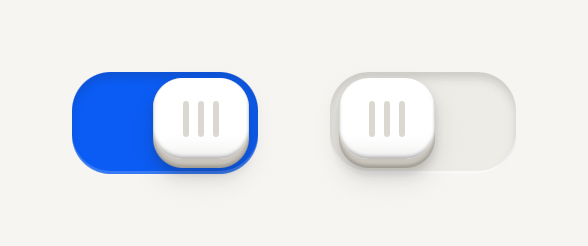
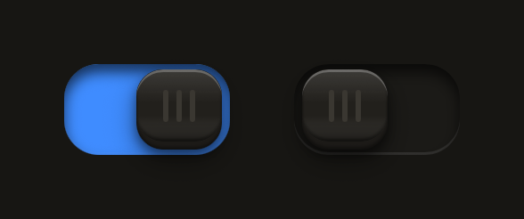
import { Switch } from "@terratcg/ui";
import { useState } from "react";
import { View } from "react-native";

export default function SwitchDefault() {
  const [haptics, setHaptics] = useState(true);
  const [sounds, setSounds] = useState(false);
  return (
    <View style={{ flexDirection: "row", justifyContent: "center", gap: 24 }}>
      <Switch accessibilityLabel="Haptics" value={haptics} onValueChange={setHaptics} />
      <Switch accessibilityLabel="Sounds" value={sounds} onValueChange={setSounds} />
    </View>
  );
}
Import
import { Switch, SwitchRow } from "@terratcg/ui";Usage
<SwitchRow accessibilityLabel="Haptics" value={haptics} onValueChange={setHaptics}>
  <RowContent>
    <RowTitle>Haptics</RowTitle>
  </RowContent>
</SwitchRow>
A Switch is controlled: it shows value and asks for the other one through onValueChange. A tap flips it with a short spring; the key also drags, and let go past the middle it flips to the far side. In a list, use SwitchRow, a Row ending in the Switch, and compose its RowContent as with any Row. Use Switch on its own only where there is no row to press.
Examples
In a settings list
A SwitchRow is one control: a press anywhere on the row flips its key, and the key still drags.
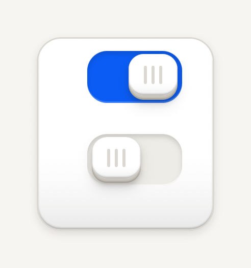
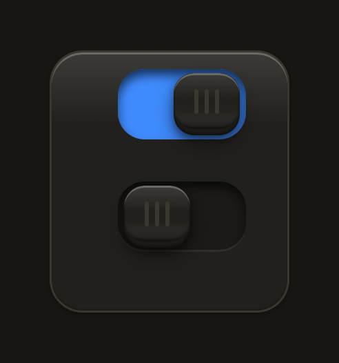
import { Card, CardContent, RowContent, RowDescription, RowTitle, SwitchRow } from "@terratcg/ui";
import { useState } from "react";

export default function SwitchRows() {
  const [sounds, setSounds] = useState(true);
  const [reveal, setReveal] = useState(false);
  return (
    <Card style={{ alignSelf: "stretch" }}>
      <CardContent>
        <SwitchRow accessibilityLabel="UI sounds" value={sounds} onValueChange={setSounds}>
          <RowContent>
            <RowTitle>UI sounds</RowTitle>
          </RowContent>
        </SwitchRow>
        <SwitchRow
          accessibilityLabel="Reveal sounds"
          accessibilityHint="Muted by the silent switch"
          value={reveal}
          onValueChange={setReveal}
        >
          <RowContent>
            <RowTitle>Reveal sounds</RowTitle>
            <RowDescription>Muted by the silent switch</RowDescription>
          </RowContent>
        </SwitchRow>
      </CardContent>
    </Card>
  );
}
States
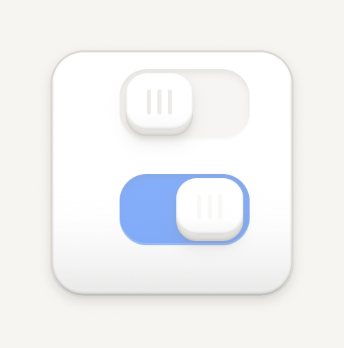
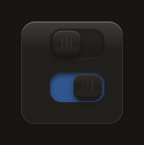
Disabled sits at half opacity; busy looks disabled while a slow wave runs along the grip bars.
import { Card, CardContent, RowContent, RowTitle, SwitchRow } from "@terratcg/ui";

export default function SwitchStates() {
  return (
    <Card style={{ alignSelf: "stretch" }}>
      <CardContent>
        <SwitchRow accessibilityLabel="Disabled" value={false} disabled>
          <RowContent>
            <RowTitle>Disabled</RowTitle>
          </RowContent>
        </SwitchRow>
        <SwitchRow accessibilityLabel="Saving" value busy>
          <RowContent>
            <RowTitle>Saving</RowTitle>
          </RowContent>
        </SwitchRow>
      </CardContent>
    </Card>
  );
}
Props
Switch
Prop
Type
Switch also accepts accessibilityLabel, accessibilityHint and testID from React Native's Pressable, and style for layout and margins.
SwitchRow
Prop
Type
SwitchRow also accepts the Row's Pressable props, except accessibilityRole, onPress and feedbackIntent, which it sets itself.
Accessibility
- Role:
switch, withaccessibilityStatekeepingchecked,disabledandbusyin sync. - Label: pass
accessibilityLabel. A SwitchRow is one element to a screen reader, so name it with the row's title, and put its description inaccessibilityHint. - Not by colour alone: the key's position carries the state; the accent fill only repeats it.
- Touch target: the slot is 62 by 34 points and its touch area reaches 8 points past it on every side. In a SwitchRow, the whole row is the target.
- Reduce Motion: the key moves at once instead of springing, stays level when pressed, and the busy wave stands still.
Platform differences
- iOS and Android: the same Slide key on both, not the system switch. A drag works the same way, and a scroll can take the touch until the key has started to move.
- Feedback: a flip calls ThemeProvider's
feedbackhandler with"select", once per change. TerraUI plays no haptic or sound itself. - Web: Switch renders through react-native-web for these docs, but the web is not a supported target.
Rules
- In a list, use SwitchRow, never a Row with a Switch inside it.
- A Switch changes a setting at once. For a choice that waits for a Save, use a Selectable cell or a selected Button.
- Set
busywhile saving the change, and clear it yourself. If saving fails, setvalueback. - Label the setting, not the action: "Haptics", not "Turn on haptics".
- Keep the key as drawn: a domed key with three grip bars in a recessed slot, 62 by 34 points. Position carries the state, with no marks in either state; off leaves the slot as a well, on fills it with the accent.
- A press sinks the key 2 points under a tint, and a short spring throws it across. Disabled is the whole Switch at half opacity. Busy looks exactly like disabled, and a band of light sweeps across the grip bars, left to right, without resizing them.
Search field
An Input with the magnifier leading it and a clear key while there is text, on the keyboard's search key. Clearing keeps the caret in the field.
Selectable cell
A quiet cell for picking items in dense grids and rows. Selection reads through its stroke and a check chip, protection through a dashed frame and a text badge.