Card
A generic content surface with shallow depth. It holds content and is not meant to stand in for your app's own signature objects.
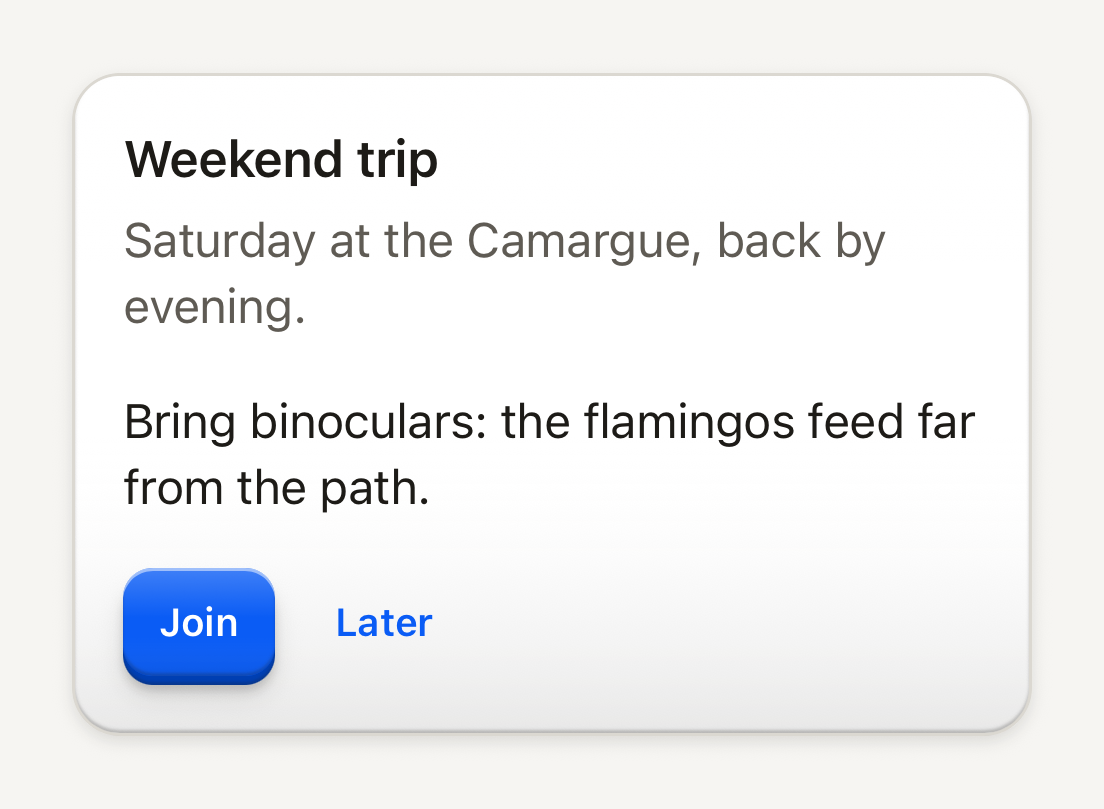
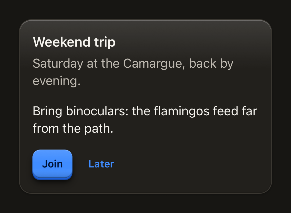
import { Button, ButtonText, Card, CardContent, CardDescription, CardFooter, CardHeader, CardTitle, Text } from "@terratcg/ui";
import { View } from "react-native";

export default function CardAnatomy() {
  return (
    <View style={{ width: 320 }}>
      <Card>
        <CardHeader>
          <CardTitle>Weekend trip</CardTitle>
          <CardDescription>Saturday at the Camargue, back by evening.</CardDescription>
        </CardHeader>
        <CardContent>
          <Text>Bring binoculars: the flamingos feed far from the path.</Text>
        </CardContent>
        <CardFooter>
          <Button size="sm">
            <ButtonText>Join</ButtonText>
          </Button>
          <Button size="sm" variant="ghost">
            <ButtonText>Later</ButtonText>
          </Button>
        </CardFooter>
      </Card>
    </View>
  );
}
Import
import { Card, CardContent, CardDescription, CardFooter, CardHeader, CardTitle } from "@terratcg/ui";Usage
<Card>
  <CardHeader>
    <CardTitle>Weekend trip</CardTitle>
    <CardDescription>Saturday at the Camargue.</CardDescription>
  </CardHeader>
  <CardContent>
    <Text>Bring binoculars.</Text>
  </CardContent>
  <CardFooter>
    <Button size="sm">
      <ButtonText>Join</ButtonText>
    </Button>
  </CardFooter>
</Card>
CardHeader pads its title and description, CardContent and CardFooter continue under it with the same side padding, and CardFooter lays its actions in a row. A Card inside another Card (or inside any TerraUI surface) takes a shallower lift on its own.
Examples
Raised, nested and well
A raised Card lifts off the page; a Card inside it takes the shallower nested lift; a well is cut into the page for quiet, empty content.
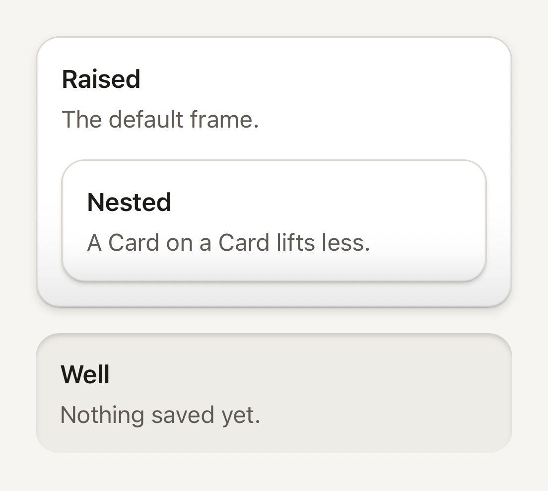
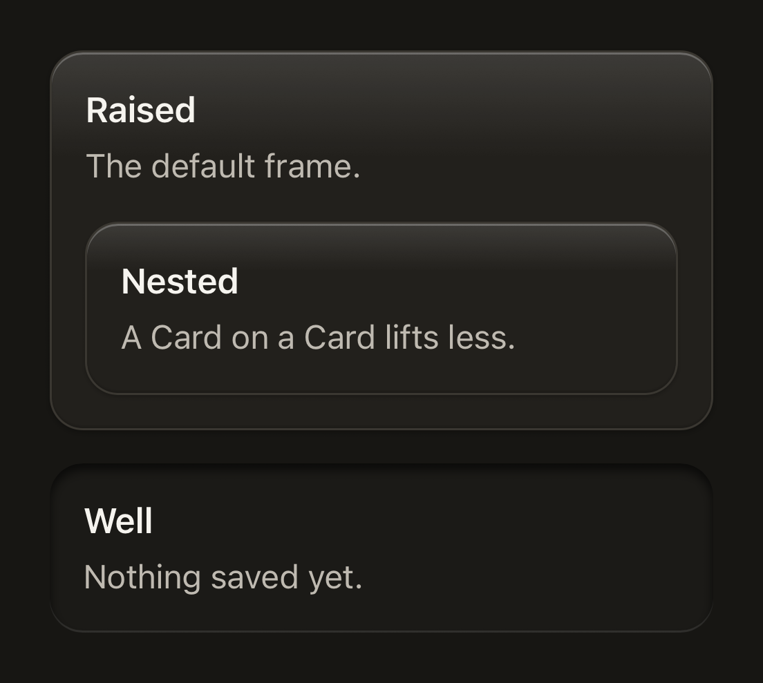
import { Card, CardDescription, CardHeader, CardTitle } from "@terratcg/ui";
import { View } from "react-native";

export default function CardFrames() {
  return (
    <View style={{ width: 320, gap: 16 }}>
      <Card>
        <CardHeader>
          <CardTitle>Raised</CardTitle>
          <CardDescription>The default frame.</CardDescription>
        </CardHeader>
        <View style={{ paddingHorizontal: 16, paddingBottom: 16 }}>
          <Card>
            <CardHeader>
              <CardTitle>Nested</CardTitle>
              <CardDescription>A Card on a Card lifts less.</CardDescription>
            </CardHeader>
          </Card>
        </View>
      </Card>
      <Card frame="well">
        <CardHeader>
          <CardTitle>Well</CardTitle>
          <CardDescription>Nothing saved yet.</CardDescription>
        </CardHeader>
      </Card>
    </View>
  );
}
Danger tone
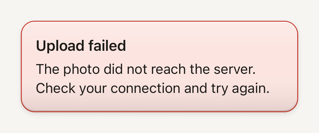
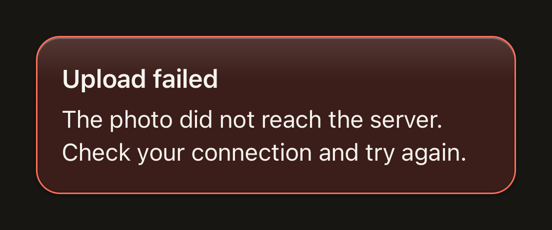
tone="danger" turns the Card into an error notice: a danger border on the soft danger floor. Here the text keeps the default ink, which reads better on that floor.
import { Card, CardDescription, CardHeader, CardTitle } from "@terratcg/ui";
import { View } from "react-native";

export default function CardDanger() {
  return (
    <View style={{ width: 320 }}>
      <Card tone="danger">
        <CardHeader>
          <CardTitle tone="default">Upload failed</CardTitle>
          <CardDescription tone="default">The photo did not reach the server. Check your connection and try again.</CardDescription>
        </CardHeader>
      </Card>
    </View>
  );
}
Selectable
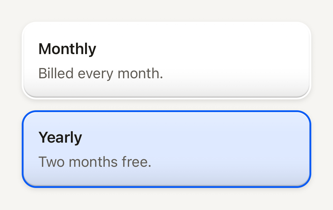
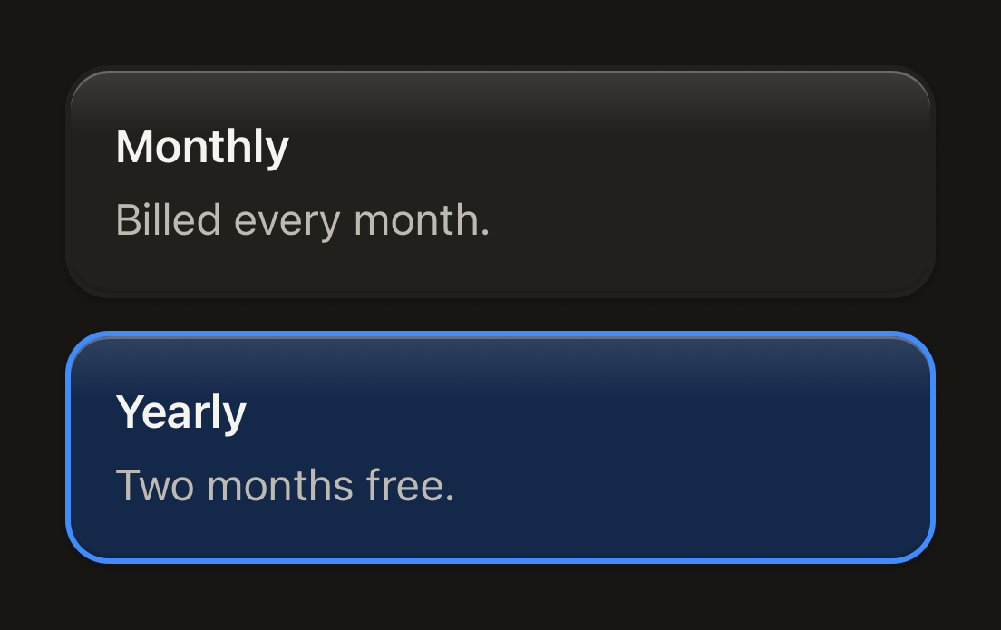
selectable turns the border into a 2 pt ring, clear until selected: choosing never moves the layout.
import { Card, CardDescription, CardHeader, CardTitle } from "@terratcg/ui";
import { useState } from "react";
import { Pressable, View } from "react-native";

const PLANS = [
  { id: "monthly", title: "Monthly", description: "Billed every month." },
  { id: "yearly", title: "Yearly", description: "Two months free." },
];

export default function CardSelectable() {
  const [plan, setPlan] = useState("yearly");
  return (
    <View style={{ width: 320, gap: 12 }} accessibilityRole="radiogroup">
      {PLANS.map(({ id, title, description }) => (
        <Pressable
          key={id}
          accessibilityRole="radio"
          accessibilityState={{ checked: plan === id }}
          onPress={() => setPlan(id)}
        >
          <Card selectable selected={plan === id}>
            <CardHeader>
              <CardTitle>{title}</CardTitle>
              <CardDescription>{description}</CardDescription>
            </CardHeader>
          </Card>
        </Pressable>
      ))}
    </View>
  );
}
Props
Card
Prop
Type
Card also accepts React Native's View props. Its frame props combine in four ways only, and TypeScript holds you to them:
frame="raised"(the default), bordered.- Raised and
selectable, withselected: the border becomes a 2 pt ring, clear until selected, so choosing never moves the layout. Selected, the ring turns accent over the accent-soft floor. - Raised and
borderless: the edge is the rims alone, for a stage. frame="well": recessed below the page, for quiet, empty or placeholder content. A well has no border, and can't be selectable.
ground paints a layer on the Card's floor, under its rims, sheen and content, clipped to its shape; touches pass through it. clip cuts the children to the Card's shape. radius replaces the theme's large radius.
Parts
CardHeader, CardContent and CardFooter take React Native's View props. CardTitle (title type) and CardDescription (body type, secondary) take React Native's Text props and Text's tone and weight; in a danger Card both default to the danger tone.
Accessibility
- Role: none. A Card groups content visually; the controls in it carry the roles.
- Selectable: a selectable Card is not pressable by itself. Wrap it in a
Pressablewith the role that fits, such asradioin aradiogroup, and itsaccessibilityState, as the Selectable example does. - Title: CardTitle is not announced as a header. Pass
accessibilityRole="header"when the Card heads a section of the page. - Danger contrast: in Electric the danger ink on the soft danger floor reaches 4.5:1, AA for body text with no room to spare. A theme that changes
dangerordangerSoftshould check that pair, or give the title and descriptiontone="default", as the Danger example does.
Platform differences
- iOS and Android: the same surfaces, depths and rings.
- Web: Card renders through react-native-web for these docs, but the web is not a supported target.
Rules
- Use a Card for content, not for a control: a pressable surface wants a Button, a Row or a Cell.
- Don't use a Card for your app's own signature objects (a trading card, a ticket): draw those yourself.
- Keep one level of nesting. A Card on a Card lifts less; a third level reads as noise.
- Choose the frame by meaning:
raisedfor content,wellfor what is empty or waiting. - Set
translucentonly on a surface resting inside a living layer, such as a Card'sground, never on the bare page: the floor keeps 72% of its colour so the layer shows through, while the rims and shadows stay.