Text
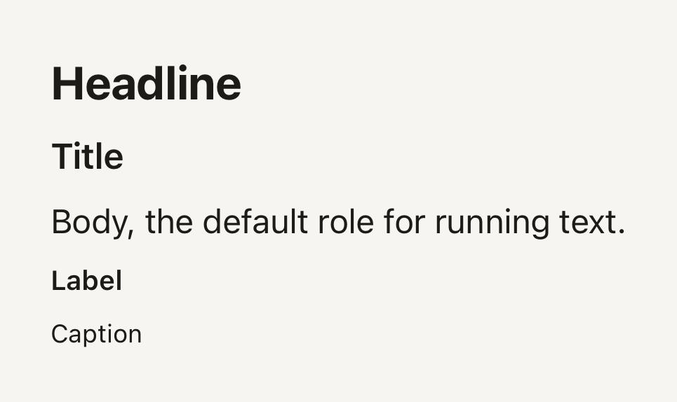
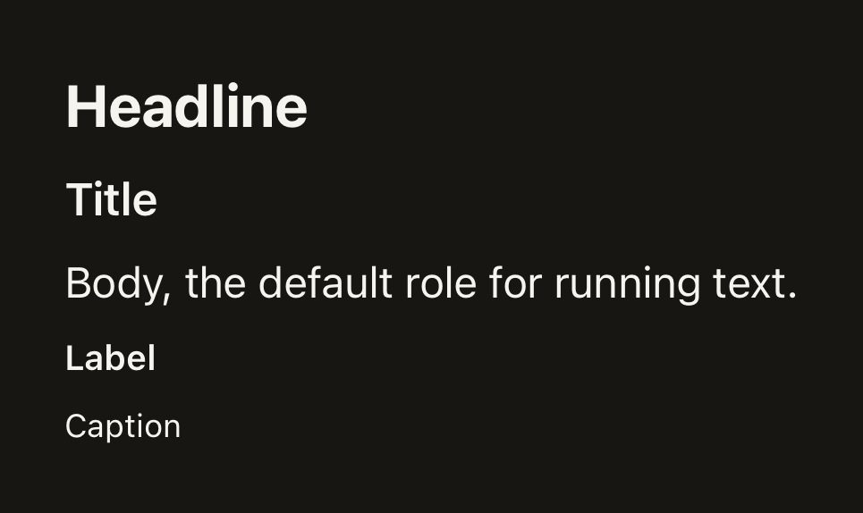
Native text with the theme's type roles and semantic tones. Every word TerraUI draws goes through it.
import { Text } from "@terratcg/ui";
import { View } from "react-native";

export default function TextVariants() {
  return (
    <View style={{ gap: 8 }}>
      <Text variant="headline">Headline</Text>
      <Text variant="title">Title</Text>
      <Text>Body, the default role for running text.</Text>
      <Text variant="label">Label</Text>
      <Text variant="caption">Caption</Text>
    </View>
  );
}
Import
import { Text } from "@terratcg/ui";Usage
<Text variant="title">Your collection</Text>
<Text tone="secondary">142 photos so far.</Text>
Text renders a React Native Text styled from the theme: variant picks the size, line height and default weight, tone the colour. The style you pass is applied last, on top of the role.
Examples
Tones
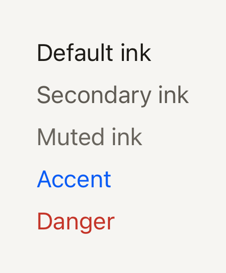
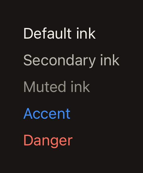
Semantic tones take their colour from the theme: default, secondary, muted, accent and danger.
import { Text } from "@terratcg/ui";
import { View } from "react-native";

export default function TextTones() {
  return (
    <View style={{ gap: 6 }}>
      <Text tone="default">Default ink</Text>
      <Text tone="secondary">Secondary ink</Text>
      <Text tone="muted">Muted ink</Text>
      <Text tone="accent">Accent</Text>
      <Text tone="danger">Danger</Text>
    </View>
  );
}
Weight and tabular figures
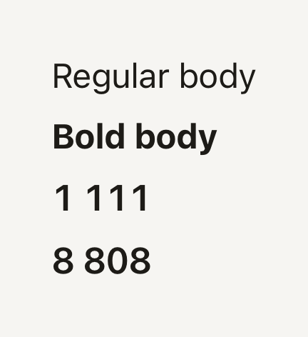
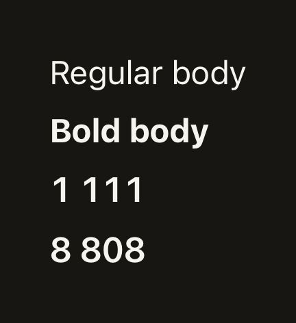
weight overrides the role's default; tabular gives every digit the same width, so numbers line up.
import { Text } from "@terratcg/ui";
import { View } from "react-native";

export default function TextWeights() {
  return (
    <View style={{ gap: 6 }}>
      <Text weight="regular">Regular body</Text>
      <Text weight="bold">Bold body</Text>
      <Text variant="title" tabular>
        1 111
      </Text>
      <Text variant="title" tabular>
        8 808
      </Text>
    </View>
  );
}
Props
Prop
Type
Text also accepts React Native's Text props, such as numberOfLines, accessibilityRole and selectable. The weights are regular, medium, semibold and bold, as the theme defines them; label, title and headline default to the theme's strong font family when it has one.
Accessibility
- Role: none of its own. A heading passes
accessibilityRole="header", as SectionHeader does for its title. - Larger text: sizes follow the system text size, like any React Native
Text. The line height is 1.35 times the size, so enlarged text keeps its spacing. - Colour: every tone comes from the theme, whose default pairs meet WCAG AA on the page and surface colours. Don't tint text with a raw colour through
styleunless you have checked its contrast.
Platform differences
- iOS and Android: the same roles and tones.
tabularsetsfontVariant: ["tabular-nums"], which both platforms honour when the font has tabular figures. - Web: Text renders through react-native-web for these docs, but the web is not a supported target.
Rules
- Put every string in a Text (or a component's own text part, such as ButtonText): a bare string outside one does not render on React Native.
- Pick a
variant, not afontSize: the roles keep the type scale consistent across a view. - Use
tonefor meaning:dangerfor errors,accentfor what the user should act on,secondaryandmutedto step text back. - Set
tabularon numbers that change or line up in columns, so they don't shift as they count.