Menu
A popover of actions or choices beside the control that opened it. Open one from anywhere with showMenu.
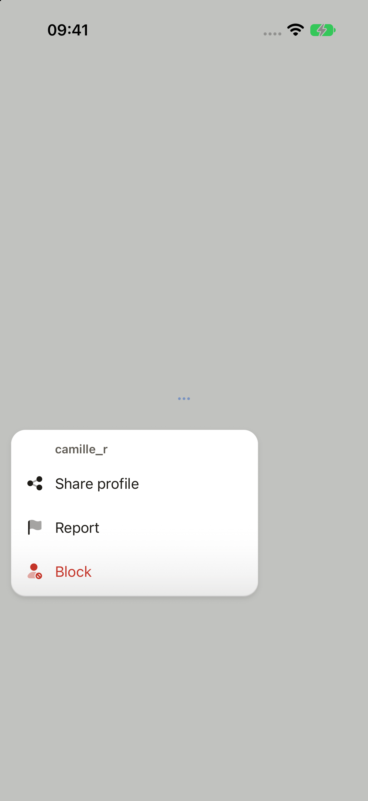
import Flag02Icon from "@hugeicons-pro/core-bulk-rounded/Flag02Icon";
import MoreHorizontalIcon from "@hugeicons-pro/core-bulk-rounded/MoreHorizontalIcon";
import Share08Icon from "@hugeicons-pro/core-bulk-rounded/Share08Icon";
import UserBlock01Icon from "@hugeicons-pro/core-bulk-rounded/UserBlock01Icon";
import { HugeiconsIcon, type IconSvgElement } from "@hugeicons/react-native";
import { Button, ButtonIcon, showDialog, showMenu, type ButtonIconProps, type OverlayTrigger } from "@terratcg/ui";
import { useRef, type RefObject } from "react";
import type { ViewInstance } from "react-native";

function icon(svg: IconSvgElement): ButtonIconProps["children"] {
  return function SlotIcon({ color, size }) {
    return <HugeiconsIcon icon={svg} color={color} size={size} />;
  };
}

function openPersonMenu(trigger: RefObject<OverlayTrigger | null>) {
  void showMenu(trigger, {
    title: "camille_r",
    items: [
      { label: "Share profile", icon: icon(Share08Icon), onSelect: () => {} },
      { label: "Report", icon: icon(Flag02Icon), onSelect: () => {} },
      {
        label: "Block",
        icon: icon(UserBlock01Icon),
        destructive: true,
        onSelect: ({ trigger: from }) =>
          void showDialog({
            tone: "destructive",
            title: "Block camille_r?",
            body: "They can't message you or see your library.",
            cancel: "Cancel",
            confirm: "Block",
            icon: icon(UserBlock01Icon),
            trigger: from,
          }),
      },
    ],
  });
}

export default function MenuActions({ capture }: SceneProps) {
  const trigger = useRef<ViewInstance>(null);
  return (
    <Button
      ref={trigger}
      variant="ghost"
      size="icon"
      accessibilityLabel="More"
      // The capture opens it once the trigger is laid out, so it has a place to open from.
      onLayout={capture ? () => openPersonMenu(trigger) : undefined}
      onPress={() => openPersonMenu(trigger)}
    >
      <ButtonIcon>{icon(MoreHorizontalIcon)}</ButtonIcon>
    </Button>
  );
}
Import
import { showMenu } from "@terratcg/ui";Usage
const trigger = useRef<ViewInstance>(null);
const openMenu = () =>
  showMenu(trigger, {
    title: "camille_r",
    items: [
      { label: "Share profile", onSelect: share },
      { label: "Block", destructive: true, onSelect: ({ trigger }) => confirmBlock(trigger) },
    ],
  });

<Button ref={trigger} variant="ghost" size="icon" accessibilityLabel="More" onPress={openMenu}>
  <ButtonIcon>{moreIcon}</ButtonIcon>
</Button>;
Menus appear in the OverlayHost, which you mount once at the root inside ThemeProvider. showMenu measures trigger and opens beside it, aligned to its trailing edge: below it, or above when there is no room. It closes on a pick, an outside tap or Back, and runs the picked item's onSelect only once it has left the screen, so onSelect may navigate or open a Dialog. Inside a native sheet, wrap the sheet's content in SheetOrigin so the menu opens in the sheet.
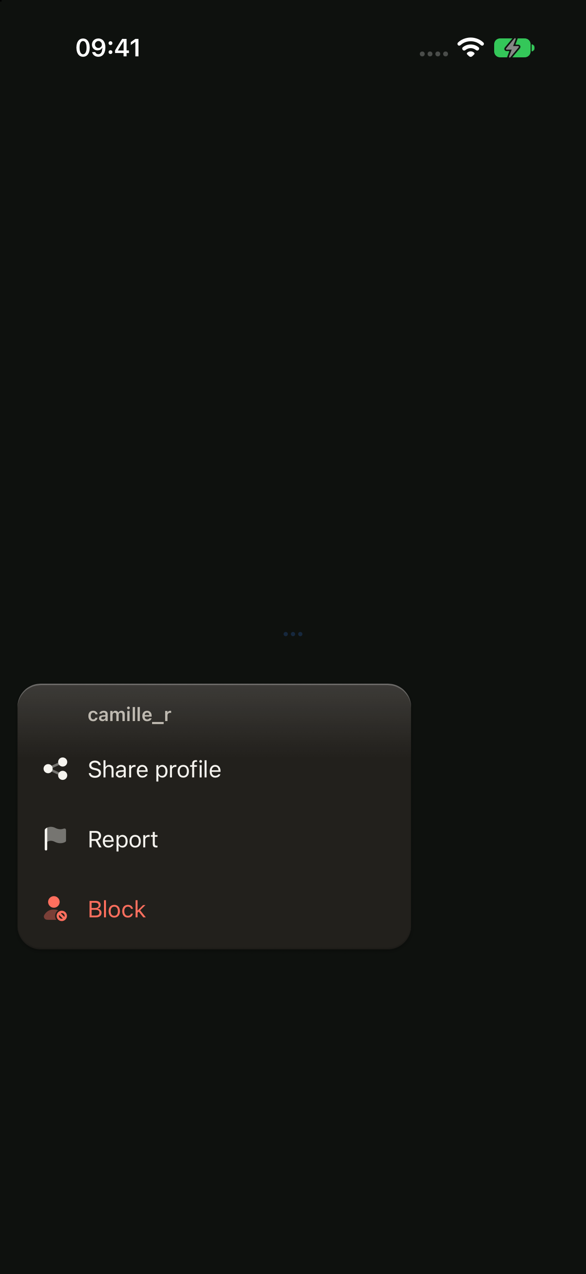
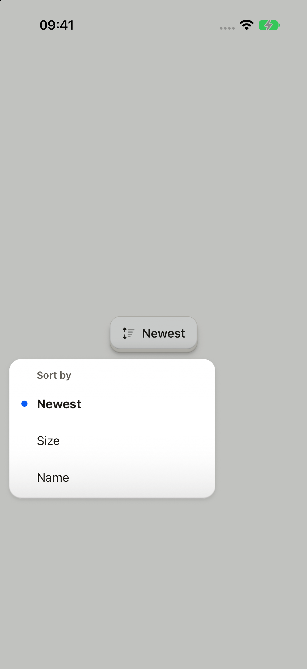
The plate stays on screen. A small title names what the menu acts on, and the items' text lines up with it. A destructive item is drawn in the danger colour, and the current choice of a value menu wears an accent dot and a bold label. There is no Cancel item: an outside tap or Back closes the menu.
Examples
Picking a value
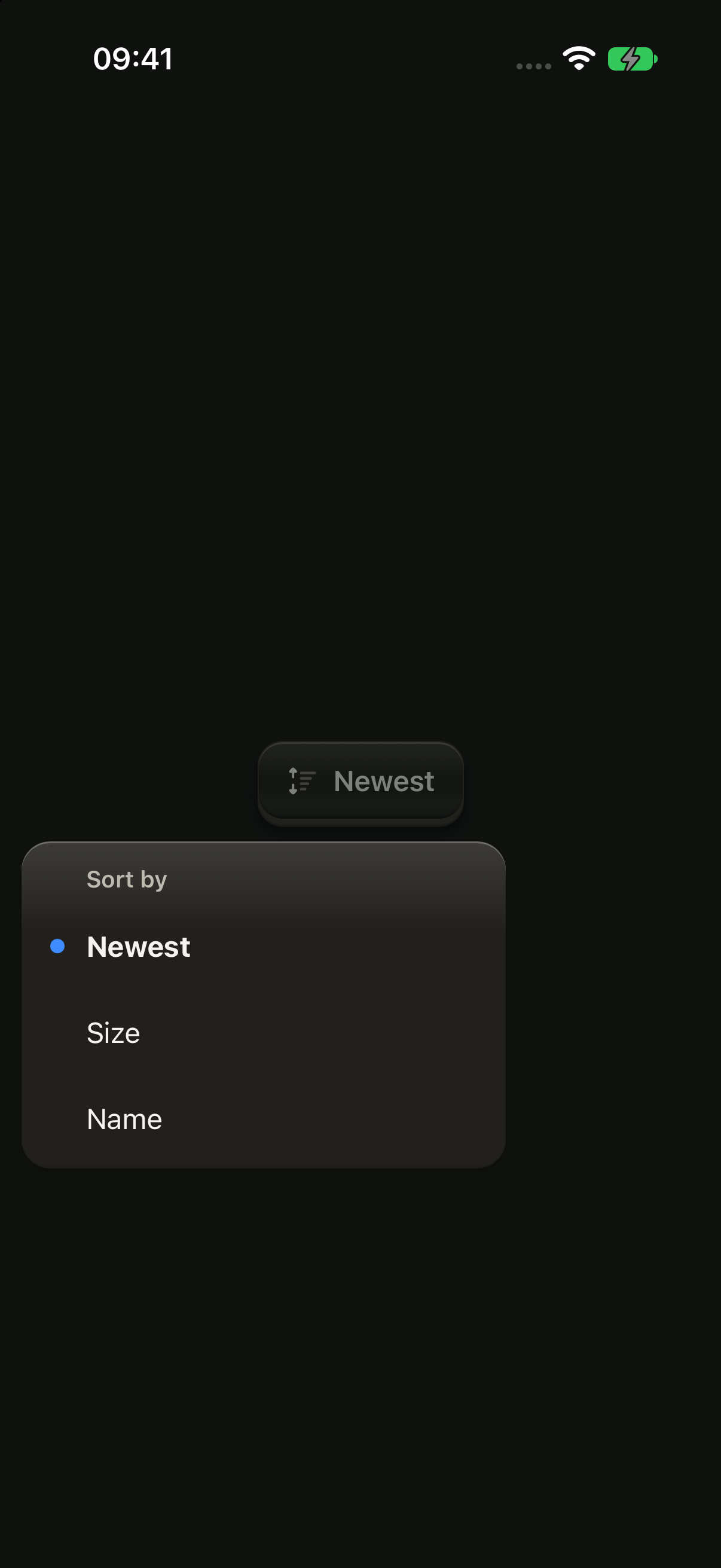
Mark the current choice selected: it takes the dot and a bold label.
import Sorting05Icon from "@hugeicons-pro/core-bulk-rounded/Sorting05Icon";
import { HugeiconsIcon } from "@hugeicons/react-native";
import { Button, ButtonIcon, ButtonText, showMenu } from "@terratcg/ui";
import { useRef, useState } from "react";
import type { ViewInstance } from "react-native";

const SORTS = ["Newest", "Size", "Name"] as const;

export default function MenuPicker({ capture }: SceneProps) {
  const trigger = useRef<ViewInstance>(null);
  const [sort, setSort] = useState<(typeof SORTS)[number]>("Newest");
  const open = () =>
    void showMenu(trigger, {
      title: "Sort by",
      items: SORTS.map((label) => ({ label, selected: label === sort, onSelect: () => setSort(label) })),
    });
  return (
    <Button ref={trigger} variant="outline" onLayout={capture ? open : undefined} onPress={open}>
      <ButtonIcon>{({ color, size }) => <HugeiconsIcon icon={Sorting05Icon} color={color} size={size} />}</ButtonIcon>
      <ButtonText>{sort}</ButtonText>
    </Button>
  );
}
Props
showMenu
Prop
Type
MenuItem
Prop
Type
MenuPick
What an item's onSelect receives.
Prop
Type
Accessibility
- Roles: the plate is a
menu, each item amenuitem, and the current choice has theselectedstate. Item icons are hidden from screen readers. - Focus: once the menu is placed, screen-reader focus moves to its title, which has the
headerrole. When it closes, focus goes back to the trigger beforeonSelectruns. - Modal: the menu is a modal layer; the escape gesture closes it.
- Larger text: labels wrap instead of truncating, and the menu flips above its trigger when the taller plate doesn't fit below.
- Reduce Motion: the plate fades in without scaling.
Platform differences
- iOS: the menu sits in a full-window overlay, above native sheets.
- Android: the menu is a transparent
Modal, so Back closes it, and it is placed from the trigger's page coordinates. - Feedback: a pick calls ThemeProvider's
feedbackhandler with"press". The keyboard is dismissed before the menu opens. - Queue: a Menu waits behind a Dialog that is up, and a second
showMenuwhile one is open does nothing. - No web tab: a live Menu shares the Dialog's overlay layer, which on a desktop browser covers the whole page because nothing caps its width yet. Until it gets a width cap (#702), this page shows only the iOS and Android captures.
Rules
- Title the menu with what it is about: a person's name, "Sort by".
- Keep items to short verbs or values. A menu that picks a value marks the current one
selected. - Put a destructive item last, and confirm it with a Dialog from
onSelect, passing on itstrigger. - Give an icon to every item or to none.
- Open a menu from a control the user pressed, never on its own.