Selectable cell
A quiet cell for picking items in dense grids and rows. Selection reads through its stroke and a check chip, protection through a dashed frame and a text badge.
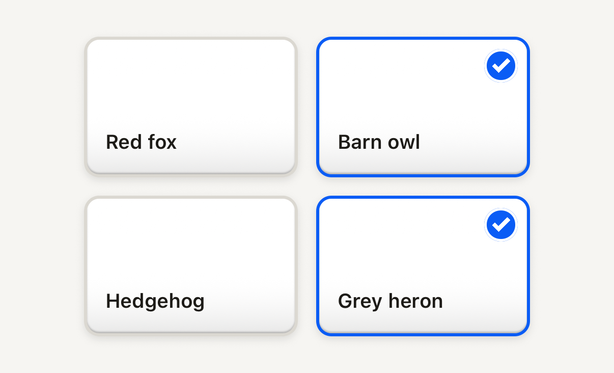
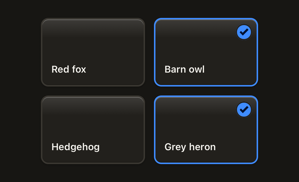
import { SelectableCell, Text } from "@terratcg/ui";
import { useState } from "react";
import { View } from "react-native";

const CARDS = ["Red fox", "Barn owl", "Hedgehog", "Grey heron"];

export default function SelectableGrid() {
  const [picked, setPicked] = useState(() => new Set(["Barn owl", "Grey heron"]));
  const toggle = (card: string) =>
    setPicked((current) => {
      const next = new Set(current);
      if (next.has(card)) next.delete(card);
      else next.add(card);
      return next;
    });
  return (
    <View style={{ flexDirection: "row", flexWrap: "wrap", justifyContent: "center", gap: 12 }}>
      {CARDS.map((card) => (
        <SelectableCell
          key={card}
          accessibilityLabel={card}
          selected={picked.has(card)}
          onPress={() => toggle(card)}
          style={{ width: 140 }}
        >
          <View style={{ height: 88, padding: 12, justifyContent: "flex-end" }}>
            <Text variant="label">{card}</Text>
          </View>
        </SelectableCell>
      ))}
    </View>
  );
}
Import
import { SelectableCell } from "@terratcg/ui";Usage
<SelectableCell accessibilityLabel={card.name} selected={picked.has(card.id)} onPress={() => toggle(card.id)}>
  <CardThumbnail card={card} />
</SelectableCell>
The cell draws the frame and the selection cue around your content, clipped to its corners, and reports a press. The selection rules are yours: toggle selected in onPress, and set protected on an item your rules keep out of the selection, such as the last copy of a card.
Examples
Protected and disabled
A protected cell wears a dashed frame and a text badge and never toggles; a disabled one fades but keeps its cue.
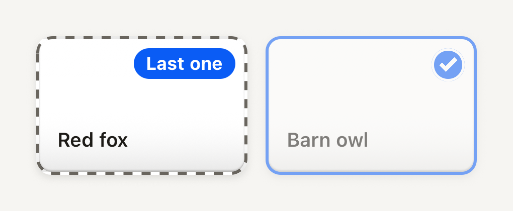
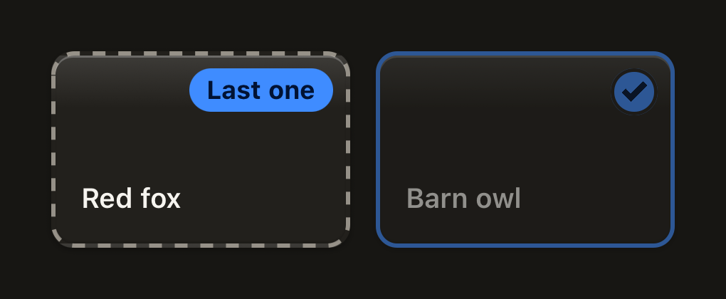
import { SelectableCell, Text } from "@terratcg/ui";
import { View } from "react-native";

export default function SelectableProtected() {
  return (
    <View style={{ flexDirection: "row", flexWrap: "wrap", justifyContent: "center", gap: 12 }}>
      <SelectableCell selected={false} protected protectedLabel="Last one" accessibilityLabel="Red fox, kept" style={{ width: 140 }}>
        <View style={{ height: 88, padding: 12, justifyContent: "flex-end" }}>
          <Text variant="label">Red fox</Text>
        </View>
      </SelectableCell>
      <SelectableCell selected disabled accessibilityLabel="Barn owl" style={{ width: 140 }}>
        <View style={{ height: 88, padding: 12, justifyContent: "flex-end" }}>
          <Text variant="label">Barn owl</Text>
        </View>
      </SelectableCell>
    </View>
  );
}
Props
Prop
Type
SelectableCell also accepts React Native's Pressable props, such as accessibilityLabel and testID, and style for its width and margins. SELECTABLE_CELL_BORDER exports the stroke width, 2 points, by which the content is narrower than the cell on each side.
Accessibility
- Role:
checkbox, withaccessibilityStatekeepingcheckedanddisabled(whiledisabledorprotected) in sync. Your ownaccessibilityStateis merged on top. - Label: pass
accessibilityLabelwith the item's name. For a protected cell, say why in the label too: the badge is not read on its own. - Not by colour alone: selected adds a check chip, protected a dashed frame and a text badge.
- Touch target: the cell is as large as you make it. Keep it at least 44 pt on iOS and 48 dp on Android.
- Reduce Motion: the cell no longer shrinks when pressed; the press dim stays.
Platform differences
- iOS and Android: the same frame, chip and press on both, with no ripple.
- Feedback: a press calls ThemeProvider's
feedbackhandler with"select". A protected or disabled cell reports nothing. - Web: SelectableCell renders through react-native-web for these docs, but the web is not a supported target.
Rules
- Use it for picking several items among many. For one setting, use a Switch.
- Keep the content quiet: a thumbnail and a short label. The cell carries the selection cue; the content shouldn't add another.
- Use
protectedfor items your rules keep, with a shortprotectedLabel, anddisabledonly for items that can't be acted on for now. - Show what the selection will do in an Action tray under the grid.