Field
One form field. A Label, an Input and an optional FieldMessage stacked together, sharing the field's invalid and disabled state.
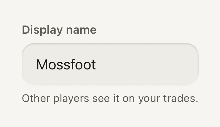

import { Field, FieldMessage, Input, Label } from "@terratcg/ui";
import { useState } from "react";

export default function FieldDefault() {
  const [name, setName] = useState("Mossfoot");
  return (
    <Field style={{ alignSelf: "stretch" }}>
      <Label>Display name</Label>
      <Input value={name} onChangeText={setName} autoCapitalize="words" />
      <FieldMessage>Other players see it on your trades.</FieldMessage>
    </Field>
  );
}
Import
import { Field, FieldMessage, Input, Label } from "@terratcg/ui";Usage
<Field invalid={tooShort}>
  <Label>Display name</Label>
  <Input value={name} onChangeText={setName} />
  <FieldMessage>{tooShort ? "Use at least 3 characters." : "Other players see it."}</FieldMessage>
</Field>
A Field only presents its parts: you own the value, the validation and the submission. Set invalid and disabled on the Field and its Label, Input and FieldMessage follow. An Input's own invalid or disabled wins over the Field's.
Examples
Invalid
An invalid field draws a danger stroke and turns its message into an announced alert.
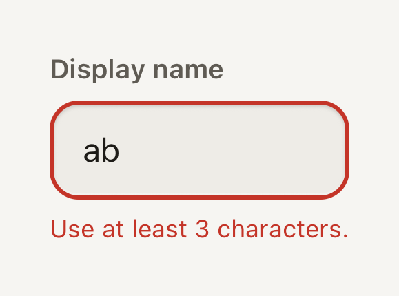
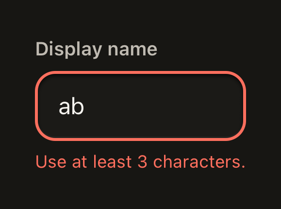
import { Field, FieldMessage, Input, Label } from "@terratcg/ui";
import { useState } from "react";

export default function FieldInvalid() {
  const [name, setName] = useState("ab");
  return (
    <Field invalid style={{ alignSelf: "stretch" }}>
      <Label>Display name</Label>
      <Input value={name} onChangeText={setName} />
      <FieldMessage>Use at least 3 characters.</FieldMessage>
    </Field>
  );
}
Disabled
A disabled field keeps its label and value readable on a flat grey well that takes no input.
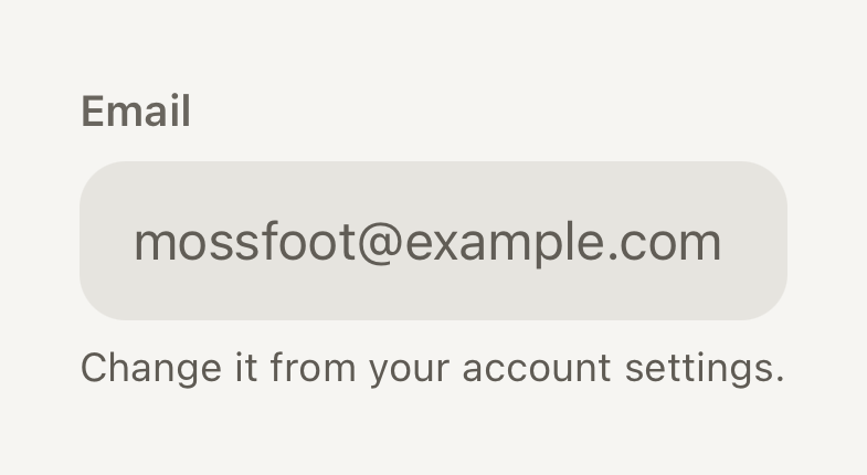
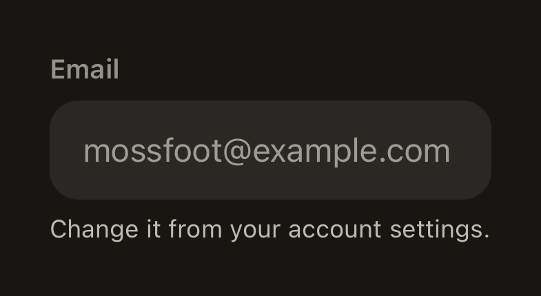
import { Field, FieldMessage, Input, Label } from "@terratcg/ui";

export default function FieldDisabled() {
  return (
    <Field disabled style={{ alignSelf: "stretch" }}>
      <Label>Email</Label>
      <Input value="mossfoot@example.com" />
      <FieldMessage>Change it from your account settings.</FieldMessage>
    </Field>
  );
}
Props
Field
Prop
Type
Field also accepts React Native's View props, such as style and testID. It stacks its children with a small gap and adds nothing else.
Label
Prop
Type
Label also accepts React Native's Text props. It is always the label text role. Without a tone, it is secondary, or muted while the Field is disabled.
FieldMessage
Prop
Type
FieldMessage also accepts React Native's Text props. It is always the caption text role. Without a tone, it is secondary, or danger while the Field is invalid.
Accessibility
- Name: a Label whose child is a plain string names the Input inside the same Field, from its first frame. With any other child, such as a Text with a link, the Label names nothing: pass
accessibilityLabelto the Input yourself. - Error: while the Field is invalid, FieldMessage takes the
alertrole so screen readers announce it, and the Input draws a danger stroke. The error never relies on colour alone: say what is wrong in the message. - Disabled: the Input is not editable and exposes
accessibilityState.disabled; the Label stays readable in a muted tone. - Larger text: the label, the value and the message all scale with the system text size; the well grows taller with its text.
Platform differences
- iOS: the Input is named through its
accessibilityLabel, filled from the Label. - Android: the Input also points at the Label with
accessibilityLabelledBy, so TalkBack reads the visible label. - Web: Field renders through react-native-web for these docs, but the web is not a supported target.
Rules
- One Label, one Input and at most one FieldMessage per Field.
- Write the Label as a plain string so it names the Input. A placeholder is never the label.
- Use the FieldMessage for one hint or one error, not both: while invalid, replace the hint with what to fix.
- Validate on submit or on blur, then set
invalid; don't flash an error while the user is still typing.