Skeleton
A quiet placeholder shape in the size of what is loading. Still on purpose, with no shimmer.
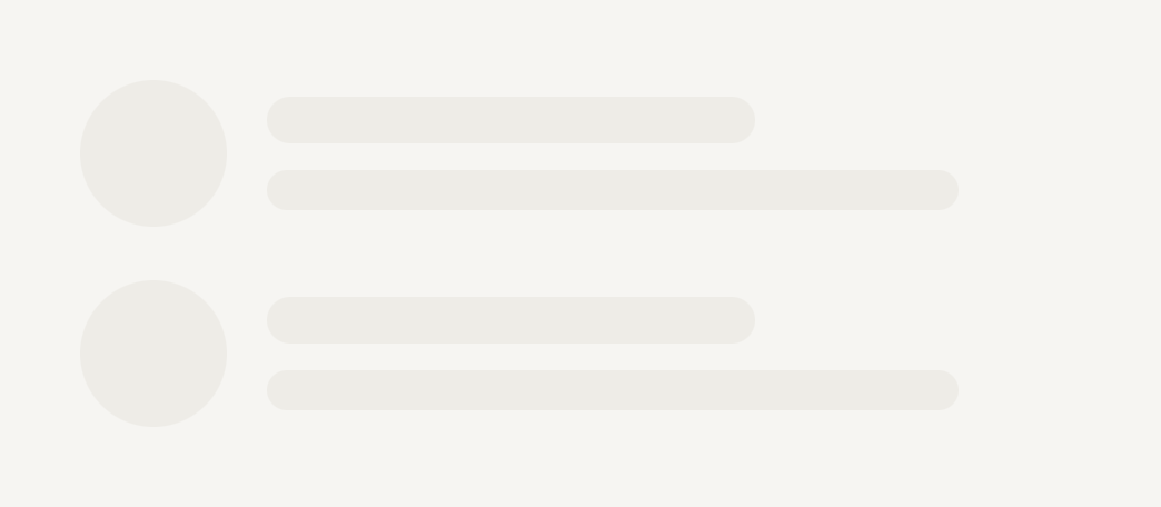
import { Skeleton } from "@terratcg/ui";
import { View } from "react-native";

export default function SkeletonRow() {
  return (
    <View style={{ width: 300, gap: 16 }}>
      {[0, 1].map((row) => (
        <View key={row} style={{ flexDirection: "row", alignItems: "center", gap: 12 }}>
          <Skeleton radius="pill" style={{ width: 44, height: 44 }} />
          <View style={{ flex: 1, gap: 8 }}>
            <Skeleton style={{ width: "60%", height: 14 }} />
            <Skeleton style={{ width: "85%", height: 12 }} />
          </View>
        </View>
      ))}
    </View>
  );
}
Import
import { Skeleton } from "@terratcg/ui";Usage
<Skeleton accessibilityLabel="Loading photos" radius="pill" style={{ width: 44, height: 44 }} />
<Skeleton style={{ width: "60%", height: 14 }} />
A Skeleton is a recessed well: give it the width and height of the content it stands in for through style. It has no size of its own.
Examples
Radii
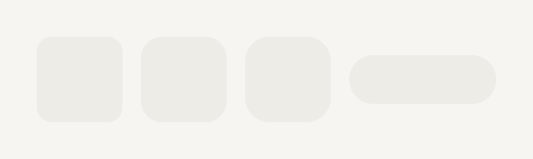
radius follows the theme's shape scale, so a placeholder rounds like the thing it replaces.
import { Skeleton } from "@terratcg/ui";
import { View } from "react-native";

export default function SkeletonRadii() {
  return (
    <View style={{ flexDirection: "row", alignItems: "center", gap: 12 }}>
      <Skeleton radius="sm" style={{ width: 56, height: 56 }} />
      <Skeleton radius="md" style={{ width: 56, height: 56 }} />
      <Skeleton radius="lg" style={{ width: 56, height: 56 }} />
      <Skeleton radius="pill" style={{ width: 96, height: 32 }} />
    </View>
  );
}
Props
Prop
Type
Skeleton also accepts React Native's View props.
Accessibility
- Hidden by default: a Skeleton is hidden from assistive technology, so a screen of shapes is not read shape by shape.
- One label per group: give one Skeleton in the group an
accessibilityLabel. That block becomes aprogressbarwith the busy state, and announces the whole group's loading once. - Reduce Motion: nothing to reduce. A Skeleton never moves.
Platform differences
- iOS and Android: the same still shape on the theme's muted surface.
- Web: Skeleton renders through react-native-web for these docs, but the web is not a supported target.
Rules
- Shape a Skeleton like what it replaces: the same size, and the radius of the real thing.
- Label one Skeleton per loading group, never each one.
- Don't animate Skeletons with a shimmer: loading stays quiet.
- Swap the shapes for the content in place, without a layout jump.