Avatar
A round portrait on the accent fill that falls back to an initial when there is no photo to show.
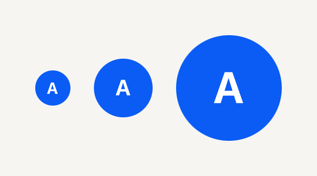
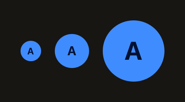
import { Avatar, AvatarFallback } from "@terratcg/ui";
import { View } from "react-native";

export default function AvatarSizes() {
  return (
    <View style={{ flexDirection: "row", alignItems: "center", gap: 16 }}>
      <Avatar size="sm" accessibilityLabel="Ada">
        <AvatarFallback>A</AvatarFallback>
      </Avatar>
      <Avatar accessibilityLabel="Ada">
        <AvatarFallback>A</AvatarFallback>
      </Avatar>
      <Avatar size="lg" accessibilityLabel="Ada">
        <AvatarFallback>A</AvatarFallback>
      </Avatar>
    </View>
  );
}
Import
import { Avatar, AvatarFallback, AvatarImage } from "@terratcg/ui";Usage
<Avatar accessibilityLabel={user.name}>
  <AvatarImage source={{ uri: user.photoUrl }} />
  <AvatarFallback>{user.name[0]}</AvatarFallback>
</Avatar>
Compose an AvatarImage and an AvatarFallback inside the Avatar. While the photo loads, the circle shows its accent fill; once it loads, the photo covers it. With no source, an empty uri, or a failed load, the fallback shows instead, so a missing photo never leaves an empty circle.
Examples
Beside a name
The default size fits a list line: the Avatar is named for screen readers, and the name beside it repeats it for everyone.
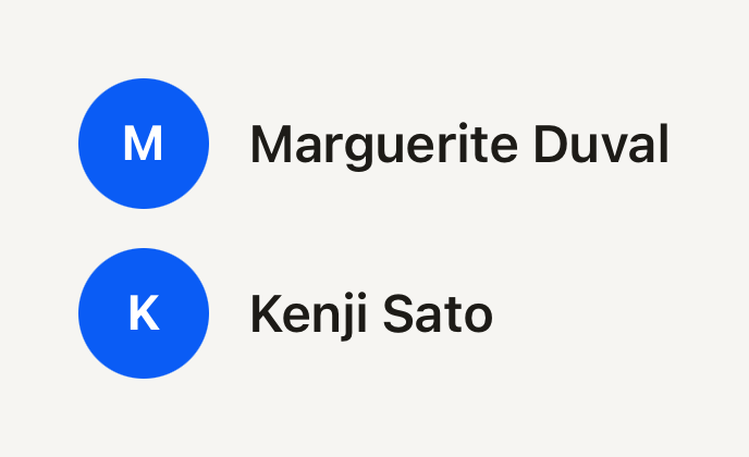

import { Avatar, AvatarFallback, Text } from "@terratcg/ui";
import { View } from "react-native";

export default function AvatarBesideAName() {
  return (
    <View style={{ gap: 12 }}>
      <View style={{ flexDirection: "row", alignItems: "center", gap: 12 }}>
        <Avatar accessibilityLabel="Marguerite Duval">
          <AvatarFallback>M</AvatarFallback>
        </Avatar>
        <Text weight="semibold">Marguerite Duval</Text>
      </View>
      <View style={{ flexDirection: "row", alignItems: "center", gap: 12 }}>
        <Avatar accessibilityLabel="Kenji Sato">
          <AvatarFallback>K</AvatarFallback>
        </Avatar>
        <Text weight="semibold">Kenji Sato</Text>
      </View>
    </View>
  );
}
Props
Avatar
Prop
Type
Avatar also accepts React Native's View props, such as accessibilityLabel and testID.
AvatarImage
Prop
Type
AvatarImage also accepts React Native's Image props, such as onLoad, onError and resizeMode. It fills the circle.
AvatarFallback
AvatarFallback takes React Native's Text props, except variant and tone: its size follows the Avatar's and its colour is the on-accent ink.
Accessibility
- Role:
image, on the Avatar itself, which is one accessible element. Its parts are decorative. - Label: pass the person's name as
accessibilityLabel. The initial alone is not a name. - Photo: the image ignores Smart Invert on iOS (
accessibilityIgnoresInvertColors), so a face is never shown in negative. - No flash: the fallback decision is made before paint, so a photo that is there never shows the initial for a frame.
Platform differences
- iOS and Android: the same circle, sizes and fallback.
- Web: Avatar renders through react-native-web for these docs, but the web is not a supported target.
Rules
- Always include an AvatarFallback: it is what shows while there is no usable photo.
- Render AvatarImage and AvatarFallback only inside an Avatar; outside one they throw.
- Keep the fallback to one or two characters: the circle is sized for an initial.
- Pick the size by place:
smbeside a caption,defaultin a Row,lgin a profile header.