Header bar
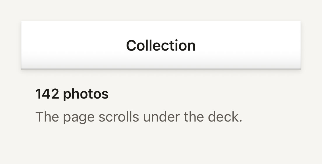
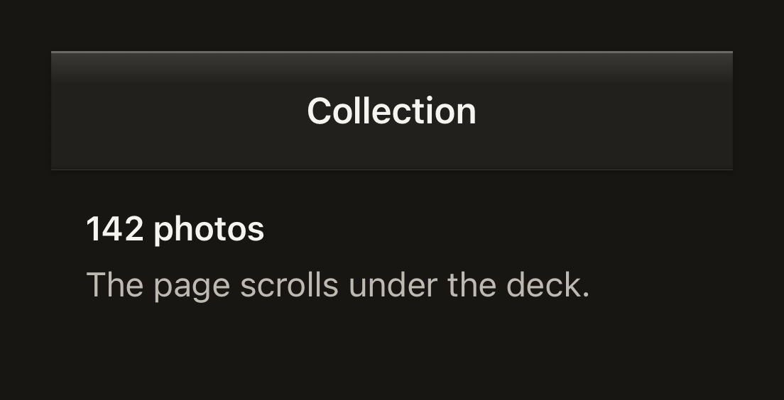
The plastic shell a navigator lays behind its native title and buttons. It is a surface slab over a hairline that casts its lift onto the page.
import { HeaderBar, Text, useTheme } from "@terratcg/ui";
import { View } from "react-native";

const HEIGHT = 56;

export default function HeaderBarDeck() {
  const theme = useTheme();
  return (
    <View style={{ width: 320, height: 140, backgroundColor: theme.colors.background }}>
      <HeaderBar height={HEIGHT} />
      <View style={{ height: HEIGHT, alignItems: "center", justifyContent: "center" }}>
        <Text variant="title">Collection</Text>
      </View>
      <View style={{ padding: 16, gap: 4 }}>
        <Text weight="semibold">142 photos</Text>
        <Text tone="secondary">The page scrolls under the deck.</Text>
      </View>
    </View>
  );
}
Import
import { HeaderBar } from "@terratcg/ui";Usage
<Stack.Screen
  options={{
    headerTransparent: true,
    headerBackground: () => <HeaderBar cornerRadius={screenCornerRadius} />,
  }}
/>
HeaderBar draws only the deck: your navigator keeps its own native title, back button and actions on top. It is absolutely positioned at the top of its parent. Without height it fills that parent, which suits a navigator's header background slot; with height it hangs from the top at that height, for a header you lay over the page yourself.
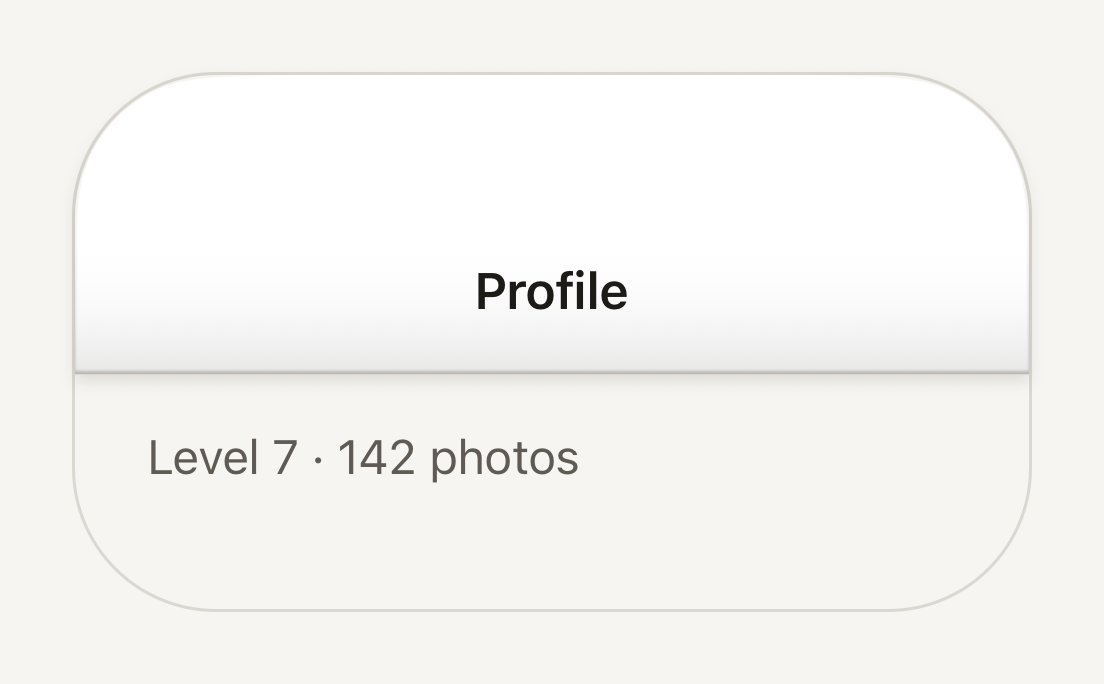
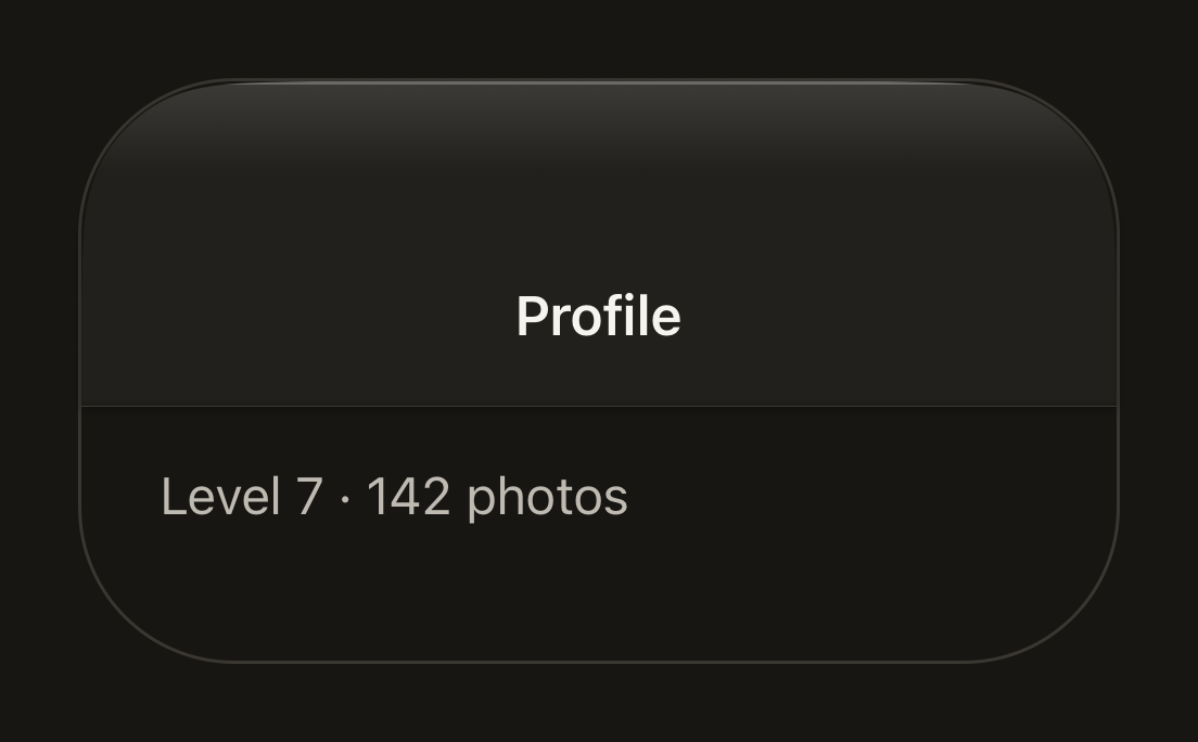
The deck fills with the theme's bar colour and runs square across the screen, with only its outer corners following the device's rounded glass through cornerRadius. Along its page-facing bottom edge it shows a turned-under line, a hairline and the shadow it casts onto the page, the same edge a TabBar shows along its top.
Examples
Following the screen corners
cornerRadius rounds the deck's top corners with the screen's continuous curve, so its edge follows the glass.
import { HeaderBar, Text, useTheme } from "@terratcg/ui";
import { View } from "react-native";

const HEIGHT = 100;
const SCREEN_CORNER = 48;

export default function HeaderBarRounded() {
  const theme = useTheme();
  return (
    <View
      style={{
        width: 320,
        height: 180,
        borderRadius: SCREEN_CORNER,
        borderCurve: "continuous",
        backgroundColor: theme.colors.background,
        borderWidth: 1,
        borderColor: theme.colors.border,
      }}
    >
      <HeaderBar height={HEIGHT} cornerRadius={SCREEN_CORNER} />
      <View style={{ height: HEIGHT, paddingTop: 44, alignItems: "center", justifyContent: "center" }}>
        <Text variant="title">Profile</Text>
      </View>
      <View style={{ paddingHorizontal: 24, paddingVertical: 16 }}>
        <Text tone="secondary">Level 7 · 142 photos</Text>
      </View>
    </View>
  );
}
Props
Prop
Type
HeaderBar also accepts React Native's View props, such as style and testID.
Accessibility
- Not announced: HeaderBar holds no content and takes no touches (
pointerEvents="none"). The navigator's title and buttons, drawn over it, carry the header's accessibility. - Colour: the deck is the theme's
barcolour; check the navigator's title colour against it when you customise the theme.
Platform differences
- iOS: the top corners follow the screen with a continuous curve (
borderCurve: "continuous"), the shape of the iPhone's glass. - Android:
borderCurveis ignored and the corners are circular arcs of the same radius. - Web: HeaderBar renders through react-native-web for these docs, but the web is not a supported target.
Rules
- Lay the HeaderBar over the page, not in a clipped frame, so its lift has room to fall.
- Leave the title and buttons to your navigator; don't draw them into the deck.
- Pass the device's screen corner radius to
cornerRadiuson a full-bleed header, and nothing on one that sits inside a sheet.