Dialog
A centred plate over a dimmed page that asks before an action, or says something to know. Open one from anywhere with showDialog.
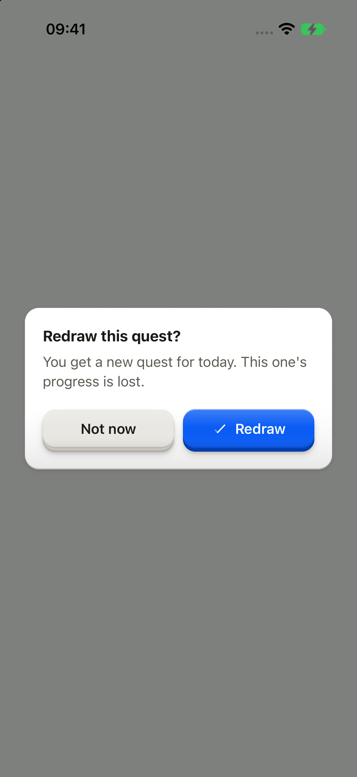
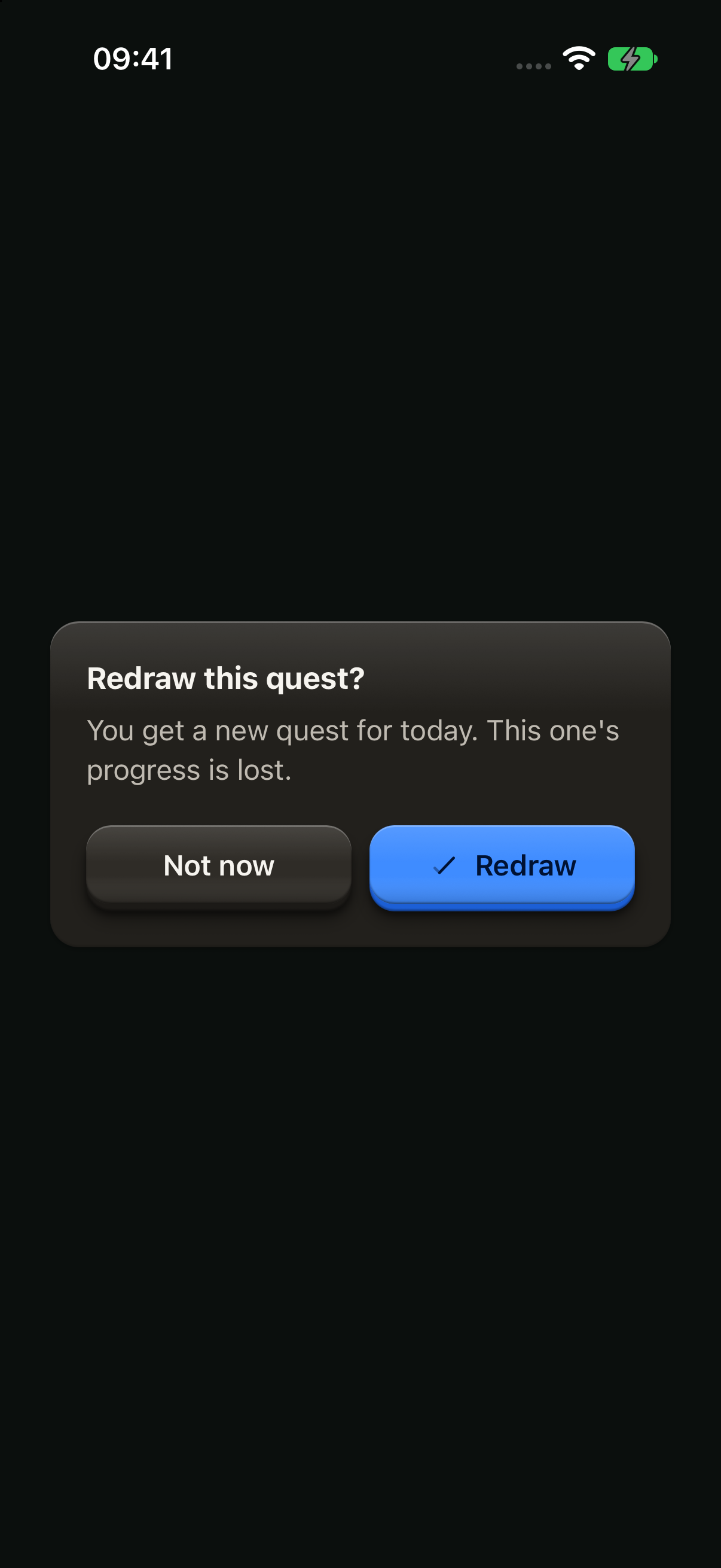
import { Button, ButtonText, showDialog, type OverlayTrigger } from "@terratcg/ui";
import { useEffect, useRef, type RefObject } from "react";
import type { ViewInstance } from "react-native";

function confirmRedraw(trigger: RefObject<OverlayTrigger | null>) {
  void showDialog({
    tone: "confirm",
    title: "Redraw this quest?",
    body: "You get a new quest for today. This one's progress is lost.",
    cancel: "Not now",
    confirm: "Redraw",
    trigger,
  });
}

export default function DialogConfirm({ capture }: SceneProps) {
  const trigger = useRef<ViewInstance>(null);
  useEffect(() => {
    if (capture) confirmRedraw(trigger);
  }, [capture]);
  return (
    <Button ref={trigger} variant="secondary" onPress={() => confirmRedraw(trigger)}>
      <ButtonText>Redraw quest</ButtonText>
    </Button>
  );
}
Import
import { showDialog } from "@terratcg/ui";Usage
const deleted = await showDialog({
  tone: "destructive",
  title: "Delete Red fox?",
  body: "The photo leaves your library for good.",
  cancel: "Keep it",
  confirm: "Delete",
  onConfirm: deletePhoto,
  trigger,
});
if (deleted) router.back();
Dialogs appear in the OverlayHost, which you mount once at the root inside ThemeProvider. showDialog works from anywhere and resolves once the Dialog has left the screen: true when its action went through, false when the user backed out. Dialogs queue, one at a time.
When onConfirm returns a promise, the Dialog stays open with its key loading until it settles. A rejection shows the host's failureText inside the Dialog, and the same key retries. Navigate after showDialog resolves, never from onConfirm.
Examples
Destructive
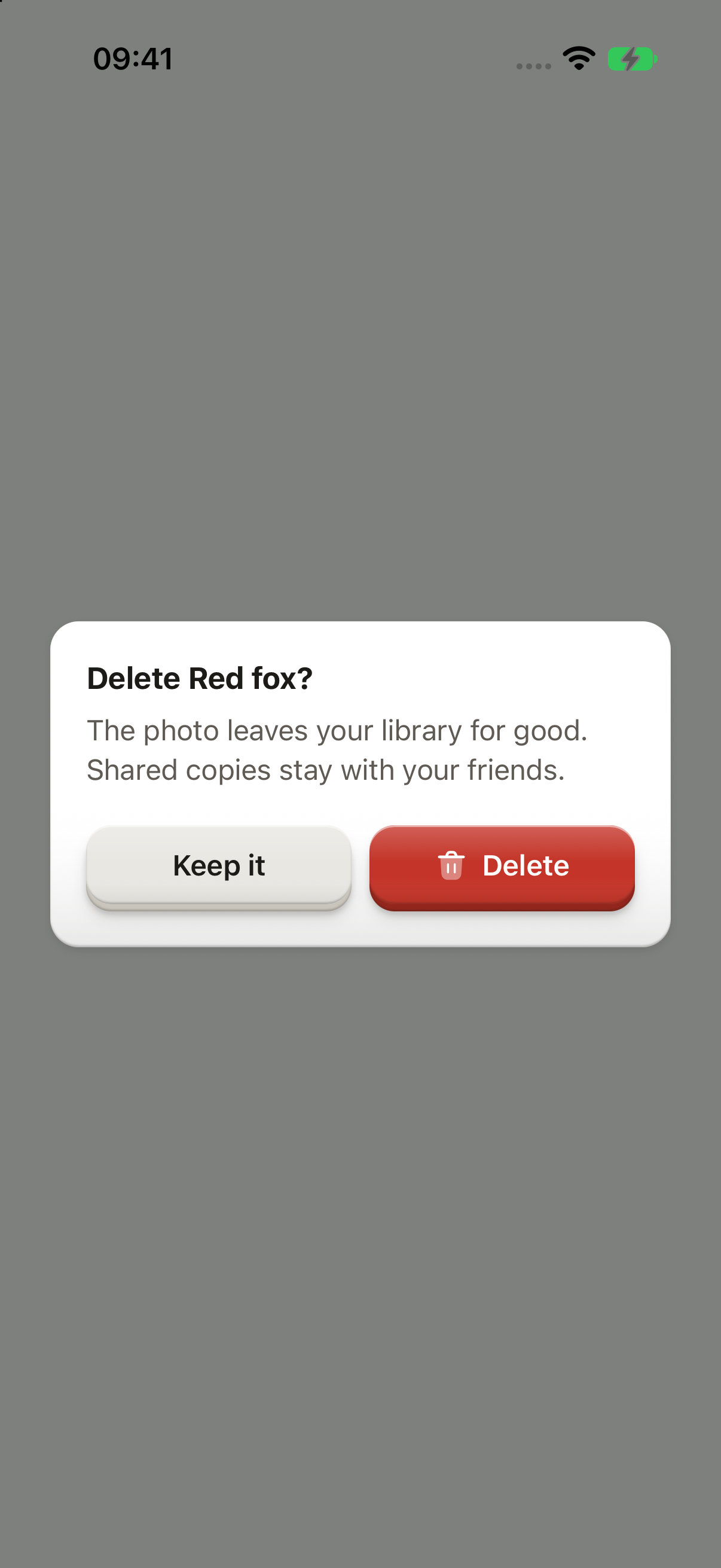
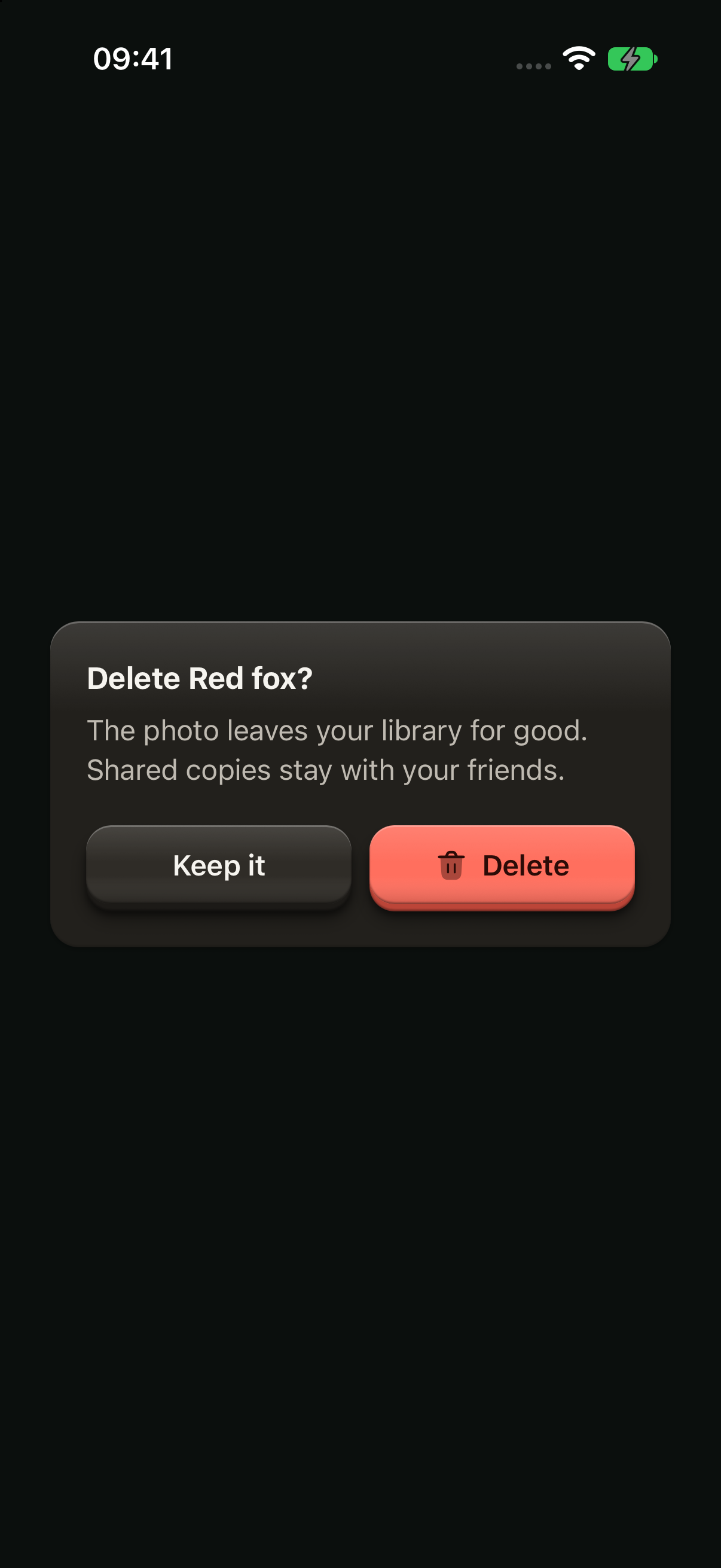
A red key that repeats the icon you pressed. An outside tap does nothing; while the work runs, the key loads.
import Delete02Icon from "@hugeicons-pro/core-bulk-rounded/Delete02Icon";
import { HugeiconsIcon } from "@hugeicons/react-native";
import { Button, ButtonIcon, ButtonText, showDialog, type ButtonIconProps, type OverlayTrigger } from "@terratcg/ui";
import { useEffect, useRef, type RefObject } from "react";
import type { ViewInstance } from "react-native";

const deleteIcon: ButtonIconProps["children"] = ({ color, size }) => <HugeiconsIcon icon={Delete02Icon} color={color} size={size} />;

/** Your request: the Dialog stays open, its key loading, until it settles. */
const deletePhoto = () => new Promise<void>((resolve) => setTimeout(resolve, 900));

function confirmDelete(trigger: RefObject<OverlayTrigger | null>) {
  void showDialog({
    tone: "destructive",
    title: "Delete Red fox?",
    body: "The photo leaves your library for good. Shared copies stay with your friends.",
    cancel: "Keep it",
    confirm: "Delete",
    icon: deleteIcon,
    onConfirm: deletePhoto,
    trigger,
  });
}

export default function DialogDestructive({ capture }: SceneProps) {
  const trigger = useRef<ViewInstance>(null);
  useEffect(() => {
    if (capture) confirmDelete(trigger);
  }, [capture]);
  return (
    <Button ref={trigger} variant="destructive" onPress={() => confirmDelete(trigger)}>
      <ButtonIcon>{deleteIcon}</ButtonIcon>
      <ButtonText>Delete photo</ButtonText>
    </Button>
  );
}
Info
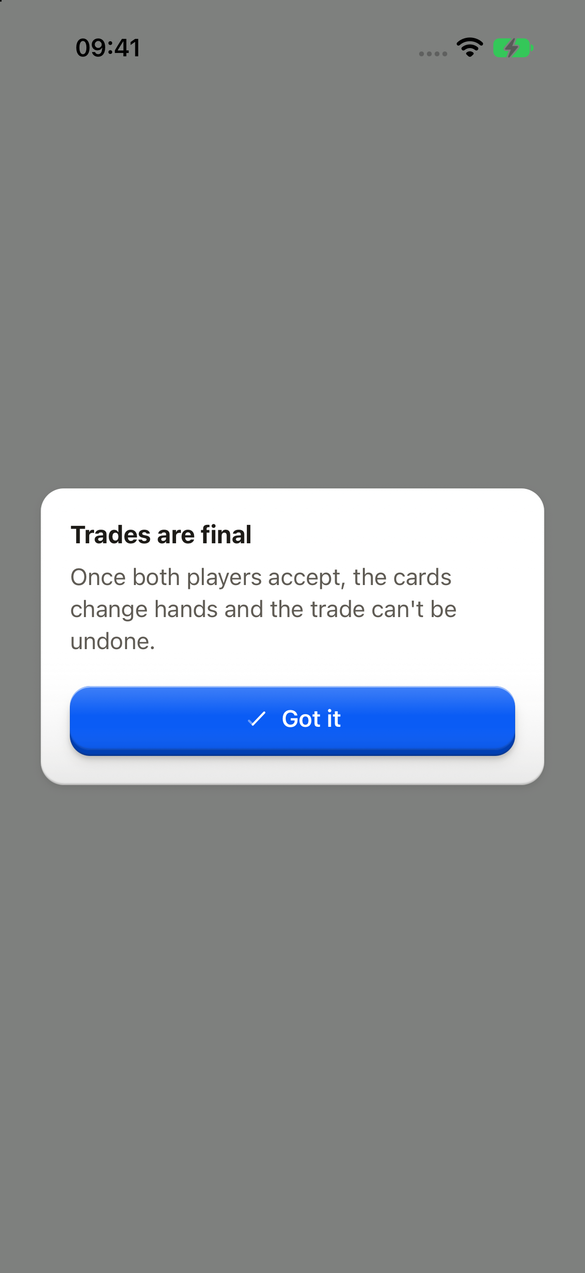
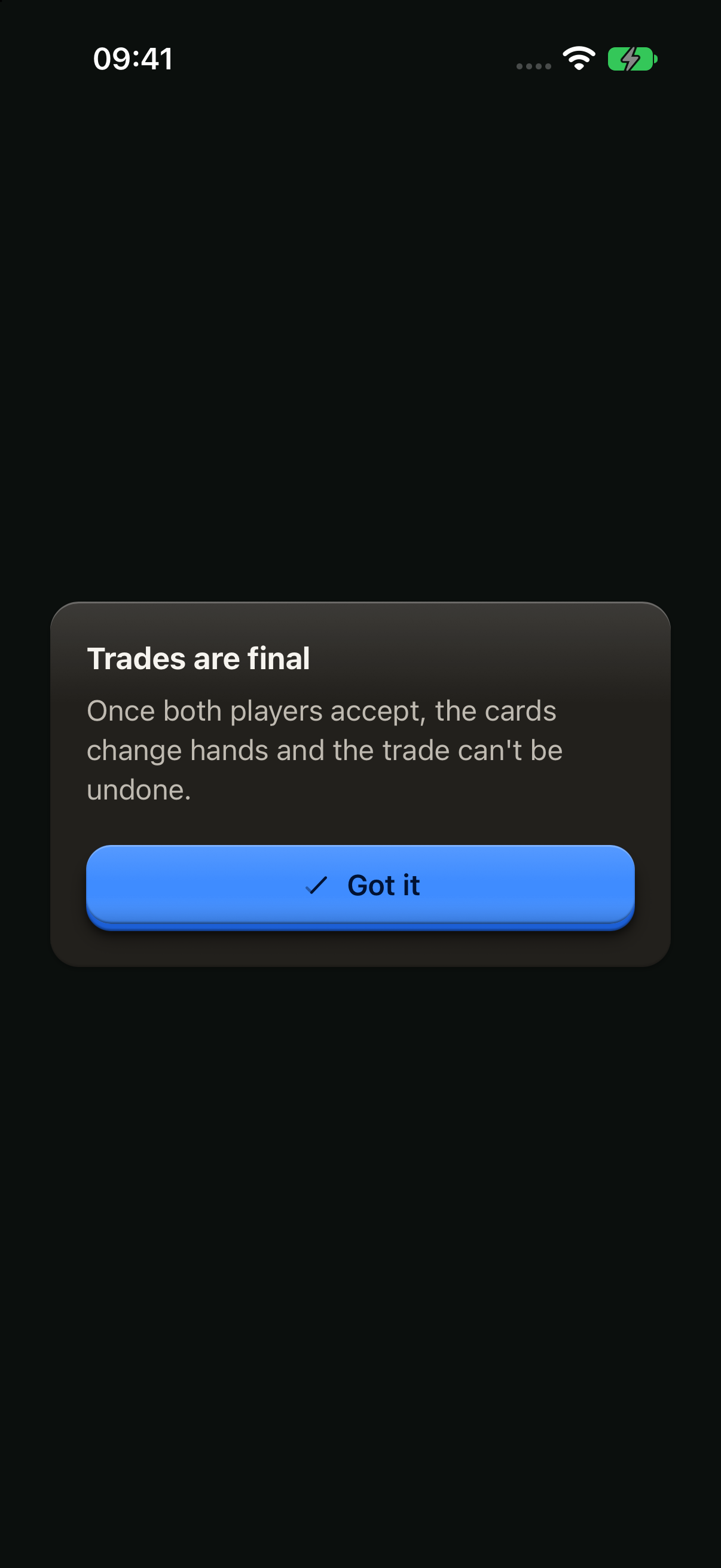
Something to know before going on: no cancel, a single key.
import { Button, ButtonText, showDialog, type OverlayTrigger } from "@terratcg/ui";
import { useEffect, useRef, type RefObject } from "react";
import type { ViewInstance } from "react-native";

function explainTrades(trigger: RefObject<OverlayTrigger | null>) {
  void showDialog({
    tone: "info",
    title: "Trades are final",
    body: "Once both players accept, the cards change hands and the trade can't be undone.",
    confirm: "Got it",
    trigger,
  });
}

export default function DialogInfo({ capture }: SceneProps) {
  const trigger = useRef<ViewInstance>(null);
  useEffect(() => {
    if (capture) explainTrades(trigger);
  }, [capture]);
  return (
    <Button ref={trigger} variant="outline" onPress={() => explainTrades(trigger)}>
      <ButtonText>How trades work</ButtonText>
    </Button>
  );
}
Props
Prop
Type
dismissOverlays() closes every Dialog and Menu at once, as if the user had backed out, for when the app moves on (a sign-out, a deep link).
Accessibility
- Focus: once the Dialog is up, screen-reader focus moves to its title, which has the
headerrole. When it closes, focus goes back totrigger. From a Menu item, pass thetriggeritsonSelectreceives. - Modal: the plate is an
alertin a modal layer, so a screen reader stays inside it. The escape gesture cancels. - Busy: while the action runs, the key is busy and the way out is shut. A failure is announced.
- Larger text: the way out sits on the left and the action on the right; when a key's label wraps, the keys stack with the action on top. The copy scrolls when it outgrows the screen.
- Reduce Motion: the plate fades in without rising or scaling.
Platform differences
- iOS: the Dialog sits in a full-window overlay, above native sheets.
- Android: the Dialog is a transparent
Modal, so Back cancels it, a destructive Dialog included. - Outside tap: it cancels a
confirmorinfoDialog. Adestructiveone ignores it. - Feedback: each key calls ThemeProvider's
feedbackhandler with"press". The keyboard is dismissed before the Dialog opens. - No web tab: a live Dialog on a desktop browser stretches to the full window width and covers the whole page, because nothing caps its width yet. Until it gets a width cap (#702), this page shows only the iOS and Android captures.
Rules
- Ask a question in the title, and say what happens next in the body.
- Label the action with a verb ("Release"), never "OK" or "Yes". Label the way out with what it keeps ("Keep it"), or "Cancel".
- Confirm a destructive action that can't be undone; don't confirm one that can.
- Pass
trigger, so focus goes back where the user was. - Give the confirm key the icon of the control that opened the Dialog (
icon), so it repeats what the user pressed. AdestructiveDialog whose trigger had no icon keeps a text-only key. - Put the work in
onConfirmand navigate aftershowDialogresolves. - Don't open a
Modalor a navigator inside the OverlayHost.