Row
One line of a list, with a leading element, its content and an optional trailing control. A pressable row is a button.
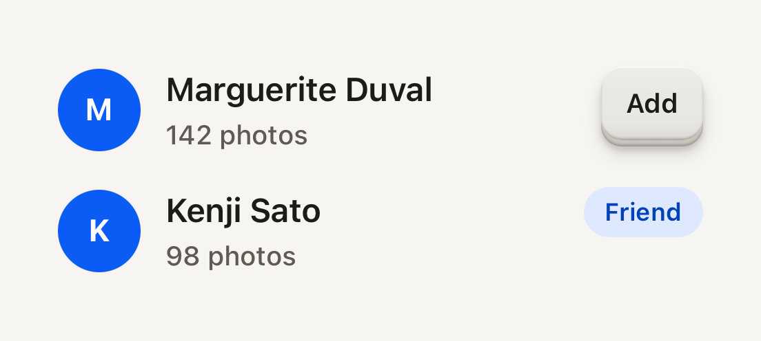
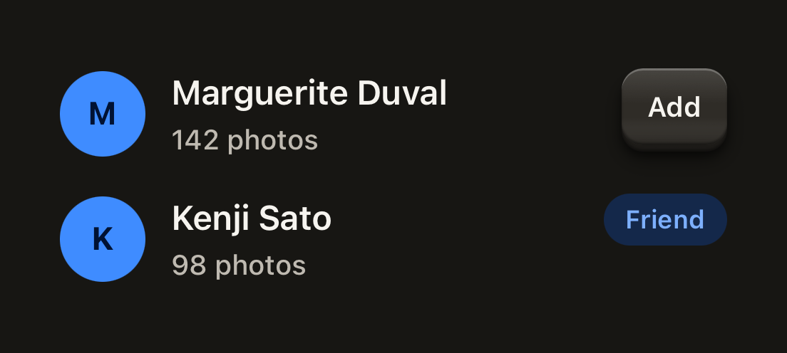
import { Avatar, AvatarFallback, Badge, Button, ButtonText, Row, RowContent, RowDescription, RowTitle } from "@terratcg/ui";
import { View } from "react-native";

export default function RowList() {
  return (
    <View style={{ width: 320 }}>
      <Row>
        <Avatar accessibilityLabel="Marguerite Duval">
          <AvatarFallback>M</AvatarFallback>
        </Avatar>
        <RowContent>
          <RowTitle>Marguerite Duval</RowTitle>
          <RowDescription>142 photos</RowDescription>
        </RowContent>
        <Button size="sm" variant="secondary" accessibilityLabel="Add Marguerite Duval as a friend">
          <ButtonText>Add</ButtonText>
        </Button>
      </Row>
      <Row>
        <Avatar accessibilityLabel="Kenji Sato">
          <AvatarFallback>K</AvatarFallback>
        </Avatar>
        <RowContent>
          <RowTitle>Kenji Sato</RowTitle>
          <RowDescription>98 photos</RowDescription>
        </RowContent>
        <Badge variant="accent">Friend</Badge>
      </Row>
    </View>
  );
}
Import
import { Row, RowContent, RowDescription, RowTitle } from "@terratcg/ui";Usage
<Row onPress={() => router.push("/settings/notifications")}>
  <RowContent>
    <RowTitle>Notifications</RowTitle>
    <RowDescription>Friend requests and trades</RowDescription>
  </RowContent>
</Row>
RowContent is the flexible middle: it takes the space between a leading element, such as an Avatar, and a trailing control, such as a Button or a Switch. RowTitle and RowDescription each stay on one line and truncate.
Examples
Pressable rows
With onPress the whole row is a button that dims under the press tint; disabled blocks the press. A title can wrap when you lift its line cap.
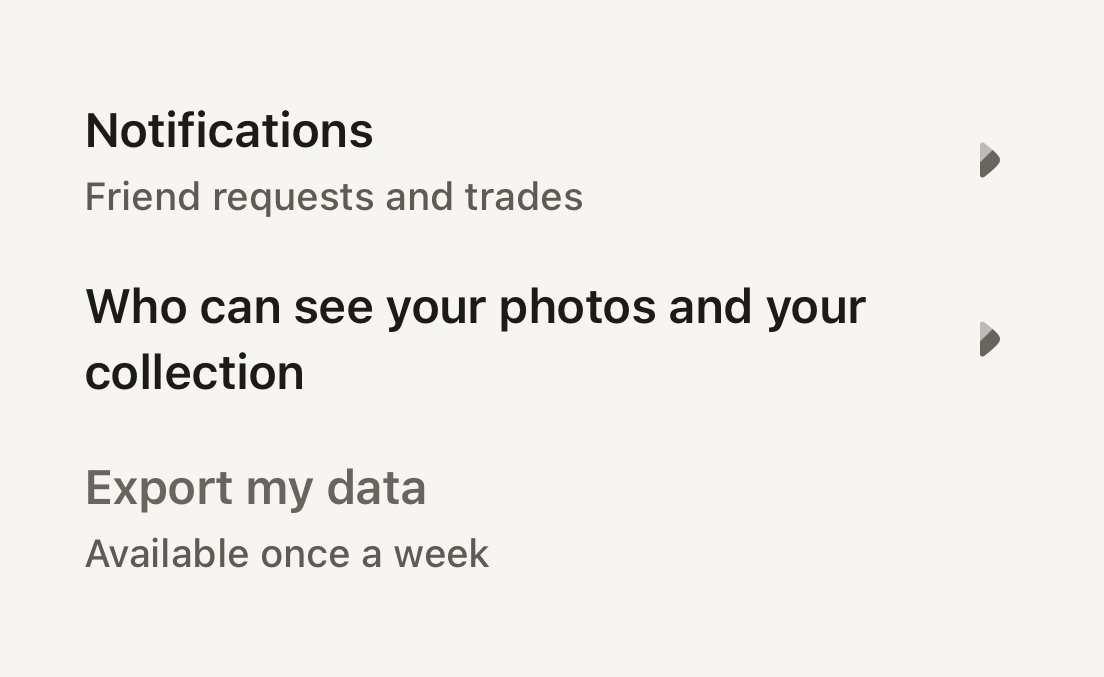
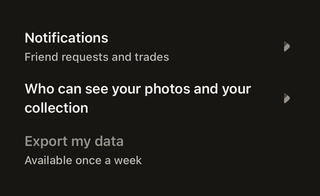
import ArrowRight01Icon from "@hugeicons-pro/core-bulk-rounded/ArrowRight01Icon";
import { HugeiconsIcon } from "@hugeicons/react-native";
import { Row, RowContent, RowDescription, RowTitle, useTheme } from "@terratcg/ui";
import { View } from "react-native";

export default function RowPressable() {
  const theme = useTheme();
  const chevron = <HugeiconsIcon icon={ArrowRight01Icon} color={theme.colors.inkMuted} size={20} />;
  return (
    <View style={{ width: 320 }}>
      <Row onPress={() => {}}>
        <RowContent>
          <RowTitle>Notifications</RowTitle>
          <RowDescription>Friend requests and trades</RowDescription>
        </RowContent>
        {chevron}
      </Row>
      <Row onPress={() => {}}>
        <RowContent>
          <RowTitle numberOfLines={2}>Who can see your photos and your collection</RowTitle>
        </RowContent>
        {chevron}
      </Row>
      <Row onPress={() => {}} disabled>
        <RowContent>
          <RowTitle tone="muted">Export my data</RowTitle>
          <RowDescription>Available once a week</RowDescription>
        </RowContent>
      </Row>
    </View>
  );
}
Props
Row
Prop
Type
Row also accepts React Native's Pressable props, such as onLongPress, accessibilityLabel and testID. disabled applies to a pressable Row only; a static Row ignores it.
Parts
RowContent takes React Native's View props. RowTitle (body type, semibold) and RowDescription (label type, secondary) take React Native's Text props and Text's tone and weight. Pass numberOfLines={2} to let a title wrap.
Accessibility
- Role:
buttonwhen the Row hasonPress, withdisabledmerged into youraccessibilityState. WithoutonPressit is a plain container and its parts are read one by one. - Label: a pressable Row is read as the text inside it. Pass an
accessibilityLabelwhen that text alone doesn't say what the press does. - Touch target: at least 48 pt tall.
- Larger text: titles truncate by default. Under enlarged text, prefer
numberOfLines={2}(orundefined) on titles that matter.
Platform differences
- iOS and Android: the same row and press tint, with no ripple. A press calls ThemeProvider's
feedbackhandler withfeedbackIntent:"press"by default,"select"for a row that changes a setting. - Web: Row renders through react-native-web for these docs, but the web is not a supported target. There a pressable Row is a focusable element with
role="button", so a trailing Button inside it doesn't nest one button in another.
Rules
- Give a Row
onPressor a trailing control, not both doing the same thing. - Keep depth on the controls inside a Row: the Row itself never lifts.
- Put text in RowTitle and RowDescription, not in bare strings.
- A Row that toggles a setting reports
feedbackIntent="select".