Tab bar
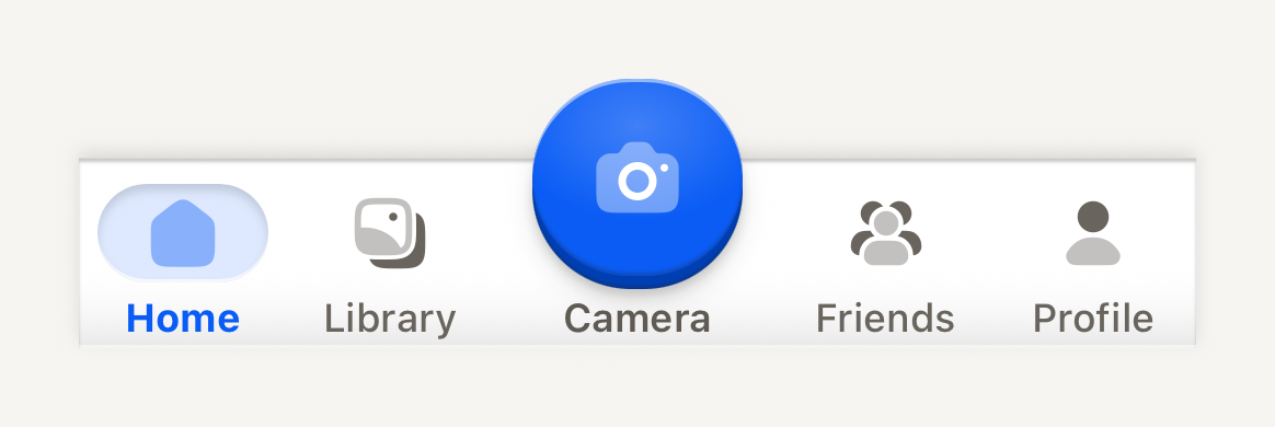
A quiet bottom deck of destinations around one raised central action. It only presents, so your navigator owns the routes and the selection.
import Album02Icon from "@hugeicons-pro/core-bulk-rounded/Album02Icon";
import Camera01Icon from "@hugeicons-pro/core-bulk-rounded/Camera01Icon";
import Home01Icon from "@hugeicons-pro/core-bulk-rounded/Home01Icon";
import UserIcon from "@hugeicons-pro/core-bulk-rounded/UserIcon";
import UserGroup03Icon from "@hugeicons-pro/core-bulk-rounded/UserGroup03Icon";
import { HugeiconsIcon, type IconSvgElement } from "@hugeicons/react-native";
import { TabBar, TabBarAction, TabBarItem } from "@terratcg/ui";
import { useState } from "react";
import { View } from "react-native";

const icon = (glyph: IconSvgElement) =>
  function TabIcon({ color, size }: { color: string; size: number }) {
    return <HugeiconsIcon icon={glyph} color={color} size={size} />;
  };

export default function TabBarScene() {
  const [tab, setTab] = useState("home");
  return (
    <View style={{ width: 340, paddingTop: 24 }}>
      <TabBar>
        <TabBarItem label="Home" icon={icon(Home01Icon)} selected={tab === "home"} onPress={() => setTab("home")} />
        <TabBarItem label="Library" icon={icon(Album02Icon)} selected={tab === "library"} onPress={() => setTab("library")} />
        <TabBarAction accessibilityLabel="Take a photo" label="Camera" icon={icon(Camera01Icon)} />
        <TabBarItem label="Friends" icon={icon(UserGroup03Icon)} selected={tab === "friends"} onPress={() => setTab("friends")} />
        <TabBarItem label="Profile" icon={icon(UserIcon)} selected={tab === "profile"} onPress={() => setTab("profile")} />
      </TabBar>
    </View>
  );
}
Import
import { TabBar, TabBarAction, TabBarItem } from "@terratcg/ui";Usage
<TabBar bottomInset={insets.bottom}>
  <TabBarItem label="Home" icon={homeIcon} selected={route === "home"} onPress={() => navigate("home")} />
  <TabBarAction accessibilityLabel="Take a photo" label="Camera" icon={cameraIcon} onPress={openCamera} />
  <TabBarItem label="Profile" icon={profileIcon} selected={route === "profile"} onPress={() => navigate("profile")} />
</TabBar>
The deck is TAB_BAR_CONTENT_HEIGHT (58 pt) tall plus the bottomInset you pass from the safe area. Above it, a transparent TAB_BAR_LIFT (24 pt) strip overlays the page for the raised action to rise into; elsewhere in that strip, touches fall through to the page. Items share the row equally and the action keeps a fixed column.
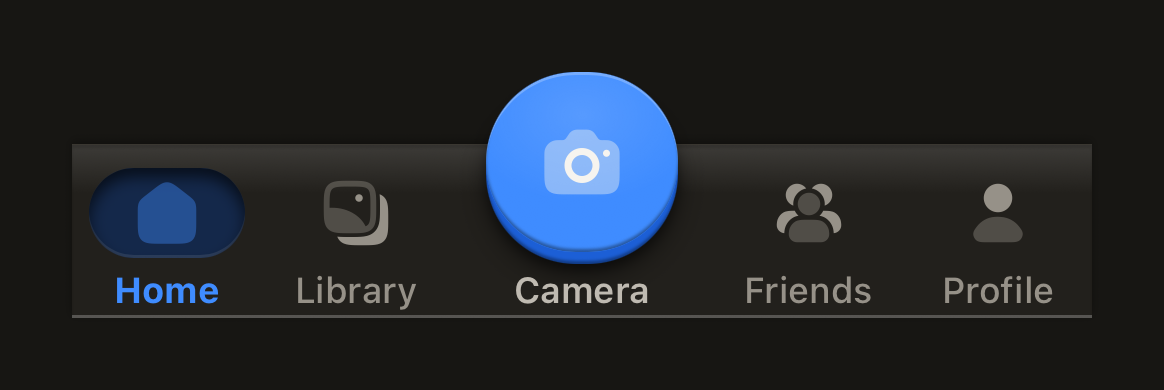
The deck fills with the theme's bar colour and runs square across the screen, with only its outer corners following the device's rounded glass through cornerRadius. It is a shell under a hairline that keeps its sheen along the top but casts its lift upward, so its page-facing top edge shows the same turned-under line, hairline and shadow a HeaderBar shows the page. Captions, the action's included, share one baseline, and icons rest in the muted ink. The selected item sits on a soft accent well recessed into the deck behind its icon, with a bold accent label. The TabBarAction is a 60 pt domed accent face with a radial catch light, its glyph in the light ink in dark and the on-accent colour in light, over its edge, contact shadow and halo; it rises 24 pt above the deck and travels when pressed like every TerraUI key.
Examples
Badges and a disabled item
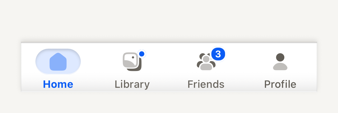
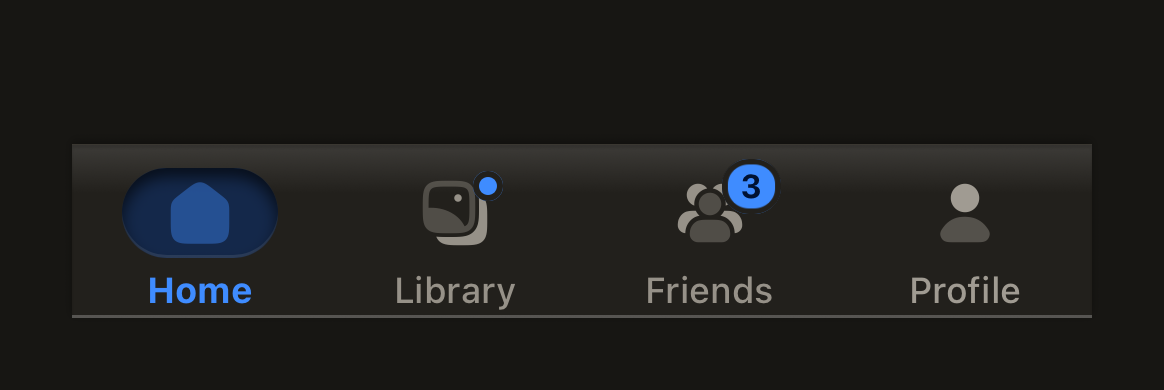
A count pill or a dot says something waits at a destination, spoken through badgeLabel; a disabled item stays readable but takes no press.
import Album02Icon from "@hugeicons-pro/core-bulk-rounded/Album02Icon";
import Home01Icon from "@hugeicons-pro/core-bulk-rounded/Home01Icon";
import UserIcon from "@hugeicons-pro/core-bulk-rounded/UserIcon";
import UserGroup03Icon from "@hugeicons-pro/core-bulk-rounded/UserGroup03Icon";
import { HugeiconsIcon, type IconSvgElement } from "@hugeicons/react-native";
import { TabBar, TabBarItem } from "@terratcg/ui";
import { View } from "react-native";

const icon = (glyph: IconSvgElement) =>
  function TabIcon({ color, size }: { color: string; size: number }) {
    return <HugeiconsIcon icon={glyph} color={color} size={size} />;
  };

export default function TabBarBadges() {
  return (
    <View style={{ width: 340, paddingTop: 24 }}>
      <TabBar>
        <TabBarItem label="Home" icon={icon(Home01Icon)} selected />
        <TabBarItem label="Library" icon={icon(Album02Icon)} selected={false} badge="dot" badgeLabel="New photos" />
        <TabBarItem label="Friends" icon={icon(UserGroup03Icon)} selected={false} badge={3} badgeLabel="3 friend requests" />
        <TabBarItem label="Profile" icon={icon(UserIcon)} selected={false} disabled />
      </TabBar>
    </View>
  );
}
Props
TabBar
Prop
Type
TabBar also accepts React Native's View props.
TabBarItem
Prop
Type
TabBarItem also accepts React Native's Pressable props, except disabled and style, which it defines itself.
TabBarAction
Prop
Type
TabBarAction also accepts React Native's Pressable props. The face is TAB_BAR_ACTION_SIZE (60 pt) across.
Accessibility
- Roles: the bar is a
tablist. An item is atabon Android and abuttonon iOS, where VoiceOver does not announce tabs reliably; itsaccessibilityStatecarriesselectedanddisabled. The action is always abutton, never a tab. - Labels: an item is read by its
label. The action shows an icon only, so itsaccessibilityLabelis required. - Badges: a badge is never told by colour alone: pair it with
badgeLabel("3 friend requests"), which is read as the item's value while the badge shows. Counts over 99 show as "99+". - Selection: shown by a soft accent well behind the icon and a bolder label, not by colour alone.
- Larger text: captions scale with the system text size up to 1.3 times, then stop, so they still fit the fixed deck.
- Press: an item dims while pressed. Nothing moves, so this stays under Reduce Motion.
Platform differences
- iOS: items take the
buttonrole, as above, and the deck's bottom corners follow the screen with a continuous curve. - Android: items take the
tabrole, and the corners are circular arcs. - Feedback: an item press calls ThemeProvider's
feedbackhandler with"select", the action with"press". TerraUI plays no haptic or sound itself. - Web: TabBar renders through react-native-web for these docs, but the web is not a supported target.
Rules
- Your navigator owns the routes. Set
selectedfrom the current route, and handle every press, including a press on the selected item, which TabBarItem delivers so you can scroll to the top or pop to the root. - Use one TabBarAction at most, for the app's central action, not a destination.
- Keep to four or five destinations with one-word labels.
- Pass the bottom safe-area inset to
bottomInsetand your screen's corner radius tocornerRadius. - Give the page under the bar a bottom padding of
TAB_BAR_CONTENT_HEIGHTplus the inset, so nothing hides behind the deck.