Spinner
The platform's activity indicator in the theme accent, for a wait without a known end.


import { Spinner } from "@terratcg/ui";
import { View } from "react-native";

export default function SpinnerSizes() {
  return (
    <View style={{ flexDirection: "row", alignItems: "center", gap: 24 }}>
      <Spinner size="sm" />
      <Spinner />
      <Spinner size="lg" />
    </View>
  );
}
Import
import { Spinner } from "@terratcg/ui";Usage
{loading ? <Spinner /> : <PhotoList />}A Spinner is React Native's ActivityIndicator coloured with the theme accent. For a busy key, set loading on the Button instead: it holds its width and shows its own Spinner.
Examples
With a label
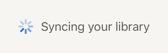
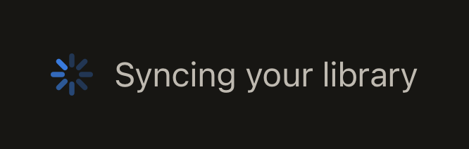
Beside text, the label says what is loading, and the spinner takes the same words for screen readers.
import { Spinner, Text } from "@terratcg/ui";
import { View } from "react-native";

export default function SpinnerWithLabel() {
  return (
    <View style={{ flexDirection: "row", alignItems: "center", gap: 10 }}>
      <Spinner accessibilityLabel="Syncing your library" />
      <Text tone="secondary">Syncing your library</Text>
    </View>
  );
}
Props
Prop
Type
Spinner also accepts React Native's ActivityIndicator props except size, such as animating, color and hidesWhenStopped. color replaces the accent.
Accessibility
- Role:
progressbar, with the label fromThemeProvider'slabels.loading("Loading" by default, see Labels) unless you pass your ownaccessibilityLabel. Say what is loading: "Syncing your library". - One per wait: a screen that is loading shows one Spinner, so it is announced once.
Platform differences
- iOS: the system activity indicator.
smanddefaultare the small one,lgthe large one. - Android: the Material circular indicator, at the same two sizes.
- Web: react-native-web draws its own indicator for these docs, but the web is not a supported target.
Rules
- Use a Spinner for a wait without a known end. When you know how far along the work is, show Progress.
- Don't use a Spinner as a page's placeholder: show Skeleton shapes for content that is on its way.
- Keep the accent: pass
coloronly on a surface where the accent doesn't read.