Shelf
A titled horizontal strip of pockets, such as recent items or favourites. Only a heading and spacing frame it, so the items stay the subject.
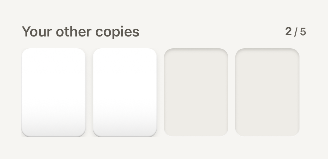
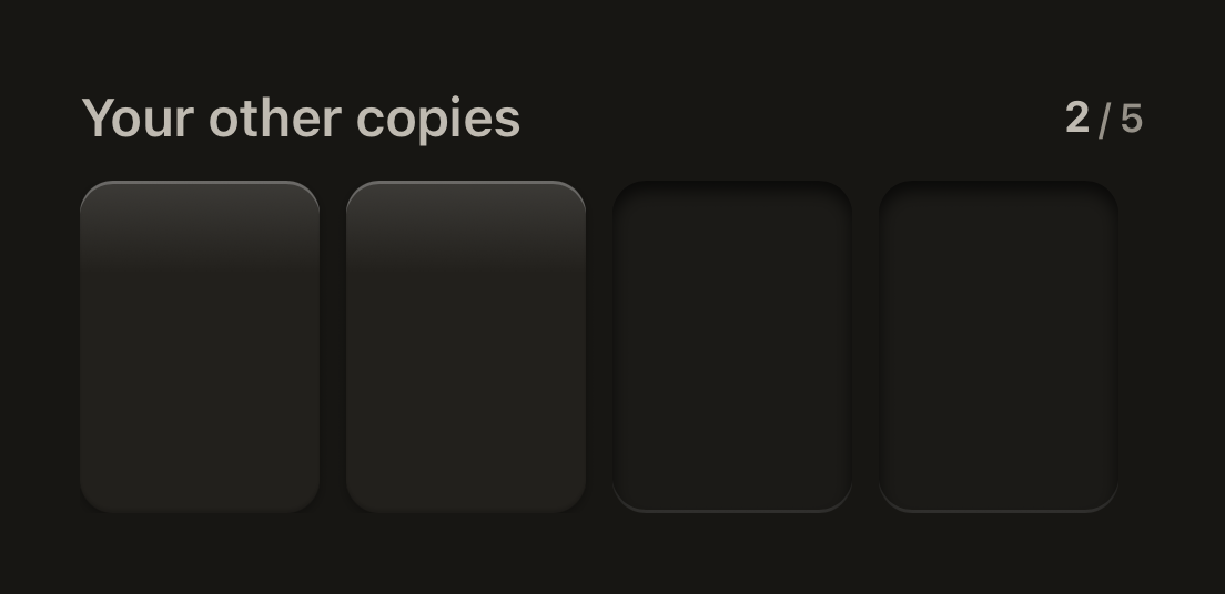
import { Cell, Counter, Shelf } from "@terratcg/ui";
import { View } from "react-native";

export default function ShelfRecent() {
  return (
    <View style={{ width: 320 }}>
      <Shelf title="Your other copies" trailing={<Counter value={2} total={5} size="sm" tone="secondary" />}>
        <Cell style={{ width: 72, height: 100 }} />
        <Cell style={{ width: 72, height: 100 }} />
        <Cell frame="well" style={{ width: 72, height: 100 }} />
        <Cell frame="well" style={{ width: 72, height: 100 }} />
        <Cell frame="well" style={{ width: 72, height: 100 }} />
      </Shelf>
    </View>
  );
}
Import
import { Shelf } from "@terratcg/ui";Usage
<Shelf title="Recent" trailing={<Counter value={2} total={5} size="sm" tone="secondary" />}>
  {recent.map((card) => (
    <Cell key={card.id} onPress={() => open(card)} accessibilityLabel={card.name} style={{ width: 72, height: 100 }}>
      <CardArt card={card} />
    </Cell>
  ))}
</Shelf>
The title is a secondary SectionHeader, with trailing at its end. The children sit in a horizontal ScrollView, spaced by the theme.
Examples
Without a title, bleeding to the edge
Without title there is no header row; inset pads the strip and bleeds it by the same amount, so items scroll to the edge of the screen.
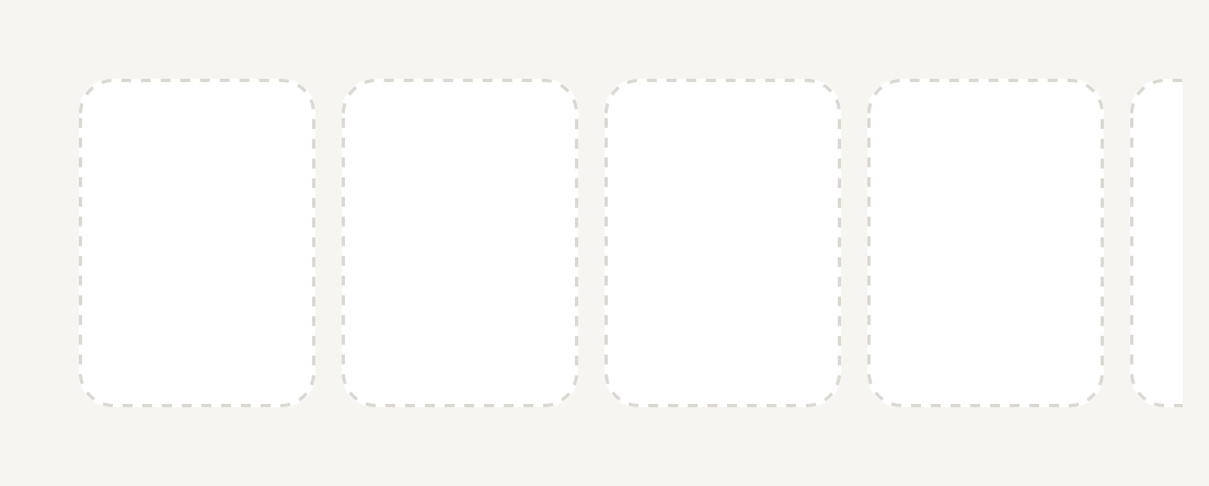
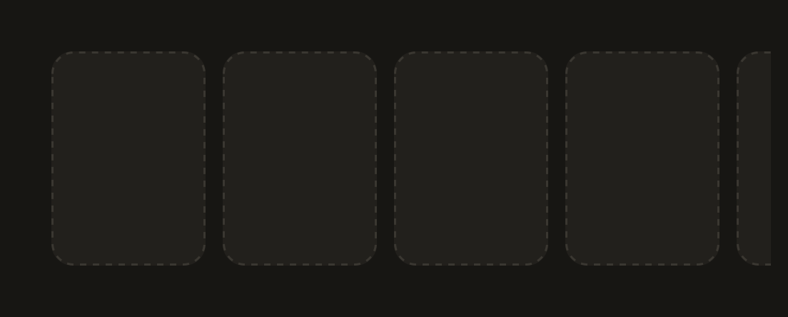
import { Cell, Shelf } from "@terratcg/ui";
import { View } from "react-native";

export default function ShelfUntitled() {
  return (
    <View style={{ width: 320 }}>
      <Shelf inset={16}>
        <Cell frame="dashed" style={{ width: 72, height: 100 }} />
        <Cell frame="dashed" style={{ width: 72, height: 100 }} />
        <Cell frame="dashed" style={{ width: 72, height: 100 }} />
        <Cell frame="dashed" style={{ width: 72, height: 100 }} />
        <Cell frame="dashed" style={{ width: 72, height: 100 }} />
      </Shelf>
    </View>
  );
}
Props
Prop
Type
Shelf also accepts React Native's View props. A testID also names the strip, as <testID>-strip.
Accessibility
- Heading: the title is announced as a header, so screen reader users can jump between shelves.
- Strip: the items are read in order; give each its own label, as a pressable Cell needs.
- Scrolling: the strip scrolls with the platform's own horizontal scrolling, without a scroll indicator. Leave part of the next item visible so it reads as scrollable.
Platform differences
- iOS and Android: the same strip, scrolling natively on each platform.
- Web: Shelf renders through react-native-web for these docs, but the web is not a supported target.
Rules
- Give the shelf a
title:trailingshows only beside one. - Set
insetto your page's horizontal padding, so items scroll to the screen edge but rest aligned with the page. - Keep items one height; a Shelf is a strip, not a masonry grid.