Toast
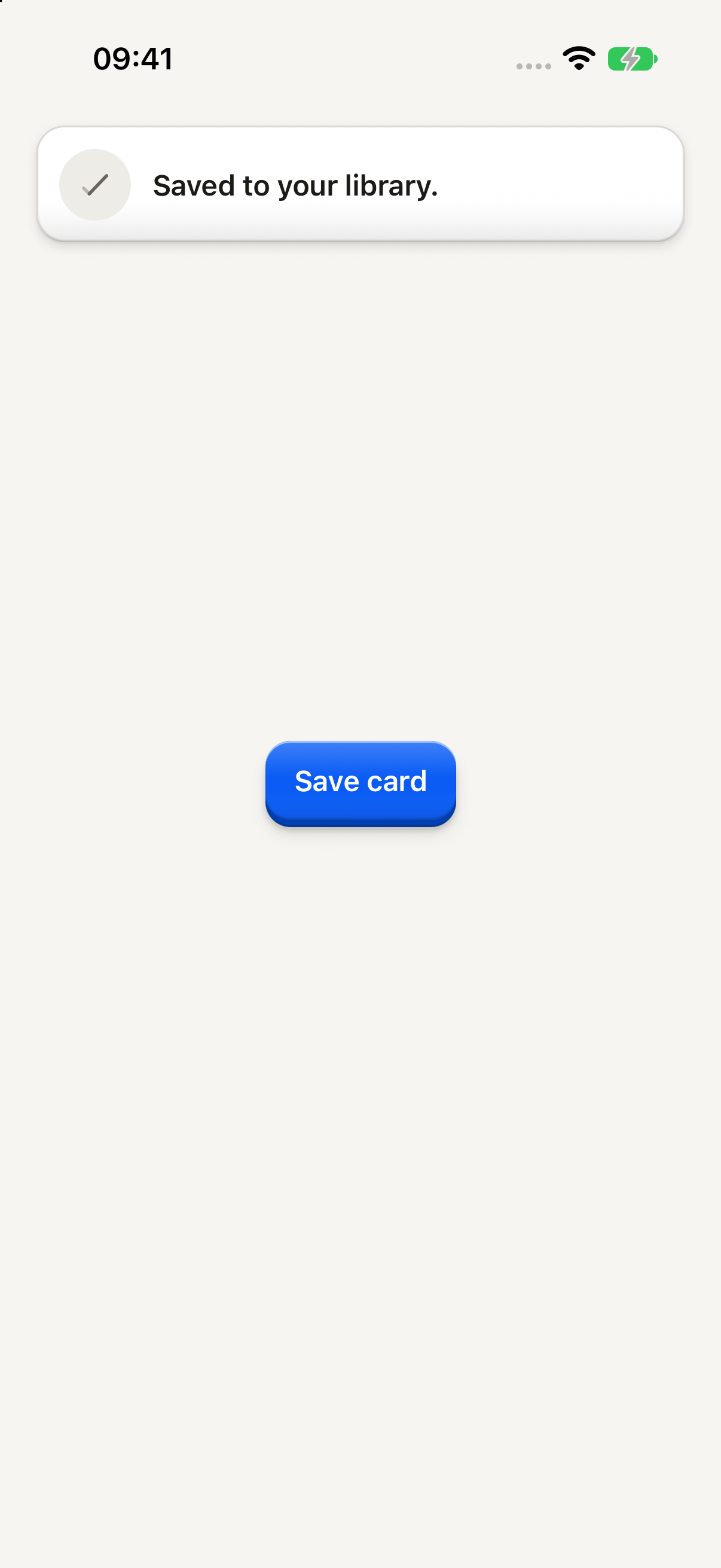
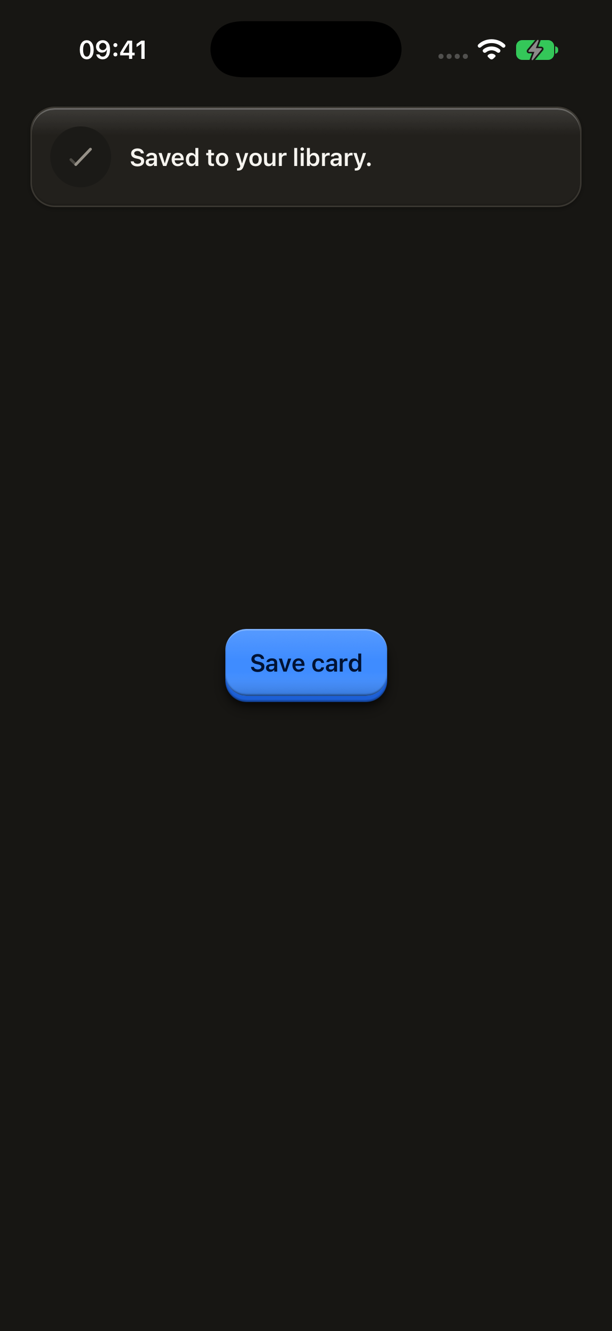
A short message that slides in from the top of the window, one at a time. Open one from anywhere with showToast.
import { Button, ButtonText, showToast } from "@terratcg/ui";
import { useEffect } from "react";

const save = () => showToast({ tone: "neutral", message: "Saved to your library." });

export default function ToastNeutral({ capture }: SceneProps) {
  useEffect(() => {
    // A neutral toast leaves after about 3 seconds, sooner than a simulator
    // screenshot lands: the capture queues it back to back to keep it up.
    if (capture) for (let shown = 0; shown < 4; shown++) save();
  }, [capture]);
  return (
    <Button onPress={save}>
      <ButtonText>Save card</ButtonText>
    </Button>
  );
}
Import
import { showToast } from "@terratcg/ui";Usage
showToast({ tone: "neutral", message: "Saved to your library." });Toasts appear in the OverlayHost, which you mount once at the root inside ThemeProvider. showToast works from anywhere, inside a render or not. Toasts queue: each one shows after the one before it has gone.
The host draws each tone's glyph from its toastIcons prop, and keeps toasts below the status bar by toastInsetTop: pass your safe-area top inset.
Examples
Danger
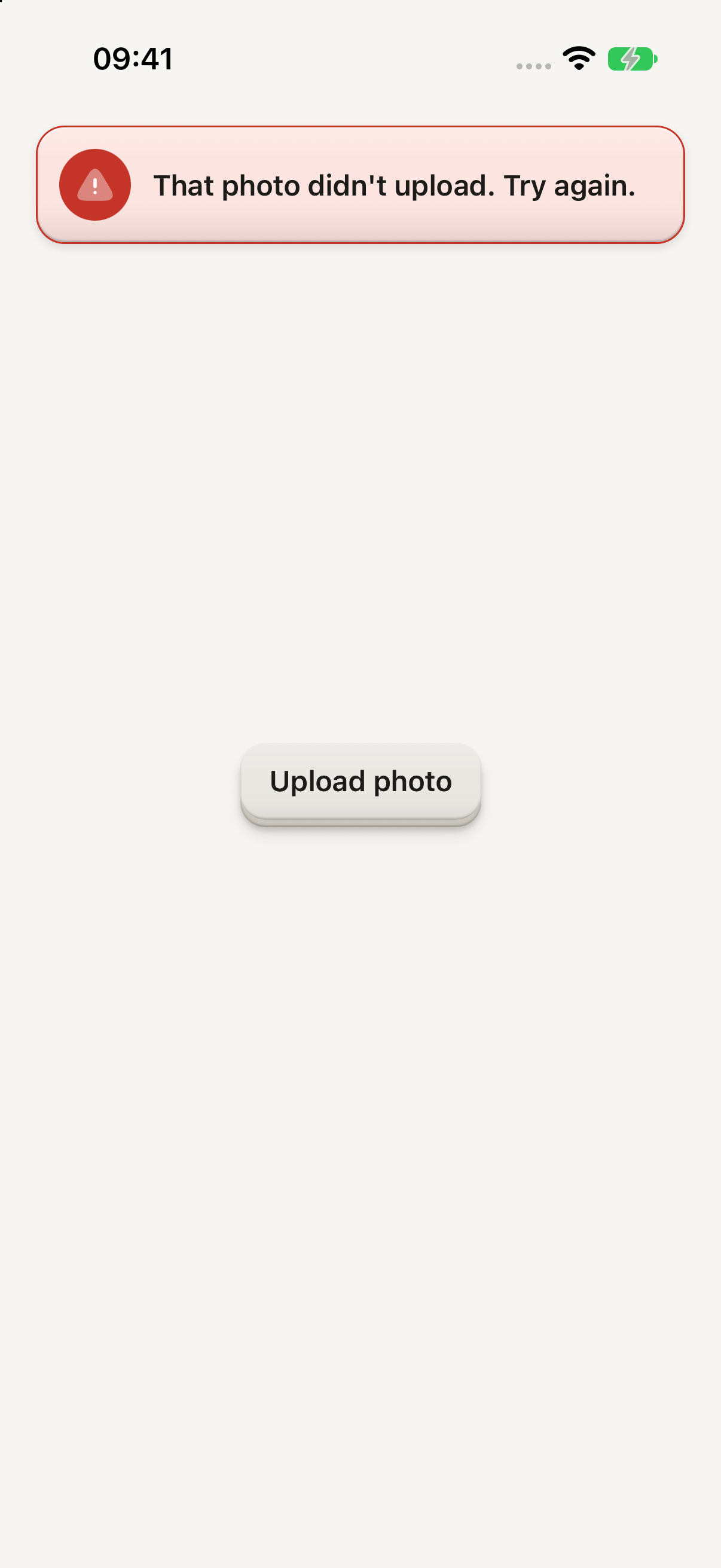
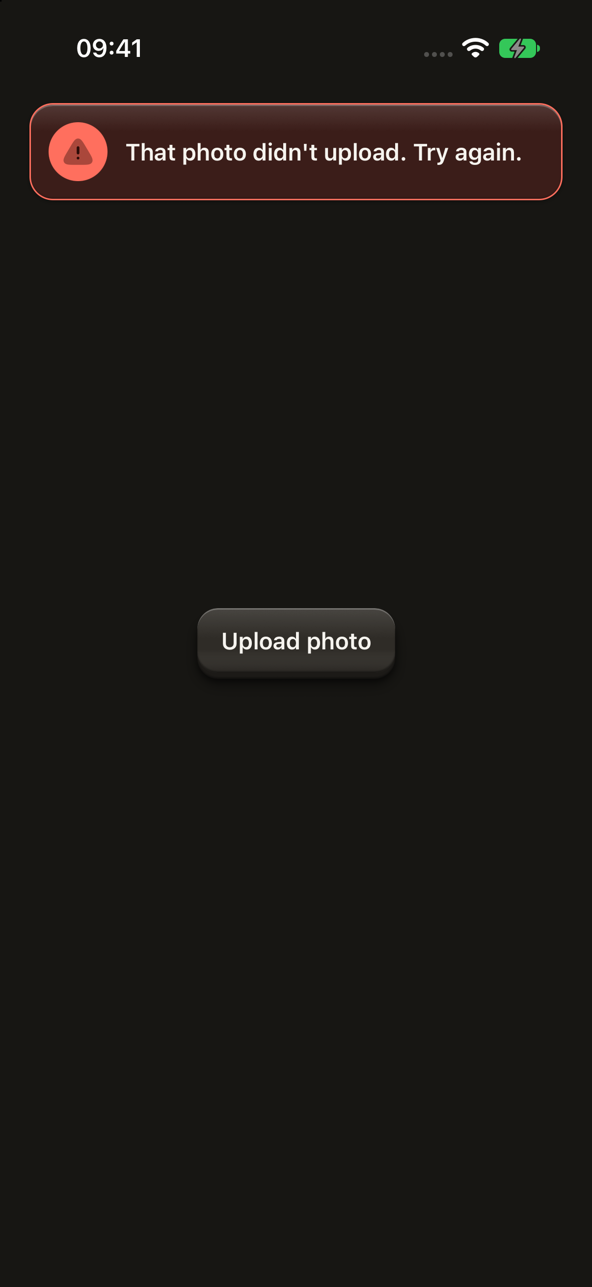
A failure with no place on screen: one sentence for about 6 seconds, and a tap sends it away.
import { Button, ButtonText, showToast } from "@terratcg/ui";
import { useEffect } from "react";

const fail = () => showToast({ tone: "danger", message: "That photo didn't upload. Try again." });

export default function ToastDanger({ capture }: SceneProps) {
  useEffect(() => {
    if (capture) fail();
  }, [capture]);
  return (
    <Button variant="secondary" onPress={fail}>
      <ButtonText>Upload photo</ButtonText>
    </Button>
  );
}
Props
showToast
Prop
Type
clearTopToasts(owner) drops one owner's toasts, the one in view included; with no owner, it drops every toast.
TopToastCard
For a toast of your own, such as one with an action, build it on TopToastCard and queue it with showTopToast({ content, durationMs, owner }). Size a custom disc glyph with TOP_TOAST_GLYPH (22 pt), the size the built-in toasts use.
Prop
Type
Accessibility
- Announced once: a toast is announced when it shows, and never takes screen-reader focus.
- Role: an
alert. A neutral toast lets touches through to the page under it. Adangertoast dismisses on a tap, and a toast withonPressis abuttonthat says what it does throughhint. - Time: a neutral toast stays about 3 seconds, a
dangerone about 6. - Reduce Motion: the toast fades in and out without sliding.
Platform differences
- iOS: toasts sit in a full-window overlay above native sheets, which VoiceOver does not treat as modal.
- Android: toasts are a plain layer of the root view, above the page and sheets in the same window.
- Holds: toasts wait while a Dialog or Menu is up, or while the host's
holdToastsis set. A toast in view steps aside and comes back with its whole time. - Web: the live tab mounts its own OverlayHost in the preview frame, so the toast shows inside the frame. The web is not a supported target.
Rules
- Write one short sentence. A toast has no title.
- Use
neutralfor a result that needs nothing from the user, anddangerfor a failure with no place on screen. - Show an error next to its field or in its Dialog when it has one: a toast is for what has nowhere else to go.
- Never put the only way to do something in a toast: it leaves on its own.
- Clear a feature's toasts with
clearTopToasts(owner)when the user leaves it.