Input
A native text input in a recessed well. It is a plain React Native TextInput, with the value, keyboard and events left to the platform.
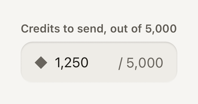
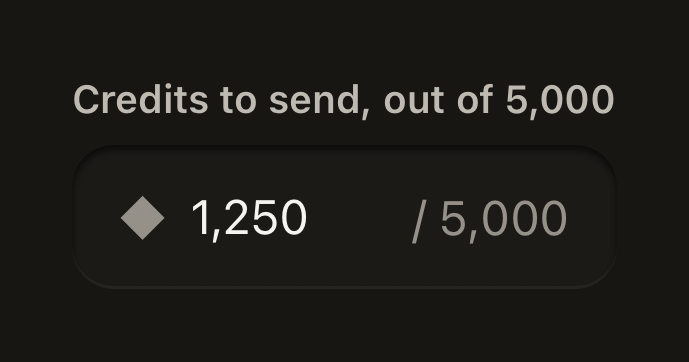
import { Field, Input, Label, Text } from "@terratcg/ui";
import { useState } from "react";

export default function InputAdornments() {
  const [amount, setAmount] = useState("1,250");
  return (
    <Field style={{ alignSelf: "stretch" }}>
      <Label>Credits to send, out of 5,000</Label>
      <Input
        value={amount}
        onChangeText={setAmount}
        keyboardType="number-pad"
        startAdornment={<Text tone="muted">◆</Text>}
        endAdornment="/ 5,000"
      />
    </Field>
  );
}
Import
import { Input } from "@terratcg/ui";Usage
<Field>
  <Label>Email</Label>
  <Input value={email} onChangeText={setEmail} keyboardType="email-address" autoCapitalize="none" />
</Field>
Put an Input in a Field: the Field's Label names it and its state reaches it. Everything else is React Native's TextInput: value, onChangeText, keyboardType, secureTextEntry, returnKeyType, onSubmitEditing and the ref work as usual. Use disabled instead of editable.
Examples
End slot
Controls at the end of the well stay tappable and reach the screen reader, so they name themselves.
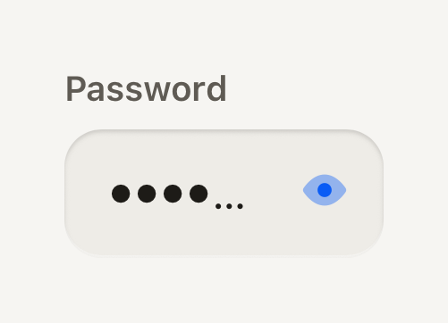
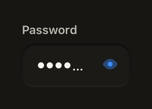
import ViewIcon from "@hugeicons-pro/core-bulk-rounded/ViewIcon";
import ViewOffIcon from "@hugeicons-pro/core-bulk-rounded/ViewOffIcon";
import { HugeiconsIcon } from "@hugeicons/react-native";
import { ButtonIcon, Field, IconButton, Input, Label } from "@terratcg/ui";
import { useState } from "react";

export default function InputEndSlot() {
  const [password, setPassword] = useState("tidepool");
  const [shown, setShown] = useState(false);
  return (
    <Field style={{ alignSelf: "stretch" }}>
      <Label>Password</Label>
      <Input
        value={password}
        onChangeText={setPassword}
        secureTextEntry={!shown}
        autoCapitalize="none"
        endSlot={
          <IconButton
            size="sm"
            variant="ghost"
            accessibilityLabel={shown ? "Hide password" : "Show password"}
            onPress={() => setShown((value) => !value)}
          >
            <ButtonIcon>
              {({ color, size }) => <HugeiconsIcon icon={shown ? ViewOffIcon : ViewIcon} color={color} size={size} />}
            </ButtonIcon>
          </IconButton>
        }
      />
    </Field>
  );
}
Without a Field
Standing alone, an Input needs its own accessibility label; a placeholder is not a label.
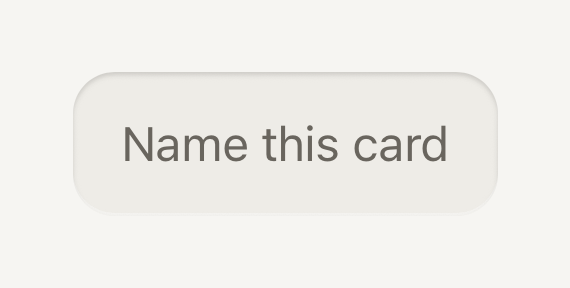
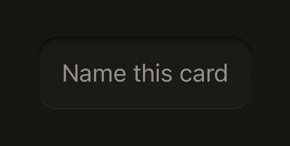
import { Input } from "@terratcg/ui";
import { useState } from "react";

export default function InputStandalone() {
  const [name, setName] = useState("");
  return (
    <Input
      accessibilityLabel="Card name"
      placeholder="Name this card"
      value={name}
      onChangeText={setName}
      style={{ alignSelf: "stretch" }}
    />
  );
}
Props
Prop
Type
Input also accepts React Native's TextInput props except editable. style styles the well itself; once the Input has an adornment or an endSlot, it sits in a wrapper that containerStyle lays out. Pass endSlot={null} while there is nothing to show, so the wrapper stays and the text keeps its focus when the slot comes back.
Accessibility
- Name: inside a Field, the Label names the Input. Standing alone, pass
accessibilityLabel: a placeholder disappears as soon as there is text. - State:
accessibilityState.disabledfollowsdisabled; your ownaccessibilityStateis merged on top. - Focus: a 2 point accent stroke shows focus, and a danger stroke shows an invalid value. The text never moves when the stroke appears.
- Adornments:
startAdornmentandendAdornmentare visual only and hidden from screen readers. Say the same thing in the label or the hint ("Credits to send, out of 5,000"). - End slot: its controls stay tappable and reach the screen reader, so give each one its own
accessibilityLabel. - Larger text: the value scales with the system text size and the well grows taller from its 48 point minimum.
Platform differences
- Keyboard and text: the keyboard, autofill, autocorrect, the secure-entry dots and the selection handles are each platform's own.
- Labelling: on Android the Input also points at its Label through
accessibilityLabelledBy. - Web: Input renders through react-native-web for these docs, but the web is not a supported target.
Rules
- Keep it controlled: pass
valueandonChangeText, and own validation in your screen. - Use
disabled, nevereditable={false}, so the well and the accessibility state follow. A disabled Input keeps the flat disabled grey, with no recess. - Never use the placeholder as the label; it is an example of the value, at most.
- Use an adornment for a unit or a limit, and the end slot for a control. Never put a control in an adornment: it can't be tapped.
- For search, use Search field instead of building the magnifier and clear key yourself.