Search field
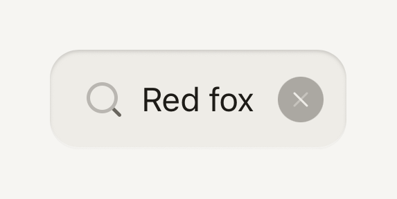
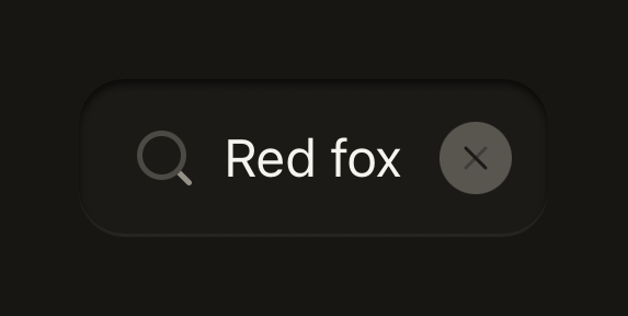
An Input with the magnifier leading it and a clear key while there is text, on the keyboard's search key. Clearing keeps the caret in the field.
import Cancel01Icon from "@hugeicons-pro/core-bulk-rounded/Cancel01Icon";
import Search01Icon from "@hugeicons-pro/core-bulk-rounded/Search01Icon";
import { HugeiconsIcon } from "@hugeicons/react-native";
import { SearchField } from "@terratcg/ui";
import { useState } from "react";

export default function SearchFieldDefault() {
  const [query, setQuery] = useState("Red fox");
  return (
    <SearchField
      value={query}
      onChangeText={setQuery}
      placeholder="Search your library"
      clearLabel="Clear search"
      icon={({ color, size }) => <HugeiconsIcon icon={Search01Icon} color={color} size={size} />}
      clearIcon={({ color, size }) => <HugeiconsIcon icon={Cancel01Icon} color={color} size={size} />}
      containerStyle={{ alignSelf: "stretch" }}
    />
  );
}
Import
import { SearchField } from "@terratcg/ui";Usage
<SearchField
  value={query}
  onChangeText={setQuery}
  placeholder="Search your library"
  clearLabel="Clear search"
  icon={({ color, size }) => <SearchIcon color={color} size={size} />}
  clearIcon={({ color, size }) => <CloseIcon color={color} size={size} />}
/>
SearchField is a controlled Input: value and onChangeText are required. The icons come from you, as nodes or as render functions given the colour and size to draw in. The screen around it owns the rest: the results, the filtering and any Cancel link.
Examples
Disabled
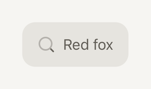
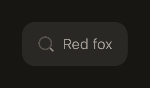
A disabled search field takes no input and offers no clear key, even with text in it.
import Cancel01Icon from "@hugeicons-pro/core-bulk-rounded/Cancel01Icon";
import Search01Icon from "@hugeicons-pro/core-bulk-rounded/Search01Icon";
import { HugeiconsIcon } from "@hugeicons/react-native";
import { SearchField } from "@terratcg/ui";

export default function SearchFieldDisabled() {
  return (
    <SearchField
      disabled
      value="Red fox"
      onChangeText={() => {}}
      placeholder="Search your library"
      clearLabel="Clear search"
      icon={({ color, size }) => <HugeiconsIcon icon={Search01Icon} color={color} size={size} />}
      clearIcon={({ color, size }) => <HugeiconsIcon icon={Cancel01Icon} color={color} size={size} />}
      containerStyle={{ alignSelf: "stretch" }}
    />
  );
}
Props
Prop
Type
SearchField also accepts the Input props except the adornments and the end slot, which it fills itself. It sets returnKeyType="search", autoCapitalize="none" and autoCorrect={false}; pass your own to change them.
Accessibility
- Name:
accessibilityLabelif you pass one, else theplaceholder. Inside a Field, the Label names it only when there is neither. - Clear key: an Icon button named by
clearLabel. It only appears while there is text, and pressing it empties the field and puts the caret back in it. - Magnifier: visual only, hidden from screen readers.
- Disabled: no clear key, even with text in the field.
Platform differences
- Keyboard: the return key reads Search on both platforms; its label and look are each keyboard's own.
- Clear key: drawn the way the system draws it, on iOS and Android alike: a 22 point grey disc (Ink Muted at half strength) with the X cut out in the well's floor colour, centred in the field.
- Web: SearchField renders through react-native-web for these docs, but the web is not a supported target.
Rules
- Keep
valuein your state, and run the search fromonChangeTextoronSubmitEditing. - Always pass
clearLabel, in the user's language. - Draw the magnifier and the X from your app's own icons (
icon,clearIcon); TerraUI ships no glyphs. - Write the placeholder as what can be searched ("Search your library"), since it is also the field's name.
- Put any Cancel link next to the field, outside it.