Badge
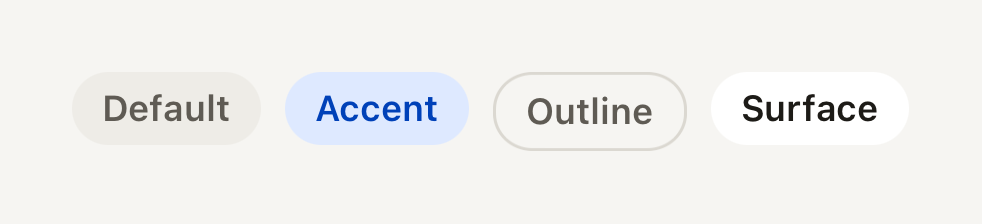
A small pill label for a category, a count or a status. Quiet by default.
import { Badge } from "@terratcg/ui";
import { View } from "react-native";

export default function BadgeVariants() {
  return (
    <View style={{ flexDirection: "row", flexWrap: "wrap", justifyContent: "center", gap: 8 }}>
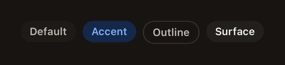
      <Badge>Default</Badge>
      <Badge variant="accent">Accent</Badge>
      <Badge variant="outline">Outline</Badge>
      <Badge variant="surface">Surface</Badge>
    </View>
  );
}
Import
import { Badge } from "@terratcg/ui";Usage
<Badge variant="accent">New</Badge>A string or number child is set in themed caption text on one line. Any other child (an icon and a Text, say) passes through, laid out in a row. A Badge hugs its content (alignSelf: "flex-start").
Examples
Sizes
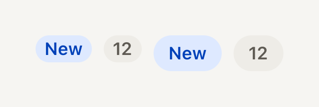
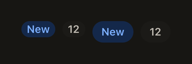
The small pill sits beside a caption; the default one beside a title. A number is set like a string.
import { Badge } from "@terratcg/ui";
import { View } from "react-native";

export default function BadgeSizes() {
  return (
    <View style={{ flexDirection: "row", justifyContent: "center", alignItems: "center", gap: 8 }}>
      <Badge size="sm" variant="accent">
        New
      </Badge>
      <Badge size="sm">{12}</Badge>
      <Badge variant="accent">New</Badge>
      <Badge>{12}</Badge>
    </View>
  );
}
Host colours
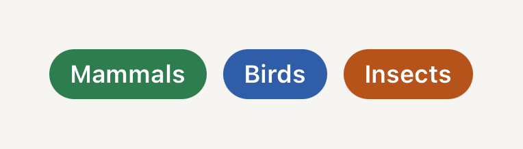
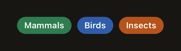
color and textColor replace the variant's fill with a category colour of your own, for content, never for chrome.
import { Badge } from "@terratcg/ui";
import { View } from "react-native";

export default function BadgeHostColor() {
  return (
    <View style={{ flexDirection: "row", flexWrap: "wrap", justifyContent: "center", gap: 8 }}>
      <Badge color="#2E7D4F" textColor="#FFFFFF">
        Mammals
      </Badge>
      <Badge color="#2F5DA8" textColor="#FFFFFF">
        Birds
      </Badge>
      <Badge color="#B5531B" textColor="#FFFFFF">
        Insects
      </Badge>
    </View>
  );
}
Props
Prop
Type
Badge also accepts React Native's View props, such as accessibilityLabel and testID. color and textColor work together: when you replace the fill, set a label colour that reads on it.
Accessibility
- Role: none. A Badge is read as its text, in the order it appears.
- Label: a count such as "12" means little alone. Give the Badge an
accessibilityLabel("12 new cards"), or say it in the text next to it. - Truncation: a string label stays on one line and truncates when space runs out; keep labels to a word or two.
- Colour: the variants use theme pairs. With
colorandtextColorthe contrast is yours to check.
Platform differences
- iOS and Android: the same pill and metrics.
- Web: Badge renders through react-native-web for these docs, but the web is not a supported target.
Rules
- Use a Badge for information, never as a control: it has no press. Reach for a Button or Selectable for anything tappable.
- Keep host colours for content (a photo category, a set), never for chrome such as headers and tabs.
- One word or a short number: a Badge that needs a sentence wants to be a Notice.