Cell
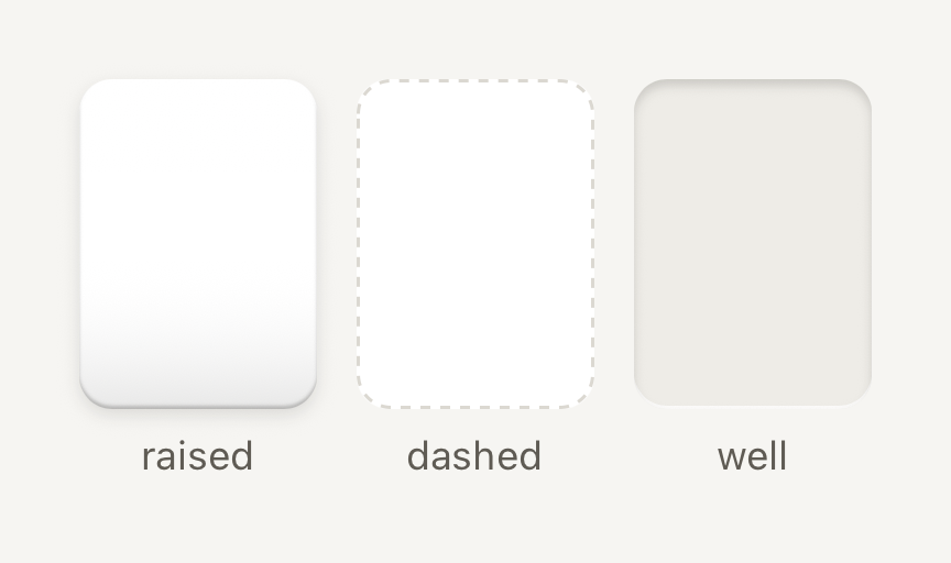
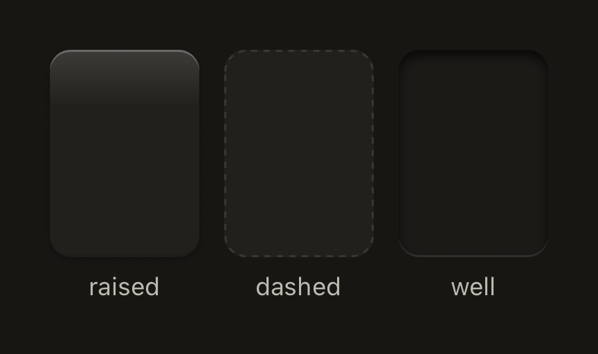
One pocket in a dense grid or shelf. Quiet framing keeps the art inside as the subject.
import { Cell, Text } from "@terratcg/ui";
import { View } from "react-native";

export default function CellFrames() {
  return (
    <View style={{ flexDirection: "row", gap: 12 }}>
      <View style={{ alignItems: "center", gap: 6 }}>
        <Cell style={{ width: 72, height: 100 }} />
        <Text variant="caption" tone="secondary">
          raised
        </Text>
      </View>
      <View style={{ alignItems: "center", gap: 6 }}>
        <Cell frame="dashed" style={{ width: 72, height: 100 }} />
        <Text variant="caption" tone="secondary">
          dashed
        </Text>
      </View>
      <View style={{ alignItems: "center", gap: 6 }}>
        <Cell frame="well" style={{ width: 72, height: 100 }} />
        <Text variant="caption" tone="secondary">
          well
        </Text>
      </View>
    </View>
  );
}
Import
import { Cell, resolveGridColumns } from "@terratcg/ui";Usage
<Cell onPress={() => open(card)} accessibilityLabel={card.name} style={{ width: 72, height: 100 }}>
  <CardArt card={card} />
</Cell>
Give a Cell its size through style; the frame and colours come from the theme, and your content is clipped to the frame. The three frame treatments tell a Cell's states apart: a raised shell, a dashed outline and a recessed well. With onPress the Cell is a button that dips to 94% and tints when pressed. Without it, it is a static frame.
Examples
Pressable and selected
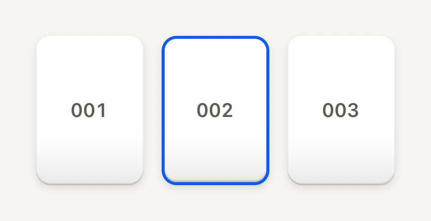
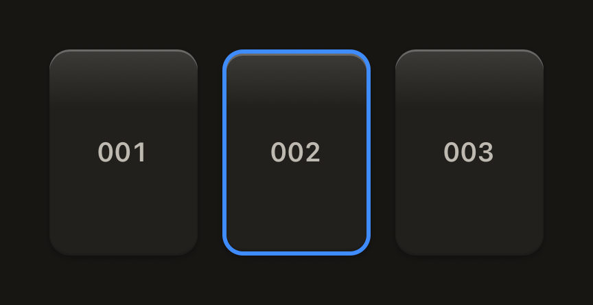
With onPress the pocket is a button that dips and tints when pressed; selected adds a 2 pt accent border.
import { Cell, Text } from "@terratcg/ui";
import { useState } from "react";
import { View } from "react-native";

const POCKETS = ["001", "002", "003"];

export default function CellSelected() {
  const [selected, setSelected] = useState("002");
  return (
    <View style={{ flexDirection: "row", gap: 12 }}>
      {POCKETS.map((number) => (
        <Cell
          key={number}
          selected={selected === number}
          onPress={() => setSelected(number)}
          accessibilityLabel={`Pocket ${number}`}
          style={{ width: 72, height: 100 }}
        >
          <View style={{ flex: 1, alignItems: "center", justifyContent: "center" }}>
            <Text variant="label" tone="secondary" tabular>
              {number}
            </Text>
          </View>
        </Cell>
      ))}
    </View>
  );
}
In a grid
resolveGridColumns picks the column count and cell width for a width: columns drop before cells shrink below minCell.
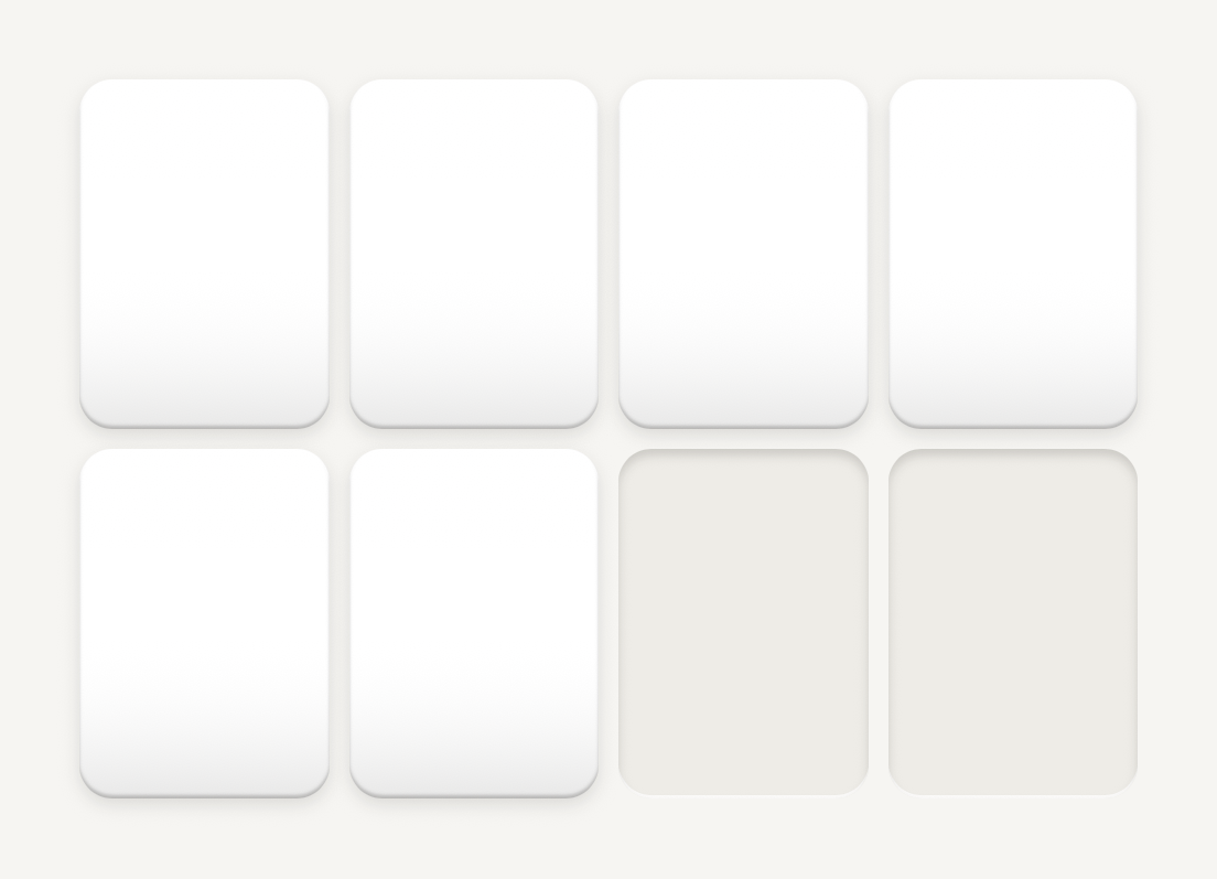
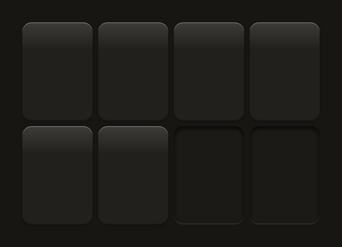
import { Cell, resolveGridColumns } from "@terratcg/ui";
import { View } from "react-native";

const WIDTH = 320;
const GAP = 6;

export default function CellGrid() {
  const { columns, cellWidth } = resolveGridColumns({ width: WIDTH, padding: 0, gap: GAP });
  return (
    <View style={{ width: WIDTH, flexDirection: "row", flexWrap: "wrap", gap: GAP }}>
      {Array.from({ length: columns * 2 }, (_, index) => (
        <Cell
          key={index}
          frame={index < columns + 2 ? "raised" : "well"}
          style={{ width: cellWidth, height: cellWidth * 1.4 }}
        />
      ))}
    </View>
  );
}
Props
Cell
Prop
Type
Cell also accepts React Native's Pressable props, such as onLongPress, hitSlop and testID.
resolveGridColumns
resolveGridColumns(input) returns { columns, cellWidth } for a dense grid: on narrow phones columns drop before cells shrink below minCell, and wide screens gain columns up to maxColumns. minColumns wins over minCell: at the floor, cells shrink instead (with the defaults, a 200 pt width yields three 52 pt cells).
Prop
Type
Accessibility
- Role:
buttonwhen the Cell hasonPress, withaccessibilityStatekeepingdisabledandselectedin sync. A static Cell is one accessible element with no role. - Label: a Cell holds art, not text. Give it an
accessibilityLabelthat names what it holds. - Selection:
selectedis shown by a 2 pt accent border and exposed throughaccessibilityState, not by colour alone. - Reduce Motion: the pressed dip is dropped; the press tint stays.
Platform differences
- iOS and Android: the same frames, dip and tint, with no ripple. A press waits 70 ms before it shows, so a scrolling grid doesn't flash its Cells.
- Feedback: a press calls ThemeProvider's
feedbackhandler with"press"; TerraUI plays no haptic or sound itself. - Web: Cell renders through react-native-web for these docs, but the web is not a supported target.
Rules
- Size Cells with
resolveGridColumns, so cards keep their geometry at every width. - Use
raisedfor a filled pocket,wellfor an empty one anddashedfor a placeholder the user can fill. - Label every pressable Cell.
- Set
translucentonly inside a Card with aground.