Shutter
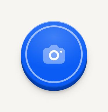
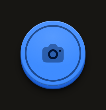
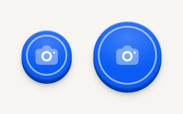
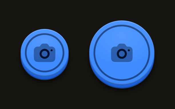
The capture key, a large round console face raised over its edge. Its inner ring reads as a shutter on any ground, a camera preview included.
import Camera01Icon from "@hugeicons-pro/core-bulk-rounded/Camera01Icon";
import { HugeiconsIcon } from "@hugeicons/react-native";
import { Shutter } from "@terratcg/ui";

export default function ShutterDefault() {
  return (
    <Shutter
      accessibilityLabel="Take photo"
      onPress={() => {}}
      icon={({ color, size }) => <HugeiconsIcon icon={Camera01Icon} color={color} size={size} />}
    />
  );
}
Import
import { Shutter } from "@terratcg/ui";Usage
<Shutter
  accessibilityLabel="Take photo"
  loading={capturing}
  onPress={capture}
  icon={({ color, size }) => <CameraIcon color={color} size={size} />}
/>
The Shutter starts a capture; the camera and the capture are yours. Set loading while a capture is in flight: the face keeps its size, shows a spinner in place of the icon and ignores presses until you clear it. The icon is optional: pass a node, or a render function that receives the face's colour and the icon size.
Examples
States
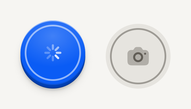
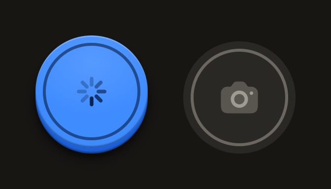
Loading holds the face with a spinner while a capture is in flight; disabled is flat and grey.
import Camera01Icon from "@hugeicons-pro/core-bulk-rounded/Camera01Icon";
import { HugeiconsIcon } from "@hugeicons/react-native";
import { Shutter } from "@terratcg/ui";
import { View } from "react-native";

export default function ShutterStates() {
  return (
    <View style={{ flexDirection: "row", justifyContent: "center", gap: 24 }}>
      <Shutter loading accessibilityLabel="Saving photo" />
      <Shutter
        disabled
        accessibilityLabel="Take photo"
        icon={({ color, size }) => <HugeiconsIcon icon={Camera01Icon} color={color} size={size} />}
      />
    </View>
  );
}
Size
The face is 76 points across by default; size sets another diameter and the icon stays 28 points.
import Camera01Icon from "@hugeicons-pro/core-bulk-rounded/Camera01Icon";
import { HugeiconsIcon } from "@hugeicons/react-native";
import { Shutter } from "@terratcg/ui";
import { View } from "react-native";

export default function ShutterSizes() {
  return (
    <View style={{ flexDirection: "row", justifyContent: "center", alignItems: "center", gap: 24 }}>
      <Shutter
        size={56}
        accessibilityLabel="Take photo, small"
        onPress={() => {}}
        icon={({ color, size }) => <HugeiconsIcon icon={Camera01Icon} color={color} size={size} />}
      />
      <Shutter
        accessibilityLabel="Take photo"
        onPress={() => {}}
        icon={({ color, size }) => <HugeiconsIcon icon={Camera01Icon} color={color} size={size} />}
      />
    </View>
  );
}
Props
Prop
Type
Shutter also accepts React Native's Pressable props, such as hitSlop and testID. SHUTTER_SIZE exports the default diameter, 76 points, for laying out the controls around it.
Accessibility
- Role:
button, withaccessibilityStatekeepingdisabled(whiledisabledorloading) andbusy(whileloading) in sync. Your ownaccessibilityStateis merged on top. - Label:
accessibilityLabelis required, since the face carries no text. Name the action: "Take photo". - Touch target: the 76 point face is well over the 44 pt and 48 dp minimums. Keep any smaller
sizeat 48 or more. - Reduce Motion: the face no longer travels when pressed; the press tint stays.
Platform differences
- iOS and Android: the same domed face, ring and travel, with no ripple.
- Feedback: a press calls ThemeProvider's
feedbackhandler with"press". A disabled or loading Shutter reports nothing. TerraUI plays no shutter sound or haptic itself. - Web: Shutter renders through react-native-web for these docs, but the web is not a supported target.
Rules
- One Shutter per screen, for the capture only. Other camera controls are Icon buttons.
- Set
loadingfor as long as the capture runs, and clear it yourself: the Shutter never clears it. - Use
onPress, neveronClick, and style props for layout only: the face's colours come from the theme.